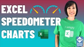
RYG Dial Gauge meter In Excel (Without Macros)

HTML-код
- Опубликовано: 20 авг 2024
- Hello Friends,
In this video you will learn how to create a RYG (Red, Yellow and Green) Gauge meter in Excel without using of any macro.
Please download this excel file from below given link:
www.pk-anexcel...
Watch the best info-graphics and dynamic charts from below link:
• Dynamic Graphs
Website:
www.PK-AnExcel...
Facebook:
/ pkan-excel-expert-9748...
Pinterest:
/ pkanexcelexpert
Telegram:
t.me/joinchat/...
Twitter:
/ priyendra_kumar
Send me your queries on telegram:
@PKanExcelExpert


Your channel deserves many more subscribers.
I’m really grateful for this video, I’ve found it especially useful and applicable in my profession. I’m a psychologist and I’ve used this way of visualization to show how many points a certain person get on a personality trait scale. Thank you!
Thanks for your valuable feedback
Thank you for the video. Taught me alot today.
Glad to hear it!
Thank you for this video, this is a nice one, also stable on Mac OS X and no VBA.
For the record, I don’t use your sheets, the best way of learning is to build it by your self 😉
Two words my good friend.... EPIC and SIMPLE
Many thanks
Thanks for your valuable feedback
Thank you very much PK from The Netherlands!
Brilliant, thank you.
You're very welcome!
Very nice video. Helped me to build one ! Thank you !
Thanks for your valuable feedback
Great job 👏🏼
Thank you!! 😁
I came here for coppers and I found golds! Thank you sir, your work is splendid
Thanks for your valuable feedback. Audience like you always encourage me to do something innovative in Excel.
Please share this with your friends and colleagues whoever is looking for excel and vba tutorials.
+PK: An Excel Expert Will do sir!
Thank you for your support to my channel
Nice
Thanks
just what i needed cheers mate !
Thanks for your valuable feedback
Thank you very much, it's so useful.
Thanks for your valuable feedback
another fabulous video and masterclass .Many thanks
Thanks
Thank You, Very Helpful!!
Thanks for your valuable feedback
nice tips, thank you
Excellent Job dear PK
Thanks Raj for your valuable feedback
Thanks that's a real help sir
Thanks for your valuable feedback
Thank you. How do I these extra shapes in PowerPoint and still have them connected to excel? For clarification, I prefer to have the chart embedded in PowerPoint so I can only make the update inside the embedded excel file as opposed to the external excel file.
Piece of art!
Thanks Celia for your valuable feedback
Hi PK, Good job, your charts are quite innovative & explanation is super simple, keep up the good work. One idea for you. Can you help in creating a gauge chart that ends with the red zone for a lagging indicator, eg. In Incidents tracking in Safety measures the Target is to maintain a 0 records of Loss Time Incidents LTI so the gauge should start with 0 LTI (green zone) and if it moved it is towards the yellow, amber then red which is the Target that should not be exceeded which is the maximum rate that the organization sets. Basically, the gauge chart you create but in an opposite manner.
Thanks for watching and sharing your valuable feedback. I will definitely try to make such video very soon.
Thanks for nice idea.
Is there any logical method we easily make outer circle perfect in graph? very difficult to arrange but if some technical method or idea that will be perfect.
How to create a speedometer graph for productivity in per hour
Sir, please provide us speedometer using combo box or data validation
you are awesome
Thanks for watching and sharing your valuable feedback
Hello, first link can not open. Could you control it please?
Hi, I would like to commission you to develop a system in excel. Have you got an email address I can send over the details
Hi Dave,
Please connect with me on Facebook, Twitter and telegram. Details have been given in videos discretion box.
Thanks for watching.
Hi Sir
how to download the excel file
Hi Srikant, Excel download link has been given in videos discretion box. Please download this excel file from there.
computerized shit
a little tat for the tit
buddy is this it