8:56 - My revelation moment - How to make the slicers with multiple columns! Wow, I cannot believe I found about it only now after working with slicers for almost 1.5 decades! Thank you for sharing this part!
Excellent video how easily you did that I saw videos taking atleast 30 mins to make this but this is done in a jiffy and I could even remember the steps you mentioned simply awesome
it's really a great video with a simple explanation, thank you for the great efforts, if you don't mind we need to get a copy of your excel file at least to follow your procedures step by step, and highly appreciated
Thank you so much for this tutorial. Can you please explain what the last chart means and scenarios where i can use that type of chart? Thank you once again
The last one is a stacked column chart. It effectively shows you two things in one: the total of everything plus how much each individual component makes up the total. You might want to use it when you want to see the different components.
This probably means your dates are entered as text. Double-check your data. A good way to test is to add 1 to the dates and if the formula results in an error, that means they aren't reading as numbers.
@@h2e yes indeed however even after fixing all dates by using text to column. It still wouldn't turn it into months so i manually turned it into groups and now Ima rename them.
This is a great video, Very informative. I was wondering why Excel did not show a pop up for Existing Connections when you added the slicer? Maybe due to the version?
That is a named range I created for my data. Rather than selecting something like A1:G1000, I just created a named range. If you're creating a pivot table, you would select the table or range that relates to your data at that step in the process.
Hello, thank you so much for your video. It helped me tremendously, however when I went to select my pivot tables, I only see pivot table 1 to select. Can you help me figure out why I cant see the others? I created three side-by-side exactly how you have it. Thank you very much for assisting
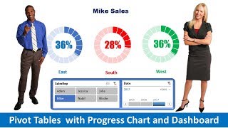
I noticed on the downloaded dataset you had the pie graph listed as dollar amount but in the video you changed it to %. Everything on your dashboard tab in the file we downloaded should match the video. That shows consistency...but still a great video!!!! You went through it very fast but better than too slow I guess. Thank you. Great job bro!
This assumes you have a data set you've already created and assigned a name to it. In this video I've skipped over the step of creating a named range for my data but essentially you just want to reference your data in that step. It doesn't have to be a named range, but that can make it easier to remember it. For example, if your data was in A1:Z100, that's what you would enter in.
Hallo, wie kann ich doppelte Namen im Zeilenfeld sauber anzeigen z.B. Ömer Toprak, Hasan Toprak, Stefan Toprak. Pivot zeigt mich die Namen Gruppiert an und ich kann anschließend im Wertfeld die Anzahlt der Tore nicht Auf oder absteigend sortieren. Wie komm ich zur Lösung?
the link looks to still be working: www.dropbox.com/s/75t9aonn6299zuq/SampleDatabase.xlsx?dl=0 If you want multiple excel workbooks linking into one database or pulling in non-excel sources then you can create a dashboard, but you'll need to use PowerPivot for that
Hey, thanks for the video 😊 Sir, could you please tell us how to set up data source first then doing the pivot table to analyze the rest of the data? Most of us are having this issue yet the article you provided doesn’t address the problem, I read the article and it explains the part of the issue then it goes straightforward to the content of the video.
The data source is just a named range. I have a couple of other dashboard videos that go from start to finish. ruclips.net/video/9_Gc_JweIUc/видео.html ruclips.net/video/IHUMOVm_rLs/видео.html
Please view the latest dashboard video which starts from scratch, that will show you how the data source gets set up at the start. ruclips.net/video/IHUMOVm_rLs/видео.html


Jaws dropping Dashboard. After so many years finally i get what is means by a "Dynamic Dashboard"
I am really thankful to you for this explanation
8:56 - My revelation moment - How to make the slicers with multiple columns! Wow, I cannot believe I found about it only now after working with slicers for almost 1.5 decades! Thank you for sharing this part!
This is one of the greatest learning videos I've seen yet. cant wait to go through your videos
Great explanation as compared to other youtube channels that explain the same concept. You'd make for a great teacher
VERY IMPORMATIVE VIDEO! With this, you help me on my task as an intern student. THANK YOU VERY MUCH!
This is done in most simplistic way to help us learn. Many thanks
Excellent video how easily you did that I saw videos taking atleast 30 mins to make this but this is done in a jiffy and I could even remember the steps you mentioned simply awesome
I have seen so many videos on kpi dashboard, only this video works and so nicely....big thanks
Please are you using a software for KPI? Or strictly excel!
Thank you for taking the time to explain this so patiently.
Just wow & Thanks for explaining us in such a nice & easy way !
it's really a great video with a simple explanation, thank you for the great efforts, if you don't mind we need to get a copy of your excel file at least to follow your procedures step by step, and highly appreciated
The data is in this post howtoexcel.net/2018/01/creating-dynamic-dashboard-in-excel.html
Thank you so much for this tutorial. Can you please explain what the last chart means and scenarios where i can use that type of chart? Thank you once again
The last one is a stacked column chart. It effectively shows you two things in one: the total of everything plus how much each individual component makes up the total. You might want to use it when you want to see the different components.
You’re absolutely PROFESSIONAL, Thanks 🙏
when i add data to rows section it doesn't group the items by months it just puts everything over just like that.
This probably means your dates are entered as text. Double-check your data. A good way to test is to add 1 to the dates and if the formula results in an error, that means they aren't reading as numbers.
@@h2e yes indeed however even after fixing all dates by using text to column. It still wouldn't turn it into months so i manually turned it into groups and now Ima rename them.
Beautifully explained and very useful video.Thanks
Thank you for this beautiful content. I have created my first dashboard.
Thank You for making this video. It's a very useful video.
This is a great video, Very informative. I was wondering why Excel did not show a pop up for Existing Connections when you added the slicer? Maybe due to the version?
Awesome. Is there a way to do age groups? Need to categorize in 10 year increments
I don't understand onething..In data sheet, at 0:53 Minutes, where does the Dataset1 comes from???
That is a named range I created for my data. Rather than selecting something like A1:G1000, I just created a named range. If you're creating a pivot table, you would select the table or range that relates to your data at that step in the process.
Thank you so much it's very very useful...👍
Fantastic video! Short, precise and elaborative..
Hello, thank you so much for your video. It helped me tremendously, however when I went to select my pivot tables, I only see pivot table 1 to select. Can you help me figure out why I cant see the others? I created three side-by-side exactly how you have it. Thank you very much for assisting
This video is really very helpful. Thank you 😊
How did you set up a named range for your data set?
Very well explained. Thanks for sharing.
I noticed on the downloaded dataset you had the pie graph listed as dollar amount but in the video you changed it to %. Everything on your dashboard tab in the file we downloaded should match the video. That shows consistency...but still a great video!!!! You went through it very fast but better than too slow I guess. Thank you. Great job bro!
Thank you for sharing the video. this video really helped me to prepare a dashboard. thank you so much :)
Very important video I appreciate you
many thanks for sharing the updates on dashboard m please add new video about the updated dashboard of construction project.
Great video! This will help me tremendously. Many thanks and well wishes
very very informative. thanks a lot .
Expecting more more like these.
Thank you so much for this video, it really has been of help for me..Great job
Most excellent video thank you so much.
AMAZING VIDEO TUTORIAL
Glad you liked it
How can we add dataset, please explain about setting up a dataset..
I have the file and i used all the process but don't know about dataset
Dataset is being used for every pivot table in your video, but their is no video of assigning the dataset to a data
Beautifully explained. Thanks
How can I update the dashboard on daily / weekly
Ratalya data update kar daily
Excellent Video and easy way to understand... Can you please help us with excel sheet. I want to download use as per shown in Video...
wonderful delivered and awesome video
Thank you for the great insight.
It's a superb video
Sir can you pls say which version of Excel your using and which window version....becz iam unable to use my slicer and some other options
Office 365
Thank you been looking to simplify this information ❤
Great video.. so easy to understand.. thanks man!!!
Slicers take a dashboard to another level. I'll need to practice the report connections.
hey when im pressing the insert pivot table it s shows reference data source is not valid
Make sure u dont empty spaces
Can you help me what you insert when creating a pivot that automatically take the whole data in the other tab in 0:53 to 0:55 in the video...
This assumes you have a data set you've already created and assigned a name to it. In this video I've skipped over the step of creating a named range for my data but essentially you just want to reference your data in that step. It doesn't have to be a named range, but that can make it easier to remember it. For example, if your data was in A1:Z100, that's what you would enter in.
Great and very helpful video. Thank you!
Hallo,
wie kann ich doppelte Namen im Zeilenfeld sauber anzeigen z.B. Ömer Toprak, Hasan Toprak, Stefan Toprak.
Pivot zeigt mich die Namen Gruppiert an und ich kann anschließend im Wertfeld die Anzahlt der Tore nicht Auf oder absteigend sortieren. Wie komm ich zur Lösung?
hi, how did you name your range to "Dateset1" please? thanks
Yes, I just selected my data and created a named range, as opposed to referencing specific cells.
So professional you are 👍
Great simple to floow through content👌
How did you name your data as dataset 1? I don't see that part in the video.
I set up a named range beforehand. Refer to this post on how to do that: howtoexcel.net/2014/01/the-benefits-of-using-named-ranges.html
@@h2e it still not clear how you name your data as dataset1. Is there a video where I can see the entire process?
I will do an updated dashboard video in the near future that will start from scratch and cover some different visuals.
To the owner,pwede po ba mahingi yung copy or files into if kung pwede for final output lng po nmon🙏
Great explanation
Awesome 🎉
Please how can i download the sample database?
www.howtoexcel.net/wp-content/Sample.Database.xlsx
Wow thanks for sharing brother
That was very helpful
That was great, thanks. How would you update this if it was a monthly dashboard?
You can just add to the data. The date slicers would allow you to select which month you want to look at, filtering out what you don't need
Really awesome .. thxs for sharing 👍
link for data not working. Can a dashboard consist of more than one data source?
the link looks to still be working: www.dropbox.com/s/75t9aonn6299zuq/SampleDatabase.xlsx?dl=0
If you want multiple excel workbooks linking into one database or pulling in non-excel sources then you can create a dashboard, but you'll need to use PowerPivot for that
I says cant find the page a 404 error to bropbox
@@wayneseymour1 Okay try this one, I've updated the link in the post as well: www.howtoexcel.net/wp-content/Sample.Database.xlsx
@@h2e Ok tat one works THANKS!!!
How did you link the sample data with data, I have rewind a few times but I didn’t see it
It may be helpful to following along with this article howtoexcel.net/2018/01/creating-dynamic-dashboard-in-excel.html
Thanks for sharing 🙏
Great job
0:42 how to do this
Hey, thanks for the video 😊
Sir, could you please tell us how to set up data source first then doing the pivot table to analyze the rest of the data?
Most of us are having this issue yet the article you provided doesn’t address the problem, I read the article and it explains the part of the issue then it goes straightforward to the content of the video.
The data source is just a named range. I have a couple of other dashboard videos that go from start to finish.
ruclips.net/video/9_Gc_JweIUc/видео.html
ruclips.net/video/IHUMOVm_rLs/видео.html
great video totally worth it
Wow super great job
This is great!
its say "Data source reference is not valid" when pivot table selected how to resolve
Please view the latest dashboard video which starts from scratch, that will show you how the data source gets set up at the start. ruclips.net/video/IHUMOVm_rLs/видео.html
Thanks for this!
Excellent dashboard 👍
Very useful video
Share me the data set ...to practice
Ur vedio was too good
Excellent one....
how can i get this dataset
www.howtoexcel.net/wp-content/Sample.Database.xlsx
Extremely useful ty
Nice, thanks!
There's no excel file in the given link.
www.howtoexcel.net/wp-content/Sample.Database.xlsx
Cant go any furthrt from dataset 1 pivot table,
This is just whatever your data set is. Set it to your data. I just created a named range in my example
Manythanks شكرا جزيلا
I can’t download the dataset
The link for the sample data is here: www.howtoexcel.net/wp-content/Sample.Database.xlsx
Excellent 👍
where can i get the data please
There is a post related to this video, and the data file is available on there. howtoexcel.net/2018/01/creating-dynamic-dashboard-in-excel.html
whre to download data sheet
Super boss 👍
Nice
Can You Kindly Share project file.
Refer to this post howtoexcel.net/2018/01/creating-dynamic-dashboard-in-excel.html
Thankyou 😇
Thank you a lot
Lovely
Thanks a lot.
please share dataset
u r great
who is watching this in 2025 😊
oh this is great video teacher please support me how to prepare financial statement wit dash borad
Thanks 😊
Thank you
wow