The Evolution of Anime Character Designs

HTML-код
- Опубликовано: 26 янв 2017
- I've been looking into stylistic developments in anime a lot recently. In this video I give an overview of how anime character designs have developed.
Video essays on this year's anime:
Top 10 Anime of 2016: • Top 10 Anime of 2016
What Makes a Good Anime Character?: • What Makes A Good Anim...
Social Links:
My twitter: / anime_everyday
My Facebook: on. 1p1QJTV
My hummingbird: hummingbird.me/users/Anime_Eve...
My MAL: myanimelist.net/profile/AnimeE...
Anime mentioned (in order):
Astro Boy
Dororo
Ashita no Joe
Space Battleship Yamato
Mobile Suit Gundam
Macross
Gunbuster
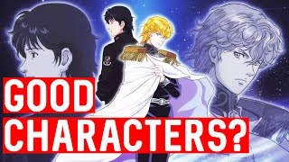
Legend of the Galactic Heroes
Fist of the North Star
Dragon Ball
Akira
Ghost in the Shell
Perfect Blue
Jin Roh
Berserk
Cowboy Bebop
Escaflowne
Evangelion
Air or Kanon
K-On
Monogatari series
Madoka Magica
Serial Experiments Lain
Boogiepop Phantom
Gurren Lagann
Eureka Seven
Kill la Kill
Kaiba


JoJo was part of the 'macho man' time period, it wasn't inspired by it. The creator himself has even redesigned preexisting characters in artworks so that they
80's and 90's had the best desings and the early 2000's the worst
1994 - 2001 ish. I just love that aesthetic.
As a child of the early 90s, the grounded, more realistic style of anime is my favorite. I have a hard time watching newer anime as its so unrealistic, colorful, and sorta childish looking. It feels like I'm constantly being reminded THIS IS ANIME. Rather then watching a show that just happens to be anime, if that makes sense.
I will keep saying But 90s anime style is the best, it looks realistic but it has the touch of being Anime, plus those dark shades make it even better, today's is way too brilliant for me with those clear colors spamming your eyes
I prefer the look of the earlier shows because they seemed to put more emphasis on facial diversity between characters. That's something I've noticed a lot of people have seemed to do away with in order to make their characters more "attractive"
To me, Akira got the worst faces designs, they all look like babies. Except the army general guy, I think it's more fitting than rest of the characters. But just to me, anyway.
god 80s and 90s anime are so comfy to look at.
You skipped the whole Gatchaman Casshan, Tekkaman, American superhero style era of the Early 70's with its "realistic" anatomy. The Super Robot Era had some of this look too.
it would be better to analyze the evolution of manga character designs and artwork rather than anime, since many of the anime mentioned are manga adaptations that rely and take heavily from their manga counterparts
1988-1998 Is my favourite period of character designs.
You should continue this character design videos with individual charachter designers spotlights. Also you could do a video on original and adaptive designs( taken from a source material).
I like the 90s style, it was the decade of creativity for me.
Thanks for another great essay!
The revolution of realistic female bodies and movement in Gunbuster. Real subtle. Real subtle pal.
2000s for me.
I love the 90's art style.
Was a bit disappointed toy didn't talk about the people behind the character designs, but great video as always
Wait, you showed the wrong Kanon, the original (and ugly) made by Toei in 2002. Kyoto Animation did the remake, with the same style but far less ugly, Kanon 2006.