Overlay histogram & normal distribution chart, bell curve: secondary axis | Excel 1-2| IHDE Academy

HTML-код
- Опубликовано: 14 дек 2022
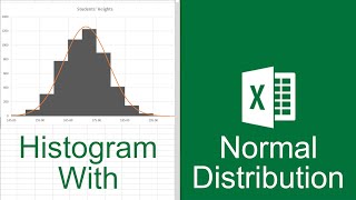
- In Microsoft Excel, superimposing or overlaying a histogram with the normal distribution or bell curve (Gaussian) in a diagram is not easy.
In this lesson, an example will show how to do this for the same dataset.
The scatter xy diagram is used for this.
This has the option of adding a secondary axis (second y-axis) and error indicators.
With this knowledge, you then have a reasonable basis for visually comparing the distribution of values in a histogram with the normal distribution.
I wish you much success.
Rolf Ihde


Thank you! Finally made sense after watching your video!
Hello, I'm always happy when the videos help. Thanks for the feedback.
Love the music, I happen to learn piano and excel at the same time.😊
Hi, thanks. Props for the music goes out to Aakash Gandhi.
I'm happy you're doing something you know. I tried to follow but I kept on trailing behind. I will watch again.
Thanks for your comment. I hope you found what you were looking for.
gg my man you saved me
Thank you for the positive feedback. I'm glad the video helped you.
Great video! Just one question. How did you decide the x-axis values for the bell curve?
Hello, that's a good question! When utilizing applications such as quality control charts, a commonly used range of interest is the "Six Sigma" range, which is equivalent to six times the standard deviation. The Six Sigma approach is rooted in the notion that processes should produce results within plus/minus 3 standard deviations from the mean.
In this specific example, if the standard deviation (Sigma) is 0.03mm, then three times the standard deviation would be: 3 × 0.03mm = 0.09mm.
This results in a range of 60.01mm to 60.19mm. However, to ensure that the chart accurately represents all potential variations and to make it more understandable, I rounded the range to 60mm to 60.2mm for the x-axis.
@ihdeacademy Great information. Thanks for responding.
how to add controll limits
Hi, if you want to learn how to add control limits or confidence intervals, I recommend this video titled "Excel Normal Distribution Chart: Example Calculate Confidence Intervals Excel 1-6." In my opinion, having the histogram, bell curve, and the area under the curve filled all in one chart exceeds the practical use of Excel.