I'm not gonna lie, I was messing around with my graph for hours, and I had to leave it because I was getting a massive headache. This video is literally gold. I understood everything so easily. Sir you are God send
This video helped me out immensely. Before this video I was trying to make a histogram in excel and it would never come out right. Now I know how to do it. Thank you so much!!
Thank you so much. Your explanation on how to make a histogram was the best one I found. Step by step, informative and attention to detail. Thanks again. Awesome!
Great video, good for those with very basic/ little or no knowledge of excel. I'm good at excel so I found the explanations to long winded sometimes. :) Good work though, we need more people to understand the power of Excel!
But, you can make a graphic using the pivot table created previously. Thanks for the tutorial. Great use of pivot tables for create range and count the frequencies
Is there a way to connect the ratings column to the histogram? I'm curious to know the correlation between the price of the restaurant and quality of ratings with the frequency of visits... All in one chart... Is that possible? Thanks!!!
I guess you could divide each bar into colors representing the number of each rating given. I don't know how to do that, but am pretty sure it is possible.
Hi, Im having trouble to group the sample... when I hovered one of the digit, then I right clicked, then pick group... it says "Cannot group that selection". Help me please, thank you
It is a data set that came from an old textbook. But, the idea is that this would have been a survey questionnaire where that value is the judgement of the customer.
Thank you for the instruction. I do have one further question for the histogram chart, the x-axle particularly. Can the marks of the x-axle be changed as "10, 15, 20,……,45, 50", rather than the ranges like "10-14, 15-19……, 45-49"?
What if I want to group the observations in uneven increments? For example, if a price is below $10, then the item is considered 'tier 1', if it's between 10-50, it's tier 2, if it's between 50-100 it's tier 3, etc. How can I get it to group it under those categories?
Then you are not making a histogram, you are separating data into qualitative categories, and make a bar graph. You can assign labels using the ifs function, then count them using the countif function.
That would be my guess- Excel is quick for getting the frequencies, but when doing anything more involved I always copy out the frequencies, then manipulate them so I know what is happening. Cheers!


I'm not gonna lie, I was messing around with my graph for hours, and I had to leave it because I was getting a massive headache. This video is literally gold. I understood everything so easily. Sir you are God send
You are awesome. Got me out of a jam. No one knows how to explain as well as you for creating a histogram. Thank you.
This was comprehensive and straight to the point. Easy to follow. Thank you!
Thank you so much!!!! After struggling for days to do this histogram solo....you made it abundantly easy!!!! Excellent quality!
I know . It’s just as simple as he makes it
This video helped me out immensely. Before this video I was trying to make a histogram in excel and it would never come out right. Now I know how to do it. Thank you so much!!
I am happy to have reduced your Microsoft-related pain! ☺
Oh man you explained that better than my lecturer I'm so puzzled to figure out how to histogram my calculation of class boundaries. Thank you so much
Thank you so much for this. It's so much more useful than the automatic histograms Excel makes.
Thank you so much. Your explanation on how to make a histogram was the best one I found. Step by step, informative and attention to detail. Thanks again. Awesome!
Glad you liked it! Please let me know if there are other topics you'd like to see!
Best and easiest to understand instructions THANK YOU!
Thank you so much, finally I found this video. It really helped a lot🙏
THANK YOU SO MUCH, SIR! I LEARNED SO MANY FROM THIS TUTORIAL! GODSPEED!
Great video, good for those with very basic/ little or no knowledge of excel. I'm good at excel so I found the explanations to long winded sometimes. :) Good work though, we need more people to understand the power of Excel!
You made my day, instructor per excellence
This saved me so much time! I was already struggling for a while many thanks!
Thank you a lot for the detailed explanation and break down. Everything was clear and comprehensive!
Thank you for the great explanation of how to create a histogram!
Thank you, very helpful. Would you know how to format those grouped numbers in that row (8:32)? In my case, I need to transform in percentage. Cheers!
Go to format (Ctrl 1)
Thank you very much, it helped me a lot with my data. My analysis got completed quickly ....
your explanation is very good!
thank you so much I cant emphasis enough how much this helped me
Thank you, you made this really simple to follow.
Thanks very much, this video helped me create a good-looking histogram for my geography project.
how can you add percent and relative frequency without changing the calculation would you have to add that row before you create the pivot table ?
But, you can make a graphic using the pivot table created previously. Thanks for the tutorial. Great use of pivot tables for create range and count the frequencies
very well explined sir thank you. you are a master
love your voice too
HAS ANYONE TOLD YOU, YOU SOUND EXACTLY LIKE TOM HANKS!
(are you tom hanks?)
Kenji Morimitsu Life is like a box of chocolates?
ha!! i had the same thought.
Lol was thinking the same thing
Awesome. Great content.
Thank you so much for making this video, it was absolutely helpful and useful!🙌🏽👌🏽
Very helpful. Thank you
Thankyou so much it's a saviour
Hi... Nice buddy...Tom Hanks...you are great....Thank you...
Thanks so much for this great video
You are the best! Thank you so much.
Thank you so much sir!! Can you please explain what 'by' stands for when grouping data?
thank you. really helped me a lot.
Is there a way to connect the ratings column to the histogram? I'm curious to know the correlation between the price of the restaurant and quality of ratings with the frequency of visits... All in one chart... Is that possible? Thanks!!!
I guess you could divide each bar into colors representing the number of each rating given. I don't know how to do that, but am pretty sure it is possible.
Hi, Im having trouble to group the sample... when I hovered one of the digit, then I right clicked, then pick group... it says "Cannot group that selection".
Help me please, thank you
Same have you found the solution?
@@mylesmovie Did you find the solution? Plz respond asap my grade depends on me overcoming this hurdle
Did you find the solution i'm having the same problem and my grade depends on me getting past this issue plz respond ASAP
Absolument great
hi, can you tell me how did you come up with a decision of giving good, very good and excellent value?
It is a data set that came from an old textbook. But, the idea is that this would have been a survey questionnaire where that value is the judgement of the customer.
Can u post the link to the previous video please
I have a link to the entire playlist in the video description... But here it is anyway: ruclips.net/video/Is1thK5X3yI/видео.html
AWESOME! two for one by pivot tabling us into a histogram!
That's how we roll at BurkeyAcademy. ☺
Thank you for the instruction. I do have one further question for the histogram chart, the x-axle particularly. Can the marks of the x-axle be changed as "10, 15, 20,……,45, 50", rather than the ranges like "10-14, 15-19……, 45-49"?
I made you a video on this: ruclips.net/video/M7u6UCiwdc4/видео.html
Thank you for the reply. However, this link is unavailable
Thanks for letting me know, and Sorry! For some reason RUclips didn't release the video after it processed it. Try now, it should work.
Thanks, You Saved Me
What if I want to group the observations in uneven increments? For example, if a price is below $10, then the item is considered 'tier 1', if it's between 10-50, it's tier 2, if it's between 50-100 it's tier 3, etc. How can I get it to group it under those categories?
Then you are not making a histogram, you are separating data into qualitative categories, and make a bar graph. You can assign labels using the ifs function, then count them using the countif function.
@@BurkeyAcademy lol ended up making a bar graph naturally & then your comment made perfect sense 😭
Very helpful. Thank you.
I'm right clicking and the grouping option doesn't appear
THIS IS SO AWESOME THANK YOU!
So helpful!!! Thank you :)
you are perfect!
Really appreciate your help man🍺
man i love you
I love you too, man!
GREAT Job!
Its was so informative .. thanks alot
You are welcome sir! Should I start a series on short Excel tips? Hmmm.
this was really helpful thankyou
You are welcome!
Thank you very much!!!
nice work
Thank you, thank you very much!
Thank you alot bro
I am having trouble finding a way to plot the relative frequency with Excel 2016. Do you know how to do that?
What trouble are you having? You can copy the frequencies, divide by N, then plot the result.
I guess you cannot do that directly. You have to make the table for it, correct? Thanks for the quick reply!
That would be my guess- Excel is quick for getting the frequencies, but when doing anything more involved I always copy out the frequencies, then manipulate them so I know what is happening. Cheers!
u r z best !
Thank you!!!
Thankyou so much :D
Really Helpfull
Thanks sir
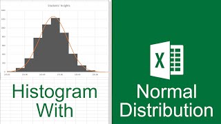
WHAT ABOUT INSERTING NORMAL DISTRIBUTION CURVE
Sure, I can do a video on that... stay tuned!
Here is a video just for you! ruclips.net/video/iHJYWg99rPk/видео.html
Thanks
THANK U
thanks, my histogram is beautiful.
I paid my university, IUB, a $1,000. They just linked me to a free, youtube video?
Admin's creative teaching skills are being exploited
Well, at least I hope you learned something. 😃 I love trying to help everyone learn, so I am happy to try to you if I can.
so complicated
this didn't help me at all
Did this really needed to take 20 minutes?
You do know you can watch at a higher speed and fast forward, right? 😁
This is VERY helpful , thank you very much