Excel Histograms: How to Add a Normal Curve

HTML-код
- Опубликовано: 12 июл 2024
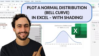
- Here we add a normal distribution curve to an existing histogram, so you can compare your data to a normal distribution with the same mean and standard deviation. As usual, it is a pain to do this in Excel- but here is a way!
Download the file: docs.google.com/spreadsheets/...
Excel Video Playlist 1: • Excel Videos
Excel Video Playlist 2: • Short Excel Videos: Bu...
My Website: www.burkeyacademy.com/
Support me on Patreon! / burkeyacademy
Talk to me on my SubReddit: / burkeyacademy
Buy me a cup of coffee on PayPal? paypal.me/BurkeyAcademy


![Eminem - The Death of Slim Shady [Graveyard Album Trailer]](http://i.ytimg.com/vi/vOJD-6vQpXU/mqdefault.jpg)


Thanks sir for all your effort in making this video, it is more than what I hoped for. I have been working with excel this week as a mean for statistical calculations. MS excel served me well for that purpose. The idea of fitting a normal bell curve into a histogram is more out of my curiosity. I will follow the steps demonstrated for my experimentation with excel.
Thanks for the excel tips as well..very useful!
Great video. nicely explained all the steps.
this is so beautiful! many thanx!
t u very much for that explanation, it saved our project :)
Thank you so so so much, this video has been very helpful.
thankyou for the video :) really helpful for the beginner like me
Great! It is very useful!
Very good explanation! I tend to agree with your initial comment though, there are better tools than excel to do this kind of analysis.
Thanks for the video . Is the exponential curve add to histogram works the same ?
In Excel version 16.22 at least on Mac go to Tools then Excel Add-ins to get Analysis pack
(I meant to say std. dev. is 34.13.) I saw the google sheet, but could you do a video? Am I right in the logic: Find the fraction of sigma, then find amount of data above that?
Hi , Please guide me on this -
how to set the limit when the value is from 200 k to 3,000,000?
Thanks
Wow. I can't believe how clunky this process is. Excel needs to get on it, and make an easy way to do this.
Thank you.
How do you outline the edges of each bar on the histogram to highlight their separation ?
This is an easier/exact bell: Click any column, Right Click, Select Data, Add, Title: Normal, Select numbers under Frequency Cells next to chart made, Ok, Ok, Click any Orange Colum, Right Click, Change Chart Type, Click Normal button, Select Scatter w/ Smoot Lines under X Y (scatter) menu, check box next to cell you just changed only, OK, Click on Number made on right hand side of chart, Delete. end
really useful - other websites offer instructions that go on for ever...
Thanks! Lots of people complain that my videos are too long, too. 😃
Which are some better softwares for doing this kind of thing?
My favorite, all around statistical, graphing, and everything else package is R. It takes a little while to learn, but once yoy do, you can do ANYTHING. Plus, it is absolutely free. Here is an intro video about how you can start learning R within R itself: ruclips.net/video/6azsCcyJ-lM/видео.html If you'd like me to make a video showing how to make a histogram and add a normal curve in R, let me know!
so when i add the data of the normal distribution it just doesn't get added to the histogram. the red bars don't show up.
Edit i figured it out. you used a column graph to make your histogram while i used the histogram. if you do histogram you can't add a second data set.
Thanks for letting me and everyone else know. I am so glad you worked it out!
@@BurkeyAcademy also when i did 1000 random numbers the curve was not normal but when i did 10000 numbers it was perfect
when I add the new data from select data NOTHING happens
Why wouldn't you normalize the binned RNG'd observations by multiplying each frequency by 1000 / # meal price observations? Then you wouldn't need a secondary axis.
Adding the Normal series didn't appear to do anything to the graph, it didn't add the additional columns. Is there something that needs to be done to add the data to the viewable portion of the graph?
Something a colleague did recently might have happened to you- she accidentally made the data for the normal series with values between 0 and 1, which was too small to be seen on the graph with the other data that had much larger values. This might be something to check.
how to make a space in the horizontal line before the onset of the first bar ?
I made a video for you: ruclips.net/video/_YnPubZOaPw/видео.html
@@BurkeyAcademy Words cannot describe my pleasure and many thanks to you sir. Although, it's helpful I am using a pivot table for frequency distribution and I cannot do the same as you did. Sir may you give me a little of your time via zoom to describe my problem exactly ?! That would be helpful for my FYP.
but how can i work on it when i have really big number like 1504552839?
What problem is having a big number causing you?
@@BurkeyAcademy i wont calculate the frequency right. Its like 0 0 0
This is an easier/exact bell: Click any column, Right Click, Select Data, Add, Title: Normal, Select numbers under Frequency Cells next to chart made, Ok, Ok, Click any Orange Colum, Right Click, Change Chart Type, Click Normal button, Select Scatter w/ Smoot Lines under X Y (scatter) menu, check box next to cell you just changed only, OK, Click on Number made on right hand side of chart, Delete. end
Is this in the latest version of Excel? You can insert Histograms now!
ps only reason I ask is that I'm following this guide and my Excel is telling me that "STDEV" is only accessible on earlier versions of Excel so I'm having to use "STDEV.S" instead!
This video is probably 4 years old, so no. I'll have to check it out. Re: changing the command for stdev, yes I have seen that... And it is ridiculous how Excel would change a command that has been the same for 25 years!
How do you do the OPPOSITE? Create a histogram from a normal curve? This seems to be the biggest secret in Statistics!
It isn't too difficult. Tell me more about what you'd like to see, and I can show you. But basically, you'd pretend you had say, 10,000 observations, and calculate how many you would expect there to be in different bins.
Let's say I want to fit 40 items to a normal curve, with a mean of 50, and std dev of 84.13 (I know it's a large std dev, so it will put some items below 0, and some above 100). I've already calculated it by hand, but I would like to double check with software.
This "software" (Excel) isn't going to do anything differently than you would do by hand. There are lots of ways to approach this theoretically. One would be to decide on some number of bins and calculate the expected number out of 40 in each bin. The other way that makes the most sense to me would be to calculate "order statistics". This means, if we were to select 40 values from this distribution a infinite number of times, on average, where would the smallest be? And the next smallest, etc. Let me know how you'd like to proceed, and I can try to help. Cheers!
What if you have 40 items, and want to find ten classes (deciles) of data? For instance, I was looking for number of items equal or over 60. I decided 60 is 10 more than 50, 1-sigma is 34.13 more, so 60 is .293-sigma, right? I got 15.32 items as the answer, but how do you do it with Excel?
Here is an excel sheet with the order statistics I was talking about. drive.google.com/file/d/1KTP_Rf5o9h2rA0RFmszyClROF3m2NO9R/view?usp=sharing
Tony Stark ?
Yes. You can call me Iron Man, or just Mr. Man.
so confusing
11:03 like wtt???? hahaha
wt do u meen? u just painted the area of the normal dist the graph in not proper and not accurate