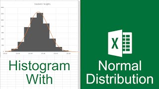
How to Create Histogram with Bell Curve in Excel

HTML-код
- Опубликовано: 15 июл 2024
- In this video, I'll guide you through two methods to create a histogram with a bell curve in Excel. You'll learn about histograms with cell curves for student marks and histograms with bell curves for project completion. By overlaying a bell curve on a histogram, you can easily identify and visualize any outliers in your data set. With practical examples and step-by-step instructions, you can make a histogram with a bell curve in your own Excel spreadsheets effortlessly.
👨🏫 Instructor: Zehad Rian Jim
🎥 Editor: Prantik Chowdhury
✨ ⯆ Resources:
Alt+F1 - To insert chart
Ctrl + F - To find the dialog box.
▬ Contents of this video ▬▬▬▬▬▬▬▬▬▬
0:00 - Intro
0:35 - What Is a Bell curve
1:08 - Creating histogram with bell curve for student marks
10:43 - Creating histogram with cell curve for project completion
📚 ⯆ DOWNLOAD the workbook here:
www.exceldemy.com/create-a-hi...
🌍 ⯆ Checkout the article here:
www.exceldemy.com/create-a-hi...
💻 ⯆ Similar Videos:
• How to Create Skewed B...
• How to Create a Bell C...
🚩 Stay connected with us on social media for more Excel tips and tricks!
Facebook: / exceldemy
Twitter: / exceldemy
LinkedIn: / exceldemy
🙋♂️ Stuck with an Excel formula or a VBA code? You can post your questions or upload your Excel file to get in touch with the professionals and get the solution you need.
ExcelDemy Forum: exceldemy.com/forum/
👉 If you found this video helpful, don't forget to subscribe to our channel for more Excel tutorials, tips, and tricks! Hit the subscribe button and turn on notifications so you never miss an upload. By subscribing, you'll be supporting our channel and helping us to reach more people who can benefit from our content. Thank you for watching, and we'll see you in the next video!
🔔 ⯆ Subscribe on RUclips:
/ @exceldemy2006
#excel #exceltutorial #exceltips #exceltricks #chart


Hi, where did the values in the coulumn 'values' come from?
Dear @emmajoel7113,
Thank you for your question. We appreciate your feedback. Regarding your question on how we got the values in the “Values” column. Now, we got these values by studying the histogram. If you look closely at the “Marks” column, you’ll find that the marks range from 63 (minimum value) to 84 (maximum value). Using this information, we selected the values to be just below the minimum value and just above the maximum value, that is, from 60 to 85. Using the NORM.DIST function we calculated the normal values. We chose increments of 1 to ensure a smooth normal distribution curve.
Hopefully, this answers your query. Make sure to stay connected with Exceldemy! 🎉❤. Have a good day.
Regards,
Exceldemy Team!
Where did you get the *97, where did the 97 came from in solving for the normal values?
Dear, Thanks for your question! We multiply 97 when calculating the normal distribution as a scaling factor. It is not a mathematical constant, but it is just a selective value to ensure the curve aligns well with the data. The same goes for multiplying 122 in the examples that come after.
As the multiplier has no fixed value, you'll need to experiment by raising or lowering it until the normal distribution curve aligns appropriately with the histogram. Through this process, we found that multipliers 97 and 122 worked best to compare the normal distribution curves with the histograms visually.
Hi, this number change for every analysis, do you know how to find the best number automatically for each capability analysis ?
Btw nice video
@@baptisteleriche8224 Dear, Thanks for your compliment!
Finding the best scaling factor for a dataset can be tricky. Try a few different multipliers manually and observe how well the normal distribution curve aligns with your histogram.
I have a question, for normal value, how do you pick the multiplier at the end of the formula (97 in the bell curve 1, 122 for the bell curve 2)?
Dear @Ryan14790,
Thank you for your query. We appreciate your interest in our video. Regarding your query on how we chose the multiplier values. In simple words, these multipliers are arbitrary and used for scaling the normal distribution (bell curve) for a better visual representation when placing the bell curve and the histogram on the same graph. The normal distribution values are very small so without proper scaling the bell curve would appear almost flat. Feel free to scale your chart according to your requirements.
Hopefully, this answers your query. Make sure to stay connected with Exceldemy!🎉❤. Have a good day.
Regards,
Exceldemy Team!
@@exceldemy2006 hello, thank you for the answer. However, I would like to ask how you come up with these 2 particular numbers 97 & 122 please?
Dear@@Ryan14790,
Thank you for your question. We appreciate your feedback. Regarding your question on how we came up with the numbers 97 & 122. If you use the NORM.DIST function to calculate the normal values, you’ll find most of the values are in the hundredth place (0.01). So you can use 100 as your multiplier. Since this value is arbitrary, you will have to use trial and error to increase or decrease your multiplier value to properly scale the normal distribution curve. After adjustments, we felt that multiplier values of 97 and 122 were suitable for displaying the normal distribution curves beside the histograms.
Hopefully, this answers your query. Make sure to stay connected with Exceldemy! 🎉❤. Have a good day.
Regards,
Exceldemy Team!
hi, I followed the same steps but when I wanted to add the bell curve it showed a flat line on y axis. why did this happen, what am I missing? (the flat line covers the data points but it's not a curve shape)
Dear @NoOne-uo2jb,
Thank you for your feedback. We are sorry that you are facing difficulties with plotting the normal distribution curve. Now it’s difficult for me to pinpoint the problem without looking at your Excel file. But here are a few possible problems and their solutions.
*1.* *The data range you chose is too small or not normally distributed:*
Solution: Ensure that your data range is sufficiently large and follows a normal distribution. A bell curve, or normal distribution, requires a significant amount of data points that are evenly distributed around the mean.
*2.* *Improper scaling on the Y-axis:*
Solution: Sometimes, the y-axis scale might not be set appropriately to show the bell curve. Check the axis settings and adjust the scale to fit the distribution of your data. For a normal distribution, the y-axis typically represents the probability density.
*3.* *Plotting error:*
Solution: If you're using a scatter plot or line chart, ensure that the data points are correctly plotted. The x-axis should represent the data values (or bins if you have binned the data), and the y-axis should represent the frequency or probability.
*4.* *Binning issue:*
Solution: If you are binning data (grouping data points into ranges), ensure that bins are correctly created. Bins that are too wide can cause the curve to flatten, as they don't accurately represent the distribution.
*5.* *Incorrect formula:*
Solution: Double-check the formula you are using to create the bell curve. The standard formula involves using the NORM.DIST function in Excel. Ensure that the mean and standard deviation are correctly calculated and used in the formula.
Make sure to stay connected with ExcelDemy!🎉❤.. Have a good day.
Regards,
ExcelDemy
@@exceldemy2006you are right, I did not add the multiplication factor in the formula you mention at 14.55
Hello @NoOne-uo2jb,
Wow! Glad to hear that you found the reason for not working the solutions. Thanks for watching our videos. Keep learning Excel with ExcelDemy.
Regards
ExcelDemy