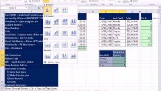
Excel 2010 Statistics 12 Data Sets, Excel Tables For Formulas & Charts, Cross Sectional, Time Series
HTML-код
- Опубликовано: 15 июл 2024
- Download Excel File: people.highline.edu/mgirvin/A...
1. Terminology for Data sets
2. Element = Primary Key
3. Variable = Field = Column Header
4. Observation = Record
5. PivotTable to Create List of Elements or "Unique List"
6. Alt Keyboard shortcut for PivotTable on New Sheet: Alt, N, V, T, Enter
7. Excel Table Feature For Dynamic Ranges
8. Cross Sectional Data = One Date, Many Categories
9. Time Series data= Many Times, One or More Categories
This is for the Highline Community College Busn 210 Statistical Analysis for Business and Economics taught by Michael Girvin.


I am glad it helps!
Totally cool and EXCELlent time saving tip!
Thanks!
It is possible to plot irregular date periods on line Chart. If the date (time) is the independent variable, then X-Y is appropriate. If date is not an independent variable or if the dates have irregular increments, plotting the trend over time can be done with line as long as the dates are true serial dates. Conrad Carlberg's new "Statistical Analysis For Excel 2010" book does a great job of talking about the problem of plotting trends across irregular dates for column or line (chapter 1).
Thank you! This is very helpful!!
In general, the Excel Table feature is not well suited for formulas. #REF! error means that the cell reference does not exsist or has been removed.
I though the main point of your first post was that Line charts cannot show irregular time periods.
@ExcelIsFun
Thanks for the books reference. its very interesting.
Mr Carlberg said in chapter 1: "Excel’s XY (scatter) charts can tell you a considerable amount about how two numeric variables are related.
It was the main idea of my previous post. (maybe I got misunderstood,)
Have a good day
I hope I made clear
Good luck
Tawfik
@ExcelIsFun
yes its true
but we can generalized to any X series with an irregular interval
Hi Mike,
Very well done as usual. my comment is on times series:
Scatter chart is more recomanded for times series than lines chart.
We can use lines chart when we have a regular interval between times (like in your example: 2005 2006 2007 2008).
Otherwise, if we have an irregular times (like: 6/1/2011 6/4/2011 7/12/2011 ....) using lines chart is wrong, and all interpretation (evolution, projection) of the chart will be also wrong because of the scall (times) in the chart is not true.
The number at 21:25 is the net income?