How to create a graph with two vertical axes in Excel

HTML-код
- Опубликовано: 11 сен 2024
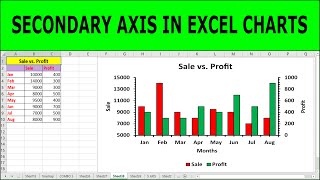
- Using a graph with two vertical axes can be quite useful when you would like to visualize two variables that use a different scale. A common example is temperature and precipitation, but it can be used with any two variables.
First, select the data that you would like to visualize.
Go to the Insert tab. Click on your preferred graph, I will go for a line graph here, and then click on more line graphs. Now, go to the bottom of the list of graphs and select the Combo option at the very bottom.
Now you have a graph with two vertical axes, one on each side of your graph. Assign the variable’s axis that you want displayed on the right side of the graph as the secondary axis, by clicking the check mark next to it. You can also change the graph type used for any of the variables, by selecting the graph type of your choice from the drop-down menu.
Τhanks for watching, don’t forget to like and subscribe! I will gladly help you with any questions you may have in the comments below.