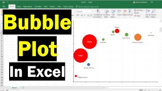
Bubble Chart with 3 Variables in Excel
HTML-код
- Опубликовано: 2 окт 2024
- Hello Friends,
In this video you will learn how to create and read a bubble chart with 3 variables. I have used Sales (on Y Axis), Service level% (on X Axis) and Revenue (Size of bubbles)
Please download this excel file from below given link:
drive.google.c...
Learn and free download best excel Dashboard template:
• Excel Dashboards
Learn VBA with me:
• VBA Tutorial
Watch the best info-graphics and dynamic charts from below link:
• Dynamic Graphs
Follow me on Facebook:
/ pkan-excel-expert-9748...


Thank you so much! This was excellent!
Most welcome🙏
Thanks a lot , really helped me
Thanks
I love you manny!!!.......This is perfect intoto.
Thank You! It was helpful
Thanks for your valuable feedback
Thanks a lot. How do I add quadrants to this bubble chart?
Great tutorial, is there a way to get text in the X axis rather than percentages?
What is the difference between Sales & Revenue ??
very educational video, only one question, i have excel 2007 i act similarly but on data labels- series name, it appears the whole A column as labelname for each bubble, not just A2 , if you could held :( , thanks
Thank you.
Most welcome
Thank you for the tutorial.
Just one thing - Option for using cell values for bubble labels is not available in Excel for Mac. So had to update it manually.
Now this is the perfect tutorial, thank you so much
Thanks for your valuable feedback
this video was awesome, thank you!!
Most welcome🙏
In Excel 2007 (Office laptop), I am unable to select LOB Data series to display when we format data labels. Any assistance??
Amazing trick shared with us
Thanks for watching
Nice work and instruction. Plotting earthquakes over time in Challis, Idaho Y=depth and size=Magnitude. I did not even know there was a bubble chart; using Excel 2003.
Thanks for your valuable feedback
Thank you so much sir. This is very useful who are learning Excel
Thanks for your valuable feedback
Pls sir,teach how I ll get file option in my tab ribbon
Thank you for the video! This saved the day!!
Thanks for your valuable feedback🙏
Excellent video, very useful. I was stuck while making an imp PPT. This video saved me. Thanks PK
Thanks for your valuable feedback
Perfect! Answered all the questions I had on creating the bubble charts in a particular way!
Thanks for your valuable feedback
Fantastic Tutorial!
Thanks for your valuable feedback🙏
Very helpful. Thanks for posting
Thanks for your valuable feedback
Great Tutorial... Very helpful
Thanks for your valuable feedback
How can you avoid auto-scaling of the bubbles?
I have some dynamic data that represent physical loads distribution, when I change the distribution defining parameters I would like the bubbles to resize to the new values; the problem is that they (also?) autoscale, apparently based on the size of the bigger bubble, so I basically see that only the smaller bubbles really resize.
I have found and tried to play around with an option "resize bubble to 100" but couldn´t really understand how it work; is that the right option?
I would like to create 4 quadrants with varied colors on the plot area. How do I go about it
Very helpful and good explanation! Thanks so much!
Thank u Sir....very helpful
Thanks for your valuable feedback
Hello, is it possible to make bubbles interactive - for example to get the list of what a bubble refers to as you do when you click on a count in a pivot and it opens a new sheet with items that go into that count? Thanks a lot!
Thank you PK! Very clear and concise. Helped me immensely.
Thanks for your valuable feedback
Nice Video
Thanks for your valuable feedback
Thank you. Saves my day. I wish to know whether I can swop the axis.
Thank you for the detailed explanation !!
Thanks for your valuable feedback
Thank you :)
Thank you.. i got what i wanted..
Thanks for your valuable feedback
Thank you so much for your effective tutorial
Thanks for your valuable feedback
Hey, this is a great tutorial. You are a good teacher.
Thanks for your valuable feedback
you're a real master! thanks a lot for your tutorials
Thanks for your valuable feedback
thank you! So easy to understand!
Life saver!
Thanks for your valuable feedback
Data is not visible
that was really good thanks, helped me throw together my bubble chart for stakeholders. The only issue I had was a zillion data points on top of each other and the labels stacked over the top of each other when centred in the bubbles. Still really relevant for 2021 and O365 excel :)
Poor video quality.....