A quick and sort lesson but give us powerful insights into applying to Excel. Thanks to Doug! Everytime I need an instant advise for any topic my mind come across to your lessons right away
Is it possible to add a 4 variable. So the I want to add a header to each line of data you have shown. So it will have an additional column which will have words displayed. so each bubble will be a different color to represent each header. Is this possible? Thanks
I was STRUGGLING wondering why my bubbles for Series1 wasn't appearing and found your video and immediately found the answer. (I hadn't declared the size of the bubbles). I want to cry - I spent way too much time trying to figure this out lo.
Hi taylor henderson, glad you liked it, thanks for commenting! If you like to see a bubble chart animate over time. See ruclips.net/video/5jWWA-lvfQM/видео.html
Very helpful. Clearly explained and quick to get to the point. Following it proved to me that the feature does actually work. It helped me troubleshoot one of my charts. The x-axis was not working correctly and would show up as data point number rather than the x value. It turns out that Excel reverts to point number on the x-axis if there are any non-numerical values in the column.
how do we create the chart from a datasheet, in this example you have a group of nombres already , is it possible to pull the data from a list that is categorized instead of generating random data.
Hello, is it possible to make bubbles interactive - for example to get the list of what a bubble refers to as you do when you click on a count in a pivot and it opens a new sheet with items that go into that count? Thanks a lot!
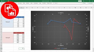
Hi thanks for the video. I have a question. How to draw a line chart over this bubble chart. X axis values will be same but y axis values will be different for the line chart. Thanks in advance.
Yes, you probably can. In Excel it's the power view feature seen the vid link below, but i think this could be translated to Power BI ruclips.net/video/5jWWA-lvfQM/видео.html
@@DougHExcel Thanks for quick reply..I tried ur suggestion but its not working...Let me explain in details...I have excel data set from which i need to create two bubble chart in one visual...it include two column with probability on it.then 4 more column with measure or fact in it... similar objective explained in ur excel...
Hey, do you know of any way we can add lines (connecting two points) in the bubble chart. It can be done with the x,y scatter chart. But i need the weight (which is only available in the bubble chart).
Very easily understandable format for CXOs and BoD members. E.g., comparison of all the major restaurant franchisors in Americas comparing their revenue growth (Y axis), EBITA margin (X axis) and Revenue (bubble size). One can then easily see which are the big companies, highly profitable and growing fast.
What is the point of bubbles with no label to explain what they represent? This example is a little worthless, because each data point would typically have a name associated. This does not show how to represent that on your chart.


![Kodak Black - Versatile 4 [Official Video]](http://i.ytimg.com/vi/VcP_1Ua__vY/mqdefault.jpg)


A quick and sort lesson but give us powerful insights into applying to Excel. Thanks to Doug!
Everytime I need an instant advise for any topic my mind come across to your lessons right away
Hi Stephen Phan, thanks for the kind words!
I was struggling with the bubble sizes, and I realized that I didn't consider I should've put Z colum data as well.
So useful clip, thx!
You're welcome!
Is it possible to add a 4 variable. So the I want to add a header to each line of data you have shown. So it will have an additional column which will have words displayed. so each bubble will be a different color to represent each header. Is this possible? Thanks
Thanks for the Bubble Chart!
You're welcome!
I was STRUGGLING wondering why my bubbles for Series1 wasn't appearing and found your video and immediately found the answer. (I hadn't declared the size of the bubbles). I want to cry - I spent way too much time trying to figure this out lo.
Thanks @ayeshaa4781, glad it helped!
Awesome video- very straight forward, easy to follow and exactly what I needed. Thanks!
Hi taylor henderson, glad you liked it, thanks for commenting! If you like to see a bubble chart animate over time. See ruclips.net/video/5jWWA-lvfQM/видео.html
Helpful, very easy to follow and to the point. Thank you very much.
Glad it was helpful!
pog champ this is very poggers thank you ms morschek
thanks for this - as an utter Excel Noob I found it very useful
Hi Stephen Quirke, glad you liked it, thanks for commenting!
Very helpful. Clearly explained and quick to get to the point. Following it proved to me that the feature does actually work. It helped me troubleshoot one of my charts. The x-axis was not working correctly and would show up as data point number rather than the x value. It turns out that Excel reverts to point number on the x-axis if there are any non-numerical values in the column.
Hi Lack of Focus, thanks for the comment!
how do we create the chart from a datasheet, in this example you have a group of nombres already , is it possible to pull the data from a list that is categorized instead of generating random data.
yep, that is possible
Hello, is it possible to make bubbles interactive - for example to get the list of what a bubble refers to as you do when you click on a count in a pivot and it opens a new sheet with items that go into that count? Thanks a lot!
Hi thanks for the video. I have a question. How to draw a line chart over this bubble chart. X axis values will be same but y axis values will be different for the line chart. Thanks in advance.
Thank you. This was very helpful and easy to follow.
Hi Keila Irizarry...you're welcome, glad you liked!
Great instructional video. Do you know the best way to deal with blank rows in a bubble chart?
Have you tried putting #N/A in place of blanks?
Hello. If thee data series is five instead of three as you have shown, which kind of chart do you use for analysis
Five is getting up there for a scatter. Maybe panel charts?
ruclips.net/user/dough517search?view_as=subscriber&query=panel
Thank you so much. It is so helpful.
You’re welcome!!
Thanks for the videos.. could you guide if I have to apply the same objective in power Bi bubble chart...
Yes, you probably can. In Excel it's the power view feature seen the vid link below, but i think this could be translated to Power BI ruclips.net/video/5jWWA-lvfQM/видео.html
@@DougHExcel Thanks for quick reply..I tried ur suggestion but its not working...Let me explain in details...I have excel data set from which i need to create two bubble chart in one visual...it include two column with probability on it.then 4 more column with measure or fact in it... similar objective explained in ur excel...
Hey, do you know of any way we can add lines (connecting two points) in the bubble chart. It can be done with the x,y scatter chart. But i need the weight (which is only available in the bubble chart).
maybe this will give ideas ruclips.net/video/bYf6qO-iBW0/видео.html
F9 is not working in my device whats alternative to that
In the Ribbon, Formula >> Calculate Now
what would a bubble chat be used for
Very easily understandable format for CXOs and BoD members. E.g., comparison of all the major restaurant franchisors in Americas comparing their revenue growth (Y axis), EBITA margin (X axis) and Revenue (bubble size). One can then easily see which are the big companies, highly profitable and growing fast.
Hi Robert Jean-Louis, thanks for the comment!
What is the point of bubbles with no label to explain what they represent? This example is a little worthless, because each data point would typically have a name associated. This does not show how to represent that on your chart.
Lee Melbourne, that is very interesting...thanks for letting me know.
Thanks for this video. It is realy useful ! Good Job
Hi Jammale Lamarti, thanks for the comment!
cheers good video - I'd say you go straight to 1:40 (like so more ppl see it) ;)
Hi +Pedro Montano, thanks for the comment!
Hi +Pedro Montano, glad you liked it, thanks for commenting!
Really helpful
Hi ziyi zhou, glad you liked it, thanks for commenting!
Brilliant! Thanks.
Thanks Dudley Gentles!
fantastic!
Hi Fred Darko, thanks for the comment!
Very helpful...thanks
You're Welcome!
how to calculate Z value at first?
Hi nira khatiwada, thanks for the comment, z value depends on the data source
thanks!
Welcome!
Thank you
You're Welcome!
Nice video
Thanks for the comment!