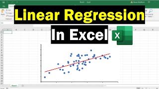
Creating an XY Scatter Plot in Excel

HTML-код
- Опубликовано: 3 июл 2024
- Learn how to create an XY scatter plot using Excel. To download the file used in this video, visit the following page: www.vertex42.com/edu/excel-tu...
0:00 Scatter plots show how two numerical values are related
0:29 Scatter graph examples
0:39 How to set up the data table in Excel
1:18 Insert the scatter chart
1:31 Add a title to the chart
1:38 Add labels for the X-axis and Y-axis
2:10 Display more than one set of data in the scatter plot
3:07 Add a legend to the chart
4:38 Add a trendline to a data series
5:17 Change the chart style and design
Don't Forget to Subscribe! 😃
How to Create a Scatter Plot in Google Sheets:
• Creating an XY Scatter...
FOLLOW VERTEX42 HERE:
Instagram: / vertex42
Facebook: / vertex42
Pinterest: / vertex42
Twitter: / vertex42
LOOKING FOR SPREADSHEET TEMPLATES? Start Here:
www.vertex42.com/


I’ve been struggling with making a chart for 20 minutes, this literally saved me. Thank you
This was easily explained and clear. You saved my butt and I finally got a complex scatter plot done for different groupings in Software and their relative market TDC ratio. Thank you!
What an amazing level of detail in explanation and in segmenting the video...we can't thank you enough!
THANK YOU
Been trying to do this with the normal line chart for 2 hours and this took me literally 5 seconds
Thanks so much! Ive been struggling to figure out how to do scatter chart with differing data sets! My chart looks great!
Thank you so much!!! I was having a headache doing this stuff... and now finally!
This was very helpful easy to understand. There was something i was looking for that wasn't there but that might be apart of the video altogether. This will help with my assignments. Thanks
You just saved my life, thank you so much
Thank you! Clearly explained!
Can anyone explain to me why whenever I do a scatter chart it charts the variables seperately?
This is the best tutorial video I've ever watched.
Thank you!
Life saver! Thank you!
I am sure I speak for many. I have also been looking for this as an answer to my question... multiple data patterns on the same chart. Thank you Vertex42
Great, clear video!
Even the first three minutes saved my teen as he tried to submit a summer school project. Thanks!
You slayed thanks for helping❤️
thank you so much this made things so much easier for me
very clear and helpful
Thank you very much. It is very useful.
Thank you for this video
Thank you so muchhhh.
Life saver!
Great video! Thankee
thank you very much for saving my time
thanks yo u helped me with my physics lab
I appreciate your work because now I've rediscovered the joy of learning computer skills, and most importantly it's fun. Thank you!
thnx for your help!!!
saved my life right there
Straight to the point please
Interesting and informative video....
thank you so much
GOD BLESS YOUR HEART!!!
what a coincidence, im using this for my research on Douglas fir growth predictions
Thank you so much, my teacher made this so hard to understand
Thank you
amazing! love u sm im ur biggest fan pls notice me!
It's called a "Series" Yesssszzzzzss! thanks
Perfect ASMR
Instead of creating separate tables for each tree, is there a way to select all trees from one table and just show tree names next to each dot on the chart as a labels ? I bet it can be achieved by creating series per tree row from the table, yet I wonder if there is a better way to do that?
Every time i go to add a new data 'series' it says the data is to complicated to be displayed and deletes the previously shown data
My excel is missing some of the features ('+' sign and other little squares to the right of the chart). A number of commands, functions she mentions are not in my Excel version :-(
same. i click on the graph like she says and it doesn’t highlight the data that’s on it, therefore i can’t add the new data 😩😩😩😩
I don't have the little plus to add labels. I tried right-clicking on the chart, or looking up "labels" on the "Tell Me" box, but.. hitting a wall. Any reply would greatly help. Thank you
1:30 As soon as I did this only 1 x-axis measurement appeared. Whereas yours (did the same exact thing I did) came up with all of your measurements in the graph/plot. The title of the graph is all of the text in the final horizontal line and the x and y values were no where near what mine were.
Im having the exact same issue, do you know how to fix it
In case it still helps anybody: I had the same problem and it turns out it was because I copied the data from elsewhere. Manually entering the data solved this problem for me
I think what you are describing happened to me too. I wrote my decimal values with a dot at first. When I wrote it with a comma it worked.
When I plug my numbers in for some reason excel is using the column number as my x value and the number I input as my y value no matter how I label them or change them around
How do you move vertical text (i.e tree height (meters) in the example of this video) from the left side to the right side?
Right-click on the vertical axis. Select Format Axis. Under Axis Options, expand the Labels group and in the Label Position field, select "High"
When I click edit series, It doesn't allow me to enter X and Y series values. It just has to field to enter series values (Doesn't specify x and y values. How can I solve this pls help!
🙏
it is still using rank values 1 2 3... as x values help me pls
How do you combine the cells like where you have "douglas fir"?
You can select the cells you want to merge and then use the "Merge & Center" command on the Home ribbon.
Mine xcel is 2013 version and does not have the DESIGN tag as yours. What can I do to plot several graphs on the same chart with different x-axis values?
Right-click on the chart and choose Select Data. Then you can add other chart series (each "series" is a different graph). An XY scatter plot lets you define a separate set of X and Y values for each series.
how to get the average?
Can you add labels for the dots? e.g "trees name" ?
Yes. Click on one of the data points until only that data point is selected (two slow clicks), then right-click on the data point and select Add Data Label. Then you can select the data label and edit the text and formatting for that label. There are other methods - similar to creating a timeline chart in Excel.
I have a question, what if the data you want to show isn't numbers? i.e words?
how do you make a tableeeeeee
if x axis contains random numbers, do I have to array numbers in order first?
No, not in a Scatter Plot.
How do you add another column if they aren’t next to each other
Edit Chart > Setup > Series ... Add Series
On the vertical axis, my graph shows up with a -2 right below 0, and I don't know how the heck get rid of it. I'm stuck.
Some how I did nod get how You calculate column C. Where is comming from number in column C
It's coming from some other sample data source, not a calculation. It's just some sample data.
I don't have these tags like DESIGN, FORMAT, DEVELOPER etc. And I don't have the chart elements
The Developer tab must be added via File > Options > Customize Ribbon and checking the Developer box. The Design and Format tabs show up when you select the chart.
couldn't "drag" it as the person said so like bru. 3:07 plz help
Sometimes if you edit a chart, you'll no longer be able to drag the selector to add a new series. In that case, to add a new series, right-click on the chart and choose "Select Data". Then click on the Edit button to see how the existing series is defined (the references for the name, x values, and y values), then click on the Add button to create a new series.
why cannot?????
i have tried and its not working
If you just can't get it to work, were your cells set as the type "Text" at some point? If your cells were at some point set as Text, you cannot just change it to Number or General, Excel is too stupid for that. You have to click on each individual cell and press enter for Excel to realise "hey this is a number". Thanks Microsoft.
Kush suratwala std 7-A
Problem: you never mentioned which version of Excel you're using, nor which versions of Excel work like this. Mine (Excel 2010) does _NOT_ work like this.
Statcrunch does this much better, Microsoft is stuck in the 1990's
dont care didnt ask
im joking dont flame me