How to Use Negative Space to Improve Your Design Layouts - Typography Tips

HTML-код
- Опубликовано: 8 сен 2024
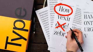
- When you're surrounded by people, you feel crowded in, right? Maybe a little trapped? It's the same way with type. Type needs space. Otherwise, a potentially great layout loses its energy. In this clip from our fourth Typography critique, Chris and Milka Broukhim experiment with space in one of the student's work.
If you'd like to watch the FULL critiques, we have a playlist for you here - bit.ly/TypeCri...
👉 Check out our Typography Course here - bit.ly/Type01_yt
===
👉Subscribe: goo.gl/vB9zoP
👉See our main channel: goo.gl/F2AEbk
#TheFutur #1BminusOne
Want a deeper dive? Typography, Lettering, Sales & Marketing, Social Media and The Business of Design courses available here:
goo.gl/bRt5qd
If you're a complete beginner, consider taking any of these Adobe Creative Cloud fundamental courses from our friends at Bring Your Own Laptop: byol.me/thefutur
-
Love the content? Become a sustaining member for $5/mo today.
goo.gl/nwekfL
Our recommended products and Booklist:
kit.co/TheFutu...
Kits & Proposals:
goo.gl/mSjuWQ
Visit our website:
www.thefutur.com
FREE resources:
goo.gl/Qh6gHr
Mandarin (Chinese) Subtitles on UiiUii
uiiiuiii.com/?...
-
AFFILIATE LINKS*
🙏 Support The Futur but purchasing through our affiliate links:
Amazon: bit.ly/thefutur...
Webflow: bit.ly/2EbET9l
Retro Supply Co.: bit.ly/2GW8gzR
Creative Market: goo.gl/g4jlTE
Design Cuts: bit.ly/2GSsAR3
✍️ Sharpen your skills by taking a course, using our affiliate links:
Skillshare: goo.gl/YCo2uT
School of Motion: bit.ly/futur-som
Bring Your Own Laptop Tutorials: byol.me/thefutur
🎧 Do you like the music? Check out the music libraries we use in our affiliate links below:
Epidemic Sound: share.epidemics...
Musicbed: bit.ly/futurmb
Artlist: bit.ly/2uWdna7
*By making a purchase through any of our affiliate links, we receive a very small commission at no extra cost to you. This helps us on our mission to provide quality education to you. Thank you.
-
Futur Podcast on iTunes: 🎙
itunes.apple.c...
Spotify: 🎙
open.spotify.c...
-
We love getting your letters. Send it here:
The Futur
c/o Chris Do
1702 Olympic Blvd.
Santa Monica, CA 90404
USA
-
Host- Chris Do
Content Director- Matthew Encina
Producer - Mark Contreras
Cinematographers- Ricky Lucas, Jona Garcia
Editors- Stewart Schuster
Live Editor- Jona Garcia
Social Team- Elle Money, Alex Burlui
Futur Theme Music - Adam Sanborne www.adamsanborn...
Typefaces: Futura, DIN, Helvetica Neue, Calibre, Champion Gothic
Futur theme song- Adam Sanborne


🖥 If you'd like to watch the FULL critiques, we have a playlist for you here - bit.ly/TypeCrit_PL
👉 Check out our Typography Course here - bit.ly/Type01_yt
Thank you. This segment was great and the live video was informative as well.
When Chris talked about flow and feng shui it gave me a realization and reminded me of how he often talks about how design is universal/if you know how to design a page layout you can design an interior space or a building, etc.
I would LOVE to see more videos that connect the dots between different disciplines like this!
Absolutely agree!! thay would be fascinating, useful and will refresh our minds on how different philosophical elements integrate in a functional way into the day a day surrounding artwork and help us towards and objective.
Noted. Thanks for pointing this out. It’s helpful for us to know what hits.
true but for buildings you also need to learn the technical details.
I've taken the typography class and it is legit.
Thanks Michael.
agreed! its very good! better than my university lectures
I've watched all the episodes about "Typography Critique".
and Loved it very much.
Thanks, Futur Team.
Cheers.
I every time eagerly wait for the Chris Do, although I am not a graphic designer, i'm an architect,
I like books and magazines, especially those that are design related, that have plenty of blank space. This can be used by the reader in an interactive reflective way to add comments or additional thumbnail sketches. To encourage and prompt such impulses, I layout all of my books that way as well.
The way you conduct the design critic sessions, i havent come across any channel like this. Keep them coming. 👍🏼 Thanks
I appreciate that!
Nice that it is possible to turn negative into something positive. I like that!
More content like this, please
Oh waow ! This is next level 👌
great channel, mate. keep it up - i'm learning so much!
Cool, but I can't see "The journal for graphic design" and " FEB ..." So what happens if that must be on poster?
And what if the client said I want REZN to be visible...
Ask why to surface their intent, then propose solutions that might help them accomplish it.
Nice job Sir.
Feelin like I'm taking some uni design course! Thanks for this educative video! :)
So fantastic! I am loving it.
When she say is working, but I don’t even know what is going on 😂
good content
thanks
Space gives context, context is power.
Thank you.
Yup, let your design "breathe" so the reader can breathe too.
Chris, I would love to learn from you on this course.
Are there subtitles? Is it possible to translate to another language?
Your content is incredible!
Thanks so much.
I’m trying to design templates for social media, so in this case don’t we want to make text as big as possible so texts would be legible on mobile or computer screens, do I still have to factor in space in my design or is it not as crucial when it comes to layout for social media?
visual hierarchy is always important
"I hope to see you in the futur(e)"...💖🤒🔥
on bad designs we just need to hope the typefaces aren't claustrophobic
Thank u
Her zoom displayed name + lastname needed some space as well.
She is a mindfull monk
You dont want to kill your best friend do ya
well if someone gotta kill my bestfrnd, its gotta be me
Ok d n chek ritan
WHITE SPACE. Stop confusing everybodyyyyyyyyyyyyyyyyyyy.