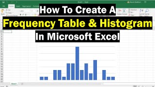
Histogram in Excel using Pivot Tables | Frequency Distribution | Quantitative raw data

HTML-код
- Опубликовано: 31 май 2023
- This video shows how to construct a frequency histogram in Microsoft Excel using Pivot Tables.
Class intervals: Lower Limit “to under” Upper Limit
Bar Chart & Pie Chart in Excel: • Bar chart & Pie chart ...
Boxplot in Excel: • Boxplots in Excel | Si...
Histogram in Excel using Data Analysis: • How to Construct a His...


Thank you so much! I was struggling until I saw this video. Easy to follow!
You're welcome, Nikki.
Super helpful! Thank you!
Thank you, exactly what I was looking for... so hard to find something helpful and valuable on the net
Glad it was helpful!
Thank you so much such a great simple and accurate video.
Thanks joshua for your best lesson videos.
from somalia
Glad to hear from you , Yahye, all the way from Somalia.✊
Thank you
شكرا من مصر
Glad to see you watched from Egypt, Ahmed.🙏
Thank you super helpful
You're welcome, David.
Thank you 👏🏼 the video was very helpful. Please how to i determine the frequency or class limit for a very large data set
Thanks and excellent. Can you prepare for simple linear regression?
Sure. I'll work on it Aishah.
See if this helps: ruclips.net/video/Uqt3x0i-nlg/видео.html
How to do this in %?
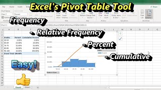
To change the frequencies to percents, at any point after 1:05,
Right-click in the frequency (Count of Data) column.
Click “Show Values As”
Select “% of Grand Total”