How To... Create an Overlapping Histogram in Excel

HTML-код
- Опубликовано: 15 июл 2024
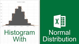
- If you want to plot two histograms on the same diagram, there currently is no option in Excel to do so. However, this can be done using Pivot Tables. In this video you will learn how to plot histograms, using data for heights in males and females, that will overlap each other.
If you would like to learn how to create a Pivot Table, check out my video that will show you how to do this step-by-step:
• How To... Create a Bas...


Saved my day. Thank you. Plus the accent is music to my ears.
This has just saved my presentation with an hour to deadline. Thank you
Out of curiosity, what was your presentation on?
Straightforward, Clear, and Perfect
A really helpful video, thank you!
this is the best video, you have made my assignment look presentable
The best video tutorial for overlapping histograms!
Thank you!!
Man, I've created so many histograms over the years for school and work, but I never investigated the different options too deeply. This was such a cool tutorial; thank you for sharing!
Thank you so much!!! Super easy to follow! I was done in less than 5 minutes!
Great tutorial, thanks!
You're awesome!
This video gave me a thorough understanding of how to work with pivot tables. Saved me on my assignment. Thank you so much.
Such a great instructional video Eugene - many thanks. Just what I needed.
Wonderfully explained. Thank you!
Really helpful. Thanks
Great and very clear tutorial, thanks!
Fabulous. I had a problem showing no analysing/grouping selection but I did - add ons - and it seemed to update it so all complete and looking great!
Thank you very much, clear and easy to follow
So much quicker than learning to do it in R! Thanks!
clear and concise, thanks for your help!
Wow.. Simply great
Very very good, clear explanantion! Thank you.
This was extremely helpful, thank you!!
So helpful and easy to follow!
Very clear, a great help, thank you.
Excellent! Thank you very much!
I spent HOURS trying to figure out how to show two sets of data on one histogram. I ended up creating two line graphs and just overlapping them and deleting all the labels from one so they could look like one graph. I wish I could have found this video last night! Thank you so much for this tutorial! I have deleted the line graphs I created last night and replaced them with the appropriate graph following your instructions. You have saved me major points on my final Measurement Evaluation assignment.
:-)
That's great to hear! Out of curiosity, how'd the rest of the class go?
Thank you. It is a very useful video.
Really appreciated this wonderful tutorial. Id been given some written instructions on how to create an overlapping chart from my tutor as part of our Uni assignment, and I think my laptop would have gone out of the window had I not found your video. Thank you so much for sharing you time and knowledge.
Out of curiosity, what class was that for, and how did it go?
It was for an Open University assignment in year 1. I forget what it was exactly as I'm so wrapped up in 2nd year now! Haha 😅
@@beckysmith4913 Oh I totally understand, and I hope your second year is going well!
Thank you so much - really helped!
This really helped with my wife's Open University TMA. Thanks!
Fingertip Practical? #Same
Thank you, it helped me a lot
Thank you so much you saved me from getting a 0 on my lab!
Thank you. It helped me quite a bit
dear sir, i wish you all the best in the world, this was really helpful. thank you
Excellent!
You sir are my hero
Thank you. Greetings from South Africa, Geologist
Thank you so much
Very useful video. I was wondering if you could do another video for non disjoint histograms (e.g. display the GDP of European countries vs OECD countries)
Thank you
Nice!
Thanks
Hello, Dr. Eugene. You helped me so much in the past week with my assignments. I tried to do the histogram the way you taught in past videos. My histogram was right skewed and when I overlap them the bar graphs go on top of each other. Am I doing something wrong? Can I overlapped a right skewed?
Out of curiosity, did you find an answer for your question? Also, how did the rest of your class go?
Thank you for your videos, how I can comunicate with you (specifically for mail)?
Greetings from Mexico.
Alejandro Gómez, Finnancial analyst.
Can you teach us how to analyze colocalization and exporting it to excel? Or if you can suggest anyone who can help?
For some reason, when I try and select a group it will not compute. Is it because I have negative/decimal values?
Is this illustration can be a t test graph also?
Hi Jair,
Yes - you could use this to illustrate the difference between two means (both data sets must be normally distributed).
You can also use this to show the Effect Size.
Dr E.
how can we insert more than 2 histograms and more than 255cells?
Why does excel tell me that I cannot group that data?
Figured it out- incase anyone has the same issue, each cell of data I had copy-pasted needed to be changed to 'number' rather than 'general' and altered so that all of the data was set to the same amount of significant figures with any accidental spaces deleted.