How to Make a Stakeholder Map in Excel | Impact Over Influence | Change Management Tools

HTML-код
- Опубликовано: 6 июл 2024
- ⭐️⭐️⭐️ GET THIS TEMPLATE PLUS 52 MORE here: www.etsy.com/au/listing/11998...
👍 Ready made and ready to use.
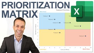
How to make a Stakeholder Map in Excel, measuring Impact over Influence. Your stakeholders are ranked and appear automatically on your chart, showing who you need to maintain confidence with and engage frequently.
#ChangeManagement Tools, #ProjectManagement Tools, #Excel
Timestamps:
00:00 Intro and sheet overview
00:38 Creating the heading
01:29 Creating the table
03:16 Creating the Influence Chart
05:19 Creating the quadrants
06:57 Fixing the axis
07:51 Outro and sheet overview
Excel and Project Management playlist here: • How to Create Excel an...


![mgk - I Think I’m OKAY (with YUNGBLUD) (Sad Version) [Official Music Video]](http://i.ytimg.com/vi/7AC1uqQLIg4/mqdefault.jpg)

The Bob Ross of Excel Spreadsheets!
I have successfully completed creating my Stakeholder Matrix by using your tutorial. I would like to express my gratitude towards you, David, for providing such an insightful tutorial. It was a lot easier to follow than I initially anticipated, and I feel much more confident about utilizing the Stakeholder Matrix technique in the future. Thank you once again for your guidance.
Overlapping points is a huge limitation - but moving the labels is fairly easy. Might want to add that to the video. Thanks!
Thank you David, probably the best explained excel tutorial I've watched in years.
Thank you for this. You have explained it so well, and made it look so easy, much appreciate it!
I followed this tonight, and I don’t want to sound dramatic, but it may be my greatest achievement in my career so far 🤣🤣
Thank you. I am normally hopeless at this sort of thing but you made it so easy.
Thank you David, You are very good teacher, practical and clear, congratuations!!!
Thank you very much, i was drawing in Ms Word, then i found you here. thank you for they humbleness and kindness
Thanks for the great turorial, David. Really appreciate your enthusiasm.
Thank you David, you're going straight to heaven.
Thank you , very helpful even after 2years
Thank you David! I learned quite a few things through this video. Really appreciate it. I added differently colored rectangles to show quadrants, and it worked out great.
A big thank you, David! I learned quite a lot by developing a risk assessment tool. The step-by-step guidance was really helpful in developing the tool.
This was the greatest tutorial ever! Thank you so much.
Amazing. This is definitely one of the coolest and useful things I've seen. Thank you so much David!
that was a journey . i never thought it would be so much technicals to create a chart
Thank you David for this video. I have been able to work better with my project mgmt class team in my program and create deliverable better
Really helpful! Clear instructions which helped me create my own map within minutes!
You can also make a coallition between your stalkeholders who have the same interests as your company has. The employee is not such interested in your vision and the whole "shit" is going into the same line. I mean there are two types of people in this world: the ones who conform and have a beaurocratic working life style and live on stagnation for years in the row and they ussualy are satisfacted with their small income/profitability and the ones who are out of coallition/team :the innovative ones, the ones who put in balance the fact that all is boring and society need to improve their life style. Having a coallition of " stagnating " sterotypes does not and will never go into the Blue Ocean for example, speaking of strategy. I mean if you are a fool stupid totally stupid-why the hell you keep people in stagnation. You can not comprehend that people need freedom of move witthout your stupidity or what is wrong in your brain?
Fantastic tutorial, thank you!
Awesome chart! Thanks for sharing such an interesting content. Cheers!
Thank you. Great tutorial and helps with my assignments.
Thank you and you have such a great and warm presentation skills. Subscribed straightaway!
waw thank you I enjoyed watching the tutorial and doing it. I thought it is for advanced level. Thank you for making it sound easy. You did amazing job
Great work David......very helpful!
Awesome! Thank you very much, David!
Love this! It’s super duper helpful!
Amazing David! Thank you.
it was very helpful. thank you so much for all your great help
The Bob Ross of excel
Fantastic tutorial Thank you 😀
Thank you... nice sheet... well done
This is brilliant, thank you!
simple, effective and wow !!!
This is excellent, thanks for sharing
Dear David, many many thanks for this tutorial, you saved my night lol. Thank you so much (from Paris and Rio)
Excel skills on point my man!
Thank you David🤩
Thank you so much, that is super helpful
David, thanks so much for this, I am doing Project management for my MBA and our lecturer insisted on a Stakeholder Map of our Business Case!
@David McLachlan this video helped a lot to make my own Stakeholder metrix without anyone teaching me. This means a lot to me Thanks a lot Dave.
You're welcome, thank you for watching 🙂
thanks for your information Dave, the next question is how to give value to each of these individuals
Great video @David McLachlan. I built a sheet today, and my client loves it! Question: is there a way to create 4 data series (or some other method) for the quadrants and colour them appropriately (Keep Satisified, Monitor....). Thank you for any help you can offer.
Great sir..thank you for wonderful tricks👏👏👏👍👍
thanks david really helpfull.
Great content this was very helpful.
Great tool! It can be use for Eisenhower Matrix too!
This is super helpful! Thank you!! You gained a subscriber :)
Fantastic! Thank you!!!
Thank you king!
awesome video. thanks david.
Muchas gracias, Muy útil tu video y muy clara tu explicación. Me sirvió mucho para mi trabajo. Saludos!
De nada, es un placer 🙂
Thank you, this was so useful rather than manually pulling together an infographic as I have done in the past. One thing I would like to do is add a sub-title of the Project name. I am sure this used to be possible, but like everything since 365, I can't find the option anymore. Any hints?
Thank you
Hey David, this is wonderful tool. Could you please help how did the maintain confidence, Keep informed, Monitor and collaborate with come from ?
I also would like to know how to add these to my own chart!
Hey David, thank you for the great instruction. What, if I want to make a third column called "Attitude towards the project". Preferebly as a 3D Bubble Chart. I think it is called the Mendelow-Stakeholder-Matrix.
Thanks
Tx sir
Thank you so much for this David. This has been a great tool and I enjoyed building it as well. Any ideas on how to show relationships (stakeholder network analysis) between stakeholders here? Thank you
Gosh, really good question. I am not sure how to add networks on this sheet other than with manual lines or arrows. Something else that might work, might be an automatic grouping sheet I have (we could group stakeholders together, in departments for example): ruclips.net/video/oFVKdlLz4yw/видео.html
Awesome @David! Is it possible to make some tutorials on CPI, SPI and other Project Management key Metrics? Thanks
@David is there a way you can filter the stakeholders. For example if you have a large list of customers and you want to filter the stakeholders in separate accounts or geographical location
Absolutely phenomenal walkthrough, David! 🤩🙏🏻
Many thanks for this.
How do I make it possible to use statuses Low, Mid, or High instead of 0 to 10?
Ur Amazing :)
I used this to create a eisenhower matrix look
What reading materials would you recommend on impact over influence stakeholder analysis?
Can you do something similar for google sheets? I tried to follow but some of the formatting is different.
This is so useful, but I wonder how to split out the stakeholders who are all in the same space so it's possible to read them? I have tried with the settings but no luck. Please help, David!!
@David McLachlan, how do you automatically fix the Overlapping points?
Can you offer the sheets you create online as examples ?
I have a difficulty in editing the lable contain (from the number to person01, person02..) in excel (office 2010)
Would you kindly advice where I can find this modification?
Thanks for this David! One question, if I have two stakeholders with the same X,Y values, their names overlay on the chart and are not easy to read. Is there any way to prevent this happening?
I usually add a .1 or .2 to one of the people, so it moves them just a bit 🙂
Very useful, thank you.
Quick one. What happens to stakeholders who rank 5,5?
I like the mustard x and y axis. It stands out from the normal graphs that are highligted in black. Is not boring and it comes up with the differentation from normal .
When adding additional data, I need help getting the data label to show. Any tips?
Thank you this was useful. However, some of the stakeholders fall on the same point or near, so the labels overlap. Do you have any suggestions to get around this?
Great question! Here are a few ideas: We could separate them by a half point (i.e 0.5). We could select the name boxes and move them a little bit manually. Or, we could put the two (or more) people in the same cell in the table (underneath each other by pressing Alt + Enter for a new line). Hope this helps a bit! 🙂
@@davidmclachlanproject Using integers works well.
Thank you David, very clear explanation. However, I didn’t get maintain confidence, monitor, keep informed and maintain confidence updated on my map? Did I miss something?
Those ones aren't labels as such, just add them as text boxes in the appropriate area 🙂
How do i resolve overlapping values in the graph?
I'm pretty sure that I love you
I have an issue I can't get rid of making my stakeholder map. My stakeholders are not spread according to the numbers in the chart. For example, a stakeholder with 7; 3 is at the same location as one with 3; 7 values for the respective categories.
Can this be done in Google Sheets?
How do you add the Labels (Monitor, Maintain Confidence etc?) please
Ah, these ones are just Text boxes. Go to insert > text box, and you can move it to wherever you like 🙂
@@davidmclachlanproject I tried that and even tried grouping the text box to the crt but that did not work. Would extra data series for each quadrant do the trick?
How did you add the maintain confidence and collaborate with etc labels?
Those ones are text boxes.
I’m lost at the additional heading to maintain confidence, etc. How to get that additional heading?
There is no 'values from the cell' option on the format data label on my Excel. Am I the only one? Can someone help?
How do you color each quadrant? Say if I want each quadrant a different color, how do I add that?
Very good question. This is possible, but not straight forward. First create a Gif picture of the coloured quadrants you want (you can use PowerPoint to create it on a full page and save/output as a Gif file).
In Excel on your scatter plot, right click the chart area, choose Format Plot Area > Fill > Picture or Texture Fill. In "picture source" you can use your quadrant picture as your chart background 🙂
@@davidmclachlanproject It worked. Thank you for your help!
Did I miss a bit of the video where you showed how to put in the "Maintain Confidence" "monitor" labels?
Not sure, but they are just text boxes. You can add them by "insert" > "text" 🙂
Very straight forward and good lesson but too fast
the arrow vanishes if it goes to 0. How to change that?
solution: instead of the 100% yopu write down half the whole span of the diagram a field above. (in my case from the left to the rigt its 10 long so I wrote down 5)
Yes, but what happens if you have a lot of stakeholders with equal values? Then, they're all on the same point and you will have lost the overview.
ياليل الترجمه مب واضح كيف نشوف !!!
You lost me after select data! That was fast...
I couldn't even follow this to the title 🤣🤣🤣 go to row P then add title..... how???
Too fast in explaining.. I don't even know how to do the basics..
I don't find this helpful
Great tutorial- thank you!
Thank you