Originally, Universal execs weren't sure if they should have "Back to the Future Part III" use the old Universal logo to keep the trilogy consistent, or debut the 75th anniversary logo with this movie. They chose the latter, and it proved to be a very smart decision (since the movie did pretty well at the box office, too).
It became Part of a Line of Selected Titles for Universal's 75th Anniversary, among them Jetsons: the Movie, Kindergarten Cop, Darkman, Child's Play 2 and Many More.
This logo was in Problem Child (1990). I absolutely love that movie, even though it got bad reviews. I don't care what anyone says that movie, that movie is awesome and hilarious.
Same problem child is such a good movie I thought it would have been bad but it isn't I've watched both of them since I was younger best movie of my life If I had to pick problem child or the little mermaid always be problem child!!!
Here in Brazil this movie is called ''O Pestinha'' (Little Pest) and it marked my childhood for good since it was one of the most watched movies broadcasted by Globo TV on its ''Sessão da Tarde'' (Afternoon Session) film block back in the 90s.
This 75th anniversary logo is one of the very best from Universal Pictures 🖼️. Every time I see this particular logo, it will always remind me of the film "Back to the Future Part III" as you can easily see here on this video. Lol 🤣😆 Classic.
The second logo (with the stars) was introduced no later than 1943. The third "AN MCA COMPANY" is no older than 1964. I know that offhand by remembering Shadow of a Doubt (1943) and The Birds (1963) logos.
This one just gives me chills each time! But I have to say...it starts off with a black screen and reminds me of THX, which I am super scared of. I still always hold my breath at the beginning 😢
Yeah very ironic since the logo is more associated with back to the future 3 and some of the pre illumination entertainment era animated films because they're more family friendly than a movie with a evil doll who kills people
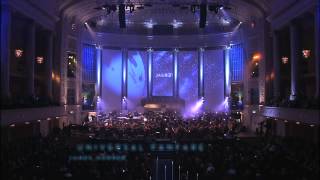
Audio description: 1927-1936: On a cloudy background, a globe rotates as a airplane flies around it. "A Universal Picture". 1936-1947: On a black background with spinning stars, a stylized glass globe is shown rotating, tilted at an angle. The words "A Universal Picture" slowly orbit around the globe. 1963-1990: Planet Earth spins in a black star-sprinkled sky. Dusty blue rings of soft light come into the focus over the planet: Universal, an MCA company. 1990-1997: Now in a black star-sprinkled sky. A dazzling silver of sunlight crests the Earth. It disappears behind the spinning watery blue planet, as a golden word orbits into view: Universal. Words appear below: An MCA Company. Words appear above the planet Earth: 75th Anniversary.
This was the best time for MCA Universal pictures because it was owned by Matsushita Electric Industrial (Panasonic) Once they sold it to Seagrams, and then became part of Comcast, it lost its spark.


Originally, Universal execs weren't sure if they should have "Back to the Future Part III" use the old Universal logo to keep the trilogy consistent, or debut the 75th anniversary logo with this movie. They chose the latter, and it proved to be a very smart decision (since the movie did pretty well at the box office, too).
And the 1990 universal logo was Amazing! It was even used as the logo of universal cartoon studios.
Try saying "Executives" the next time please?
@@dwho19951 most sane people say “execs.”
Glad they did. I feel this sets you in the mood for Doc and Marty’s final adventure through time.
@@dwho19951 bruh moment
oddly appropriate that this anniversary version of the logo first appeared on a time travel movie
Didn't they celebrate their 75th anniversary in 1987?
The 75 in this logo is in reference to the establishment of the studio lot in 1915, which grew into Universal City.
@@AurumUsagiyeah, this is Universal, not Paramount
Hands down the best Universal intro music ever. Chills
I agree ☝️!!
Nostalgia ❤
Do you like the one being used now for Universal pictures?
Honestly the 1997 one is my favorite
You’re right 👍🏾
The only logo I’ll always appreciate, the magic, the adventure it delivers.. beautiful
Especially the Music for one Incredible Legend, James Horner.
@@joseguevara8321 RIP James Horner for Titanic and Avatar. 😢😢😢😢
back in future 3
R.I.P James Horner
(1953-2015)
It became Part of a Line of Selected Titles for Universal's 75th Anniversary, among them Jetsons: the Movie, Kindergarten Cop, Darkman, Child's Play 2 and Many More.
I remember seeing this in Back To The Future Part III & Child's Play 2
It was also seen in Kindergarten Cop and Jetsons: The Movie.
@@lanceplaxton6967Correct
And Mo' Better Blues
You can say that the logo is travelling through time to future with 88 mph! Haha!
This logo was in Problem Child (1990). I absolutely love that movie, even though it got bad reviews. I don't care what anyone says that movie, that movie is awesome and hilarious.
Same problem child is such a good movie I thought it would have been bad but it isn't I've watched both of them since I was younger best movie of my life If I had to pick problem child or the little mermaid always be problem child!!!
This was used on Kindergarten Cop too
Here in Brazil this movie is called ''O Pestinha'' (Little Pest) and it marked my childhood for good since it was one of the most watched movies broadcasted by Globo TV on its ''Sessão da Tarde'' (Afternoon Session) film block back in the 90s.
It was also in Jetsons: The Movie.
It premiered with back to the future three
Jetsons The Movie Child's Play 2 Mo' Better Blues Back To The Future Part 3 Kindergarten Cop Darkman
Back in the day, I saw this for Back To the Future III, and the Jetsons movie
Those watching Child’s Play 2: everything was all sunshine and rainbows… UNTIL IT WASN’T.
Talk about mood whiplash.
That's definitely a b*tch slap moment right there
Universal Pictures (Now owned by NBCUniversal is a Different Company Now, Than it was When MCA Owned it Back Then!!!!
Is it bad that I associated this version of the logo with child's play 2?
Quite possibly my favorite sound in the world. Makes me happy
This is the best logo of them all.
The Hard Way (1991) and A Kiss Before Dying (1991)
Sums up Child’s Play 2 (1990).
Child's Play 2!
This 75th anniversary logo is one of the very best from Universal Pictures 🖼️.
Every time I see this particular logo, it will always remind me of the film "Back to the Future Part III" as you can easily see here on this video. Lol 🤣😆
Classic.
1928, 1955 and 1985.
The second logo (with the stars) was introduced no later than 1943. The third "AN MCA COMPANY" is no older than 1964. I know that offhand by remembering Shadow of a Doubt (1943) and The Birds (1963) logos.
MNMMMMMMMKOPO. NKPO
Mmmmmmmn. Mmmmm.n pook 0:54 0:54 0:54
Seen it in Jetsons the movie Mo better blues and Child's play 2
RIP
James Horner
(1953-2015)
U-N-I-V-E-R-S-A-L, Universal!
Gostei de Back to the future
This one just gives me chills each time! But I have to say...it starts off with a black screen and reminds me of THX, which I am super scared of. I still always hold my breath at the beginning 😢
It’s funny seeing this logo in child’s play two. The tone of the logo does not fit the movie at all.
Yeah very ironic since the logo is more associated with back to the future 3 and some of the pre illumination entertainment era animated films because they're more family friendly than a movie with a evil doll who kills people
It's more helpful to adjust to the tone of a different genre without the regular fanfare.
I love this theme!!!!
Did anyone know that the people at NASA had hand in creating the 75th anniversary logo?
Audio description:
1927-1936:
On a cloudy background, a globe rotates as a airplane flies around it. "A Universal Picture".
1936-1947:
On a black background with spinning stars, a stylized glass globe is shown rotating, tilted at an angle. The words "A Universal Picture" slowly orbit around the globe.
1963-1990:
Planet Earth spins in a black star-sprinkled sky. Dusty blue rings of soft light come into the focus over the planet: Universal, an MCA company.
1990-1997:
Now in a black star-sprinkled sky. A dazzling silver of sunlight crests the Earth. It disappears behind the spinning watery blue planet, as a golden word orbits into view: Universal. Words appear below: An MCA Company. Words appear above the planet Earth: 75th Anniversary.
Go
This was the best time for MCA Universal pictures because it was owned by Matsushita Electric Industrial (Panasonic)
Once they sold it to Seagrams, and then became part of Comcast, it lost its spark.
I recently saw this logo with Darkman, one of 5 movies I rented for Labor Day weekend from Be Kind in Burbank. Definitely a pleasant surprise.
Globe and outer space propaganda. It sucks because this was my favorite.
Darkman
Memories of child's play three and back to the future 3
Taken From Problem Child
from Childs play 2 (1990)
Are you watching ready player one
sounds like galuku entertainment
If this intro started it's 75th anniversary would the year be 1987 since Universal was founded in 1912.
That's true.
Taken from: Back To The Future III
Beautiful
UNIVERSAL A COMCAST COMPANY
Saturday
November 12, 1955
10:03PM
Child's Play 2
I can never, EVER, tire of this intro. There's been nothing like it before, or since.
Produced at:
The Chandler Group
and
Flip Your Lid Animation
Music Composed by:
James Horner
Child Play 2
The Burbs
This logo was at the beginning of Problem Child and Back to the Future Part Three.
Everytime I listen and look at it, it just reminds me of the film 'Problem Child'.
They were celebrating 75 years to Universal city studios
Well, shit. Looks like I have to watch BTTF now. Oh whoa is me, 😄 the suffering, how I look forward to it.
75th Anniversary of universal city studios
Chucky 2
no
I've Seen This on Jetsons: The Movie
the latest two are bangers but im starting to like this one too
❤
Taken From Jetsons the movie
Мурашки по коже
Jetsons the movie
Jetsons!
:D
Darkman