How To Kern Professionally. (Not many know this!) 🤯

HTML-код
- Опубликовано: 4 окт 2024
- Sponsored By Walling! It's free! Use code PATERSON20WALL for 20% discount on premium!
walling.app/
Great Graphic Design Resources! creativemarket...?u=Willberto
Instagram: / willpat
Thanks for watching! Hope you enjoyed this video!
If there's anything you would like me to cover in a RUclips Video, then let me know by commenting down below!
Edited by Jordan Summers: www.1five.co.uk
If you like what I do, and you want to partner with me:
BECOME A MEMBER! / @willpatersondesign
Hire me: www.willpaters...
If you would like me to design you a logo, poster or anything for your RUclips Channel or business, then I'm your man! I would love to work with you to make what you want a reality! Check out my website and portfolio for more information.
Hire me: www.willpaters...


Hope you enjoyed the video and learned something new about kerning! If you have any questions be sure to leave them below and I'll do my best to answer them :)
If there is a website that tells you what the ideal kerning should be, how come there is no automated process for this in Adobe CC?
@@copypaste3526 A good start would be to change the kerning setting from Metric to Optical in the type panel. I have it set to optical on startup.
🥕🥕🥕🥕🥕🥕🥕🥕🥕🥕🥕🥕🥕
Thanks Will. When you have angleed letters like A Y V etc and/or fancy fonts. What parts of the letters should one be looking to kern off?
I clicked so fast when I saw the kerning master talking about kerning. LOVE IT.
same tho loll
SAME 😂😂😂😂
Another trick you can use to help you while you kern is to rotate the word 180 degrees so that it’s upside down. This helps your brain to treat each character as an object, focus less on reading them, and increase your ability to identify spacing issues between them.
Carrots are delicious when cooked in an instapot oh wait, this isn’t a cooking channel :) Still kerning is something my brain perceives but doesn’t really know about. Nice to learn that when I’m thinking “why do these letters seem a bit off” there is something real behind it. Happy algorithm accident, me finding this vid.
Glad it's helped :D
Hahaha kudos to you for watching this without being related to the field. 🤭🤭💖✨
Had a hard time understanding why you'd fill a joke with water.
Haha, wasn't just me then!
😂
I couldn’t un-hear it 😂
HAHAHA i got it too
He said Jug of water
I’ve been focusing specifically on my type during my final semesters in school because I recognized it as a weak point. When you kerned Giga correctly it sent shivers down my spine.
Thank you for the video. Your knowledge of kerning is based on your intuition and a rool of thumb. There are at least two very useful practices I use all the time to kern words. The first one is the rule of the middle letter. All you have to do is to split your word into groups of three consecutive letters and then adjust the middle letter in each group.
and the second one is a secret that will remain hidden for the centuries to come
@@thesteaksaignant we were never chosen to know, won't you get it
Carrots! Thank you for putting this out; I dabble in design and am 100% self-taught, you're content is the easiest to digest. Please, keep it coming!
Generally, you kern adjacent curved forms closer to one another (example c and o together) and letterforms with vertical strokes like l, i, j, I, t, etc. further apart. Use the squint test and you can see where the problems lie a bit better.
Great video, thanks for making this.
One method I was taught back in the day to visually check if your kerning is off: is to look at the word upside down. It forces you to look at the negative space more abstractly.
Also, I find certain capital letters at the endings of words (depending on the type style) could sometimes overhang slightly over the next lowercase letter: like T, Y, P and sometimes W.
Great tips!
Carrots!! A neat trick taught to me by an art director I worked with is to turn the word upside down. There’s an interesting science to reading words in that we read the space around the letters and not the letters themselves. So turning the word upside down forces you to examine the space and not the letters. And this shouldn’t just be for logos but also larger headlines too, especially where they dominate an ad space. The growing world of reactive creative work for digital/social is killing this level of craft. Thanks for addressing it. Nice vid.
I think you should do a part 2 of this video. Really informative. Thanks for this Will
Never thought bad eyesight was actually helping my design until you asked me to look at Giga. Thanks Will🙏🏾
I am not typing "carrots." Dammit! You tricked me!
I'm not a typographer, so I'm really happy that my typical method of "push letters around until they look better" is the correct one. 😂
Carrots. I totally love this refresher. One of the most overlooked skill in design :)
Love it. Once I leant this in design school, I get triggered every time I see badly kerned text. It makes such a huge difference. Once you see it - you can't unsee it.
Same here.
Glad to see this, so many new graphic designers don't consider type at all. It's too easy to just type and leave it. Maybe some good old, hand drawn text should be brought back for training new designers, it didn't do me any harm about 24 years ago. 😱
I don't know if commenting twice helps with the algorithm but I like how you're asking to comment exactly for that purpose and not faking to want to hear what we think
Carrots. I always adjusted kerning like this instinctively. Also I've worked with an art director that kerned just like this.
When your video title appeared to me I clicked thinking there was a proper method to calculate the spacing, but it turns out I was doing it the right way all along.
Great video nonetheless, it's a considerable amount of work we do to make type just perfect that is mostly unappreciated.
Carrots, I found this video very helpful sometimes as a new designer I forget how important this lesson is.
Glad it was helpful! :)
If you wanna check your kerning you can also turn your text block upside down, it becomes less about text and more about geometry and spaces between shapes
This was very helpful for understanding the goals and process of kerning type. I was surprised to see how intuitive/"gut feel"/subjective the process is, although I suppose that makes sense because you are measuring visual balance as perceived by a reader. I'm curious if you could train an AI to do this, even if it just gave you a "score" like the game or a second opinion.
Thanks so much for sharing. I stumbled across your channel recently. I'm a software engineer by trade, but I also have a strong interest in visual design. It's been a great way to level up my game when building user interfaces. It's really cool to see your expertise at work.
Carrots. Kerning do be a tricky aspect of Typography. Thank you for explaining it more well
Love this, been trying to find typography tutorials that go super detailed.
Carrots. Love these tips. Great explanations of do's, don'ts and why! Learning lots.
Thank you so much for this video! Having some hands-on resources is going to help as I make my way through my typography class! 🥕🥕🥕
Ohh Carrots. Watxhing this and knowing a bit about kerning but not actually realising I've been doing just that for a few years now, sort of organically. Thanks for making me actually think about it!
4 years already crossed to know this simple technique.
Carrot! That was most essential basic adjustment in type design and I'm bad at it. Thankyou so much for this. That was really helpful.
I'm a front end dev who's been a dipping toe into the design world. Your videos have really given me a sense of how to approach a project, the common mistakes to avoid, and subtleties like this that can really make the difference in the way a project turns out.
Cheers, man. 🥕 🥕
Typeface designer here, Some of your forms look quite top heavy. Like the a, o, and d, and c, take a bit off the top of the curves to make them more subtly bottom-heavy, it is an optical adjustment but works wonders
6:16 e goes one step right, then two steps left, then one step right - perfection!
Carrots. I'm curious how well you think Adobe's "optical" setting in the kerning section of the character panel works. Probably not a substitute for an expert's eye, but perhaps better than the default "auto" setting?
I always use the "optical" setting.
Sorry, that was an incomplete reply. I always use the “optical settings” as a starting point when I am using Adobe InDesign. Then I go back and look closely, then individually kern spaces between certain letters.
With today's good fonts (not the free ones, but most purchased ones) are often optimally kerned. Mostly through services like iKern, these fonts are "metrically" optimized. That's why you should by no means set them to "optical". Because this destroys the optimized kerning. Just leave them "metric". Only really bad fonts like frome Linotype should be set to optical, even according to Linotype. Which is actually already a poverty testimony of these fonts.
@@jensche21 How's the kerning on Google Fonts, any idea?
@@prashadlodhia it depends on each foundry/font…
Thx for the blur tip! I’m not bad at kerning, but that alone should help raise my game.
thanks a lot for that great tutorial ! currently studying media design and one course is typography.. kerning is one part that I couldn't yet comprehend fully 😊🥕
Carrots! This makes a whole lot of sense and very easy to digest. Im a self taught designer so everything I know is through trial and errors and tons and tons of experience. Thanks a lot for this!
I learned quite a bit about proper kerning having been a graphic designer and sign painter. Awesome stuff!
Carrots. I learned something today. I frequently hear or see designers talking about (criticising) kerning in other's work but never knew there were actual fundamentals to look for - I just thought it was down to opinion and personal preference.
I've been learning so much recently from your videos and logo reviews. Thank you 😊.
You are my hero! Thanks a HUGE CARROT for a “alt+arrow” shortcut!!!
🤯🤯🤯duuuuude the telepathy is insane. I was looking for a good kerning video to learn about kerning after you mentioned it in a video I watched yesterday and then you posted about it today🤯. THANK YOU!!!!
Oh man! As art director this is a great great video to share with the rest of my team who are not designers but use texts on videos every week.
Thank man! please continue doing great content!
Carrots does helps me alot, and now I'm editing my fonts kerning
Carrots. I really enjoyed this lesson about kerning. You broke it down to simple steps. I hope you'll be able to dive deeper into some of these lessons some day. I wouldn't mind watching these lessons broken into parts either. Keep up the good work!
Glad you enjoyed it!
Kerning joke with 5 "ands" in a row. A signwriter was teaching his apprentice to make sure the kerning on the new sign they were making for "Smith & Jones" butchery. When the apprentice finished sign, all the tracking was wrong: SMIT H & JONES! His boss said, "Hey all your gaps are wrong!". "Apart from the word SMITH, the spaces between SMITH and & and & and JONES are not even!". Cheers from this toy deisgner in Australia.
Haha, that's great!
Yes! Someone else who nerds out about fonts and design.
Alt-arrow - I’m stealing that! Another tip I picked up is to turn the word upside down. Also (if deadline allows) going back to it after a few hours break (or next day is even better). Sometimes seeing it with fresh eyes (so to speak) you spot things you didn’t notice before.🥕🥕🥕
Carrots. Nice one, that's helpful stuff. Didn't know the ALT + arrows trick, that's nifty.
Hi Will, thanks for another great video. I'm starting out on my Graphic Design study (at age 55! Too old?) and I find your videos very informative and easy to follow. Thanks again.
Thanks for watching! It's never too late to learn. I hope you find a good home here in the channel :)
Best carrots explanation video!
Carrots. I am a type designer and it's very difficult at first to adjust the kerning issues. But as you go through the process, the end result is so satisfying.
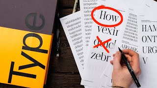
Very appealing thumbnail. Props to you!
Hey Will, I just watched your video on kearning and I dig it! I've never heard of it before but I've been doing it for 40 years. I look forward to learning more and watching my artwork grow. Thank you for the knowledge and I tried the Kerntype game and got a 70, 81 and 100. It's interesting to me how this process gratifies me so much and some folks just think that I'm easily ammused
Informative... This subject is underrated...
Thanks for this! In my first job back in 1989, I did manual typesetting and had to do everything by eye. I used to love doing this part of my work. Upon the advent of digital typesetting, I really noticed the quality of typesetting go down the drain for years, it was so depressing to see. I never went into digital work for that reason. I think things have improved over the years, but at first it was awful.
I began in 1986 and would agree that typography in general has slipped. Having to manually adjust headline type etc was a great learning opportunity.
Carrots! Why do I come back to this video every now and then?
Blurring the font as an alternative to squinting is a brilliant idea.
Carrots! Thanks for a quality video. There are only a couple of good ones on this topic on RUclips.
This topic is really really need to talk about! Thanks mate
Summing up: Kerning, walling and carrots
Carrots a year later. Learning so much here, thanks for the content!
LOOK at That mechanical keyboard !🔥🔥💜⌨️
Walling looks like Notion, which it's what i use. Good carrots colleague!!
So Alt+arrows ooook! Tnks for the tips!
Greetings from Kernville, California
Carrots. Will, enjoyed this video. Kearning seems easy (for a non designer) but can be tricky to really pick up.
Glad you enjoyed it!
Trust me, everyone watches your videos to the end. We may skip the square space bit lol but we watch it all. Carrots!
Again, Well done! I am teaching a typography course and I will direct my students to they channel.
The Kern game gets a massive thumbs up from me,,always great to practice properly,,gotta keep your eye in the game... only point you should have made was what your kerning space increment was when shuffling letters around... ;p
Carrots. This is something I don't see enough designers talking about and I always see it done wrong. Also, I'm totally into that kerning game like a gigantic nerd. :D
I love the game too!! 🤣
Carrots :3 I can't wait to give that site a go. I've really wanted to improve on my kerning, because I've known its a thing but never really understood it. I started a job a few years ago, and didn't initially go in worrying about typesetting/topography, but over time, between complications with our specialized program (that i hope one day we will move away from honestly) and having to hand-draw in custom lettering (typically from old family headstones), I've really wanted to understand kerning. The person I work with has an eye for it because she's been doing it since before I was born, and even back when they had to use die cut letters by hand. She's great at pinpointing out stuff, but because she was never like specially trained/college trained, she doesn't know like terms and stuff and I'm just an inquisitive person that wants to dive into the "why" of things. I can be very technical and mathematical with spacing on letters but a current project had me rethinking because an A was between a T and i want to say W (but late night brain plus crap memory) when I took a second to step back, printed out what I had done and realized how off the spacing looked and realized my mistake. So, sent me down a rabbit hole. Off to learn more.
I honestly didn't know. Thanks Paterson
Such a great video & it is great to hear your perspective. I find myself naturally going a bit wider with my kerning sometimes so I like to see your narrow balance. I also love carrots 🥕
it’s good to revisit the basics from a different perspective. The blur technique is quite interesting and will use it time to time. Thanks bru.
Glad it was helpful!
that keyboard on your desk............is so cuteeeee 😍
Proper kerning takes time. Often it means coming back to your design multiple times -
after taking a break - and seeing it with fresh eyes. Ultra-fine tuning it If it is an important project.
It's like the negative space in a drawing, the space between 2 subject is still important for compelling composition
Spot on.
🥕🥕🥕🥕 I never was too certain about kerning till now… best tutorial ever!
Carrot! Anyway maybe you can show us how to “tracking” professionally for title or logotype
CARROTS! Great video!
Carrots! Very helpful. Thanks Will 👌
I just wanted to say that carrots was really carrots. I especially find the part about the carrots super useful because it allows me to look at my own carrots and see where they carrot.
All about the carrots
Why does carrot help algorithm!
Carrots! That kerning minigame is really good to train your eye.
Quick unrelated question, what is the model of that Keyboard you have?
^This
Very good, I learned a lot from your video as usual! My only problem is that the music is a little bit distracting. Otherwise, thanks very much for being out there.
Thank you very much for making it so practical and simple.
carrots! the kerning game is a lifesaver thanks!
The kerning game is super helpful, Carrots
Carrots! Love it, thanks will!!! 🙏🏻
I love your vids they’re so helpful
What helps me is to put a word outside down. I stop reading the word and it helps me to focus on the space.
Carrots
Great to learn something new - not a designer, but always good to add knowledge as you never know when you need it - cheers
Carrots! Thanks. Nice to be reassured I've been doing it correctly : )
You learn something new everyday. Great video! Carrots
Carrots. My dad was a signwriter back in the day when that meant drawing boxes to put your letters in and actually painting things on walls. I’ve been fascinated with letters ever since.
Carrots! Super useful, I absolutely wanted to lean more about kerning. Well-kerned logos and type looks totally different, it's the next level! Thanks Will :D
Carrots! I always wanted to hear you about kerning. So when I saw this video I clicked on the spot. 🙂
Learned something, and the kerning game is fun to do.
Carrots. As someone else mentioned… My burning question I thought you would cover through all of that… What do you think of the “Optical” kerning setting in Illustrator?!?
I use it to get started, then manually adjust by eye from there.
Definitely carrots. Thank you sooo much for the value provided :).
Thanks mate for all this content, you teach wonderfully.Thanks brav!
Glad you enjoy it!