Plotting Likert (agree/disagree) data in Excel

HTML-код
- Опубликовано: 25 июл 2022
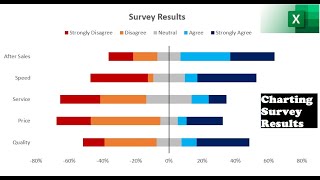
- If you're processing survey data that includes scales from strongly agree to strongly disagree, or similar, you probably want to plot it rather than try to compress it to a single number -- I know people who would get very, very angry if you did that. This gives a nice visualisation of your results, which doesn't hide any distributions or make assumptions about what "neither" might mean. This tutorial covers how to build such a plot in Excel. Alternatives are available, obviously. It's probably in R, too, but you can build a spreadsheet template and drop your data into it again and again and have it update instantly.
 Наука
Наука


Thank you. It took me a while to find as most videos out there are on how to create an initial Likert scale, not on how to display the results. I am grateful that I came across your video!
I likert very much, thank you!
thank you very much. I have learned a lot from your presentation.
Thanks for your help Chris
This was such a life saver, thank you so much!!
thank you!!! this was so helpful
genius! exactly what I needed, thanks a lot!
Excellent explanation! Thank you! It's a wonder that Excel doesn't do this already.
It can do stacked bar charts that are scaled to 100%. That's perfectly acceptable for most uses, especially if the number of responses is comparable between questions, and works "out of the box" with no modifications. But those can be a little harder to see exactly where the central tendency is. It'll come down to preference and what you want to show.
What about where 'Neither agree nor disagree' is zero?
Thank you for this video. I’ve trying to figure out how to properly display my data from my surveys
It's probably slightly easier in R, but once you have a template set up, may as well keep with a spreadsheet.
How would you visualize a "NA/Don't know" response? Would that be a 2nd axis?
I don't think I've seen N/A used with this style.