From what I have seen other artist on RUclips, since I am no expert, I would think that maybe the problem is that you are trying to use these watercolours as normal european watercolours and they simply are not and cannot perform as those? So layering expecting them to be as transparent or vibrant as the others simply won't work. I have very recently bought them myself because I love these muted vintage victorian style colours and enjoy coloring with them, it takes all the thinking out of the window of trying to mix correct colours and just lets me enjoy the experience of coloring a predrawn coloring page or a stamp with an established palette. I have the pastel Prima watercolours and some of the White Nights pastels and they go fabulous with these. And well, pastel hues, morandi palettes, or vintage colours aren't for everybody, you can totally enjoy bright jewel tones if its your vibe. Thank you for the review and opinions, I did find them very useful.
Or maybe she just doesn't like it. Why anyone would say they wonder if they are a "bad artist" because they don't like over hyped paint is beyond me. The hype around them is ridiculous as is the price gouging. Now they're only $25. If folks like transparent water colors, all these colors come in brands, so I'd say just build one's own palette. I already have a lot of these colors. It's just a gimmick. It's a nicely curated palette but nothing really unique. I'd rather just use the paints I like and make my own palette. In fact, it's easy to just do a bit of study of the colors like art nouveau and curate the colors. Done.
Where do they say anything about her being a bad artist? You don’t like this palette, or it sounds this brand paints at all, but plenty do. There’s a lot of unusual, different colours in this palette.
I just paid 50.00 for the 48 set and 31.00 for the AN. I still think they are a good value for the money and I have the Graphite set which is Phenomenal 🎉🎉🎉 the 48 is a replacement. Lost in a storage incident 😭 I am just happy to get them again! I don't plan to use them as intended either. My expensive experiment for sellable art 🎨 All the best! Their sticky quality is going to lend to my process.
@@TerrieJohnson731 AN set only has one color overlapping the 48 set. that's really nice. and you probably already know. $80 is nothing in the world of watercolor. one single kolinsky brush could be $200
@@oaktharas Yes I am only missing two six sets and the new single color. I forgot the name but it's like a buff titanium... I intend to have them all. What color is duped? I haven't noticed yet.lol
The Nouveau set was my first of the Kuretake paints and they are now my favorite over Daniel Smith, Windsor-Newton, Kremer and Koi. I have since bought the graphite set and love those also. Now waiting for delivery of the 48 piece set which I found on Amazon for $37.27. Only wish I could afford the anniversary set and I SO don’t care about having duplicate colors. And no one says “mau-vay “.
I loved the paintings I did with this set but I added black ink after. I need to get the set out again! It's a great palette for a vintage storybook look in think. We all like different stuff tho.
I love these vintage, more muted tones. I made my own version of this palette by mixing my colors with PW6:1. It's called Petersburg Ochre. A soft Pearl Gray would also be good for mixing these Morandi colors too!
I would love to see these tested on rice paper and in a quality coloring book such as a Kerby Rosanes book. The reason being that the binder used in these paints is not intended for paper with sizing which is what our watercolor papers have. Also the oyster shell that they're using is not a lightener that is absolutely a filler. Thank you for doing this review it tells me what I needed to know about the performance of the paint on sized papers. You are more than welcome to send them to my house 😂.
I see everyone loving this palette, but I can't imagine doing anything with that color selection. Then again, I'm fair more drawn to jewel tones, so it's probably a matter of preference. As far as organization goes, Studio of MM has a 3D printed storage tower version that holds these Kuretake pans. They're pretty reasonably priced for how custom they are. (I've ordered a compact palette from the store that was really nice.)
I bought myself this set as a birthday treat last month, and it's my first ever set. (I was actually using it as I watched your video) The colours are beautiful, especially for anyone wanting to work in neuvaux colours, or in a similar style. I do think it's an add-on palette, though. It's not meant as a stand-alone set in its own right. I didn't have any others, so I boughy three primaries, a black, and a deep brown, and added them to make it a more complete palette, because I didn't have any basics. As a curated add-on set it's amazing. (I also discovered Holbein Shin-Gansai while I getting my extra 5 kuratake pans. Oh dear!)
I only have a couple of these paints. I was able to peel out the paint and put it in a regular size full pan by softening with a little water. Fits in my regular palette now.
Hint, if you can find any of those empty silver ingot storage boxes, like the commemorative collection sets, the spaces fit the KGT pans perfectly! I have an empty wooden box that once held ingots for the 50 states. Not enough spaces for my 78 pans presently, but it’s a start! Sometimes you can find the tired boxes at Goodwill, St. Vincent’s, etc.
If you collect Kuretaki, I love this set and it's the perfect compliment to the 48. Graphite, Granulating, Sumi are super fun additions. My favorite brand next to DS, The workhorse watercolors!
i love these colors for making backgrounds - either on a glass plate or my geli plate. they give a beautiful antique look and i love the black seeping out - it looks aged :)
I was one of the lucky ones that snagged this set as soon as it hit Amazon in 2022. I don’t use it all the time, but I really have had good success with it. I’ve only used it on 100% cotton. I’ve painted loose conceptual scenery, herbs, floral and mushrooms, etc. I do not believe this palette is for beginners because you absolutely do need control. I love granulating watercolors, so a few of these fit the bill along with the graphite set. If Kuretake comes out with additional graphite shades I will get them. I’m not a pro, just a hobbyist, but I’ve loved all the Gamsai Tambi palettes I’ve bought. I also have the graphite set and hope they come out with more graphite colors. I haven’t bought any of the little Pearl, Gem or metallic sets as I don’t use that sort much.
Thank you for this rewiev, and for beeing honest and brave enough to stand your point. Ive seen so many rewievs that just say theyre great, but dont really go into theyre preferences. I have thought of getting one of the bigger a kuretake basic Sets, but have been worrying about if the colors would be a bit "dead" as theyre not that translucent, loosing some of its vibrancy in comparision to regular high quality Watercolor.. And I think I got my answer here, even if this was about this special pallet. Thank you!!
Well, I really wanted this pallet first time when I saw it so I decided to play around with paints that I already have and try to mix those colors myself. It turned out super easy with naples yellow, I found it worked the best. As turned out colors and opacity were not working for my style of painting.
@@aDricaluaI would say 50% of the colors. What naples yellow does it mutes the color without adding too much yellow. Flax Beige, Ecru Beige, Potters Pink, Alizarin Crimson, Mauve Taupe(purple+NY), Old Mauve ( ultramarine +NY), Shadow green, Billard, Ivy Green.
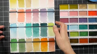
I feel like these would be great for making backgrounds. The colors shown in the bookmark are beautiful together. I think I would ink over top of them with pitt artist pens.
I can see the frustration with the field test. The bookmark is cute, but the lavender is not the same level as your other loose florals with the same paper and approach. As always, I appreciate the review!
My solution to managing many smaller palettes was to purchase n Xl tin palette, approx. 9 inches by 12, (Etsy) and placed 48 of my Kuretake pans in it, using adhesive magnets to hold them in place. I use the lid for mixing, watering down, etc. i loved the original boxes they came in, but since they are cardboard or whatever, they would become quite messy after dipping in brushes, spraying with water, etc. The 48 pans fit just right, with a small space to easily move pans around.
I hesitated to buy this palette because honestly, the colors look muddy to me. And the introduction of black into colors that are supposed to be pastels is just weird. I have a 24 set of the original paints and I just don't gravitate toward them either, as candy-like as they feel. They feel hard to work with, honestly. BTW, the pigment information for all of the Gansai Tambi paints is on the Kuretaki web site. Good review. Your Etegame postcard struggles remind me of what I went through when trying to paint with Distress Oxide inkers, brilliant as an idea, not so great in execution.
Thank you for your comparision with the oxides. Everyone loves the oxides, but I just feel like the oxide itself sort of "kills" the color, it dulls it and take the vibrancy away and then I try to add more and more but it just feels like a dead surface to me. I have been wondering about getting a kuretake basic Set, but been a bit worried about them feeling a bit "dead" and now when you compare them with the feel of oxides, I think I have my answer 😊👍
You don't like them because you didn't do your research on what they are and how they work. That's on you, not these paints. Your expectations were wrong, so it really isn't fair to leave such a negative review. You shouldn't even have bought them, as they clearly aren't for you.
You do get rather excited, don’t you! Set your volume lower girl. You tired me out in 5 minutes literally. Then again your hands are a whole other voice. Good luck to you. Share your energy. Bye!


From what I have seen other artist on RUclips, since I am no expert, I would think that maybe the problem is that you are trying to use these watercolours as normal european watercolours and they simply are not and cannot perform as those? So layering expecting them to be as transparent or vibrant as the others simply won't work. I have very recently bought them myself because I love these muted vintage victorian style colours and enjoy coloring with them, it takes all the thinking out of the window of trying to mix correct colours and just lets me enjoy the experience of coloring a predrawn coloring page or a stamp with an established palette. I have the pastel Prima watercolours and some of the White Nights pastels and they go fabulous with these. And well, pastel hues, morandi palettes, or vintage colours aren't for everybody, you can totally enjoy bright jewel tones if its your vibe. Thank you for the review and opinions, I did find them very useful.
Or maybe she just doesn't like it. Why anyone would say they wonder if they are a "bad artist" because they don't like over hyped paint is beyond me.
The hype around them is ridiculous as is the price gouging. Now they're only $25.
If folks like transparent water colors, all these colors come in brands, so I'd say just build one's own palette. I already have a lot of these colors. It's just a gimmick. It's a nicely curated palette but nothing really unique. I'd rather just use the paints I like and make my own palette. In fact, it's easy to just do a bit of study of the colors like art nouveau and curate the colors. Done.
Where do they say anything about her being a bad artist? You don’t like this palette, or it sounds this brand paints at all, but plenty do. There’s a lot of unusual, different colours in this palette.
And ‘study the colours and create your own palette’ sometimes you just like a palette for the hell of it
I have used these this brand for a long time. Just as long as you don’t trip they stay in this nice box. Love these watercolors.
I just paid 50.00 for the 48 set and 31.00 for the AN. I still think they are a good value for the money and I have the Graphite set which is Phenomenal 🎉🎉🎉 the 48 is a replacement. Lost in a storage incident 😭 I am just happy to get them again! I don't plan to use them as intended either. My expensive experiment for sellable art 🎨 All the best! Their sticky quality is going to lend to my process.
@@TerrieJohnson731 AN set only has one color overlapping the 48 set. that's really nice. and you probably already know. $80 is nothing in the world of watercolor. one single kolinsky brush could be $200
@@oaktharas Yes I am only missing two six sets and the new single color. I forgot the name but it's like a buff titanium... I intend to have them all. What color is duped? I haven't noticed yet.lol
The Nouveau set was my first of the Kuretake paints and they are now my favorite over Daniel Smith, Windsor-Newton, Kremer and Koi. I have since bought the graphite set and love those also. Now waiting for delivery of the 48 piece set which I found on Amazon for $37.27. Only wish I could afford the anniversary set and I SO don’t care about having duplicate colors. And no one says “mau-vay “.
😂😂 mau-vey
I loved the paintings I did with this set but I added black ink after. I need to get the set out again! It's a great palette for a vintage storybook look in think. We all like different stuff tho.
I love these vintage, more muted tones. I made my own version of this palette by mixing my colors with PW6:1. It's called Petersburg Ochre. A soft Pearl Gray would also be good for mixing these Morandi colors too!
I love this color selection! I use my gansai tambi set to paint dolls and some of these colors would be perfect for a more natural face
I would love to see these tested on rice paper and in a quality coloring book such as a Kerby Rosanes book. The reason being that the binder used in these paints is not intended for paper with sizing which is what our watercolor papers have. Also the oyster shell that they're using is not a lightener that is absolutely a filler. Thank you for doing this review it tells me what I needed to know about the performance of the paint on sized papers. You are more than welcome to send them to my house 😂.
That is a gorgeous freaking palette, damn
I love this set. I have the 48 and 52 set and will definitely replace wotth more when they run out. They are so joyful to paint with.
I just ordered mine today and they went up in price not surprisingly with inflation $41.10 AMAZON. Love these watercolors my personal favorite.
I see everyone loving this palette, but I can't imagine doing anything with that color selection. Then again, I'm fair more drawn to jewel tones, so it's probably a matter of preference. As far as organization goes, Studio of MM has a 3D printed storage tower version that holds these Kuretake pans. They're pretty reasonably priced for how custom they are. (I've ordered a compact palette from the store that was really nice.)
I bought myself this set as a birthday treat last month, and it's my first ever set. (I was actually using it as I watched your video)
The colours are beautiful, especially for anyone wanting to work in neuvaux colours, or in a similar style. I do think it's an add-on palette, though. It's not meant as a stand-alone set in its own right. I didn't have any others, so I boughy three primaries, a black, and a deep brown, and added them to make it a more complete palette, because I didn't have any basics.
As a curated add-on set it's amazing.
(I also discovered Holbein Shin-Gansai while I getting my extra 5 kuratake pans. Oh dear!)
Thank you for your thoroughness and listing the possible pitfalls.
I only have a couple of these paints. I was able to peel out the paint and put it in a regular size full pan by softening with a little water. Fits in my regular palette now.
Hint, if you can find any of those empty silver ingot storage boxes, like the commemorative collection sets, the spaces fit the KGT pans perfectly! I have an empty wooden box that once held ingots for the 50 states. Not enough spaces for my 78 pans presently, but it’s a start! Sometimes you can find the tired boxes at Goodwill, St. Vincent’s, etc.
If you collect Kuretaki, I love this set and it's the perfect compliment to the 48. Graphite, Granulating, Sumi are super fun additions. My favorite brand next to DS, The workhorse watercolors!
I love that bookmark!
Love Love Love this palette
i love these colors for making backgrounds - either on a glass plate or my geli plate. they give a beautiful antique look and i love the black seeping out - it looks aged :)
Does the kuretake work on a gel plate without pearling up and without adding any medium, as normal Watercolor does otherwise?
I was one of the lucky ones that snagged this set as soon as it hit Amazon in 2022. I don’t use it all the time, but I really have had good success with it. I’ve only used it on 100% cotton. I’ve painted loose conceptual scenery, herbs, floral and mushrooms, etc. I do not believe this palette is for beginners because you absolutely do need control. I love granulating watercolors, so a few of these fit the bill along with the graphite set. If Kuretake comes out with additional graphite shades I will get them.
I’m not a pro, just a hobbyist, but I’ve loved all the Gamsai Tambi palettes I’ve bought. I also have the graphite set and hope they come out with more graphite colors. I haven’t bought any of the little Pearl, Gem or metallic sets as I don’t use that sort much.
Thank you for this rewiev, and for beeing honest and brave enough to stand your point. Ive seen so many rewievs that just say theyre great, but dont really go into theyre preferences. I have thought of getting one of the bigger a kuretake basic Sets, but have been worrying about if the colors would be a bit "dead" as theyre not that translucent, loosing some of its vibrancy in comparision to regular high quality Watercolor.. And I think I got my answer here, even if this was about this special pallet.
Thank you!!
Well, I really wanted this pallet first time when I saw it so I decided to play around with paints that I already have and try to mix those colors myself. It turned out super easy with naples yellow, I found it worked the best. As turned out colors and opacity were not working for my style of painting.
What mixes did you make with naples yellow ?
@@aDricaluaI would say 50% of the colors. What naples yellow does it mutes the color without adding too much yellow. Flax Beige, Ecru Beige, Potters Pink, Alizarin Crimson, Mauve Taupe(purple+NY), Old Mauve ( ultramarine +NY), Shadow green, Billard, Ivy Green.
I feel like these would be great for making backgrounds. The colors shown in the bookmark are beautiful together. I think I would ink over top of them with pitt artist pens.
I can see the frustration with the field test. The bookmark is cute, but the lavender is not the same level as your other loose florals with the same paper and approach. As always, I appreciate the review!
My solution to managing many smaller palettes was to purchase n Xl tin palette, approx. 9 inches by 12, (Etsy) and placed 48 of my Kuretake pans in it, using adhesive magnets to hold them in place. I use the lid for mixing, watering down, etc. i loved the original boxes they came in, but since they are cardboard or whatever, they would become quite messy after dipping in brushes, spraying with water, etc. The 48 pans fit just right, with a small space to easily move pans around.
I love those colours! Also that easy watercolour bookmark thing is also a great way to check your colour swatches as well :D
i liked your try outs
What’s the point of the black marker line?
I really want that set, buts costly in canada
The colors make such a good palette. I wonder if I could make my own palette but wkth different paints. Anyone?
I thought about creating some dupes and started to, but within a week I ordered. I don't regret it 😉
Japanese make the best art stuff I guess you need to know what your doing
Check of Studio of MM, she 3d prints things and has just what you need!
❤❣
I hesitated to buy this palette because honestly, the colors look muddy to me. And the introduction of black into colors that are supposed to be pastels is just weird. I have a 24 set of the original paints and I just don't gravitate toward them either, as candy-like as they feel. They feel hard to work with, honestly. BTW, the pigment information for all of the Gansai Tambi paints is on the Kuretaki web site. Good review. Your Etegame postcard struggles remind me of what I went through when trying to paint with Distress Oxide inkers, brilliant as an idea, not so great in execution.
Thank you for your comparision with the oxides. Everyone loves the oxides, but I just feel like the oxide itself sort of "kills" the color, it dulls it and take the vibrancy away and then I try to add more and more but it just feels like a dead surface to me. I have been wondering about getting a kuretake basic Set, but been a bit worried about them feeling a bit "dead" and now when you compare them with the feel of oxides, I think I have my answer 😊👍
You don't like them because you didn't do your research on what they are and how they work.
That's on you, not these paints.
Your expectations were wrong, so it really isn't fair to leave such a negative review.
You shouldn't even have bought them, as they clearly aren't for you.
You do get rather excited, don’t you! Set your volume lower girl. You tired me out in 5 minutes literally. Then again your hands are a whole other voice. Good luck to you. Share your energy. Bye!