Gansai Tambi Watercolor Review

HTML-код
- Опубликовано: 18 окт 2024
- Join this channel to get access to perks:
/ @artonthecreek
My review of the Art nouveau set of Gansai Tambi watercolors: Gansai Tambi Watercolor Review | Art Nouveau Set
• Gansai Tambi Watercolo...
In this review of the Kuretake Gansai Tambi Watercolors, I will highlight the differences between these unique paints and conventional watercolors!
I’ll test these paints on different papers and compare the results to conventional watercolors. Who are the Gansai Tambi Watercolors best for? Well, it depends on how you express your artistic vision! I am providing my opinion in this review based on my experience as an artist and instructor.
The links below are affiliate links on Amazon US. I may earn a small commission should you choose to use these links. Any commission earned through your purchase will go directly to sustaining and growing Art on the Creek. It will allow me to continue to create video tutorials and art supply reviews for you here on RUclips. I can't thank you enough for your support! I hope this channel brings you as much joy as I have creating it for you.
Kuretake Gansai Tambi 36 Colors Set
www.amazon.com...
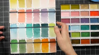
Here are the numbers & colors in the set I have, L-R, top to bottom:
Row 1
No. 32 Red
No. 35 Carmine
No. 34 Rose Madder
No. 36 Rose Madder Deep
Row 2
No. 30 Cadmium Red
No 31 Cadmium Scarlet
No 33 Cadmium Orange
No 44 Yellow Ochre
Row 3
No 43 Cadmium Yellow
No 42 Aureolin
No 40 Lemon Yellow
No 54 Olive Green
Row 4
No 51 Sap Green Light
No 53 Sap Green
No 52 Hooker’s Green
No 58 Sap Green Deep
Row 5
No 55 Viridian
No 56 Forest Green
No 57 Turquoise Green Deep
No 50 Malachite
Row 6
No 61 Ultramarine Pale
No 64 Ultramarine
No 63 Cerulean Blue
No 62 Turquoise Blue
Row 7
No 66 Prussian Blue
No 67 Indigo
No 38 Imperial Violet
No 139 Cobalt Violet
Row 8
No 37 Purple
No 46 Burnt Sienna
No 47 Raw Umber Deep
No 20 Black
Row 9
No 10 White
No 906 White Gold
No 91 Bluish Gold
No 90 Gold
@DylusionsDyan
has a great channel for artists!
@ranger_ink
is also an exvellent source for artists!
If you’reready to dive in to all 100 colors, check out St Louis Art Supply.
At publication, they have the best price on this beautiful wooden box set:
shop.stlartsup...
FineTec Mica Watercolors: www.dickblick....
Show Theme Music: Charles Shomo, Caffeine Creek Band "Forest Trail"


So glad I came across this video. Thank you so much for the insight. Kuretake was what I chose as my beginners w/c set. Now I understand why I struggle to get some of the effects I see in western w/c.
Hi Meg! You’re so welcome I’m glad you found this useful! They are a slightly different animal but they sure can be fun to use!
LOVE this paint! Very enjoyable and intense - highly recommend for more coverage, heavy blending, smooth more opaque techniques!!!! 😍
Hi Aleene! Yes! The Gansai Tambi formula is made to be that way-it’s really fun to work with!
That was such an in-depth review; thank you. I have these on my wishlist.
You’re so welcome! They also come in smaller sets and a “nouveau” set. I was actually thinking of expanding my collection as well! 👩🏻🎨🤠
Hope you enjoy them when your wish list is fulfilled ❤️ Happy painting!
Hello! I find these fun to use. I think of them more as a gouache-ish like medium, sort of a cross between gouache and watercolor. I love them that way.
Hi there! Thanks for watching and commenting! Yes, since they are made in the Gansai Tambi tradition, they are very different from conventional watercolor. Glad you enjoy them!❤️🤠
Another very interesting video. You find such interesting ways to use watercolors adapting to their unique qualities. I love it. FYI, Kuretake does have the pigment information on their website. ❤
Good to know! I’m glad you enjoyed this video. I have their Art Deco set in my cart….such versatile paints!
@artonthecreek Yes, I've been keeping my eye on the Art Nouveau set... waiting for the price to drop. I hear Blick had them for $25 over the Memorial Day sale, but I missed it. I'm sure it will come back around.
@windywednesday4166 yes Art Nouveau not Art Deco!🤦🏻♀️ Only $27.81 today🤠
@artonthecreek LOL, I knew what you meant 🤣. I'm still going to have to hold off... for now. I have my DaVinci order coming in, and my piggy bank needs to recover. ❤️
@windywednesday4166 I totally hear that!!!❤️🩹❤️🩹
Love these watercolors. These pans last a long time.
Hi Laura! Yes, they have a considerable amount of paint. Enjoy!
Thank you so much for doing this research and explaining! I’ve opened a small set for a few years and just didn’t reach for it as much as I’d expected, now that I know they’re intentionally different from standard western watercolors I can appreciate them much more!
I’m so happy you enjoyed this! Thanks for your comments. I hope you continue to enjoy them!
Hi! Thanks for the information. I bought the 48 count set last year just to try it and I'm about to use them to paint a college piece for my daughter on Arches 140lbs HP. I'm no longer a watercolorist (I'm 9 years a silk painter-very similar to watercolor) so I went looking for info on these paints and that's how I found you. I have enjoyed your video and you have answered all my questions.
To answer your question in regards to roses. The piece at the bottom of the rose is called a calyx. I am not a rose aficionado, but I recently watched a sugar artist create some beautiful flowers and one of them was a rose.
Thanks again for your help!
Happy 😁 Painting!
God Bless 😃
Oh my goodness thank you for letting me know it’s called a calyx! I realize I’ve heard that before at some point. Now I shall remember it! I’m so happy you found me☺️ I’m glad you’re here and I hope you continue to enjoy my channel! These Gansai Tambi paints are unique and I bet you will enjoy them! I bet they will work very well on the hot press Arches and I know your daughter will be thrilled with the results💖💖
Nice review! Kuretake does have their pigment info on the web site. The reds are very fugitive. Greens and blues aren't bad.
Thanks for sharing! Glad you enjoyed this😃
If you are curious about the art nouveau set, I’ve got that review up as well. These paints are really fun to work with! Gansai Tambi Watercolor Review | Art Nouveau Set
ruclips.net/video/l2T48i5J4P4/видео.html
I have this brand of paints only in their shadow black set. I love it. I do find that they do mix well when you’re using them with professional grade watercolors. I do love the size of the pans.
Hi Richard! Thank you so much-I’ve never thought to mix these with my professional watercolors because of their added ingredients. I just never thought to try! I’ll have to give that a go. I’d be curious to see how the sheen dissipates. Thank you!
I have the set of 36. Keep in mind that they are more opaque than translucent watercolors normally are. Also, the paint pans are large, but the amount of paint is shallow. The colors are really pretty. I am amazed at the large increase in price, as I paid one half of what they currently cost. She is right on about how shiny they are.
Hi Gale-thanks for your comments! The opacity is attributed to their formulation. The Gansai Tambi traditional method is slightly different than western watercolors, as I mentioned in this review. They are fun to play with & I’m happy you have a set!
They are an asset to have, but the price increases in general are unfortunate, indeed! I always recommend that you shop around, look for sales, etc.
Of note, the pans are also sold individually.
Happy painting! 🤠🩵
Thank you for sharing all this information! I’ve had the set of 48 but haven’t found a use for them and you solved that problem 😊
So interesting regarding the Finetec…I love mine also and now considering purchasing the metallic Gansi Tambi…no wonder I love your videos!! I’m not sure why they aren’t showing when you post so I’ll just have to keep checking…lol
As always, your beautiful introduction always feels my heart with such a great feeling and everything about your videos are always so uplifting!
Thank you as always for sharing,
Nancy Rolfe
Hello Nancy! This made me so happy-thank you❤️ I post tutorials every Wednesday, Thursday, & Friday. Saturday is a review video. All videos post at 3pm mountain time. I hope that helps I’m sorry you’re not getting notifications.
These Gansi Tambi watercolors are quite interesting. I’m thinking of trying the shadow colors 💜 FineTec are really great paints! Yes, depending on how you use the metallics you might enjoy the Gansai Tambi better. Have a wonderful week and happy painting! 👩🏻🎨
Hi Ann...I just found your channel and this wonderful video. The most helpful comparison, demonstration, and general information about Gansai Tambi I've yet seen. I now feel like I know exactly when and why it would make sense to invest in these beautiful and unique paints. Thank you so much! Subscribed, and really looking forward to digging into your content, and just love your energy. 🙏
Hi Jordan! What a wonderful comment to wake up to! Thank you so much and I do hope you continue to enjoy my channel❤️🤠
@@artonthecreek Absolutely...so much time and devotion to produce this content by you and so many other incredible RUclipsrs. Just the best art school I can imagine!
@JordanHunter333 I am humbled. I hope you continue to grow as an artist, and I am honored to be a part of your journey!🙏🏻👩🏻🎨
The color names, bit written beneath each color, use the old Japanese words for the colors, some obscure today, things seen in nature. I like that approach better than pigment numbers and seemingly random naming. English has a few, olive green, lemon yellow… There’s clarity to their palettes not just random colors somebody whipped up.
Hi Jan! Thanks for your comment. Several of the newer watercolor paints are coming out with “marketing” names, yes! I like using the pigment-named hues as well. There’s no question in a burnt ochre or raw umber❤️
@@artonthecreek I think Holbein uses some literal translations naming their colors. Japanese are attentive to oranges ->reds and brilliant greens! West seems to lean on blues that end up mostly drab greens. I often end up grabbing my basic Sakura Koi 24 box, for colors that pop! 😂
Nice!
Ordered the Paul Rubens half pans you suggested, Ann. I'm looking forward to trying them. Thank you again for your careful counsel. Wishing you well, Susan
You’re so welcome! I hope you really like them😁!
Excellent!
Hi Lulu! I’m so happy you found this useful!
I LOVE these paints! So creamy and the colors are spectacular!
Thanks so much! Yes, they are really unique & I’m happy you enjoy using them😊
Thanks for sharing. I love hearing your bit of research and take on them. I succumbed to peer motivation and bought a smaller set and then bought the mini-pan travel set during a Sketchbox sale (silly me). I enjoy them as a change of pace, but I'm proud of myself for resisting the new art nouveau set at least! They are great for cards and journaling, and maybe even for experimentation on rice paper!
Ohhh…rice paper! What a wicked animal that is! These would be great on it, though❤️
I always enjoy your feedback-thank you again! I admit-I lurked around that art nouveau set for more days than I care to admit-then resolves on removing it from my cart. This set is plenty for my style of art.
Lol silly you-I live a good SketchBox sale! No shame there!😂
I only use them for my watercolor paintings.
I appreciated this deep dive int Gansai Tambi. As someone who has used watercolor for more than 30 years, I gotta say I'm not a big fan of these because I don't like that they're shiny when dry.
Hi Jeka! You are absolutely right-they are a different animal. They remind me of a lacquer more than a watercolor. In the eighties circumstances, they can be beautiful, although definitely not for every artist.
Enjoy your week and thanks for watching & commenting!
Thank you for the great video. I would have liked if you included the info or a link to the other watercolor. I think its the finetect.
Thanks so much for your comment! I'm so sorry I neglected to ad that. I've edited the description to include that link, and here is the link for the set I purchased for your convenience:www.dickblick.com/items/finetec-artist-mica-watercolor-pearlescent-set-of-12/?gclid=Cj0KCQjw2eilBhCCARIsAG0Pf8u7DTkMS2zWchJXG7VlKlEuIPpTwA8qYAfD1Ab83EkxXbEjquBuB4kaAsVyEALw_wcB
Happy Painting!
The Pul Rubens half pans have arrived! I swatched them. Colors looks great--much more natural than the Kuretaki. I think these will be terrific! These half pans are tiny in comparison to the Kurretaki but they pack a big punch. Loaded with pigment. Mix beautifully, too. Love them! Thank you, Ann.
Hi Susan! Oh, that makes me so happy! I truly hope you thoroughly enjoy them!
Happy, happy painting!
Really fantastic video, covered everything. so well explained. i had smicke wc and wondered how they would compair, so this was especially helpful. thanks
Hi Billie! Thank you so much I’m so happy you found this informative and useful! Have fun creating😍
What a fun and helpful video! Thank you!
Hi Christine! Thank you so much 😊 I’m happy you found this review helpful!
Hi Ann! I was not familiar with the Gansai Tambi watercolors prior to your video. Wonderful review! Yes they are super shiny and those full pans are huge and a nice size for larger brushes. Interesting how they don't flow and are best for wet on dry for rice paper- yes, great for journaling! I enjoyed seeing your side by side of the Schmincke vs Gansai Tambi paints - (you were asking us about the roses- those bits are sepals). Awesome video, Ann! I am hoping you will participate in the upcoming Favorite Bird Art Challenge I am hosting, my friend!
Thank you, Dena! I’m glad you found this informative! Sepals, Calyx…I’ve got a lot of names I vaguely remember from biology classes suggested by viewers-thank you! I’ll need to dig in and look some things up to re-learn the parts of a rose😃 I saw you bird challenge-I will check it out! 💜
@@artonthecreek Ann awesome!!
Such a perfect review
Hi Mary! Thank you so much! I’m so happy you found this review useful 💜
Thank you for your thoughtful reply, Ann. The question came about because I bought the 48 pan Kuretaki set and find that they don't blend well either wet on wet or wet on dry. I will look into the half pans you suggested, but I really prefer tubes and love to mix colors separately on a plate before I touch the paper. A quick suggestion for paints in tubes? Thanks again. Susan
Hi again-I’m just now seeing this after I saw your comment that you bought the Paul Rubens-I’m so sorry!!
Ok-paints in tubes-if you enjoy mixing and really just want to start building a palette-I recommend picking up Daniel Smith, DaVinci, M Graham or Winsor & Newton.
You could still buy these tubes individually and Gradually build your collection-I like to recommend starting with a warm & cool primary, Burnt Sienna, Yellow Ochre, Payne’s Gray & Indigo.
Thanks again for your questions I’m sorry I answered them out of order!!
I love the Gansi Tambi in bible journaling. If the wrinkles bother you, put plain paper on each side of the page and iron it on a low setting. Problem solved.
Hi Revsla-thanks for your comment and I’m happy you enjoyed this video! Yes, Ironing is a perfect solution. I do that regularly for my watercolors-did not know journalers did that as well! Happy creating🤠
Which paints would you recommend for wet on wet watercolor work? Great comparison. Thank you.
Hi Susan! Thank you! I’m happy you found this useful.
Any watercolor will work using the wet on wet technique. The important considerations are budget, lightfastness & format (pans vs. tubes)
For a really decent budget set of half pans & for hobby watercolorists, I recommend the Paul Rubens Artist Grade Professional Watercolor Paint Set of 24 half pans (Amazon) in the US right now it’s $39.99 with a 5% coupon.
If you’re not concerned with lightfastness & primarily watercoloring as a hobby, I recommend the MeiLiang Watercolor Paint Set, 36 Vivid Colors in Pocket Box. $16.79 on Amazon.
If you are looking to study watercolor and want a student-grade set to start, I recommend the Winsor & Newton Cotman Watercolor Paint Set, Customisable Travel Tin Set of 12 Half Pans- US Amazon has it for $31.30.
This is a great way to gradually get into professional grade paints, as you can add pans to this tin and fill them with your favorite professional-grade paints. As you run out of the Cotman paints, you can replace them with professional grade also. The tin can hold either 24 half pans or 12 full pans.
The most important thing for you to have is 100% cotton watercolor paper. Many sizes and types are available. Look for a cold press 140lb 300gsm.
I hope that helps! Let me know if you have further questions.
I’ve been thinking actually today of ordering these or Yasutomo brand. Glad I saw this tutorial. Since they hold a lot of paint, do you think the pans will empty out fast? Can you get separate refills( pans)?
Hey Chris-no, I don’t think they will run out fast at all. St. Louis Art Supply sells individual pans for $2.49 each. You might be able to find them elsewhere but at least I know they tend to regularly carry them. You could start small & mix different hues-they have the set of 12 for only &18.95. I’ve ordered things from them before and have been very pleased with the service! Shop around, though💜 Have fun with them!
Love the review. I have that set and love them. Do you have a list of their numbers and coordinating names? Thank you
I do! Thank you Sandy-I wanted to answer you right away to let you know I saw your comment. I will add that to the video description in a bit (I’m away from my studio at the moment) and reply to you again☺️ I’ll have that description revised for you within 2 hours-by 11 am mountain❤️
Hi Sandy! I’ve updated the description with the color names & numbers. Thanks for your patience & please let me know if you need anything else! Im glad you enjoyed this video🤠
I love this
Thanks, Toni! 💗
I have both the kerutake green box the same as yours plus the gem colours and starry nights and adore them. Like the intense pencil are intense against normal watercolour pencil, I think this is the same with the kerutake. I do have other watercolours as well but reach for the kerutake much much more. Thank you for this informative video and you have gained a new Aussie subscriber. Much love & *virtual hugs* xxx
Hello Claire! Thank you so much and I’m so happy you enjoyed this review! I love the Inktense as well-I have a review on that one too if you’re interested. Thanks for subscribing I appreciate you! (I’m a sucker for gem tones I just might look for those lol🤠)
That google translate is hilarious!😂 Made me snort laugh!
🤦🏻♀️ so many things get lost in translation 😂❤️
@@artonthecreek 😂