► Further Reading on Color Contrast: 1. The Science of Color Contrast by Justin Baker: medium.muz.li/the-science-of-color-contrast-an-expert-designers-guide-33e84c41d156 2. W3C Article (Skip to Contrast Ratio): www.w3.org/WAI/WCAG21/Understanding/contrast-minimum.html
0:25 As I can see you are using a laser printer. I have noticed that your print head is misaligned. This will cause problems. Misaligned print head in a laser printer can cause print head jamming.
The level of insight in every single video--- it feels like each video is maximally thought-out. In terms of words vs lessons, I'd say the signal-to-noise ratio is extremely high!
Back about 15 years ago, I was working for my brother's advertising agency as a "Jack of all trades" (most of it being deliveries). I had taken the 5 years before teaching myself graphic design (didn't have the money to go to school). So, I was freelancing as a graphic designer for two local billboard companies (they sent me overflow work when they became overwhelmed) while I was also working the jack of all trades job for my brother's company. One day at the ad agency, the art department was falling behind so they asked me to do a billboard for a "lesser" client. It was a museum for kids and that month's theme was "TREASURE!". I picked out my objects to include in the billboard: old wooden table top, an old treasure map with scalloped edges, a couple of pieces of eight, a sextant and the word "TREASURE!" in Blade Pro 3D lettering. I tilted the whole frame 15 degrees to the left to keep it from feeling boring...then added a white runner on the bottom with all the info (dates, address, etc). Turned it in to the art director and went home to work on my freelance billboards. I forgot the treasure billboard until a couple of weeks later when I saw a billboard on the freeway for TREASURE! that wasn't mine. The billboard was an effeminate "pirate" in a polyester costume with a plastic cutlass in his hand with a black background. The word "TREASURE!" to his left was typed in RED. The information typed in RED on the same black background. Worst yet was that the site of the billboard was the left side of the freeway...that means it is on the driver's left, four or five lanes of freeway, an embankment plus two lanes of frontage road then about 60 more feet of easement away from the freeway...and it was Black with RED type! Imagine trying to read that at 60 mph. I asked my brother what happened? He said he didn't like brown tones (wooden table, old treasure map, sextant...) Sounded fishy to me so I also asked the art director. She told me in confidence that my brother only respects sheep skins and college degrees. My brother had let a new just out of school kid (with a brand new degree) try his hand at the billboard. I said "Ok" and never offered my graphic design work to my brother's agency again. 2 years later, the agency is having a meeting trying to come up with a set of new potential clients. By then I had told the art director that I had been busy with freelance billboards and business was booming. During that meeting, I was put on answering phones so the receptionist could go to lunch. Then the art director comes to the conference room glass door and calls out my name, "Have you worked on a billboard for such and such Vein Doctor?" "Yes!" Comes to the door again, "so and so Mattress company?" "Yes!" This went on for 5 more times and the answer was "YES!". My brother is leaving the building for a lunch meeting and huffs, "You're putting us out of business." "I said, "Not me, it's the account executives selling the billboards. I'm just providing something in their hands to clinch the deal. You don't respect the work of people without degrees so I found somebody else that does."
Hey Unmesh, I am hispanic but I live in Canada. I want to emphasize on your great ability to teach and explain these subjects properly. It is clear that you understand the knowledge you pass on. Very great tone and kind way of teaching. Thank you for everything you do.
As someone whose also regularly doing graphic design works (especially dealing with brand colors in visual identity/branding design), I've already knew of most of these, but it's good to get a refresher on it. With the channel is leaned more towards photo-manipulation and photography, it's quite a quick, good, get-go explanation to the people who normally doesn't used to recognizing strict, hard-line legibility as such a critical thing as us in the design worlds do. The hardest thing when it comes to, in my case of branding design-is to find a good center balancing point between the actual shades of the specific color and the appropriate amount of contrast, and it often just require a bunch trial-&-error to get it perfect. As sometimes the automatic contrast calibrator tool in contrast checking website often goes too dark, or bright shades of color to get the appropriate contrast level, in so often resulting in darker or brighter color than I'd preferred, and sometimes even close-to complete black, or white if the original color scheme is already a very saturationless shade of dark and bright colors. So I pretty much have to manually tweaked them afterwards until find a appropriate enough balance in terms of both contrast and still retaining the saturation of the color. And as color theory also applied during brand color selection, one can't simply just change to another hue of color to get enough contrast as that would alienate from the brief of the brand. It doesn't help that even though there are, user-generated tried-&-true color palettes on site like Coolors, I prefer to choose and source them colors manually, as I got more creative freedom if I do it with my own hand than just choosing a suitable color palette off the website.
This is great! As photographers we often overlook design knowledge like this, even though it can really elevate what we do. I'd be curious to know how this applies to more complex backgrounds. An idea for a future video? ;) Thanks for everything Unmesh!
This is 'just' a tutorial and you are using one of the best condenser mics in the world! Even audio recording professionals use them. Salute for your passion of building this beneficial RUclips channel for us. Again, thanks!
I have been editing some web page templates recently, and one of the things I have been picky about is just this: Readability through decent color selection! Many of the templates were doing this wrong. Fun to see my choices confirmed here. I totally agree with you, this is how you do it! I also tried one of the online color contrast testers, and I noted that it does do one thing that I don't think you mentioned (but I am sure you know): Blue always looks dark, so blue on black is awful while blue on white is fine. It is one thing one should know. That is also why I avoid green and red on whiteboards. Always blue or black to get good contrast.
I am a web designer. One of my UK client asked me to cover WACG guidelines for upcoming project. I had no Idea before that. Thanks to you for saying about it. It was excited to know more .
I am unable to figure out how time passes when I play the videos of this channel. Not because they are addictive( just like Tik tok or other short form content), but because they are really valuable and very well explained.
Thanx Unmesh! The most important lesson to remember for laymen or those who have not studied communication design, or even for master designers, is certainly useful.
Thank you for making a video on this Unmesh and providing the guidelines and tools that are needed to tackle this issue. This is so important for vision impaired people. Having a certain degree of color blindness myself doesn’t make life as a photographer easier so I know the struggles with certain color contrast ratios. Thanks again and have a nice weekend my friend!
I didn’t know that photoshop have this option in color proofing settings, bc I through it is only for printing related stuff. Easier way to preview color contrast is to use BW filter as adjustment layer (hue or gradient map)
Hey I haven't watched your videos for a while due to me not really using Photoshop, but I'd love to say that the quality of your content has improved drastically! The camera quality, editing, and your background are super sick too :)
Thanks to the algorithm for recommending this channel. I had a lot of doubts about using a single white word (the others were in other colour) on a poster with a yellow background. I wanted somehow to soften the sequence of words on the poster by adding that white word (just 5 letters) .The font was bold, geometric, big, and it looked great, there was no visual difficulty in distinguishing it because it was just BIG! ... I wanted to But perhaps my aesthetic appreciation was completely different from the readability that anyone could have.
really appreciate you adding this information to the world of artists/designers/creators... feel silly not making this more of a priority, and that i never learned about it studying design in Uni. great video, would love more like this (theory vs editing techniques)
I didn't go to school for this (I went for electrical engineering), other than an 8th grade art class that showed me the basics of Photoshop in 1998 (which is actually useless 20 years later). I got thrown into Photoshop 6 years ago by my family's wedding album business, but Unmesh taught me how to use techniques that the "professional" editors at our studio didn't know how to do. I would watch his videos on my 2nd monitor while doing my editing on my primary. The theory is what I'm most interested in now. I absolutely HATE having to choose colors that work well together (because I can't, my brain doesn't work that way) so it is nice to have an equation (engineering brain) that can tell me quantitatively how good the colors will look. I'd love more of this!
There's a good way to check the contrast of pretty much anything on your computer (and not just in Photoshop) using a Black & White Filter. Windows has one by default (Windows 10 and above): Press the Windows Key, type "Color Filters" (or go to Settings > Ease of Access > Color Filters) Tick the box to allow for usage of a shortcut. The default setting is to Grayscale but you can customize it to help against colorblindness, or have inverted colors. Now pressing the Ctrl + Windows + C key combination will enable or disable the grayscale filter on All of your screen, as a way to quickly check contrast on any image, design, website or other. It even works for videos ! The algorithm is probably not the same as the Color Fusion Mode of Photoshop, but it's still an easy way to check in my opinion.
I actually made a program to tell me the best color pairing between 2 - 4 colors because I had to make something using different colors and I suck at picking colors that work together so I would pick my primary color the one I used the most and the program would spit out the best combinations of colors to use in a given ratio. Also, I'm partially colorblind so having an application that could tell me the best contrasting between colors was a godsend.
Thanks Unmesh, I've been doing this along time, and didn't know there is an easy way to rate legibility of things. I'm looking at my work on a very sharp 24 inch monitor, I tweak the color and font then call it a day. It might be tough for someone seeing it on a phone. There is more to it than just nice color combinations.
I was newly learning about colour contrast which you explain widely in this video and i think i had a better understanding on the topic. Thanks my friend.
This is a really really good video/channel for just putting in the background while working and learning as you go, very comforting music and voice, etc.
Something to keep in mind is that the current draft of WCAG3 replaces the AA and AAA standards and uses a new algorithm called APCA to determine contrast. So if possible, see if theres an APCA plugin for your favorite design tool to get more accurate contrast results.
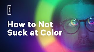
You totally got me with the great Thumbnail and kept me with the on point presentation and information! Thanks alot, for someone who's pretty bad & unexperienced with colors this was an eye opener!!
3:50 The green-ish lime-green text on the slightly orange-ish yellow background is such a strong color contrast to me. It's like red text on a green background. But my color perception is also a bit different from others'.
Working in Architecture we usually try to comply with the Equality Act 2010 which incorporates guidelines on how to make buildings and signage usable by partially sighted people, there should be a contrast of 30 points and all paints have these values listed or we as Architects and Technicians have a standard value that we can use for some items like white bathrooms vs black floor tiles etc so that a person with sight difficulties can move around a room and find door openings or see a WC against a wall etc. Sadly text on products uses colour contrasts too low and even if you have good eyesight it is difficult to actually read. Thanks for highlighting this problem for other designs. The Equality Act 2010 is a law that is being ignored by a lot of designers :(
I have no interest in editing or color theory...but the thumbnail for this video was so perfect, I had to see what this was about and I was not disappointed.
Nice video! I know this was just a design tip video and not a technical video, but can you also make a video about correct colours on different monitors? Almost every monitor has a unique contrast and stuff, but what are the correct values? How do we know if our mint green is same as someone else's, or our other monitor? Are there some tests we can do or fixes or anything? Again, this was not a video about hardware components, but since it is related to contrast and colour correctness, I thought you might know. Thanks for this awesome video, by the way. It was very informative.
Man, it would be SO good to be a graphic design student these days. With content like this at your finger tips, you could do nothing absorb it all day. We'll have high schoolers designing circles around the pros...
You can also keep in mind the rule of tincture in vexillology. Colors go on metals and vice versa. Metal is gold and yellow, the rest are colors. This isn't a hard rule, even the US flag breaks it wuth the blue square touching red stripes. But it's a great rule of thumb to follow for good contrast
This reminds me of 80's computer magazines, some of them would use the most vibrant, luminous colour schemes - they'd play havoc with my eyes all the time, I always thought it was my eyes being a bit weird, kinda glad that other people suffer colour clash too!
Something besides colors/colorblindness that I rarely see mentioned is illegibility and eye strain from bright text on a dark background, as in white text on black. It's high contrast and doesn't fall into colorblind combinations but it's still inaccessible to some people with astigmatism. As in, it's blurry and unfocused ("halation", the text looks like it has a gradient halo around it). AFAIK it has something to do with the fact that the lens of the eye doesn't fully focus if there's not enough light and tiny pinpricks of light within full darkness isn't enough. As extremely high contrast OLED-targeted dark modes have spread, where everything is now pure white on pure black instead of white on dark grey, I've had to change a bunch of things to light mode to avoid getting a headache (namely Google products which recently went from having very good mid-contrast dark mode to terrible white-on-black dark mode). :/


► Further Reading on Color Contrast:
1. The Science of Color Contrast by Justin Baker: medium.muz.li/the-science-of-color-contrast-an-expert-designers-guide-33e84c41d156
2. W3C Article (Skip to Contrast Ratio): www.w3.org/WAI/WCAG21/Understanding/contrast-minimum.html
Do you know if these ratios the same in print? (Also sorry for replying to a comment, my iPad isn’t letting me write a new comment…)
0:25 As I can see you are using a laser printer. I have noticed that your print head is misaligned. This will cause problems. Misaligned print head in a laser printer can cause print head jamming.
Name of music used initially???
We don't just learn edits from you. We learn so many things...... You are an inspiration bro..!
Thank you, Rishabh :)
So true veer
The level of insight in every single video--- it feels like each video is maximally thought-out. In terms of words vs lessons, I'd say the signal-to-noise ratio is extremely high!
This is by far the best photo tutorial channel on RUclips. Thank you for being such an immense source help and knowledge to so many of us out here.
Happy to know it helps, Thanks AJ :)
Back about 15 years ago, I was working for my brother's advertising agency as a "Jack of all trades" (most of it being deliveries). I had taken the 5 years before teaching myself graphic design (didn't have the money to go to school). So, I was freelancing as a graphic designer for two local billboard companies (they sent me overflow work when they became overwhelmed) while I was also working the jack of all trades job for my brother's company. One day at the ad agency, the art department was falling behind so they asked me to do a billboard for a "lesser" client. It was a museum for kids and that month's theme was "TREASURE!". I picked out my objects to include in the billboard: old wooden table top, an old treasure map with scalloped edges, a couple of pieces of eight, a sextant and the word "TREASURE!" in Blade Pro 3D lettering. I tilted the whole frame 15 degrees to the left to keep it from feeling boring...then added a white runner on the bottom with all the info (dates, address, etc). Turned it in to the art director and went home to work on my freelance billboards. I forgot the treasure billboard until a couple of weeks later when I saw a billboard on the freeway for TREASURE! that wasn't mine. The billboard was an effeminate "pirate" in a polyester costume with a plastic cutlass in his hand with a black background. The word "TREASURE!" to his left was typed in RED. The information typed in RED on the same black background. Worst yet was that the site of the billboard was the left side of the freeway...that means it is on the driver's left, four or five lanes of freeway, an embankment plus two lanes of frontage road then about 60 more feet of easement away from the freeway...and it was Black with RED type! Imagine trying to read that at 60 mph. I asked my brother what happened? He said he didn't like brown tones (wooden table, old treasure map, sextant...) Sounded fishy to me so I also asked the art director. She told me in confidence that my brother only respects sheep skins and college degrees. My brother had let a new just out of school kid (with a brand new degree) try his hand at the billboard. I said "Ok" and never offered my graphic design work to my brother's agency again. 2 years later, the agency is having a meeting trying to come up with a set of new potential clients. By then I had told the art director that I had been busy with freelance billboards and business was booming. During that meeting, I was put on answering phones so the receptionist could go to lunch. Then the art director comes to the conference room glass door and calls out my name, "Have you worked on a billboard for such and such Vein Doctor?" "Yes!" Comes to the door again, "so and so Mattress company?" "Yes!" This went on for 5 more times and the answer was "YES!". My brother is leaving the building for a lunch meeting and huffs, "You're putting us out of business." "I said, "Not me, it's the account executives selling the billboards. I'm just providing something in their hands to clinch the deal. You don't respect the work of people without degrees so I found somebody else that does."
this dude deserves more subscribers than he has. He explains everything, you don't just learn designing, he teaches you the "why" behind each action.
4.25 million subs is already insane.
@@77dris nah man, he deserves at least 10M
@@alexmercer57 Haha, that would be wild. Thank you and I appreciate your support :)
@@alexmercer57 no 25Milli is better
@@glitchmanshandle agreed
this guy deserves more recognition he's so passionate and thoughtful of whatever he does and i love it so much, you just earned another subscriber.
Hey Unmesh, I am hispanic but I live in Canada. I want to emphasize on your great ability to teach and explain these subjects properly. It is clear that you understand the knowledge you pass on. Very great tone and kind way of teaching. Thank you for everything you do.
As someone whose also regularly doing graphic design works (especially dealing with brand colors in visual identity/branding design), I've already knew of most of these, but it's good to get a refresher on it.
With the channel is leaned more towards photo-manipulation and photography, it's quite a quick, good, get-go explanation to the people who normally doesn't used to recognizing strict, hard-line legibility as such a critical thing as us in the design worlds do.
The hardest thing when it comes to, in my case of branding design-is to find a good center balancing point between the actual shades of the specific color and the appropriate amount of contrast, and it often just require a bunch trial-&-error to get it perfect.
As sometimes the automatic contrast calibrator tool in contrast checking website often goes too dark, or bright shades of color to get the appropriate contrast level, in so often resulting in darker or brighter color than I'd preferred, and sometimes even close-to complete black, or white if the original color scheme is already a very saturationless shade of dark and bright colors.
So I pretty much have to manually tweaked them afterwards until find a appropriate enough balance in terms of both contrast and still retaining the saturation of the color.
And as color theory also applied during brand color selection, one can't simply just change to another hue of color to get enough contrast as that would alienate from the brief of the brand.
It doesn't help that even though there are, user-generated tried-&-true color palettes on site like Coolors, I prefer to choose and source them colors manually, as I got more creative freedom if I do it with my own hand than just choosing a suitable color palette off the website.
subbed. as a colorblind person im glad someone finally acknowledges how much we struggle with some combos. ty 🙌
This is great! As photographers we often overlook design knowledge like this, even though it can really elevate what we do. I'd be curious to know how this applies to more complex backgrounds. An idea for a future video? ;)
Thanks for everything Unmesh!
That's an interesting idea, especially if you have graphics over gradients or images. Thank you!
@@PiXimperfect My pleasure! I'm glad you're exploring new topics by the way, this is great! :)
This is 'just' a tutorial and you are using one of the best condenser mics in the world! Even audio recording professionals use them. Salute for your passion of building this beneficial RUclips channel for us. Again, thanks!
I have been editing some web page templates recently, and one of the things I have been picky about is just this: Readability through decent color selection! Many of the templates were doing this wrong. Fun to see my choices confirmed here. I totally agree with you, this is how you do it!
I also tried one of the online color contrast testers, and I noted that it does do one thing that I don't think you mentioned (but I am sure you know): Blue always looks dark, so blue on black is awful while blue on white is fine. It is one thing one should know. That is also why I avoid green and red on whiteboards. Always blue or black to get good contrast.
Thanks for breaking my eyes with the thumbnail 👍
It's so hard to find a channel who discusses such stuff with so much ease and lucidity... Absolutely loved the video sir !!!!!
Glad you think so! Thank you, Sutripan :)
Thanks for another amazing tutorial.
You have seriously saved thousands of hours!
Glad to know that! Thank you :)
I am a web designer. One of my UK client asked me to cover WACG guidelines for upcoming project. I had no Idea before that. Thanks to you for saying about it. It was excited to know more .
I am unable to figure out how time passes when I play the videos of this channel. Not because they are addictive( just like Tik tok or other short form content), but because they are really valuable and very well explained.
Thanx Unmesh! The most important lesson to remember for laymen or those who have not studied communication design, or even for master designers, is certainly useful.
Nice work, as always! I thought about this problem so many times but had no idea what the solution is...
Thank you for making a video on this Unmesh and providing the guidelines and tools that are needed to tackle this issue. This is so important for vision impaired people. Having a certain degree of color blindness myself doesn’t make life as a photographer easier so I know the struggles with certain color contrast ratios. Thanks again and have a nice weekend my friend!
I didn’t know that photoshop have this option in color proofing settings, bc I through it is only for printing related stuff.
Easier way to preview color contrast is to use BW filter as adjustment layer (hue or gradient map)
Very informative! I somewhat knew that color contrast mattered but I didn't know that there is a whole scale system!
Hey I haven't watched your videos for a while due to me not really using Photoshop, but I'd love to say that the quality of your content has improved drastically! The camera quality, editing, and your background are super sick too :)
Thanks to the algorithm for recommending this channel. I had a lot of doubts about using a single white word (the others were in other colour) on a poster with a yellow background. I wanted somehow to soften the sequence of words on the poster by adding that white word (just 5 letters) .The font was bold, geometric, big, and it looked great, there was no visual difficulty in distinguishing it because it was just BIG! ... I wanted to But perhaps my aesthetic appreciation was completely different from the readability that anyone could have.
really appreciate you adding this information to the world of artists/designers/creators... feel silly not making this more of a priority, and that i never learned about it studying design in Uni. great video, would love more like this (theory vs editing techniques)
So glad you found this useful, thank you for watching :)
I didn't go to school for this (I went for electrical engineering), other than an 8th grade art class that showed me the basics of Photoshop in 1998 (which is actually useless 20 years later). I got thrown into Photoshop 6 years ago by my family's wedding album business, but Unmesh taught me how to use techniques that the "professional" editors at our studio didn't know how to do. I would watch his videos on my 2nd monitor while doing my editing on my primary. The theory is what I'm most interested in now. I absolutely HATE having to choose colors that work well together (because I can't, my brain doesn't work that way) so it is nice to have an equation (engineering brain) that can tell me quantitatively how good the colors will look. I'd love more of this!
thank you for keeping the content high quality, been subscribed for years, no regrets.
This type of knowledge is absolutely needed in so many level. Big thanks
This is super helpful info! Thanks man. You've saved me hundreds of hours of work over the years
wasn't expecting such a good video, I already knew about this, but still, it's so great to have someone teaching about it the way you did
this guy's voice is so nice to listen to
There's a good way to check the contrast of pretty much anything on your computer (and not just in Photoshop) using a Black & White Filter.
Windows has one by default (Windows 10 and above):
Press the Windows Key, type "Color Filters"
(or go to Settings > Ease of Access > Color Filters)
Tick the box to allow for usage of a shortcut.
The default setting is to Grayscale but you can customize it to help against colorblindness, or have inverted colors.
Now pressing the Ctrl + Windows + C key combination will enable or disable the grayscale filter on All of your screen, as a way to quickly check contrast on any image, design, website or other. It even works for videos !
The algorithm is probably not the same as the Color Fusion Mode of Photoshop, but it's still an easy way to check in my opinion.
The way you explain everything is so amazing!!!
Useful in everyday situation. You gave me a new insight in a short and clear video. Always learning, thanks a lot for teaching us!
Following this channel for almost 5 years. Still, the best channel to learn photoshop.
Thank you for making this video! More people need to understand contrast and consider it in their designs. :)
I actually made a program to tell me the best color pairing between 2 - 4 colors because I had to make something using different colors and I suck at picking colors that work together so I would pick my primary color the one I used the most and the program would spit out the best combinations of colors to use in a given ratio.
Also, I'm partially colorblind so having an application that could tell me the best contrasting between colors was a godsend.
you might want to look at some colour wheels and read about complementary colours
Thanks Unmesh, I've been doing this along time, and didn't know there is an easy way to
rate legibility of things. I'm looking at my work on a very sharp 24 inch monitor, I tweak the
color and font then call it a day. It might be tough for someone seeing it on a phone. There
is more to it than just nice color combinations.
I was newly learning about colour contrast which you explain widely in this video and i think i had a better understanding on the topic. Thanks my friend.
I usually not commenting, but I don't know it before, that was just new experience for me, thanks for teaching me. 😁
Dude is so considerate of everyone
Very basic but very helpful lesson. I remember this from my mentor as well. It's very helpful in typography...
This is a really really good video/channel for just putting in the background while working and learning as you go, very comforting music and voice, etc.
This dude is literally the G.O.A.T. in terms of design tutorials
It´s so rewarding to watch your content, everyday you learn amazing things like this one, thank you so much!
You always share amazing information so we learn so many things from you.. Thank you so much..
SImply great way to make audiance understand.
You are very good at teaching. Thank you
I was just starting to study color theory with photography, this is definitely a bonus for photoshop !🎉
As a Graphic Designer - this is invaluable! Thanks again Unmesh!
Something to keep in mind is that the current draft of WCAG3 replaces the AA and AAA standards and uses a new algorithm called APCA to determine contrast. So if possible, see if theres an APCA plugin for your favorite design tool to get more accurate contrast results.
Came across this video at the perfect time, just about to plan the colour scheme for my restaurant
Oooohhhh this is extremely useful for game design especially for visual novels! I loves it!
You totally got me with the great Thumbnail and kept me with the on point presentation and information! Thanks alot, for someone who's pretty bad & unexperienced with colors this was an eye opener!!
The editing is off the charts
3:50 The green-ish lime-green text on the slightly orange-ish yellow background is such a strong color contrast to me. It's like red text on a green background. But my color perception is also a bit different from others'.
Hands down you put out the best content to help with photoshop
The timing of this was perfect! Thank you!
Excelent videos, always. Love your work. Keep creating!
This video is such a treasure. Thank you!
This videos are getting so much better!!!
A great video on a topic so rarely discussed.
This was amazing! And I love the Tim Berners-Lee shout-out 😍
Working in Architecture we usually try to comply with the Equality Act 2010 which incorporates guidelines on how to make buildings and signage usable by partially sighted people, there should be a contrast of 30 points and all paints have these values listed or we as Architects and Technicians have a standard value that we can use for some items like white bathrooms vs black floor tiles etc so that a person with sight difficulties can move around a room and find door openings or see a WC against a wall etc. Sadly text on products uses colour contrasts too low and even if you have good eyesight it is difficult to actually read. Thanks for highlighting this problem for other designs. The Equality Act 2010 is a law that is being ignored by a lot of designers :(
The thumbnail for a video about choosing color is perfect considering it made my eyes hurt just seeing it in the feed
You just saved my job. My boss always says my color combination is not good. Thank you! Thank you! Thank you!
I doubt I'll use this knowledge anytime soon but it was so fun to learn lmao thanks
I have no interest in editing or color theory...but the thumbnail for this video was so perfect, I had to see what this was about and I was not disappointed.
It took me a few minutes to figure out what was written on that there thanks my g.
Funny how the thumbnail is the one makes me click this video. I love graphic design...
Anyway, thank you. It's a new knowledge for me.
Indeed, the colors in the thumbnail make my eyes glitch out
Your handwriting is beautiful, and so do you
This is an absolute class of knowledge thank you.
Informative and, I think, Important! Thanks Unmesh!
Sharing is caring! Thank you for sharing knowledge!
Guess I've not been using Coolors well enough. Thank you Idolo
Another great informative video. Thanks, piximperfect! ❤
The thumbnail is a great example, it genuinely causes me physical pain to look at for a long time.
Nice video! I know this was just a design tip video and not a technical video, but can you also make a video about correct colours on different monitors? Almost every monitor has a unique contrast and stuff, but what are the correct values? How do we know if our mint green is same as someone else's, or our other monitor? Are there some tests we can do or fixes or anything?
Again, this was not a video about hardware components, but since it is related to contrast and colour correctness, I thought you might know. Thanks for this awesome video, by the way. It was very informative.
Get a good monitor and use a colorimeter to calibrate. There’s lots of guides out there from people such as techless and hwub
simply awesome.. just an article wich i was searching of several years.. thanks bro.
Thanks for every lesson! everyone is useful and interesting! 🤩🔥🤗
Man, it would be SO good to be a graphic design student these days. With content like this at your finger tips, you could do nothing absorb it all day. We'll have high schoolers designing circles around the pros...
Thank you, I have learnt something new
You can also keep in mind the rule of tincture in vexillology. Colors go on metals and vice versa. Metal is gold and yellow, the rest are colors. This isn't a hard rule, even the US flag breaks it wuth the blue square touching red stripes. But it's a great rule of thumb to follow for good contrast
Good Luck my Photoshop Teacher 😍
😃😍This is amazing! Thank you so much for being your amazing self!!
gray text with red is a real karkat moment
Clicked on this video just to see if someone said it.
This reminds me of 80's computer magazines, some of them would use the most vibrant, luminous colour schemes - they'd play havoc with my eyes all the time, I always thought it was my eyes being a bit weird, kinda glad that other people suffer colour clash too!
This thumbnail is so creative.
Thank you @Unmesh for burning my eyes :)
Just wow! Thank you,
Incredible information and technique. Thank you
Professor level teaching😍😍😍
Another excellent video.😍
Thanks for interesting knowledge ! Bro 🙏
Thanks for this video .❤
Fantastic, so many tips in one video
We love your tutorials
Very nice. Will be a while before start putting this in my workflow though. I still have a long ways to go.
your video is always helpful
Something besides colors/colorblindness that I rarely see mentioned is illegibility and eye strain from bright text on a dark background, as in white text on black. It's high contrast and doesn't fall into colorblind combinations but it's still inaccessible to some people with astigmatism. As in, it's blurry and unfocused ("halation", the text looks like it has a gradient halo around it). AFAIK it has something to do with the fact that the lens of the eye doesn't fully focus if there's not enough light and tiny pinpricks of light within full darkness isn't enough.
As extremely high contrast OLED-targeted dark modes have spread, where everything is now pure white on pure black instead of white on dark grey, I've had to change a bunch of things to light mode to avoid getting a headache (namely Google products which recently went from having very good mid-contrast dark mode to terrible white-on-black dark mode). :/
Really great video. Thank you.