Every now and then I stumble on a formula that I forgot about or should have been using. The percent of change formula you used in this video is one I had forgotten about, but will start using againg. Thanks!! I typically use the =(NewAmount-OldAmount)/OldAmount to get my percent of total, but your formula is much more efficient. Appreesh my friend!!
أعجبت جداً بطرحتك الراقي ، وتنظيمك. i like what you do so much . thank you a lot and please note that someone from Saudi Arabia best wishes for you always.
DUDE! U R so awesome. Thank you so much for this. Seriously, I spent 3 days on a homework assignment trying to figure this out and in 20 seconds after seeing your video, I resolved and finished the assignment. YOU ARE THE BEST. EASY SUBSCRIBE.
Dear PrincessWithSkills, Everyday that I use Excel I am learning new things, and every other day, I think to myself, "I am not sure that I even know a little bit about Excel!!!" That is how much there is. But this is good -- We'll always have fun learning new things. --excelisfun --excelisfun
Thank you so much mate, it was really helpful. Loved your point-wise explanation. Keep on posting new videos, guys like you are really needed. Thanks a bunch bro!
Thanks for being a great teacher and for using Excel 2007. I'm not going to update my excel because I want to keep using Windows 7 and newer versions of excel don't work on this Windows.
However, I may have been incorrect in my language in the video by using the term percentage. But the bottom line, when you see the number 0.12 or the percentage 12%, the machine uses only the 0.12 for calculating and the 12% is not a number it is a formatted symbolic representation of a number.
Awesome video and a great reminder as to why Excel is such an essential business tool! Quick question for you: I do everything EXACTLY as instructed, but the months end up showing in the middle of the graph instead of as a legend at the bottom. I can't figure it out. Suggestion?
Dear PrincessWithSkills, But I have never taken the MS Excel Expert Exam!! Have you taken that exam? Maybe I should try it some time (but just because Excel is so much fun!). --excelisfun
Thank you so much for your tutorial it was very helpful. I took excel expert but I was not able to create the dual axis chart. the chart has the primary axis as column and the secondary as line. the chart has to show only where the two chart has value but if the secondary has 0 as value don't show the column data of the primary. Thank you so much.
Dear capodaughter, Thanks! But I am not the best with Excel (the best are at the Mr Excel Message Board), but I am a guy Having Fun With Excel!! --excelisfun
If I have dry/reefer cost of freight by carrier month after month for certain regions of the country and I want to see the % change in cost how can I put a chart together to see what the increase is?
Thats a useful formula. I'm interested in using a variant - percentage change from the zero day rather than from the previous cell in the series. Would you know the formula for that?
Hi Sungwan and thank you. I am wondering how you would go about adding for example the tax amount for each month and (should there have been a change in the %) show the change . When I try, the markers go in between the column graphs. i would like to keep them bang in the middle. Otherwise the graph does not make sense. Help appreciated.
It's great video but one thing which is bothering me is what if i want to add date label and remove junk from both the axis ........it doesn't work, could you pl look in to that........Thanks
That is not correct. (a/b-1)*100 is a formula that was invented before calculators. The *100 is just for the facade: it is just a formatting that you use on paper. In calculators and Excel, when you apply the % format, the decimal number is still being used by the code underneath. 0.12 is a number. 12% is a symbolic formatted representation of the number 0.12. As an example, does 0.12 = 12? The answer is FALSE. So when you multiple a/b-1*100 you are fundamentally changing the number.
I created an Excel Table in Word and then created the graph in Excel like you outlined HOWEVER, the Chart doesn't save into Word with my table. All I see is the table. Is there a way that the Chart will save in Word, below the Table as it does in Excel directly?
I have a chart like this, but everytime I put new data, the labels (with percentages) dont all automatically update. Do you know what the solution for that is
IS it possible to create a dynamic percentage change like the way you did for the creating a dynamic index function? Basically, I would like excel to automatically compute the percentage change for YoY change over past 3 years (for example, changes between Y1and Y2, Y2 and Y3, Y3 and Y4) as I add continually add the data?thanks
I forgot to ask. How to create a dual axis chart? where the primary is column and secondary is line but don't show the primary if the secondary is null. Thanks.


I can't believe this 12 year old video helped me out more than my professor, my TA, or any recent excel tutorial
I got your back ; ) I also have over 3,300 other Excel videos - just search the channel : ) Or ask.
Every now and then I stumble on a formula that I forgot about or should have been using. The percent of change formula you used in this video is one I had forgotten about, but will start using againg. Thanks!! I typically use the =(NewAmount-OldAmount)/OldAmount to get my percent of total, but your formula is much more efficient. Appreesh my friend!!
Thank YOU!!! for posting this video- I can't tell you how much time and frustration you saved me- thank you, thank you, thank you!!!!!!!!
أعجبت جداً بطرحتك الراقي ، وتنظيمك.
i like what you do so much . thank you a lot and please note that someone from Saudi Arabia best wishes for you always.
DUDE! U R so awesome. Thank you so much for this. Seriously, I spent 3 days on a homework assignment trying to figure this out and in 20 seconds after seeing your video, I resolved and finished the assignment. YOU ARE THE BEST. EASY SUBSCRIBE.
Dear PrincessWithSkills,
Everyday that I use Excel I am learning new things, and every other day, I think to myself, "I am not sure that I even know a little bit about Excel!!!"
That is how much there is. But this is good -- We'll always have fun learning new things.
--excelisfun
--excelisfun
Thank you for making my life easy.
You are welcome!
Excel is awesome and you are clearly demonstrating that. Thank you for your help!
14 years ago and still helpful
thank you
Thank you so much for posting this video. I would never have figured it out. Lifesaver!
Thank you so much mate, it was really helpful. Loved your point-wise explanation. Keep on posting new videos, guys like you are really needed.
Thanks a bunch bro!
I'm still using this trick on a regular basis. So useful! 😉
THANK YOU. This video was the perfect solution to my excel chart issue. Thumbs Up and Subbed.
I am glad that you liked it!
I am glad that you like it!
Try right-clicking the axis and point to Format, then there should be settings to do what you want.
You are welcome!!!
Thanks for the 5 star rating!!
thanks my brother 👊🇹🇿
You are welcome!
Thank you very very very very very very very very much!!!!!!!!!!!!!!!!!!!!!
+Sinethemba Nontshintshi You are welcome!
Great video ! You explained that so well ! Much appreciated
Thank you --you have made my day alive with good lesson.
I am glad that it helped!
Thank you vary much.♥️
You are welcome so much!!!
That's brilliant ! Thanks very much. Simon.
Infact every excel lover has a lot of fun with excel
You are so talented and knowledgeable!
I hope the videos helped, Creighton!!!!
ur one of the best human in world :) grt free service
Glad you like it!
Very helpful and easy to follow. Needed it for a client report and looks great. Thank you!
I put off upgrading to 2007. Eventually had to, and could not figure out how to do many things that I could do in Excel 2003. Thanks for your videos!
Excellent video thanks a lotb
You are welcome!
Thank you for this you made my task a lot easier!
You saved my life. Bless you!
you are the KING.
Thank you so much sir. It really very helpful for me. Your videos work as a doramon gadgets for me. Thank you again😁
Thanks, I changed the description!!
Thanks for being a great teacher and for using Excel 2007.
I'm not going to update my excel because I want to keep using Windows 7 and newer versions of excel don't work on this Windows.
I try to be a one-stop shopping channel: new, old, basic, advanced and lots of fun : )
@@excelisfun
Glad you replied to my comment.
Many of the other channels are only focusing on the newer versions of excel.
@@steniorodrigo5590 Well, after 14 years at RUclips I do have a lot of videos covering a lot of different versions lol
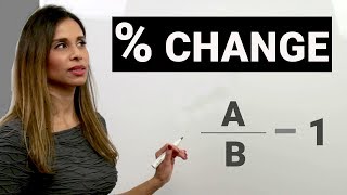
@pliskiniroquis , mathematically (End-beg)/beg is the same as End/Beg - 1.
@tillchelsea , you are welcome!
very nice teacher. Thanks
However, I may have been incorrect in my language in the video by using the term percentage. But the bottom line, when you see the number 0.12 or the percentage 12%, the machine uses only the 0.12 for calculating and the 12% is not a number it is a formatted symbolic representation of a number.
Very True!
Thank you!
@teohais , glad that you like it!!
I LOVE YOU MAN SAVE MY LIFE...
Excellent!!! Thank you so very much
awesome video, your efforts are highly appreciated
AWESOME!! Thank you for the magic!
Nice explanation. Thank you very much.
You are welcome!!!
Pretty clear
You are just amazing! Thank you!
This was very good one...
Thank you so much , your video was of so much help
Awesome video and a great reminder as to why Excel is such an essential business tool!
Quick question for you: I do everything EXACTLY as instructed, but the months end up showing in the middle of the graph instead of as a legend at the bottom. I can't figure it out. Suggestion?
Dear PrincessWithSkills,
But I have never taken the MS Excel Expert Exam!! Have you taken that exam? Maybe I should try it some time (but just because Excel is so much fun!).
--excelisfun
Great Info. Thanks.
You are welcome!
your video very helpfull to me.. tq soo much..
You're a legend sir.
thanks a lot for your help
Thank you so much for your tutorial it was very helpful. I took excel expert but I was not able to create the dual axis chart. the chart has the primary axis as column and the secondary as line. the chart has to show only where the two chart has value but if the secondary has 0 as value don't show the column data of the primary. Thank you so much.
Thanks! Just what I needed :)
Thank you very much.
You are welcome!
ExcelIsFun the UK and
absolutely cool video, much so much
Thank you! really helpful...
Thank you so much! It helped!
Great video. Question do you have a video for something with three data series and two chart types?
Thanks for the video! BTW, there's a typo in the Video Description's percent change formula. (It's missing the minus sign.)
Thank you sir, it really helpful :)
great and thanks a lot buddy
thanks))) this is video so useful
OMG !!! Incredible !!!
Dear capodaughter,
Thanks! But I am not the best with Excel (the best are at the Mr Excel Message Board), but I am a guy Having Fun With Excel!!
--excelisfun
Awesome !! Thanks
thanks a lot!!!
What about data table? How can we change the signs (percentage or currency) with data table in the chart?
thanks so much...
If I have dry/reefer cost of freight by carrier month after month for certain regions of the country and I want to see the % change in cost how can I put a chart together to see what the increase is?
Thats a useful formula. I'm interested in using a variant - percentage change from the zero day rather than from the previous cell in the series. Would you know the formula for that?
thanks !
What to do? if you have some values in your table equal 0
you can not divide any number by zero
Is there a video on how to produce percentage bar chart?
Hi Sungwan and thank you. I am wondering how you would go about adding for example the tax amount for each month and (should there have been a change in the %) show the change . When I try, the markers go in between the column graphs. i would like to keep them bang in the middle. Otherwise the graph does not make sense. Help appreciated.
thx alot bro
It's great video but one thing which is bothering me is what if i want to add date label and remove junk from both the axis ........it doesn't work, could you pl look in to that........Thanks
Wow
Glad you liked it, SORIF!!!!
good job
Hi There,
Can you please explain . why are we using -1 after End Value/Beg Value
Thanks in advance ...
whats the meaning of series 1, series 2? is it name of the columns in excel?
That is not correct. (a/b-1)*100 is a formula that was invented before calculators. The *100 is just for the facade: it is just a formatting that you use on paper. In calculators and Excel, when you apply the % format, the decimal number is still being used by the code underneath. 0.12 is a number. 12% is a symbolic formatted representation of the number 0.12. As an example, does 0.12 = 12? The answer is FALSE. So when you multiple a/b-1*100 you are fundamentally changing the number.
I created an Excel Table in Word and then created the graph in Excel like you outlined HOWEVER, the Chart doesn't save into Word with my table. All I see is the table. Is there a way that the Chart will save in Word, below the Table as it does in Excel directly?
thanks alot.
How to place %change between Jan and Feb Bar???
what is that -1 for? Was it referring to the "current month"-1?
Nice vdos.
I have a chart like this, but everytime I put new data, the labels (with percentages) dont all automatically update. Do you know what the solution for that is
Hi , when i am using % change, getting error#value!..Could you pls tell me what format i should select ?
Sir ! I would like to know if my Chart replaced by year instead of month, so how I can do that?
thanks sir
IS it possible to create a dynamic percentage change like the way you did for the creating a dynamic index function? Basically, I would like excel to automatically compute the percentage change for YoY change over past 3 years (for example, changes between Y1and Y2, Y2 and Y3, Y3 and Y4) as I add continually add the data?thanks
try THE best Excel question site:
mrexcel.com/forum
I forgot to ask. How to create a dual axis chart? where the primary is column and secondary is line but don't show the primary if the secondary is null. Thanks.