I agree with what you said:"so much paint so little time". That is even more true for people who have to work a job besides art at home. Seeing your test shows, there is no need to buy more or to swatch more than neccessary. Use what you have in the little time you have. Also I think that you tube art channels do a nice service testing products and showing the results. That being said on the other hand the what I call "swatch-artists" have totally gotten out of hand peddling products, encouraging horting of worthless cheap quality Amazon products, and hardly doing any art on their channels. There is time to look for product info when you are looking for a product but everything else is often redundant. Use what you have and don't fall for every fad thrown out on RUclips world.
Lol, 'swatch-artists' 😂 ... they never saw a paint they didn't love and recommend, but that's not the paint they use when they do art. That said, it can be inspirational to get something new and play around with it. I picked up some Daniel Smith on sale (secondary set is still $27 on Amazon). The SWC Shinhan 'tint' set popped up for about the same price, so I snagged it. It's about the cost of going to a movie and I'm pretty sure I can have at least 2 hours of fun with it. I have tried to mix my own because I wanted to paint along with somebody using the Art Nouveau set by Kuretake and I don't want to pay $40 for it. It was an interesting experiment, but for around $2 a tube I think it's worth it. Cheers.
I absolutely love da vinci paints. After trying a ton of brands they make up 60% of my main palette. Where as Daniel Smith and M graham only 2%. That is doing color to color comparison and picking my favorite. I encourage you to play with them! Thanks for the video! They definitely don't look as opaque as gouache, they have a luminosity that is missing from the gouache. Happy painting
My friend got me that Painter's Diary for me for my birthday and it was the best gift I received. So happy it saves me from having to draw out swatch charts; now I can just go directly to the painting on 100% cotton watercolor paper! Da Vinci is great! Thank you for swatching out and talking about the Spring set. I had been looking at it but instead will get the new Denise Soden colors at Da Vinci, Stormy Blue and Denise's Gray!
The swatch book has given me a good idea of what to do. I’m going to make my own swatch book using sheets of watercolor paper, binder rings, a ruler, and a waterproof micron pen. Thanks.
Yeah. I bought a set of pastel watercolors once. I poured them into pans, swatched them, ... sold them on a second hand marketplae. Ahem. I find pastels useful in my paintings sometimes, but I can mix them real quick with just some PW6.
Honestly, do we really ever NEED more watercolours? 😂😂😂 Never! We still want all of the colours, though 😊. So, thanks for this review. Da Vinci is not available in Europe, but it is always fun to watch people trying new paints. Thanks, Steve!
I saw those paints on a couple of sites and it just left me flat. I have an enormous tube of white gouache. I can make any pastel in the known universe on my own if I want to. But that swatch book! I have wondered about that for ages! Looks great! Thank you!
Terri Light - I bought one several months ago. Finally got around to using it and I really like it. Before all my swatches were scattered around in several books, files, on tables and under them. I took each pallet that I normally use and put each paint into that book in the same order as I found it on my pallet. Then I labeled each paint swatch with its given name and added its ATSM number (Pb-12, Pw-1, etc). The overall page was labeled by the name of the paints, ie Windsor-Newton, MungYo, etc. Then I set out to mixing new colors with the ones on the pallet. Man was I surprised with what I came up with. I discovered more ways to make browns, oranges, grays, etc. than I thought possible. In one case my mixes caused me to get to the end of that page. In order to continue I simply removed a back page and its cover sheet and re-inserted it behind the page I was working on. Of course each mixture was labeled for future use. This really saved me a lot of paint. No more experimenting when trying to make a color I did not have. Just look in the book and one quickly gets enough information to make the proper mixture with a minimum of fuss.
@@OkieSketcher1949 Thanks so much for that info! Sounds like a process that I would benefit from. I have a tendency to chase color mixes and a good way to store them would be a bonus!
Agreed so now it in in my Amazon cart...waiting to recover from the order I just sent to thrift books for every Bateman book they had.........and down the rabbit hole I go.
Thank you for this. It really helps those of us who have not been doing watercolor that long. I already have more brands and more paints than I could ever use in a lifetime.
and there-in lies the problem... stick with a single good brand like daniel smith... buy jsut a few, mix and play and learn... try and avoid supply overload! I continue my goal of not buying any new paints and supplies but instead using what I have... so far so good.. going on 2 years now!!
the more i think about paints, the more i realize i only need a handful like 7 pigments along side some neutrals. i mean Monet only bothered with 6 or so and he made enough impact on the artworld as it is.
Thanks for your time and talent. I have enjoyed your teaching style, and running commentary as you teach us what you love. It shows in every video, but one thing that I have been curious about is this, because I am an aviation mechanic I have noticed throughout many videos over the years is there a story about the F- 86 Saber on top of your shelf,it is one of my favorites. Thanks again Steve.
Lovely colors, but as even I explored in my “white watercolor” video, this is exactly why white comes in most palettes. Sadly, most people ditch the white and never explore how useful it can be. You provide a great reveal of these paints and despite being a luxury purchase (beyond convenient colors), they might come in handy for the right project. And they save time from making your own. Not something for me but good to watch you swatch and hear your thoughts. I think I just rhymed! Lol!! Hoping all is well Steve!! Great work on this.
Oh, nice! I'll look for your video on whites. I'm following somebody who uses the Art Nouveau set in her tutorials and tried to mix my own. It was a fail for that purpose but fascinating all the same. I was amazed at the way the white carried the pigment even into the faintest washes. Fun stuff.
Thank you, Steve! This was extremely helpful! I admired these when they 1st showed up, but my instinct was similar to yours, so I didn’t get them. You taking the time to show how to approximate these colors is wonderful. I have a huge palette of M. Graham colors and now I’m inspired to see what “pastels” I can make adding white gouache.
Hullo Steve, I have been tempted by the Jerry’s swatch book! It sure looks good and keeps the swatches all in one place and on the same paper! I am just a sucker for “new” paint colors and knowing how to mix colors, tints and shades is much more important with gouache than transparent watercolor! Convenience colors are always convenient! But rarely necessary for any artist but they can be very fun! I even got some macron pencils knowing that I have similar colors with my Prismacolor colors! I am firmly in the DaVinci camp and I have not purchased other brands in any quantity, the company has treated me just the BEST! Cost is a consideration for most everyone and DaVinci is the best all around professional paint company period. I enjoyed watching your swatching, I am also a guy that makes most of my mixes, but I did buy Denise’s new palettes for true support for a friend. (The new opaque palette & re-worked wildlife and Earth Friendly versions) It is how I was exposed to DaVinci to begin with. DaVinci has all but taken over my 40 well studio palette! I have several small palettes that feature other brands.
Thanks for this video. I feel the same about Davinci's gouache. It's basically slightly heavier pigmented watercolor rather than designer gouache with the white mixed in. I was reluctant to purchase the pastel set because I usually work with transparent watercolors unless I am using gouache....but now that I see these watercolors act more like a gouache I may purchase this set.
Thanks for the review . I just ordered this set. As you say, not sure why I had to have this, but your review is very timely! Nice mixes with these selections.
I have been loving using semi opaque watercolor like this in wet on wet applications. The velvety texture is so unique. It's been especially fun to play with this texture in florals. I have a couple of these colors on the way, but skipped the set. I already have lavender which is amazing for transitioning from blue to yellow in skies. And Sennelier makes a beautiful buttery Naples Yellow, so I knew I wouldn't use that one.
That peach color is INCREDIBLY similar to Schminkie’s Naples yellow reddish, you should look at them side by side, thanks always for saving us money ! 😂
I like the way you compared the different paints. Pretty educational and points out the need for all painters to actually put their paints onto water color paper and see what it is they are working with. I for one do not use opaque paints, but it is good for me to see what it is I am not using. Who knows? Someday I may decide to change my pallets. I also need to add that I recently purchased one of the Paint Color Diaries and put most all my of different pallets onto a page or their own. I even went so far as to do a series of mixes to see just what mixed colors I could develop. What an eye opener for me! Some of my pallets do not have anything approaching a brown. Now I can easily and quickly see what colors in that particular pallet I need to mix to get the brown I need. Same goes for greens, oranges, etc. This allows for a more conservative use of the limited paints I have right now (the costs for some tubes have gone way up in my area so my limited budget tells me to be conservative). I do like the book. It is easy to use and it appears to be something that can and will be with me for some time to come. One last item. I am in the process of asking artists what services they use when it comes to making and shipping prints of their work, to include where necessary matting and framing. Red Bubble was one such company I was going to look at this week on the suggestions of several artists I have spoke to. Lo and behold today I watched a video concerning Red Bubble. I have a feeling this is not going to be one of the companies I will look into. I believe you do use, or have at one time, Red Bubble. If you care to comment about this I would be interested. I really like your work and I do respect your opinion based on what I have heard over the past several years. Thanks again for all you do. -OkieSketcher1949
Not done much with Redbubble at all in at least 3 years. Their art prints aren’t bad but I’ve not done enough more recent research to offer valid recommendations. Let me know what you find out.
@@mindofwatercolor - It took a few days but I was able to get back to several artists in regards to Red Bubble. It appears several have not posted anything with them in several months/years and have no future plans to use them; some were planning on posting their latest creations, but are not going to. They will go elsewhere.I guess that pretty well ends any further investigation into this ‘service’ and sends me elsewhere. -OkieSketcher1949
Schmincke has a 12 15ml tube pastel "Icy colours" set, in their Akademie line. I think they would be good for card makers, rather than landscape painters. Oh, and White Night's (from Nevskaya Palitra) launched a pastel set around 2019/2020. Maybe it's a thing? Not my cup of tea but surely there is a market. Thanks for the review
I’ve been doing it and experimenting with my watercolors and add TWhite, is like you have Gouache, very, very similar. I did it with my W&N, and many others. Many blessings to you and yours ❤
I’m really appreciative you published this video. I’ve been trying to understand for some time how to effectively paint with a combination of gouache and watercolor paints. John Lovette, an Australian artist does this, but I don’t know anyone else. Javid Tabatabaei does beautiful watercolor work on his You Tube channel. But he uses a combination of transparent and opaque watercolor. I’ve only seen him use white gouache for highlights. I haven’t liked gouache much because it seems chalky and flat versus watercolor, but as an oil painter, I understand how to use it better than water color. Thus my interest in combing the two. So, if your cats multiply and you get curiously adventuresome, I’d be interested in seeing some of your attempts at combining the two mediums. Thanks so much for all you share.
Thanks for sharing this Steve. I'm surprised to see DaVinci make a pastel line of watercolor. I guess they just want to keep up with Daniel Smith, since they too have several pastel colors made with titanium white and many people are going for them. Holbein also has some pastels made with PW6 for year's. I'm sure interested in that swatch journal! Thanks again!
Thank you for this video. We need more of this kind of review. Although it’s fun to try all the new stuff, do we really need it or can we use what we have in a different way to achieve the same thing? I have been wondering about that swatch book, so now I know it is worth the money. I always learn something new from you and enjoy your sense of humor. see you next time!😎
I have WN gouache starter set and just starting to experiment with them. I also have a bunch of American Journey ( made by Da Vinci) that are opaque so I'm using them ala the style of Wyeth and it's very interesting to paint with opaque colors and dilute them to get transparency yet can get moody or subtle effects. I am waiting for an order to arrive and that swatch book is in my order along with a set Rembrandt pan paints in a tin. I have many brands of paint and have a love/ hate relationship with ALL of them. Lol!
I got into watercolour to save money. Sure it can be expensive. But with gaming I can spend £100 at 3am on a bunch of games I'll never play. Or, in the computer world we spend £3k every 18 months on a laptop. Music production, ha, hah. I could spend £2k on a box that makes noise and hate it. The more I get into watercolour, and being monocentric, I am saving a fortune. What is £100 on paints that will last over a month of use. £300 on a field easel that will be used for years, or £450 on a brass palette that will last a decade. You could spend £10k on a music production setup and be seriously left wanting. If you spend £10k on a watercolour kit you would be in a dreamworld for a good year, or more. Be thankful, watercolour is a relatively small and narrow rabbit hole to most.
Okay l am laughing at my guess. Glad you did the swatches. Recently I had an idea for purchased watercolor that I am not that wild about. Keep it separate from other water color and when I use it, mix it with white and make my own qouache. It will been fun for journals and I won’t feel so bad about the money I spent on them.
Even before you looked... I was like let me guess these all have PW6 in them right. :) Ya just buy a tube of T white gouache, Chinese white, or perhaps even a buff titanium.
I totally saw these and immediately was I need these but then I read more and was like uhmmm maybe not. Either way their beautiful but not "traditional" colors. Now I'm watching the video and seeing what you think of these. Have a great day
Thanks for sharing your thoughts on this new DiVinci paint & the new swatch book (I have been thinking of getting a couple of them too). I can see how these colors could be great for ready made colors for certain subjects/uses like Florals, Blue & Purple (skies), Green (grasses/foliage), Peach (skin tones) but yes probably not necessary. I already use Winsor & Newton for both my choice of watercolors, gouache, watercolor pencils & colored pencils. Thanks again for sharing this informational video with us.
I have that swatch book and love it. I like to be able to see all a color family at once. I also have that stamp set and made my own cards. There were some colors not on cards because I needed to make more cards. I like both swatching options. I put more info on the cards. I just have the name and pigment numbers in the book.
I got the swatch book too. I now wish I had gotten two of them because it is cheaper, and I am very happy with it. But the pastels aren’t going to be on my radar.
thanks Steve! i appreciate the comparison you made between the different types of paint. They are nice but honestly if you really like pastels you can make them yourself and you don't have to be limited by the palettes or color choices from that brand. I'd just use liquid watercolor and add it to my pw6 :)😅
These are definitely more for convenience's sake than actual usefulness... And I agree with you when if comes to lightening a watercolor paint, just add water. And if you want gouache or tints? A tube of white gouache + watercolor will go a LONG way XD
I was just telling myself that I can’t buy anymore art supplies for a month! So thanks for your great reviews 😅(but that swatching book looks very cool🙃)
Daniel Smith also has all lightfast pigments in their gouache, so doesn't need to obscure their pigment content like some of the other brands do (Holbein). Their white has been troublesome to rewet. The rest of their gouache paints are glorious in every way....but also the most expensive. Yes, instead of "opaque watercolor," just get gouache and thin it out or add some white. Of course, DaVinci is the least expensive of the brands, so that should factor in as well. Thanks for the review. Interesting and entertaining.
You make me laugh sometimes…your comments about being a sucker for new/more art supplies. I could start a small store, but still keep on. It’s addictive! This was interesting, but I’m glad YOU tried out the pastel paints. They would not tempt me. Ever heard of a brand Grable? I just ordered a travel set from them. Supposed to be artist quality. I liked the little palette. Ha!
I swatch when I get new paint , otherwise I swatch when I am in a slump. It regenerates my joy in playing with color. I find gonache to be "pastelly" anyway. So swatch book ordered but not really a need to buy the paint just to own it. Recently saw a video about M Graham and a mold issue which I have never experienced. Have you? M. Graham still my favorite watercolor. And you are still my favorite Yontube channel. BTW Lebenzon itty bitty brushes are my favorite fiddlers.❤
Nope, no mold ever. In fact honey formulation prevents that. Honey is a natural preservative. If someone got mold it was likely from another contaminate. Student grade paints are famous for mold, probably because of the fillers.
oh no - it's always the same when it come to pastel watercolors :( ......... but first i wanted to thank you steve for another ver interesting video......back to the pastels....... well most reactions you get to pastels is usually........ 1) thy are opaque - there is no use and no place 2) if you really think you need them they are easyly mixed by adding white.... well - both statements too me fel alittle bit narrow sighted - why is that? lets answer the second one first yes you can easyly mix them yourselfe - the same is true for any other convenience color - so please guys go check your palettes for conveience colors - thorugh them out and go for a basic palette :) the second one - when we call them pastes there use is questionable -their opacity is bad - okay lets dont forget pastl watercolors are widely used and loved - simply uner other names like, naples yellow, jaune brilliant, lavender, wisteria, verditer blue and s on....and there are many artist out there using them and doing great things with them......... i felt the need to play a little bit of devils advocate here in order not to get the discussion to one sided :)............have all fun painting - with or without pastels :).
Yup, I thought the same things……… this did not appeal to me at all. I am a huge DaVinci fan in general but all companies have their marketing 🤑 I mean, Holbein has been producing a pastel set for years. That said, the sets are very good deals and I do recommend them!
“Just dilute it with water” but can you really get eg strawberry milkshake color without mixing with white? Or peach? I like their paints and have bought a few “tints”. Didn’t realize gauch was the same. Thanks for the video.
Thanks for this👍 Pastel watercolours, or even titanium white has never been on my wish list because of the opacity. I like watercolour for the transparency and pastels seem to be too gouache like
Great info. I think these might be good for colorists. They're pretty. The swatch book would be extremely useful. I just ordered two so your review is very timely. I'm very interested to try them.
I think beginners might find these a lot more appealing. It can be difficult and intimidating to learn how to mix colors. I, personally, find consistency a real challenge. Thanks!
I have noticed some manufacturers of materials putting out 'pastel' lines. (Markers, colored pencils particularly). Perhaps this was the motive behind these DaVincis? I have a curated collection of their regular watercolors and I like them, and I have a travel brush which is pretty good too. Good demo/comparison. Thanks Steve!
There is some room for “pastel” and opaque watercolors for me, but not the ones with titanium white added. I like pg50, py216 and py53 which are titanium dioxide, but not mixed but doped with different ions that add color to it. I love them for the skies and sunsets. Moreover, I recently synthesized spinel doped with chromium (pr235, I believe) that is a light pastel and yet transparent color, that may be useful to regulate the diffusion of paint on the page while adding some tone. So I’ll pass these pw6 mixes, but thanks a lot for the review nonetheless!
@À Strand they are not actually transparent, but semi-opaque in watercolors. They are in several brands, Winsor and Newton has them as nickel titanate and Turner's yellow, Schmincke has both yellows. PG50 is in Daniel Smith and many others in different blue and green variants.
Love the color diary. Will get one for myself. I have a question: what is the best fan brush for watercolor? All the high end fan brushes I have been buying end up like chicken feet
M.graham was my 2nd pro watercolor set, my first was qor. Now I have more brands than I can keep up with. I swatched all my brands out where I had the same pigments...and m.graham is by far the most pigmented; more so than qor, daniel smith, senillier, and others. But I do think a contender might be Roman Szmal. I don't know how they get that much color into one halfpan. However I don't have the same colors to make a comparison.
Steve turned me on to M. Graham and I'm so glad he did. They don't have the 1 million unique DS options, or the unique mixes schmincke has. What they do sell is just solid highly pigmented smooth paint. I actually love M graham goauch a lot more then Steve does. For me traditional gouache wasn't specifically 100% opaque... I since the 30s people have just come to think 100% opaque since designers gouache became a thing and traditional gouache mostly faded away. M. Graham is imo traditional gouache.
They are nice but useful as a confidence mix. You are guaranteed the exact same pastel base tone and hue to then mix from. They are useful but not ‘necessary’. Less expensive to have titanium white gouache + regular watercolours. People you can also premix convince mixes I. Empty half/full pans too!
Designer Gouache by Winsor Newton and Schmincke have white mixed in the pigment in the tube. "Gouache" by Schmincke does not have white in the paint. Other companies do the same thing -- you need to check the brand you are looking to buy to understand what they have in the tube. James Gurney contacted several companies and asked them what the difference is between their watercolors and gouache if white is not in the tube. Schimincke lets you add the white - titanium or their "transparent" white which is zinc? Schmincke Gouache - they say difference between their watercolor and gouache is is that the watercolor pigment is more finely ground. I have used all three of their lines and I agree with their statements. I find their watercolor paint to be more vibrant even with white mixed in. But I like them both. I find I do not use the Designer series as much because I usually start paintings as transparent watercolor and end with gouache if I need to. I believe Winsor Newton paints have gone down a different path than most manufacturers with using a different binding agent in their pans vs.tube paints. Their watercolor from tubes rewet in pans but not like their pans or other brands paint. I think this can be used to your advantage on a painting when you put a wash over the top of previous paint without not reactivating as quick but I do not have experience with that. Thank you for covering the range of topics you do. I have not searched through all your videos to see but do you have videos on work like the one you did of the Star Wars pilot ? (More commercial style painting) Whould be nice to understand your process and it might help others that are looking at the field of art to understand what some of the challenges you have if you are in that market.
Don't really have any commercial style illustration videos to speak of. That's what I used to do professionally, but left that behind. Now just landscape and the occasional portrait.
Thanks Steve enjoyed this especially the swatch book bought one here from your link was curious if you were setting it up with all your paints would you go by colors all greens all yellows on one page and so forth so forth or by types of paint such as semi trains. Or opaque ? This might be fun for you to show us!
Da Vinci, while not as well known or as highly marketed, is a company making in my opinion, some of the best watercolors on the market. Also, without deceptive marketing schemes. The sets they offer in my opinion are convenience oriented, but not just hap-hazardly done to wonder what they were thinking. Da Vinci truly appreciates their customers/artists and in their efforts to demonstrate this, they have worked with artists who use their paints to create tailored palettes and sets that are convenient to that artist in their own style and choices. So, you can take them or leave them, but you will always have the choice of selecting your own colors from their list according to transparency/opacity and pigment properties. Mostly I have stuck with unique single pigment offerings, or colors that are convenient but more tricky to create quickly, especially if I find myself using it quite often. I own at least 40 colors each of M. Graham, Da Vinci, Lukas 1862... Along with at least 30 colors of Paul Rubens, ShinHan, Nevskaya Palitra (both in White Nights and Sonnet) Plus many other curiosity sets. The fewest of any one brand I have is Daniel Smith, which I feel is severely over priced for what I call fad club status offerings. I almost started down that road... enough said. Out of the many I have tried, I find that Da Vinci is my number 1. They are dependable, affordable quality, good binder that doesn't shrink and crack, easily re-wettable, well behaved, stable, and have a nice finish on paper without drying issues, tackiness or shiny spots. M. Graham is probably my #2, but only because of the inherent issues with using honey as a humectant binder ingredient. They can melt in heat and humidity, stay tacky for long periods of drying time, and leave a sheen in places... but make no mistake, they are fantastic pigments that really excel in washes and wet into wet deliberation. But overworked they can become just as muddy as the next brand. Lukas is my all around beater shoes. Not fancy expensive shoes, but good shoes that hold up. Yes, they are a little on the more opaque side in comparison, but that is also why they are so vivid. I would say they remind me a lot of Van Gogh, Royal Talens offerings.
Davinci is my favorite too but DS does have quite a few beauties! Aussie red gold. Quin sienna. Azo. Green gold. Kingman turq. Sleeping beauty. Easy to make the convenience colors on your own in most cases but there are a few that must be DS for me. But DV is my all time favorite too. ♥️
I agree with you. The only one worth it seems to be the Naples Yellow. Really beautiful color. It seems very luminous. Is it the screen or did it seem like this to you too? Do you know another Naples Yellow with that luminosity? If that's the right term. Thanks!
Hi Steve! I just reviewed the Da Vinci sample dot set of 110. Spoiler…loved the paints, not too big a fan of the packaging to use as a palette. One viewer shared with me the idea of cutting the dots out of the cardboard and using them from a ceramic palette. Genius! At any rate, Da Vinci seems like they are making their watercolors unique with their curated sets. This pastel set seems a prime example of that convenience curation. I like their PW6, but any will work. Did you see their Bright Spring Watercolor Set? That might be a good option for some artists- myself included, lol- with an added PW6 you could just about have 2 curated palettes in one❤️
Your telling on yourself with the pallet pad... Shop at Jerry's artarama? Lol good on you I absolutely love Jerry's and their sales can feed that curiosity. ❤❤❤
As someone who uses both watercolour and gouache, there is a big difference to me between gouache and opaque watercolours. There's been a trend in paint manufacturers making a line of gouache and boasting "we don't use any opacifiers," and the moment I hear that I immediately lose all interest. Because some pigments are simply worthless in gouache without the added white. The binder might be similar, or even the same, but that isn't the only thing that makes a paint. Gouache should be made with a much higher pigment load to begin with, which on it's own makes it streaky and even muddy when used watered down, but gives a velvet matte finish when used in mass tone. I think the differences are demonstrated quite well in your swatches. And that's not to mention the potential use of watercolours made with more opaque pigments, or convenience mixes like these. I think the differences are demonstrated quite well in your swatches.For an idea, I'd look at the works of JWM Turner; he used usually blue toned paper and painted opaquely, and his paintings have such a vibrancy and luminosity to them.
Seems to be a new marketing game: These are 'convenient pastel colours' with a fancy name. Another brand has 'dust colours' and those all have PBK11 added to the 'normal' pigments.
@@awatercolourist There are other companies doing the same thing, and there are an incredible number of ArtTubers who are overly-keen on the latest fashion, and by promoting the product, encourage a lot of others who are less pigment-savvy folk to spend money they don't need to spend.
@@MrsBarnabas 👋🏼 I know what you mean. But new art supplies do bring overwhelming joy, so I honestly can’t blame them 😄. But it is not for me. I tend to be more judicious in my purchases. I will confess, though, that my wishlist is long 🤣. There are so many pigments and brushes out there that I have not tried yet and many companies that I would love to try. M Graham tops my list, so does A Gallo. And I hope to get to try the Roman Szmal tubes one day, once they are out. Luckily, art supplies are very expensive for me and there isn’t a wide variety where I live, so I get to keep my money 😂. And I can’t get paints from Jackson’s due to the customs here. I am considering trying some new brushes now that they have a brush sale. Not the best sale, though 🫤.
@@awatercolourist _new art supplies do bring overwhelming joy ..._ Yes, they do, don't they! Jackson's deal with the customs and show the costs at the checkout, so we can change our minds if we have to, which I really appreciate. Like you, art supplies are now very expensive for me, not because of where I live but because of cost of living rises, etc, but I still enjoy living vicariously through the ArtTubers - eg Creating Cute Art - whose joy overflows wonderfully as they show us "what's in the box." It's not so good when some of them are buying for buying's sake, or because art hauls are click bait which will boost their channel... It's taken a while to deal with the "I want that!" feeling, which I had so badly last year, while I was ill, but I'm sort-of there. I just look at the bank balance! So much choice, and I really do have just about all I need to thoroughly enjoy my art, in various mediums (enough of each), so it's not really so bad. I do have a wish list, but it's mostly just adding things like coloured pencils, or replacing those which need it with something proven to be a little better, and justified in terms of what the Americans call, "Bang for your Buck"... Eek! It's late! I should have been in bed and hour or more ago! Thanks for the chat. Sleep well, AW, if it's that time where you are, or enjoy the rest of your day, if not! 😄
@@MrsBarnabas Thanks MrsB! I should indeed be in bed! Thanks for the chat 😊. I never thought that art supplies are being bought for buying’s sake. Even when I was very, very, very generous with my spending and going on a spending spree, I still had to be judicious about what I bought because the paints (Schmincke) where I am are exceedingly expensive. There are many paints that I would love to try and explore but the prices really bite, even without the cost of living crisis. With that in mind, I never thought anyone would buy materials for buying’s sake. I’m sure I’ve done it with less expensive things, but not with art supplies.
very informative as an FYI I also like Waffle Flower swatch stamp but found it inconvient to pull out all the stamping stuff just for one or two swatches . I found a template on Etsy the same size and infp which is very easy to grab and make one or two awatch card using a fine liner. Still for making larger number of card I would still use the stamp. Take care.
@@mindofwatercolor Fantastic would love to see the template. I would like a sheet template made of 1.25 inch by 2 inches would she be interested in making it and how much would she charge? I do not have a Cricut.
Thanks for this comparison of the DaVinci pastel watercolors and other brands of transparent watercolors plus titanium white gouache. I have a few DaVinci watercolor tubes from a number of years ago, but I admit, I'm using them up and likely won't be replenishing with the brand. Not knocking them at all, it's just that I've discovered other brands with greater concentration of pigments that I prefer. Thanks for saving me a some money as I too have made a lot of discovery purchases in art supplies over the years!
So I’ve been looking at this set, but also…. I’ve been researching gouache and watercolor. You’re telling me all I need to do is add t. White gouache to my watercolors and I don’t need gouache?
Sort of. Gouache colors are more opaque and sit on top of the paper a bit more but just adding Titanium while to watercolors is a good way to try it. If you paint more transparently like I do it’s fine either way.
For me the real review is in a sketch and mixing "wheel", as you do in your other sketch books. I don't buy any more paint. I have been disappointed by other reviewers just swatching. I've bought the hype. That said, though, there is a different style for everyone so clearly brands are trying to create convenience for all styles.
Yes, it's great when a reviewer will go the extra mile and demo the product in a painting. I'm not interested in buying into any other brands now, but I will watch the uploads of one particular youtuber with an extensive list of watercolor reviews solely because he does puts great effort into each and always finishes the review with a sketch demo.
I don't have a lot of Sennelier but what I have is nice. i enjoy them. They don't rewet quite as quickly and are slightly less transparent but great colors all the same.
I have a large selection of sennelier and they are. transparent and so silky smooth. Nothing lays down as beautifully as sennelier. I love m graham too but sennelier is in a class of its own. It’s like the rolls Royce of watercolor imo. And they are all super easy to rewet imo except maybe raw umber? But I love the fun colors and high quality of Davinci best. Most brands have their place in my art world though. I like options for different moods or whatever. 😊
@@LCLand I have both and agree with you. Furthermore Sennelier lifts better than any other brand! If you do a lot of lifting of color you will be amazed at what you can with them. They are exquisite.
In that gouache review I said the top three were practically on equal footing. I said here that W&N is “traditionally” what artists think of as quality gouache. Smooth, velvety, highly opaque, tons of colors in the range, most well-known brand.
@@mindofwatercolor Would you believe it, I don’t remember that at all 😂. I distinctly remember that Schmincke came out on top and that you spoke of it in very glowing terms. I really should watch that video again. Thanks for your reply 🙂.


"Curiosity killed the cat, but satisfaction brought him back". Convenience pastel gouache paints sounds about right.
I agree with what you said:"so much paint so little time". That is even more true for people who have to work a job besides art at home. Seeing your test shows, there is no need to buy more or to swatch more than neccessary. Use what you have in the little time you have.
Also I think that you tube art channels do a nice service testing products and showing the results. That being said on the other hand the what I call "swatch-artists" have totally gotten out of hand peddling products, encouraging horting of worthless cheap quality Amazon products, and hardly doing any art on their channels. There is time to look for product info when you are looking for a product but everything else is often redundant. Use what you have and don't fall for every fad thrown out on RUclips world.
Lol, 'swatch-artists' 😂 ... they never saw a paint they didn't love and recommend, but that's not the paint they use when they do art. That said, it can be inspirational to get something new and play around with it. I picked up some Daniel Smith on sale (secondary set is still $27 on Amazon). The SWC Shinhan 'tint' set popped up for about the same price, so I snagged it. It's about the cost of going to a movie and I'm pretty sure I can have at least 2 hours of fun with it. I have tried to mix my own because I wanted to paint along with somebody using the Art Nouveau set by Kuretake and I don't want to pay $40 for it. It was an interesting experiment, but for around $2 a tube I think it's worth it. Cheers.
Hey Steve, as cartoon illustrative artist I immediately saw that these paints can be used in my art style. Try drawing and painting more cartoony 😊
I absolutely love da vinci paints. After trying a ton of brands they make up 60% of my main palette. Where as Daniel Smith and M graham only 2%. That is doing color to color comparison and picking my favorite. I encourage you to play with them!
Thanks for the video! They definitely don't look as opaque as gouache, they have a luminosity that is missing from the gouache.
Happy painting
My friend got me that Painter's Diary for me for my birthday and it was the best gift I received. So happy it saves me from having to draw out swatch charts; now I can just go directly to the painting on 100% cotton watercolor paper! Da Vinci is great! Thank you for swatching out and talking about the Spring set. I had been looking at it but instead will get the new Denise Soden colors at Da Vinci, Stormy Blue and Denise's Gray!
The swatch book has given me a good idea of what to do. I’m going to make my own swatch book using sheets of watercolor paper, binder rings, a ruler, and a waterproof micron pen. Thanks.
Yeah. I bought a set of pastel watercolors once.
I poured them into pans, swatched them, ... sold them on a second hand marketplae. Ahem.
I find pastels useful in my paintings sometimes, but I can mix them real quick with just some PW6.
I like that swatch book! Thanks for showing these paints.
Honestly, do we really ever NEED more watercolours? 😂😂😂 Never! We still want all of the colours, though 😊. So, thanks for this review. Da Vinci is not available in Europe, but it is always fun to watch people trying new paints. Thanks, Steve!
Thank you for the information of the swatchbook. I am definitely interested in that!
I saw those paints on a couple of sites and it just left me flat. I have an enormous tube of white gouache. I can make any pastel in the known universe on my own if I want to. But that swatch book! I have wondered about that for ages! Looks great! Thank you!
Yup!
Terri Light - I bought one several months ago. Finally got around to using it and I really like it. Before all my swatches were scattered around in several books, files, on tables and under them. I took each pallet that I normally use and put each paint into that book in the same order as I found it on my pallet. Then I labeled each paint swatch with its given name and added its ATSM number (Pb-12, Pw-1, etc). The overall page was labeled by the name of the paints, ie Windsor-Newton, MungYo, etc. Then I set out to mixing new colors with the ones on the pallet. Man was I surprised with what I came up with. I discovered more ways to make browns, oranges, grays, etc. than I thought possible. In one case my mixes caused me to get to the end of that page. In order to continue I simply removed a back page and its cover sheet and re-inserted it behind the page I was working on. Of course each mixture was labeled for future use. This really saved me a lot of paint. No more experimenting when trying to make a color I did not have. Just look in the book and one quickly gets enough information to make the proper mixture with a minimum of fuss.
Just bought my own swatch books, thx for this product demo!
@@OkieSketcher1949 Thanks so much for that info! Sounds like a process that I would benefit from. I have a tendency to chase color mixes and a good way to store them would be a bonus!
Agreed so now it in in my Amazon cart...waiting to recover from the order I just sent to thrift books for every Bateman book they had.........and down the rabbit hole I go.
Thank you for this. It really helps those of us who have not been doing watercolor that long. I already have more brands and more paints than I could ever use in a lifetime.
and there-in lies the problem... stick with a single good brand like daniel smith... buy jsut a few, mix and play and learn... try and avoid supply overload! I continue my goal of not buying any new paints and supplies but instead using what I have... so far so good.. going on 2 years now!!
Lol thats me too!!!! I just cant resist getting a new 'something' for my studio....and now i am off to get the swatching book!!!! :) xxx
@@juliewilliamsnewzealand818 STOP the madness!!! 🙂
@@pesto12601 lol
the more i think about paints, the more i realize i only need a handful like 7 pigments along side some neutrals. i mean Monet only bothered with 6 or so and he made enough impact on the artworld as it is.
Thanks for your time and talent. I have enjoyed your teaching style, and running commentary as you teach us what you love. It shows in every video, but one thing that I have been curious about is this, because I am an aviation mechanic I have noticed throughout many videos over the years is there a story about the F- 86 Saber on top of your shelf,it is one of my favorites. Thanks again Steve.
No story in particular. It was a gift from my Uncle. He and I share a love of military aviation history. F-86 is a favorite of mine too.
Lovely colors, but as even I explored in my “white watercolor” video, this is exactly why white comes in most palettes. Sadly, most people ditch the white and never explore how useful it can be. You provide a great reveal of these paints and despite being a luxury purchase (beyond convenient colors), they might come in handy for the right project. And they save time from making your own. Not something for me but good to watch you swatch and hear your thoughts. I think I just rhymed! Lol!! Hoping all is well Steve!! Great work on this.
Thanks so much Mark. Well said and I agree. I can see the designer or decorative painter loving the repeatability of these hues.
Oh, nice! I'll look for your video on whites. I'm following somebody who uses the Art Nouveau set in her tutorials and tried to mix my own. It was a fail for that purpose but fascinating all the same. I was amazed at the way the white carried the pigment even into the faintest washes. Fun stuff.
Thank you for showing us comparisons. It is so useful to know what to look for.
Thank you, Steve! This was extremely helpful! I admired these when they 1st showed up, but my instinct was similar to yours, so I didn’t get them. You taking the time to show how to approximate these colors is wonderful. I have a huge palette of M. Graham colors and now I’m inspired to see what “pastels” I can make adding white gouache.
I have a couple of those swatch books and really like them.
Love the honest comparison. Thank you.
Hullo Steve, I have been tempted by the Jerry’s swatch book! It sure looks good and keeps the swatches all in one place and on the same paper! I am just a sucker for “new” paint colors and knowing how to mix colors, tints and shades is much more important with gouache than transparent watercolor! Convenience colors are always convenient! But rarely necessary for any artist but they can be very fun! I even got some macron pencils knowing that I have similar colors with my Prismacolor colors! I am firmly in the DaVinci camp and I have not purchased other brands in any quantity, the company has treated me just the BEST! Cost is a consideration for most everyone and DaVinci is the best all around professional paint company period. I enjoyed watching your swatching, I am also a guy that makes most of my mixes, but I did buy Denise’s new palettes for true support for a friend. (The new opaque palette & re-worked wildlife and Earth Friendly versions) It is how I was exposed to DaVinci to begin with. DaVinci has all but taken over my 40 well studio palette! I have several small palettes that feature other brands.
Oh my gosh! The colour diary! Just ordered 2 for myself😂🥰
Excellent comparison (and explanation of comparisons), thank you!
Thanks for this video. I feel the same about Davinci's gouache. It's basically slightly heavier pigmented watercolor rather than designer gouache with the white mixed in. I was reluctant to purchase the pastel set because I usually work with transparent watercolors unless I am using gouache....but now that I see these watercolors act more like a gouache I may purchase this set.
Thanks for the review . I just ordered this set. As you say, not sure why I had to have this, but your review is very timely! Nice mixes with these selections.
Lol...I ALMOST Bought this set from DaVinci BUT I researched the Pigment codes first brilliant minds think alike. Enjoy your channel. Be Well.
I have been loving using semi opaque watercolor like this in wet on wet applications. The velvety texture is so unique. It's been especially fun to play with this texture in florals. I have a couple of these colors on the way, but skipped the set. I already have lavender which is amazing for transitioning from blue to yellow in skies. And Sennelier makes a beautiful buttery Naples Yellow, so I knew I wouldn't use that one.
That peach color is INCREDIBLY similar to Schminkie’s Naples yellow reddish, you should look at them side by side, thanks always for saving us money ! 😂
I like the way you compared the different paints. Pretty educational and points out the need for all painters to actually put their paints onto water color paper and see what it is they are working with. I for one do not use opaque paints, but it is good for me to see what it is I am not using. Who knows? Someday I may decide to change my pallets. I also need to add that I recently purchased one of the Paint Color Diaries and put most all my of different pallets onto a page or their own. I even went so far as to do a series of mixes to see just what mixed colors I could develop. What an eye opener for me! Some of my pallets do not have anything approaching a brown. Now I can easily and quickly see what colors in that particular pallet I need to mix to get the brown I need. Same goes for greens, oranges, etc. This allows for a more conservative use of the limited paints I have right now (the costs for some tubes have gone way up in my area so my limited budget tells me to be conservative). I do like the book. It is easy to use and it appears to be something that can and will be with me for some time to come.
One last item. I am in the process of asking artists what services they use when it comes to making and shipping prints of their work, to include where necessary matting and framing. Red Bubble was one such company I was going to look at this week on the suggestions of several artists I have spoke to. Lo and behold today I watched a video concerning Red Bubble. I have a feeling this is not going to be one of the companies I will look into. I believe you do use, or have at one time, Red Bubble. If you care to comment about this I would be interested. I really like your work and I do respect your opinion based on what I have heard over the past several years.
Thanks again for all you do. -OkieSketcher1949
Not done much with Redbubble at all in at least 3 years. Their art prints aren’t bad but I’ve not done enough more recent research to offer valid recommendations. Let me know what you find out.
@@mindofwatercolor - It took a few days but I was able to get back to several artists in regards to Red Bubble. It appears several have not posted anything with them in several months/years and have no future plans to use them; some were planning on posting their latest creations, but are not going to. They will go elsewhere.I guess that pretty well ends any further investigation into this ‘service’ and sends me elsewhere. -OkieSketcher1949
Schmincke has a 12 15ml tube pastel "Icy colours" set, in their Akademie line. I think they would be good for card makers, rather than landscape painters. Oh, and White Night's (from Nevskaya Palitra) launched a pastel set around 2019/2020. Maybe it's a thing? Not my cup of tea but surely there is a market. Thanks for the review
I’ve been doing it and experimenting with my watercolors and add TWhite, is like you have Gouache, very, very similar. I did it with my W&N, and many others.
Many blessings to you and yours ❤
I’m really appreciative you published this video. I’ve been trying to understand for some time how to effectively paint with a combination of gouache and watercolor paints. John Lovette, an Australian artist does this, but I don’t know anyone else. Javid Tabatabaei does beautiful watercolor work on his You Tube channel. But he uses a combination of transparent and opaque watercolor. I’ve only seen him use white gouache for highlights. I haven’t liked gouache much because it seems chalky and flat versus watercolor, but as an oil painter, I understand how to use it better than water color. Thus my interest in combing the two. So, if your cats multiply and you get curiously adventuresome, I’d be interested in seeing some of your attempts at combining the two mediums. Thanks so much for all you share.
Thanks for sharing this Steve. I'm surprised to see DaVinci make a pastel line of watercolor. I guess they just want to keep up with Daniel Smith, since they too have several pastel colors made with titanium white and many people are going for them. Holbein also has some pastels made with PW6 for year's. I'm sure interested in that swatch journal! Thanks again!
Thank you for this video. We need more of this kind of review. Although it’s fun to try all the new stuff, do we really need it or can we use what we have in a different way to achieve the same thing? I have been wondering about that swatch book, so now I know it is worth the money. I always learn something new from you and enjoy your sense of humor. see you next time!😎
"I can honestly say I have spent more money on curiosity..." Hmmm, I am not the only one!
Very interesting and informative. Thanks for doing that 😊
I have WN gouache starter set and just starting to experiment with them. I also have a bunch of American Journey ( made by Da Vinci) that are opaque so I'm using them ala the style of Wyeth and it's very interesting to paint with opaque colors and dilute them to get transparency yet can get moody or subtle effects. I am waiting for an order to arrive and that swatch book is in my order along with a set Rembrandt pan paints in a tin. I have many brands of paint and have a love/ hate relationship with ALL of them. Lol!
I got into watercolour to save money. Sure it can be expensive. But with gaming I can spend £100 at 3am on a bunch of games I'll never play. Or, in the computer world we spend £3k every 18 months on a laptop. Music production, ha, hah. I could spend £2k on a box that makes noise and hate it. The more I get into watercolour, and being monocentric, I am saving a fortune. What is £100 on paints that will last over a month of use. £300 on a field easel that will be used for years, or £450 on a brass palette that will last a decade. You could spend £10k on a music production setup and be seriously left wanting. If you spend £10k on a watercolour kit you would be in a dreamworld for a good year, or more. Be thankful, watercolour is a relatively small and narrow rabbit hole to most.
The paints aren’t even that pastel! 😮 thanks for checking these out for us, I think I’ll be sticking with my w&n gouache 😊
Okay l am laughing at my guess. Glad you did the swatches. Recently I had an idea for purchased watercolor that I am not that wild about. Keep it separate from other water color and when I use it, mix it with white and make my own qouache. It will been fun for journals and I won’t feel so bad about the money I spent on them.
Even before you looked... I was like let me guess these all have PW6 in them right. :) Ya just buy a tube of T white gouache, Chinese white, or perhaps even a buff titanium.
I totally saw these and immediately was I need these but then I read more and was like uhmmm maybe not. Either way their beautiful but not "traditional" colors. Now I'm watching the video and seeing what you think of these. Have a great day
Thanks for sharing your thoughts on this new DiVinci paint & the new swatch book (I have been thinking of getting a couple of them too). I can see how these colors could be great for ready made colors for certain subjects/uses like Florals, Blue & Purple (skies), Green (grasses/foliage), Peach (skin tones) but yes probably not necessary. I already use Winsor & Newton for both my choice of watercolors, gouache, watercolor pencils & colored pencils. Thanks again for sharing this informational video with us.
I have that swatch book and love it. I like to be able to see all a color family at once. I also have that stamp set and made my own cards. There were some colors not on cards because I needed to make more cards. I like both swatching options. I put more info on the cards. I just have the name and pigment numbers in the book.
I got the swatch book too. I now wish I had gotten two of them because it is cheaper, and I am very happy with it.
But the pastels aren’t going to be on my radar.
Ok…I too have that swatch book and love it. Like Steve, I have swatch grids everywhere. Hopefully, this will somewhat organize.
thanks Steve! i appreciate the comparison you made between the different types of paint. They are nice but honestly if you really like pastels you can make them yourself and you don't have to be limited by the palettes or color choices from that brand. I'd just use liquid watercolor and add it to my pw6 :)😅
These are definitely more for convenience's sake than actual usefulness...
And I agree with you when if comes to lightening a watercolor paint, just add water. And if you want gouache or tints? A tube of white gouache + watercolor will go a LONG way XD
Yes, exactly. Thanks for stopping by Eve!
I was just telling myself that I can’t buy anymore art supplies for a month! So thanks for your great reviews 😅(but that swatching book looks very cool🙃)
I just adore your humor 😂
Daniel Smith also has all lightfast pigments in their gouache, so doesn't need to obscure their pigment content like some of the other brands do (Holbein). Their white has been troublesome to rewet. The rest of their gouache paints are glorious in every way....but also the most expensive. Yes, instead of "opaque watercolor," just get gouache and thin it out or add some white. Of course, DaVinci is the least expensive of the brands, so that should factor in as well. Thanks for the review. Interesting and entertaining.
The Lavender pigment info on the label might be a typo; correct pigments are PV15 and PW6.
You make me laugh sometimes…your comments about being a sucker for new/more art supplies. I could start a small store, but still keep on. It’s addictive! This was interesting, but I’m glad YOU tried out the pastel paints. They would not tempt me. Ever heard of a brand Grable? I just ordered a travel set from them. Supposed to be artist quality. I liked the little palette. Ha!
I swatch when I get new paint , otherwise I swatch when I am in a slump. It regenerates my joy in playing with color. I find gonache to be "pastelly" anyway. So swatch book ordered but not really a need to buy the paint just to own it. Recently saw a video about M Graham and a mold issue which I have never experienced. Have you? M. Graham still my favorite watercolor. And you are still my favorite Yontube channel. BTW Lebenzon itty bitty brushes are my favorite fiddlers.❤
Nope, no mold ever. In fact honey formulation prevents that. Honey is a natural preservative. If someone got mold it was likely from another contaminate. Student grade paints are famous for mold, probably because of the fillers.
@@nmhrva true. Closing up any type watercolor air tight and wet after use is not recommended.
Thanks Steve, that swatching diary was tempting me 😅…
oh no - it's always the same when it come to pastel watercolors :( ......... but first i wanted to thank you steve for another ver interesting video......back to the pastels....... well most reactions you get to pastels is usually........
1) thy are opaque - there is no use and no place
2) if you really think you need them they are easyly mixed by adding white....
well - both statements too me fel alittle bit narrow sighted - why is that?
lets answer the second one first
yes you can easyly mix them yourselfe - the same is true for any other convenience color - so please guys go check your palettes for conveience colors - thorugh them out and go for a basic palette :)
the second one - when we call them pastes there use is questionable -their opacity is bad - okay lets dont forget pastl watercolors are widely used and loved - simply uner other names like, naples yellow, jaune brilliant, lavender, wisteria, verditer blue and s on....and there are many artist out there using them and doing great things with them.........
i felt the need to play a little bit of devils advocate here in order not to get the discussion to one sided :)............have all fun painting - with or without pastels :).
Instantly added the swatch book to my cart! But could not find in any comments or description if you can swatch on the back of each page -- curious!
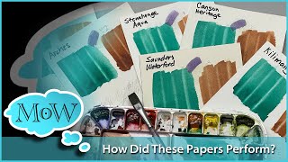
Very informative as was your video on various papers. Not saying that your other videos weren't useful too.
Seems they'd be great in flesh tones for portraiture?
Yup, I thought the same things……… this did not appeal to me at all. I am a huge DaVinci fan in general but all companies have their marketing 🤑 I mean, Holbein has been producing a pastel set for years. That said, the sets are very good deals and I do recommend them!
“Just dilute it with water” but can you really get eg strawberry milkshake color without mixing with white? Or peach? I like their paints and have bought a few “tints”. Didn’t realize gauch was the same.
Thanks for the video.
Thanks for this👍 Pastel watercolours, or even titanium white has never been on my wish list because of the opacity. I like watercolour for the transparency and pastels seem to be too gouache like
Great info. I think these might be good for colorists. They're pretty. The swatch book would be extremely useful. I just ordered two so your review is very timely. I'm very interested to try them.
Agreed the convenient repeatability would appeal to decorative painters and designers both.
I think beginners might find these a lot more appealing. It can be difficult and intimidating to learn how to mix colors. I, personally, find consistency a real challenge. Thanks!
I have noticed some manufacturers of materials putting out 'pastel' lines. (Markers, colored pencils particularly). Perhaps this was the motive behind these DaVincis? I have a curated collection of their regular watercolors and I like them, and I have a travel brush which is pretty good too.
Good demo/comparison. Thanks Steve!
There is some room for “pastel” and opaque watercolors for me, but not the ones with titanium white added.
I like pg50, py216 and py53 which are titanium dioxide, but not mixed but doped with different ions that add color to it. I love them for the skies and sunsets.
Moreover, I recently synthesized spinel doped with chromium (pr235, I believe) that is a light pastel and yet transparent color, that may be useful to regulate the diffusion of paint on the page while adding some tone. So I’ll pass these pw6 mixes, but thanks a lot for the review nonetheless!
@À Strand they are not actually transparent, but semi-opaque in watercolors. They are in several brands, Winsor and Newton has them as nickel titanate and Turner's yellow, Schmincke has both yellows. PG50 is in Daniel Smith and many others in different blue and green variants.
Love the color diary. Will get one for myself. I have a question: what is the best fan brush for watercolor? All the high end fan brushes I have been buying end up like chicken feet
I get this. I stand in the art store just thinking “ooooh. Pretty ….”
M.graham was my 2nd pro watercolor set, my first was qor. Now I have more brands than I can keep up with. I swatched all my brands out where I had the same pigments...and m.graham is by far the most pigmented; more so than qor, daniel smith, senillier, and others. But I do think a contender might be Roman Szmal. I don't know how they get that much color into one halfpan. However I don't have the same colors to make a comparison.
Steve turned me on to M. Graham and I'm so glad he did. They don't have the 1 million unique DS options, or the unique mixes schmincke has. What they do sell is just solid highly pigmented smooth paint. I actually love M graham goauch a lot more then Steve does. For me traditional gouache wasn't specifically 100% opaque... I since the 30s people have just come to think 100% opaque since designers gouache became a thing and traditional gouache mostly faded away. M. Graham is imo traditional gouache.
They are nice but useful as a confidence mix. You are guaranteed the exact same pastel base tone and hue to then mix from. They are useful but not ‘necessary’. Less expensive to have titanium white gouache + regular watercolours. People you can also premix convince mixes I. Empty half/full pans too!
Repeatability was my thought too. More of a designers color.
@@mindofwatercolor I was thinking of the peach for flesh tones, something to start from.
Designer Gouache by Winsor Newton and Schmincke have white mixed in the pigment in the tube.
"Gouache" by Schmincke does not have white in the paint. Other companies do the same thing -- you need to check the brand you are looking to buy to understand what they have in the tube. James Gurney contacted several companies and asked them what the difference is between their watercolors and gouache if white is not in the tube. Schimincke lets you add the white - titanium or their "transparent" white which is zinc?
Schmincke Gouache - they say difference between their watercolor and gouache is is that the watercolor pigment is more finely ground.
I have used all three of their lines and I agree with their statements. I find their watercolor paint to be more vibrant even with white mixed in.
But I like them both. I find I do not use the Designer series as much because I usually start paintings as transparent watercolor and end with gouache if I need to.
I believe Winsor Newton paints have gone down a different path than most manufacturers with using a different binding agent in their pans vs.tube paints. Their watercolor from tubes rewet in pans but not like their pans or other brands paint. I think this can be used to your advantage on a painting when you put a wash over the top of previous paint without not reactivating as quick but I do not have experience with that.
Thank you for covering the range of topics you do.
I have not searched through all your videos to see but do you have videos on work like the one you did of the Star Wars pilot ?
(More commercial style painting) Whould be nice to understand your process and it might help others that are looking at the field of art to understand what some of the challenges you have if you are in that market.
Don't really have any commercial style illustration videos to speak of. That's what I used to do professionally, but left that behind. Now just landscape and the occasional portrait.
@@mindofwatercolor Thank you for answering.
I wonder if these might work being used over a “dark” to create a bit of light.
Possibly yes!
Thanks Steve enjoyed this especially the swatch book bought one here from your link was curious if you were setting it up with all your paints would you go by colors all greens all yellows on one page and so forth so forth or by types of paint such as semi trains. Or opaque ? This might be fun for you to show us!
Da Vinci, while not as well known or as highly marketed, is a company making in my opinion, some of the best watercolors on the market. Also, without deceptive marketing schemes. The sets they offer in my opinion are convenience oriented, but not just hap-hazardly done to wonder what they were thinking. Da Vinci truly appreciates their customers/artists and in their efforts to demonstrate this, they have worked with artists who use their paints to create tailored palettes and sets that are convenient to that artist in their own style and choices. So, you can take them or leave them, but you will always have the choice of selecting your own colors from their list according to transparency/opacity and pigment properties. Mostly I have stuck with unique single pigment offerings, or colors that are convenient but more tricky to create quickly, especially if I find myself using it quite often.
I own at least 40 colors each of M. Graham, Da Vinci, Lukas 1862... Along with at least 30 colors of Paul Rubens, ShinHan, Nevskaya Palitra (both in White Nights and Sonnet) Plus many other curiosity sets. The fewest of any one brand I have is Daniel Smith, which I feel is severely over priced for what I call fad club status offerings. I almost started down that road... enough said.
Out of the many I have tried, I find that Da Vinci is my number 1. They are dependable, affordable quality, good binder that doesn't shrink and crack, easily re-wettable, well behaved, stable, and have a nice finish on paper without drying issues, tackiness or shiny spots.
M. Graham is probably my #2, but only because of the inherent issues with using honey as a humectant binder ingredient. They can melt in heat and humidity, stay tacky for long periods of drying time, and leave a sheen in places... but make no mistake, they are fantastic pigments that really excel in washes and wet into wet deliberation. But overworked they can become just as muddy as the next brand.
Lukas is my all around beater shoes. Not fancy expensive shoes, but good shoes that hold up. Yes, they are a little on the more opaque side in comparison, but that is also why they are so vivid. I would say they remind me a lot of Van Gogh, Royal Talens offerings.
Davinci is my favorite too but DS does have quite a few beauties! Aussie red gold. Quin sienna. Azo. Green gold. Kingman turq. Sleeping beauty.
Easy to make the convenience colors on your own in most cases but there are a few that must be DS for me. But DV is my all time favorite too. ♥️
I agree with you. The only one worth it seems to be the Naples Yellow. Really beautiful color. It seems very luminous. Is it the screen or did it seem like this to you too? Do you know another Naples Yellow with that luminosity? If that's the right term. Thanks!
It’s a very lovely color yes.
Hi Steve! I just reviewed the Da Vinci sample dot set of 110. Spoiler…loved the paints, not too big a fan of the packaging to use as a palette. One viewer shared with me the idea of cutting the dots out of the cardboard and using them from a ceramic palette. Genius! At any rate, Da Vinci seems like they are making their watercolors unique with their curated sets. This pastel set seems a prime example of that convenience curation. I like their PW6, but any will work. Did you see their Bright Spring Watercolor Set? That might be a good option for some artists- myself included, lol- with an added PW6 you could just about have 2 curated palettes in one❤️
Yes, I saw the Bright set.
Thank you! I enjoy all your videos.
Your telling on yourself with the pallet pad... Shop at Jerry's artarama? Lol good on you I absolutely love Jerry's and their sales can feed that curiosity. ❤❤❤
I actually bought it on Amazon but I do like Jerry’s.
@@mindofwatercolor oh didn't know Heather Goldstein had her own Amazon store. Good for her.
Please review the Schmincke Liquid Charcoal
Already did!
I have that tablet to test my favorites the colors.
Spending money on curiosities? You’re not alone…that’s for sure.👍
As someone who uses both watercolour and gouache, there is a big difference to me between gouache and opaque watercolours. There's been a trend in paint manufacturers making a line of gouache and boasting "we don't use any opacifiers," and the moment I hear that I immediately lose all interest. Because some pigments are simply worthless in gouache without the added white. The binder might be similar, or even the same, but that isn't the only thing that makes a paint. Gouache should be made with a much higher pigment load to begin with, which on it's own makes it streaky and even muddy when used watered down, but gives a velvet matte finish when used in mass tone.
I think the differences are demonstrated quite well in your swatches.
And that's not to mention the potential use of watercolours made with more opaque pigments, or convenience mixes like these. I think the differences are demonstrated quite well in your swatches.For an idea, I'd look at the works of JWM Turner; he used usually blue toned paper and painted opaquely, and his paintings have such a vibrancy and luminosity to them.
Seems to be a new marketing game: These are 'convenient pastel colours' with a fancy name. Another brand has 'dust colours' and those all have PBK11 added to the 'normal' pigments.
You mean Dusk Colours 😂
@@awatercolourist There are other companies doing the same thing, and there are an incredible number of ArtTubers who are overly-keen on the latest fashion, and by promoting the product, encourage a lot of others who are less pigment-savvy folk to spend money they don't need to spend.
@@MrsBarnabas 👋🏼 I know what you mean. But new art supplies do bring overwhelming joy, so I honestly can’t blame them 😄. But it is not for me. I tend to be more judicious in my purchases. I will confess, though, that my wishlist is long 🤣. There are so many pigments and brushes out there that I have not tried yet and many companies that I would love to try. M Graham tops my list, so does A Gallo. And I hope to get to try the Roman Szmal tubes one day, once they are out. Luckily, art supplies are very expensive for me and there isn’t a wide variety where I live, so I get to keep my money 😂. And I can’t get paints from Jackson’s due to the customs here. I am considering trying some new brushes now that they have a brush sale. Not the best sale, though 🫤.
@@awatercolourist _new art supplies do bring overwhelming joy ..._
Yes, they do, don't they!
Jackson's deal with the customs and show the costs at the checkout, so we can change our minds if we have to, which I really appreciate. Like you, art supplies are now very expensive for me, not because of where I live but because of cost of living rises, etc, but I still enjoy living vicariously through the ArtTubers - eg Creating Cute Art - whose joy overflows wonderfully as they show us "what's in the box."
It's not so good when some of them are buying for buying's sake, or because art hauls are click bait which will boost their channel... It's taken a while to deal with the "I want that!" feeling, which I had so badly last year, while I was ill, but I'm sort-of there. I just look at the bank balance!
So much choice, and I really do have just about all I need to thoroughly enjoy my art, in various mediums (enough of each), so it's not really so bad. I do have a wish list, but it's mostly just adding things like coloured pencils, or replacing those which need it with something proven to be a little better, and justified in terms of what the Americans call, "Bang for your Buck"...
Eek! It's late! I should have been in bed and hour or more ago! Thanks for the chat. Sleep well, AW, if it's that time where you are, or enjoy the rest of your day, if not! 😄
@@MrsBarnabas Thanks MrsB! I should indeed be in bed! Thanks for the chat 😊. I never thought that art supplies are being bought for buying’s sake. Even when I was very, very, very generous with my spending and going on a spending spree, I still had to be judicious about what I bought because the paints (Schmincke) where I am are exceedingly expensive. There are many paints that I would love to try and explore but the prices really bite, even without the cost of living crisis. With that in mind, I never thought anyone would buy materials for buying’s sake. I’m sure I’ve done it with less expensive things, but not with art supplies.
ahhhh , validation ,Thank You
very informative as an FYI I also like Waffle Flower swatch stamp but found it inconvient to pull out all the stamping stuff just for one or two swatches . I found a template on Etsy the same size and infp which is very easy to grab and make one or two awatch card using a fine liner. Still for making larger number of card I would still use the stamp. Take care.
My wife has a Cricut and I made a template. Will probably use that from now on.
@@mindofwatercolor Fantastic would love to see the template. I would like a sheet template made of 1.25 inch by 2 inches would she be interested in making it and how much would she charge? I do not have a Cricut.
I hope my prior comment did not offend.
@@TheBicycleLadyThings No worries. No offense taken. We don’t really hire out for stuff like that though. We barely know how to use it ourselves.
Not my thing. Might be good for florals . Thanks for talking me out of it! 😬
Thanks for this comparison of the DaVinci pastel watercolors and other brands of transparent watercolors plus titanium white gouache. I have a few DaVinci watercolor tubes from a number of years ago, but I admit, I'm using them up and likely won't be replenishing with the brand. Not knocking them at all, it's just that I've discovered other brands with greater concentration of pigments that I prefer. Thanks for saving me a some money as I too have made a lot of discovery purchases in art supplies over the years!
thanks for saving us money steve😊❤
I like you a lot ; I like your approach and style ; 😊
I love DaVinci paints - especially their watercolors. Don’t need the new sets, though. They’re all opaque like gouache. So what’s the point.
So I’ve been looking at this set, but also…. I’ve been researching gouache and watercolor. You’re telling me all I need to do is add t. White gouache to my watercolors and I don’t need gouache?
Sort of. Gouache colors are more opaque and sit on top of the paper a bit more but just adding Titanium while to watercolors is a good way to try it. If you paint more transparently like I do it’s fine either way.
For me the real review is in a sketch and mixing "wheel", as you do in your other sketch books. I don't buy any more paint. I have been disappointed by other reviewers just swatching. I've bought the hype. That said, though, there is a different style for everyone so clearly brands are trying to create convenience for all styles.
Yes, it's great when a reviewer will go the extra mile and demo the product in a painting. I'm not interested in buying into any other brands now, but I will watch the uploads of one particular youtuber with an extensive list of watercolor reviews solely because he does puts great effort into each and always finishes the review with a sketch demo.
Do the Da Vinci pastels dry with a mat finish?
Yes, very.
@@mindofwatercolorvery? It’s either matte or it isn’t
Your presentatioons helpful in developin my childes book seriesd: Rainbow {THE MULTICOLORED CAT}
You can use that for peoples cloths or dresses i think.....
Love my DaVinci but they can keep their pastels
Sennelier watercolors are honey based. How do they compare to M Graham?
I don't have a lot of Sennelier but what I have is nice. i enjoy them. They don't rewet quite as quickly and are slightly less transparent but great colors all the same.
I have a large selection of sennelier and they are. transparent and so silky smooth. Nothing lays down as beautifully as sennelier. I love m graham too but sennelier is in a class of its own. It’s like the rolls Royce of watercolor imo.
And they are all super easy to rewet imo except maybe raw umber?
But I love the fun colors and high quality of Davinci best.
Most brands have their place in my art world though. I like options for different moods or whatever. 😊
@@LCLand I have both and agree with you. Furthermore Sennelier lifts better than any other brand! If you do a lot of lifting of color you will be amazed at what you can with them. They are exquisite.
@@sherryfurr9115 oh! I will keep in mind! 😄
Curiosity killed the cat, but satisfaction nearly saved it.
When color names start getting “creative” I start getting suspicious. Thanks for the deep dive.
Curiosity killed my bank account!😂
Did you add any water to these? I couldn't tell
Yes. You have to add some or it doesn't spread right.
Hi Steve! I thought Schmincke Horadam gouache was your standard for gouache paints, not Winsor and Newton?
Both are dreamy IMO.
@@AmandaMG6 Thanks!
In that gouache review I said the top three were practically on equal footing. I said here that W&N is “traditionally” what artists think of as quality gouache. Smooth, velvety, highly opaque, tons of colors in the range, most well-known brand.
@@mindofwatercolor Would you believe it, I don’t remember that at all 😂. I distinctly remember that Schmincke came out on top and that you spoke of it in very glowing terms. I really should watch that video again. Thanks for your reply 🙂.
It’s a lot less expensive than the thousands I’ve spent on papercrafting supplies!!
1:44 LOL 🤣