Stop Sharing Data-Start Telling Stories
HTML-код
- Опубликовано: 7 фев 2025
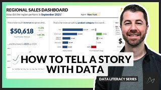
- Data is everywhere, but not all data tells a compelling story. This video explores how various charts-such as a breakdown of Titanic passengers, UFO sightings over time, and corporate performance metrics-can be transformed into clear, insightful, and engaging visuals. You'll learn:
✅ How to rethink chart types to highlight key insights
✅ The power of storytelling in data visualization
✅ Practical techniques for making any dataset more compelling
⬇️ Links mentioned in this video ⬇️
📣 FREE STUFF
Download Ampler* ☞ bit.ly/3tFq4Ze
SlideStart (Slide Database) ☞ bit.ly/3HctLIM
Slide Building Course ☞ bit.ly/3v5vcCZ
Ampler Tutorial ☞ bit.ly/4cVrIr2
🏆 COURSES
Presentation Design Course ☞ bit.ly/3UJJi88
Data Visualization Course ☞ bit.ly/3TKt11s
PowerPoint Speed Course ☞ bit.ly/3hOxjaM
Courses for Teams ☞ bit.ly/3H4YSGv
🎬 VIDEOS
• The 5 Most Popular Con...
• Why McKinsey uses blue...
• How I redesigned 3 McK...
• How McKinsey creates m...
🚀 MORE STUFF
Follow us on Instagram ☞ bit.ly/3H7S3ny
Connect on LinkedIn ☞ bit.ly/41T7SIk
Paul's LinkedIn ☞ bit.ly/3tyAOsr
*Affiliate relationship
=============================================
📊 CHARTS FROM THIS VIDEO
Titanic Survivors ☞ bit.ly/4gihMZn
McKinsey Slide ☞ bit.ly/42xOumv
UFO Sightings ☞ bit.ly/416YzWx
Company Ratings ☞ bit.ly/4jCZk0C
=============================================
ABOUT US
At Analyst Academy, we teach high-value consulting skills found at the world's top consulting firms. Our clients include small businesses, Fortune 500 companies, universities, and individual students in 100+ countries around the world. Each of our courses combine years of knowledge from high-performing consultants into highly engaging lessons packed full of best practices, time-saving tricks, and some of the industry's best kept secrets. Our downloads, courses, and articles are all inspired by best practices from the consulting industry. Learn more at www.theanalyst...
All views expressed on this channel are that of Analyst Academy LLC and its employees. Any materials mentioned or shown have been obtained through publicly available sources (e.g. firm or client website).
=============================================
#powerpoint #presentations #consulting #storytelling


What video should we make next?
I would love to see more scatter plots in action.
@@roderickmose4691 this is a great idea, thank you!
@@AnalystAcademy Also, on area chart. I find them very interesting. As always thanks Paul!
Please more videos on distilling insights!! There’s more than enough saturation of content on getting here, but the synthesis is the true last mile ❤
Very insightful! Love this video style for explaining data storytelling. Would love a video that tackles the most common tricky or difficult data analysis results to communicate. I know it’s all based on the narrative that is trying to convey, but what are some of the most common ones that are notably difficult and the best way to communicate it.
Incredible work, Paul! The 100% stacked column chart was such a great update. The education and easy-to-follow suggestions are so great with these videos.
Thanks from Mexico. Really interesting material, especially since the industry is different on this side and I think we'll head towards something like the US industry.
Thanks! Different how?
Brilliantly presented!!! Excellent content.
This is yet again excellent demonstrating, Paul!
Thank you!
you should do a series where you review different real life data slides that viewers send in.
Great idea!
I fully agree with this, amazing
thank you for sharing