I facilitate meetings for several corporate boards so I see tons of presentations. Fortunately many of them are well crafted. But some others... The horror... Your channel should be mandatory viewing for anyone that has PowerPoint installed on their machine.
Fantastic series and your delivery is excellent. If I had to pick one suggestion for beginners, it would be to change the default colour palette immediately. This simple fix makes a significant visual impact and helps to push ugly slides towards professional.
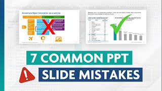
Solid advice. If I could offer one suggestion on where I would've taken the slide further, it would be this: If I was reading that slide, I would wonder why the companies represented in the left chart were expanded to include others in the right chart. I realize this is not always possible (to show the exact same ones for both charts), but the asymmetry of the two being on the same slide would likely beg the question for readers. Outside of that nit, and my personal preference for making it more visually stimulating than what consulting firms advocate, this was pretty solid advice. The folks below being ugly about "tell me how you did this" need to either learn from other videos on functionality or ask you to make videos that are quadruple in length. People, don't be ugly...you didn't pay to watch this.
Super helpful and it boggle my mind that how accessible such knowledge has become, 20 years back this would be a thousand dollar course, and forget to access it in India or any other developing country. True knowledge democracy :)
Great question! The courses are much more structured and detailed, plus they cover some advanced concepts not covered here. They also come with quizzes, assessments, and lots of exercises. Watch the RUclips videos if you want to get a basic understanding of the concepts, but take the courses if you spend a decent amount of time in PowerPoint.
Thanks for this, the information was really useful in helping me create a set of uniform-looking slides submitted by 7 different speakers for a conference. I will say, though... I found the video editing (particularly the zooming in and out) at the beginning of this to be distracting and had to restart it and listen again without looking at the screen until the Slide part began.
Fantastic video and series - much appreciated! (P.S. I think you may have left out the word “million” in the second subtitle after “365” and before “times”).
0:15 design, formatting, consistency, structure. all have impact on audience perception of you, your team, and organization. 0:40 i don't know why i should even care. 1:40 5 questions, and first and foremost - what are they trying to say? many people neglect that corporate slides need to stand alone. 2:30 accenture, 2:50 ... continue to average over one million downloads per day. 3:10 by changing into more descriptive subtitles. 3:25 first sub question: what's the implication, why are they matter to audience. from good to great. 4:00 by completing the second question, we can change the title once again. 4:35 the next question: what can i simplify. too much text is the cost of audience attention. 4:55 BCG, 5:30 the picture here is just decorative. 5:44 the text is just repeating info to the chart and could be deleted. 6:20 take away the gridline of both the charts; as they are distractions. 7:00 the third question: how could i show it better? 8:40 the difference between bar chart and column chart, also for space constraint: better to bar charts. column: natural to our mind for time-changing trend. bar: for categories one: lebal. 9:30 the fourth: what grab the audience attention? 9:45 deloitte 10:30 add a line under the title: pyramid principle that we want audience to read title first, subtitle, then the charts. 11:20 the final question: what looks intentional? everything should be intentional not random. not sloppy. 11:35 StrategyX 12:10 font size: may not notice at first place: this is different font size; and make consistency the font size 13:00 you want to avoid default powerpoint color, because it come across to look sloppy. 13:05 and final thing to do: add footnote. 13:15 till end: a very visual recap.
Love the video. One small thing, the title of the right-side graphic says "was download XXX times". I think it should be "was downloaded XXX million times". Tiny quibble on an otherwise masterful period of instruction
I have spent an hour from my morning going through multiple videos - great way to represent data and message Thank you for sharing such insightful experience
Brilliant video - I use PowerPoint to create insight reports, commonly viewed as a PDF and not in-person. Are the principles outlined here the same, for non ‘in-person’ slides (if that makes sense)?
Yes! Those types of slides tend to be more dense anyway, so structuring/designing them in a way that helps people get to the insights quickly is especially important.
@@AnalystAcademy 3 months have passed since this comment and I have made significant gains in my PPTs. Your videos have truly changed how I present to senior management. Thank you!
The design or the layout or anything that is being emphasised here is only suitable to draw the first line of attention, engagement/keep them interested are keys to get any result. Yes!! Well dressed people does draw attention ultimately what comes out of the MOUTH matters most.
I would make the title 6-9 words long for each line. A title stretched across the page is not ideal for readability and looks visually challenging to read. The eye has to travel across a longer length before reaching the next line.
I definitely get frustrated with the limitations of certain charts. Haven't quite gotten to the level where I'm inventing new ones yet, but maybe someday!
Constructive criticism: please, for the love of god, fuck the commentary only approach. Demonstrate. Demonstrate. Demonstrate. Provide some technical guidance / instruction.


![I.N "HALLUCINATION" | [Stray Kids : SKZ-PLAYER]](http://i.ytimg.com/vi/n5B5q1Hwt_U/mqdefault.jpg)


Our new Data Visualization course is live! Head to our website for more details.
Hi. I want to take the course
I facilitate meetings for several corporate boards so I see tons of presentations. Fortunately many of them are well crafted. But some others... The horror...
Your channel should be mandatory viewing for anyone that has PowerPoint installed on their machine.
What I liked about your video is the clarity. Thank you! Appreciate it!
Thank you for taking the time to record theses videos. They’re super helpful and you’re an amazing instructor. 🎉❤
Fantastic series and your delivery is excellent. If I had to pick one suggestion for beginners, it would be to change the default colour palette immediately. This simple fix makes a significant visual impact and helps to push ugly slides towards professional.
Solid advice. If I could offer one suggestion on where I would've taken the slide further, it would be this: If I was reading that slide, I would wonder why the companies represented in the left chart were expanded to include others in the right chart. I realize this is not always possible (to show the exact same ones for both charts), but the asymmetry of the two being on the same slide would likely beg the question for readers.
Outside of that nit, and my personal preference for making it more visually stimulating than what consulting firms advocate, this was pretty solid advice. The folks below being ugly about "tell me how you did this" need to either learn from other videos on functionality or ask you to make videos that are quadruple in length.
People, don't be ugly...you didn't pay to watch this.
Super helpful and it boggle my mind that how accessible such knowledge has become, 20 years back this would be a thousand dollar course, and forget to access it in India or any other developing country. True knowledge democracy :)
I'm binge watching your videos. They are SO good! Great info, brilliantly presented. Thanks!
I am just pondering, what more would be there in the courses if you cover this much greatness in just one video!
Great question! The courses are much more structured and detailed, plus they cover some advanced concepts not covered here. They also come with quizzes, assessments, and lots of exercises. Watch the RUclips videos if you want to get a basic understanding of the concepts, but take the courses if you spend a decent amount of time in PowerPoint.
love the way you teach. everything is simply done and straight to the point. thank you!
Thanks for this, the information was really useful in helping me create a set of uniform-looking slides submitted by 7 different speakers for a conference.
I will say, though... I found the video editing (particularly the zooming in and out) at the beginning of this to be distracting and had to restart it and listen again without looking at the screen until the Slide part began.
Thanks for the feedback! You're right... we went a little overboard this time.
Amazing content, thanks for supporting all of us!!
Thanks Paul, that was so helpful. Very clear and easy to understand
The best RUclips channel ever
I really like listening to you. Very useful slides and your communication way is awesome. Thank you
Your videos are always so helpful, thank you for your work on this one!
Perfect!
I think I would use icons instead of text to show the apps
Fantastic video and series - much appreciated! (P.S. I think you may have left out the word “million” in the second subtitle after “365” and before “times”).
Yes! I was wondering how long it would take for someone to notice this. I also misspelled "downloaded". Thanks!
0:15 design, formatting, consistency, structure.
all have impact on audience perception of you, your team, and organization.
0:40 i don't know why i should even care.
1:40 5 questions, and first and foremost - what are they trying to say? many people neglect that corporate slides need to stand alone.
2:30 accenture,
2:50 ... continue to average over one million downloads per day.
3:10 by changing into more descriptive subtitles.
3:25 first sub question: what's the implication, why are they matter to audience.
from good to great.
4:00 by completing the second question, we can change the title once again.
4:35 the next question: what can i simplify.
too much text is the cost of audience attention.
4:55 BCG,
5:30 the picture here is just decorative.
5:44 the text is just repeating info to the chart and could be deleted.
6:20 take away the gridline of both the charts; as they are distractions.
7:00 the third question: how could i show it better?
8:40 the difference between bar chart and column chart, also for space constraint: better to bar charts.
column: natural to our mind for time-changing trend.
bar: for categories one: lebal.
9:30 the fourth: what grab the audience attention?
9:45 deloitte
10:30 add a line under the title: pyramid principle that we want audience to read title first, subtitle, then the charts.
11:20 the final question: what looks intentional?
everything should be intentional not random. not sloppy.
11:35 StrategyX
12:10 font size: may not notice at first place: this is different font size; and make consistency the font size
13:00 you want to avoid default powerpoint color, because it come across to look sloppy.
13:05 and final thing to do: add footnote.
13:15 till end: a very visual recap.
Great video! Any tip on where to some slides to practice this on? :D
Your videos have helped me so much. Thank you.
love this thankvs very much. on 'intentional' changing to the whatsapp brand green could have been just a touch more effective I think!
What's your take on axis lines? For example on the y-axis you kept the vertical axis line.
I think if you show an axis line it emphasizes the fact that you are showing a graph (with a common zero) rather than a collection of boxes.
Love the video. One small thing, the title of the right-side graphic says "was download XXX times". I think it should be "was downloaded XXX million times". Tiny quibble on an otherwise masterful period of instruction
I have spent an hour from my morning going through multiple videos - great way to represent data and message
Thank you for sharing such insightful experience
Really happy to hear this. Thanks!
The zoom in and out will be dated soon. Might want to add that to your recommendations. :)
Very insightful!
Super useful
Thank you so much
Thank you, Paul
Great vídeo and very real. Thanks
Thanks for watching!
Thank you so much 🎉
Brilliant video - I use PowerPoint to create insight reports, commonly viewed as a PDF and not in-person.
Are the principles outlined here the same, for non ‘in-person’ slides (if that makes sense)?
Yes! Those types of slides tend to be more dense anyway, so structuring/designing them in a way that helps people get to the insights quickly is especially important.
Great tips, but for me to execute any of this I need to see how you made these formatting changes.
That’s a good point, thank you for the feedback. Will try to show more in upcoming videos.
@@AnalystAcademy 3 months have passed since this comment and I have made significant gains in my PPTs. Your videos have truly changed how I present to senior management. Thank you!
Amazing !!! Thanks 🙂
Another great one
thank you for taking time to explain why and how for everything. great learning
do you recommend light backgrounds or dark backgrounds?
Light backgrounds in most cases, but dark backgrounds if it's in a dark room or on a very large screen.
Very useful!
Can you provide more examples to show better. Brief and concise?
Thank you very useful
Outstanding.
Step by step 👍
cool, thank you!
Data visualization course? I will go to your page or can you share link!
You can find all of our courses at www.theanalystacademy.com. Thanks for watching!
fantastic!
Thx you sir
The design or the layout or anything that is being emphasised here is only suitable to draw the first line of attention, engagement/keep them interested are keys to get any result. Yes!! Well dressed people does draw attention ultimately what comes out of the MOUTH matters most.
Strategy& have the best slides
I would make the title 6-9 words long for each line. A title stretched across the page is not ideal for readability and looks visually challenging to read. The eye has to travel across a longer length before reaching the next line.
wonderful
Leaving that misspelling up the entire time must have been intentional, right? Right?
automatic portuguese audio? never seen that before
Yes! We're part of a beta test for one of Google's translation projects...
Was it helpful? Any feedback?
@@AnalystAcademy i found really usefull. Theres little to none content like that in portuguese. It will help a lote
Do you ever find yourself inventing a visualization to get a specific point across, instead of choosing an existing chart type?
I definitely get frustrated with the limitations of certain charts. Haven't quite gotten to the level where I'm inventing new ones yet, but maybe someday!
wow
Lucid presentation
I find it EXTREMELY irritating and distracting when you zoom in and out the whole time. What is the purpose of this?
Constructive criticism: please, for the love of god, fuck the commentary only approach. Demonstrate. Demonstrate. Demonstrate.
Provide some technical guidance / instruction.
Slides are useless so we do not need your advices
Thanks for this. Definitely useful. I will implement this the next time I make a deck :)