SCATTERPLOTS: Visualize Relationships Between Two Scale Variables (4-4)

HTML-код
- Опубликовано: 27 дек 2022
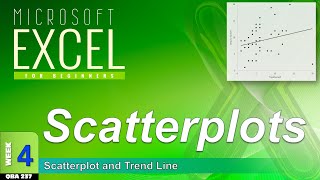
- Scatter Diagram (a.k.a. Scatterplot) is a graph used with correlation and regression. It summarizes the relationship between two quantitative variables. Trendline (a.k.a. Regression line) approximates the relationship between the two variables. A pair of scale variables, X and Y, are plotted on their respective axes. The pair of scores forms a single dot representing the combination of scores. The regression line runs through the data points, like a mean.