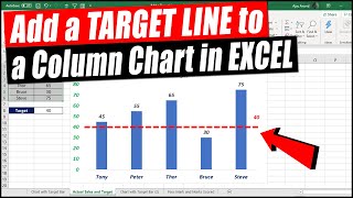
I love hacks like this! Thanks for posting Dave! Another trick I recently learned to accomplish this same effect is to create a clustered bar with two columns series (one for your actual and one for target), then right-click the target bars and select “add trendline”… set the target bar color to no fill, set the overlap to 100%, and adjust the length of the trendline as needed in the format trendline menu. Thanks again for sharing these useful tips! 🙏🏻
I'm glad you enjoyed the video. I used to teach the trendline technique but it does not work if you want to use it on a stacked bar chart. The technique in this video works for both bar charts and stacked bar charts. And, as I show at the end of the video, you can leverage this idea for even more effective callouts and visuals.
this was great, couldn't find out how to do this, wasn't having success in search results. i can do this easily in Tableau, and this viz is a great one, and being able to do it in Excel is excellent!!! (was getting the column version of this in searches NOT THE SAME). thanks again!
I'm glad you found the video helpful. You can add additional goal lines by adding more scatter with lines data series like the goal line shown in the video. Hope that helps.


I love hacks like this! Thanks for posting Dave! Another trick I recently learned to accomplish this same effect is to create a clustered bar with two columns series (one for your actual and one for target), then right-click the target bars and select “add trendline”… set the target bar color to no fill, set the overlap to 100%, and adjust the length of the trendline as needed in the format trendline menu. Thanks again for sharing these useful tips! 🙏🏻
I'm glad you enjoyed the video. I used to teach the trendline technique but it does not work if you want to use it on a stacked bar chart. The technique in this video works for both bar charts and stacked bar charts. And, as I show at the end of the video, you can leverage this idea for even more effective callouts and visuals.
this was great, couldn't find out how to do this, wasn't having success in search results. i can do this easily in Tableau, and this viz is a great one, and being able to do it in Excel is excellent!!! (was getting the column version of this in searches NOT THE SAME). thanks again!
I'm glad you found the video helpful.
Very well explained and useful for me. Would have been good to see how to add additional (multiple) goal lines. Thanks very much!
I'm glad you found the video helpful. You can add additional goal lines by adding more scatter with lines data series like the goal line shown in the video. Hope that helps.