10 Web Design Layout Ideas for Inspiration

HTML-код
- Опубликовано: 4 авг 2024
- Learn to design high end websites with our Web Design Pro course - bit.ly/3WaPu9D
In this video I'll introduce you to ten tried and true layout concepts that are widely used in the industry to make websites more engaging, appealing and user friendly. So let's dive in and discover ten layout concepts that every web designer should know.
📽️ CHAPTERS
00:00 - Intro
00:36 - Oversized grid
02:01 - Layers
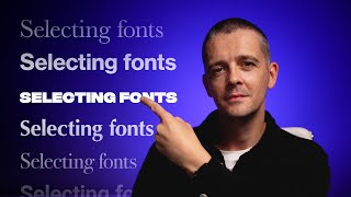
04:19 - Huge type
06:11 - Macro images
09:48 - Vertical alignment
11:08 - Inline images
12:35 - Solid borders
14:12 - Full screen video
16:15 - Clear space
17:47 - Radial alignment
💻 Websites featured:
bien-joue.ca/fr/
join.cosmos.so/
www.davidwilliambaum.com
www.filayyyy.com/
www.getrepeat.io/
www.swoosh.nike/
aawum.com/
womena.com/
drivecapital.com/
www.rolex.com/watches/day-date
teenage.engineering/
www.vacation.inc/
sikhahaircare.com/en/
www.eatocco.com/
bowndsranches.com/
www.newformcap.com/
www.foundrspace.com/
www.getrepeat.io/company
www.hardinscreek.com/ also viewport alignment
gumroad.com/
www.dsanddurga.com/products/b...
www.mclaren.com/
www.fielddaysound.tv/ with interaction
atck.fr/ also viewport size and borders: atck.fr/about/
www.skydweller.aero/
optinet.co.uk/
www.56k.cloud/
prespa.s.nomatter.dev/
www.stryds.com/
en.manayerbamate.com/
📱 Find us on SOCIAL MEDIA
Flux Academy's Instagram 👉 / flux.academy
Matt's Instagram 👉 / mattbrunton. .
Matt's RUclips Channel 👉 / mattbruntonuk
#webdesign #webdevelopment #freelancewebdesigner #freelancedesigner


I extremely like the video, man. Very helpful and informative. Thank you very much. It is presented so well too. Great, positive work.
Thanks for this video. Excellent ideas!!!
Great presentation for ideas, which I"m always looking for. My only concern is that, often, the most design-oriented layouts are not that user friendly.
It's always a judgement call.
@@MattBruntonUK What does that mean? Are you saying that it is subjective?
@@mgoodkin it’s partially objective-there are principles of design, user data etc. but matters of design always have some subjectivity to them.
@@MattBruntonUK usually this kind of layout is really good just showcase your portfolio and not focusing on conversion
Masterful overview.
Hope this one helps you try some different things. ✌
Thanks for the tutorial
Thanks it was inspiring!
Thanks for ur video ❤
These are really cool and creative examples, but I can see a UX designer or Marketing leadership tearing these apart. Where is the line drawn between creative vs user experience/accessibility/responsiveness?
That's what we have designers for-to draw that line. There's no universal "line" that applies to every project, but remembering to considering the points you've raised is always important.
This is helpful for sure
Just one thing can we create the scrolling effect like the first website in webflow without any code
Looks like it was made using canvas, afaik you won't be able to do that natively in webflow without custom code.
thank you for this informative video, if I may, can you provide us a free website builder that can give us a closer result to the website you featured in the video? thanks
If you are a digital marketer designimg a porfolio websiye for your self, what color pallet will you use
As a UX Designer, some of these are beautiful but not at all user friendly. Some of them can be I overwhelming. For example, I couldn’t figure out what the main CTA would be
Thank you for your work. I have a request. I've noticed over the years that you draw on the same styles/types of sites. It's a very narrow aspect range. Could you look at pages that are spiritually, not necessarily religious inspirational? Pages that are geared for more mature audiences? Not everyone gravitates to the hip, the artsy, or trendy. Thank you.
Just remember the UX! That gallery with random images serves almost NO point and utterly confused frustration about what is actually important other than the design of the website itself. Which isn’t really the point of any website if I’m being honest
For a usual user, it would be difficult for him to understand the design.
In terms of usability, the user will be confused about where to look.
Many of these are too busy, no white space. Too much emphasis on design as opposed to focused communication. And it's not that breathtaking