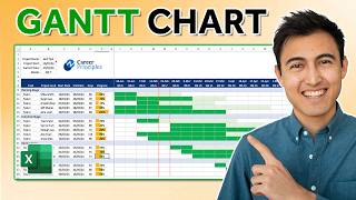
Advanced Gantt chart in Excel with drill-down feature

HTML-код
- Опубликовано: 28 июл 2020
- Learn how to create a multi-level Gantt chart / Project Plan using Microsoft Excel. You can use this to drill-down to an individual module or department activities and see the progress, completion and upcoming items.
For the gantt chart template and more visit:
chandoo.org/wp/drill-down-gan...
ABOUT THE GANTT CHART TEMPLATE
================================
We can use Excel's conditional formatting, slicers and tables to quickly create an automated, interactive project plan (or Gantt chart). In this video, I will show you how to make such a chart from raw project plan data such as module, activities, start date and finish date. We will create the chart that can be filtered by a module (or other things like team, deliverable milestone etc.).
We will be using slicers for the user interaction.
Whenever there is new data or change to project plan, you can refresh the pivot table (shortcut CTRL+ALT+F5) and the gantt chart will be automatically updated.
#GanttCharts #ProjectManagement #MsExcel  Наука
Наука


Hi Chandoo, Thanks for your video. I am good in excel VBA and have done many projects in the past. After coming across your video, I realised excel has got so many builtin functionality and does not need complex VBA to acheive the same result. Good work.
Came in at the right time. Loved variety of conditional formatting
Thanks. Conditional Formatting can do so many wonders.
Your tutorial is very simple with very clear guidance and instructions. Very much appreciated.
Thanks Milton.
Thank you very much for the video. It makes my job a lot easier
Learned so much from this, thank you
Wonderful tips and techniques! Thanks a lot!
Hello from Brazil! Your videos are just great, they help me a lot.
Glad you like them!
love the median rule for highlighting cell, very smart and simple calc.
One of my fav formula tricks too 😀
Thank you very much for the details. This makes my job a lot easier
Glad to hear that. All the best.
Mr. Chandoo, you are really Awsome..!!! Thanks for this help, I've been looking for this explanation and finally is here..!
Hello Sir
I saw your all video.
Your all video are very helpful.
Thanks
Thank you so much Chandoo. very good technique.
Nice use of MEDIAN. Awesome!
Thank you! Cheers!
Hi Chandoo.. very nice chart and technique. Thanks for sharing! Thumbs up!!
Thanks Wayne...
Nice video. There are some nice ideas in here and very clearly explained and demonstrated.
Glad you liked it!
Really its great and helpful, thanks
thank for the awesome tutorial.....
Hai! I am learning a lot from your uploads. Sessions are very descriptive and informative. Started using skills learnt from your videos and getting results. Fan of yours! Thank you and keep posting good sessions.
Thank you Sh...
Simply superb sir 🙂
Great video, thank you!!!
Glad you liked it!
awesome. thanks for doing this!
Thanks Michi...
I really like date part in pivot table, overall lot of new things for learning, your all videos are very fruitful. New setup looks goods. Thanks
Take Care
Shoaib Rehman
Glad you like them!
All I liked, very well process. Best regards
Thanks for liking
Really amazing
i really like that the date columns in the gantt columns dynamically expand and contract depending on the slice of the data set. do you know of a way to do this with a regular table using the default filters?
this is very useful. wondering if you have similar video to create Gantt chart by quarters instead of days..
I Like you video
You are a real "Puli" .. I am a mallu.
Excellent
Thank you so much 😀
Hi
Your videos are great & beneficial for me specially for learning excel. I am working at this with little amendment as placing date in horizontal as showed in the video. I am trying to dynamic it as date start from minimum date in the start date and go to the end date in the table. Kindly address this issue as i am trying to do it through if condition at start date but as i drag it horizontally, table1 update columns & is not fixing it while if, i drag it vertically, it remain static.
Very well sir
Thank you Joshi ji.
Thanks for the video which I learned, but I have a question, for making a gantt chart, how to do format when 1 activity in 2 or more different duration time?
By definition, Gantt needs to do much more than just tabulation of work. Take this example.
Simple case:
There is project task A, task B, and task C. A requires 5 days to complete, B needs 3 days, and C needs 10 days. A and C are independent tasks, while B can be done only when both A and C are complete. Resources P1 and P2 are working on the project. P1 works 0.5 days sometimes, and P2 always works full time. I want to distribute the work so that I can make optimum utilisation of their time and skills.
In Gantt:
I can put P1 for 10 days on A, so that A gets completed in 5 days (i.e. 10 calendar days, 0.5 working day each). Parallel, I can put P2 on task C. So, C and A both get completed in 10 calendar days = 15 workdays. If I have 6 or more calendar days in hand, I can put P1 on task B, and assign something else to P2, or vice versa.
No Excel sheet allows these variations, unless we enter everything manually with arithmetic of work per day per person. These variations are critical for managing any practical work. Even if I am managing my personal work, I should be able to plan a portion of task every day and do multiple tasks in parallel, subject to their interdependency and priorities. Sadly, there is no alternative to Microsoft Project. If anyone has a freeware solution, please reply to this comment.
Super one for all, please tell us how to add today's line in Excel also. Thank you
great work .thanks for your video . is it possible to add time on gantt chart
Hi, learning a lot from you chandoo. I have a problem in a file of mine. When I put the data in pivot, the data is automatically sorted alphabetically, the original order is lost. How to get the same order when I put it in the pivot table.
@chandoo I love the chart! It works brilliantly....until I tried to incorporate repeating activities (first example is 'Rachel holiday') and for that I would like one line item in the gantt chart with the actual holiday periods highlighted along the timeline - how can we get this view of exact dates and not just the whole time highlighted as a start and end from all of the line items for 'Rachel holiday'?
Can you help me?
How can i have a milestone light up in this chart?
And is it possible to have like a different groups and then a topic and then the activity of the topic?
That people can choose the group and topic in the slicer?
Thanks in advance!
@chandoo Hello, I got lost at "MIN(data[Start Date])", did you define a start date already in your sheet somewhere?
We are using Excel tables in this. If you give your table a name, then you can refer to the columns of the table with tablename[column name] notation. That is how I am getting the earliest start date.
Hi! Thanks for sharing the knowledge. I have a question regarding the zebra lines, how can I incorporate them at the Gantt without erasing the 'progress' bars?
Sorry couldn't help myself, I figured I'd answer your question. Click Conditional Formatting → Manage rules → From there move your zebra line rule to the bottom. Hopefully that helps.
Many thanks DEar Chandoo for insighful video. This really saved my day for a client's project plan. One query- How did you bring slicer on Gantt chart sheet from Pivot table?
You can make the slicer, cut it (CTRL+X) and paste it anywhere else.
@@chandoo_ Great thankyou for being such a wonderful being 😊. Have a great time 🌼
Microsoft launches MS project, Chandu oh f off, let me build it in excel
😂🤣
Is there a way that 'date order' can be switched off so that rows remain in the order entered?
Once I saw a file in which the cells were compressed and decompressed by means of a character symbol inside a cell, similar to grouping and ungrouping applying schema, with the disadvantage that when applying it, the working field is compressed and is not optimal . I will greatly appreciate your help with this.
Greetings from Peru
Could it be selectable cell technique demoed here - chandoo.org/wp/show-details-on-demand-in-excel/
Thank You. I have one question how did you move/created the module slicer in the plan sheet, whereas the pivot is on another sheet.
I think I explain it in the video. You can make the slicer, cut it and paste it on the other sheet.
I want to prepare a cost forecasting report into a Gantt chart. I have the cost between a duration and i want to allocate the cost monthwise. Kindly make a video on that.
This video was really helpful! Would you be able to show us or update the template to roll it up to "quarterly" views?
Thanks Reshma... Good idea. I will make next-level version of this.
@@chandoo_ Thanks so much! I wonder if it could be made for 2021 dates too. :)
Certainly.
hi. I have made a planned vs actual Gantt chart. but it has a problem, every time I add a new activity, I have to copy planned and actual formula in that whole row. Is there any formula or coding in vba so that formula applied by itself in the row looking/searching for planned or actual keyword? Please tell.
Can the gantt chart show a baseline, forecast and actual durations? Can it also show milestones?
How to do a Monthly gantt chart? any idea? I don't want to show days/week in that chart and is this possible to make that automated too?
You can use =EDATE(previous date, 1) to move the date on top by months.
Excellent. Kindly show us a way to create two parameters on top side bar (from Start Date to End Date you showed there in terms of Month / Date) - we want to show working dates and number of hours per day. This way we should plan scheduling, in which we may enter number of working days per week. A provision to input for any other holiday or OFF also.
You can easily customize the template to add those feature Vinod. Give it a try. You would need workday.intl formula to enable custom working days situation.
@@chandoo_ I tried same chart on time frame basis, initially distributed all activities within 24 hrs (planned all to happen in a day, otherwise it was difficult to differentiate 8:00 AM ) but failed.
@@chandoo_ we used 11/05/2020 8:00 AM as Start Time / End Time format, so look forward to write function for the task bar, as you wrote =MIN(data[Start Date]) in the above video
What version of excel did you use?
I am using Excel 365 in this video, but you should be able to apply this on Excel 2013 or above...
At 15:13 you are fixing the highlighted empty cells by changing the formula. What is the formula? I cannot see and it is not working. I was using " ", Is that correct? You said not equal empty spaces?
Very informative video, but half work done. Please guide how to track plan vs actual progress in same format. Will be really very helpfull.
You can add another set of conditional formatting rules and that should work. Visit chandoo.org/wp/category/project-management-2/ for some inspiration and ideas.
@@chandoo_ thanks for replying.
If possible pls make a video on plan vs actual tracking on gantt chart. It will b helpful for millions of people.
How to use median formula for WEEKLY timeline or MONTHLY time line ?
You can't use MEDIAN for that. You need a range overlap function. Something like this:
chandoo.org/wp/date-overlap-formulas/
@@chandoo_ its not working for smaller durations within the week but i got a work around .. =IF(MEDIAN(WEEKNUM($B24),WEEKNUM($C24),WEEKNUM(J$8))=WEEKNUM(J$8),"R",0)
Just getting started, How do I add weekends? I need a full calendar week not just week days?
Refer to this video where I show another method (with weekends ofcourse) - ruclips.net/video/FXnyKU6xZeI/видео.html
First comment
How to represent delay in activity in Gantt chart
Hello Chandoo, Workday function is returning wrong date, returns excess of 2 days. Pls help.
Please shoe us how to highlight today?
I have abbreviations of activity.
I want to display it in my chart instead of highlighting.
Is there any way ?
You can use formulas to pull the activity abbreviations. As the cells are narrow, you may not be able to show much though.
Hi I am Afrin, How can I hide the grand total row in the pivot sheet. I have downloaded your template but could not find the solution. could you please tell me?
Hi Afrin...
Select the Pivot Table
Go to Design Ribbon
Click on "Grand Totals" and off them for rows & columns.
How to make a gantt chart, that the highlighted cells will affected the date start & date end instead. I.e. I need to highlighted cells or move the gantt chart in order to balance the manpower for the project, and in doing so, I need the date start and date end will follow the gantt chart bar or the highlighted cells, and in addition each cells I need the input number of manpower and sum it at the bottom, in doing so I will know how many manpower need in daily basis for a specific project. Thanks.
Unfortunately, this is not an easy thing to do with Excel. Please use a Project Management software like MS Project or trello
@@chandoo_ Luckily one of my friend manage to do it, it completed my excel project management life!!!
what if the actual is different as plan ? how do it in one view?
You can see this page for some ideas - chandoo.org/wp/gantt-charts-project-management/
One time I send you one comment
Can you make grocery items stock report.
Good suggestion Vijay... I will create a template like that and share later. Meanwhile, check this generic tracking template and use it - chandoo.org/wp/create-an-excel-tracker/
Sir
How to make that module window for different sheet
Plz guide
My friend name is also Chandoo
Say hello to him :)
Good morning sir, I have a project in excel and i need your help. How can I contact you by telegram?
Thanks MP. I am not taking up any consulting work at the moment. I suggest finding some help thru freelancing websites such as upwork or fiverr.
please explain the shortcut keys you are suing at each stage. please add it to the captions or modify the video to show the same, without the shortcuts, the whole tutorial is useless to a beginner like me because it cant be reproduced
Did you somehow miss the word "advanced" in the title? Please watch my begginer Gantt chart tutorial here. ruclips.net/video/FXnyKU6xZeI/видео.html