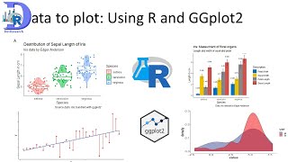
How to plot barplots similar to those in journal articles using R and ggplot2 and other packages

HTML-код
- Опубликовано: 21 авг 2024
- #datavisualization #rprogramming #barcharts #ggplot2 #barplot
#research
This is a complete tutorial to plot publication-ready bar plots.
In this video, I have demonstrated how to plot a barplot similar to those we see in research articles in scientific journals. Here I have plotted the barplot using ggplot2 functions. The bar plots are in grayscale and mapped to a categorical variable. I have discussed how to rearrange the bars as per our requirement. Error bars also are plotted and customized. Some journals require error bars only at top of bars, I have discussed using ggAnnotate package function geom_halferrorbar().
The originalplots are form :
Mikuláss KR, Nagy K, Bogos B, Szegletes Z, Kovács E, Farkas A, Váró G, Kondorosi É, Kereszt A. Antimicrobial nodule-specific cysteine-rich peptides disturb the integrity of bacterial outer and inner membranes and cause loss of membrane potential. Ann Clin Microbiol Antimicrob. 2016 Jul 28;15(1):43. doi: 10.1186/s12941-016-0159-8. PMID: 27465344; PMCID: PMC4964015.
Data used is not original. I just made up the data to make similar plots.
Loink to dwonload data: docs.google.co...
#the code
setwd("D:\\RGC work\\Rworks\\bargraphasyouseeinpublications")
to read xlsx file
library(readxl)
for half error bars
install.packages("remotes")
remotes::install_github("azzoam/ggAnnotate")
library(ggAnnotate)
df1 = read_xlsx("data.xlsx",range="A1:C6")
df1$Ab = factor(df1$Ab,levels=c("Chloroform+SDS" ,"Polymyxin B" , "NCR335", "NCR247" , "NCR001"))
library(ggplot2)
p1 = ggplot(df1,aes(Ab,MillerUnit,fill=Ab,label=MillerUnit))+
geom_col()+
geom_halferrorbar(aes(ymax=MillerUnit+SD),width=0.2,size=1,color="black")+
scale_fill_grey()+
geom_text(vjust=-1.5)+
theme_classic()+
scale_y_continuous(expand=c(0,0))+
expand_limits(y=c(0,150))+
theme(legend.position = "none",axis.text.x = element_text(angle=90,vjust=0.2,hjust=0.9),text=element_text(size=14,face="bold",colour = "black"))+
labs(x="",y="Miller Units %")
df2 = read_xlsx("data.xlsx",range="A8:C14")
df2$Ab = factor(df2$Ab,levels=c("Control", "CCCP" , "Polymyxin B", "NCR335" , "NCR247" , "NCR001" ))
library(ggplot2)
p2 = ggplot(df2,aes(Ab,`Relative Fluorescence` ,fill=Ab ))+
geom_col()+
geom_halferrorbar(aes(ymax=`Relative Fluorescence` +SD),width=0.2,size=1,color="black")+
scale_fill_grey()+
theme_classic()+
scale_y_continuous(expand=c(0,0))+
expand_limits(y=c(0,0.8))+
theme(legend.position = "none",axis.text.x = element_text(angle=90,vjust=0.2,hjust=0.9),text=element_text(size=14,face="bold",colour = "black"))+
labs(x="",y="Relative Fluorescence(red/green) %")+
geom_hline(yintercept=0.25,linetype=3,size=2,color="grey40")
for arranging multiiple graphs together
library(patchwork)
p = p1/p2
p+plot_annotation(tag_levels = "a")
Facebook page:
/ rajendrachoureisc
Mail Id:
rajuchoure@gmail.com
youtube playlist:
• R programming tutorials


Thank you very much. Excellent tutorial.
Thanks and please watch my other videos also and share with your friends.
Absolutely amazing style to teach us thank you so much from my inner heart 🇳🇵
Thanks for good words. It really motivates.
Niceeeeeeeeeeeee
Thanks for watching. Please watch my other videos also.
You really the best professional person I have watch
thanks
This is a really good and easy to follow tutorial. Thank you.
Glad it was helpful!
very useful video sir
Thanks for appreciation
Very nice sir, superb, thanks.............. I would like to see some videos on weather data and beautiful graphs 📈......sorry it was a typing mistake
Yes. You can share the link.
Thank you very much, Sir 💐🙏
It's my pleasure.
@@DevResearch Sir, I'm a Ph. D. of Agriculture submitting thesis this year. I have learnt making good graphs through your videos. I'm very grateful to your efforts, Sir. Thank you again.
Thanks for appreciation. It motivates a lot.
Thanks a lot..
Sir how shoud i add legends for the geomh lines
Suppose i have created a bar plot for pH levels now by geomh line i have to show a standard value suppose WHO standard value
For the specific line and color how to signify WHO standard in legend
You can use geom annotate to add text at soecofyc location specified by x and y arguments. Text is specified by label. You can customize using size, color etc. see the code
# Load the necessary library
library(ggplot2)
# Create a sample data frame
df