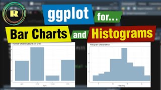
Barplot and column plot using R (ggplot)

HTML-код
- Опубликовано: 14 июл 2024
- In this video we will explore how to draw barplot, column plot using ggplot2. Data used in the video can be downloaded from drive.google.com/file/d/1jcr-...
0:00 Introduction
1:03 First example
3:47 Stacked barplot
5:49 Flip coordinates
6:29 Side wise barplot
7:30 Use Facet wrap
10:15 column plot


Good job, looking forward for more R contents.
Thank you sir. Very nicely done ! More lectures sir !
Very useful. Thanks a lot!
Thank you sir. Very well explained.
Useful for economics as well. Thank you
Get this man more subscribers
Thank you!!!
Thanks man, I´m from Colombia and this video help me so much! :3
Thank you. Please share among your network and social media to reach out to wider audience. Appreciate it. Thanks again.
Excellent!
Thanks Shaminur. Please share in your network to reach out to wider audience. Thank you. Appreciate it.
good video. thanks.
Thanks Saygin. Request you to support channel by subscribing and getting notification for upcoming videos.
I’m wondering what values were being used for the y axis in the stacked bar plots when the y axis wasn’t specified.
Its the count of each category which is specified on x axis. it will be automatically counted. When we specify x with a column, R will xount frequency of each category and consider that as y. Hope it answers.