How To Create An Actual Vs Target Chart In Excel

HTML-код
- Опубликовано: 14 июл 2024
- Sign up for our Excel webinar, times added weekly: www.excelcampus.com/blueprint...
In this post, I explain how to create an Actual vs Targets chart in Excel. This chart overlays the projected or goal numbers with the actual performance numbers realized for a time period.
The chart can be used to compare multiple targets, goals, budget amounts, forecast projections, etc. It can also be created as either a bar or column chart.
If you’d like to see the accompanying blog post on my website, you can find it at this link: www.excelcampus.com/charts/ac...
Additional Resources:
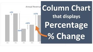
Column Chart That Displays Percentage Change in Excel - Part 1: • Create A Column Chart ...
Percentage Change in Excel Charts with Color Bars - Part 2: • Percentage Change in E...
Column Chart That Displays Percentage Change - Part 3: • A Column Chart That Di...
#MsExcel #ExcelCampus
00:00 Introduction
00:22 Charting Actuals vs. Targets
01:05 Start with Your Data
01:48 Create a Chart
02:25 Formatting the Bars in the Chart
04:57 Overlaying the Columns
05:33 Additional Formatting
10:25 Converting a Column Chart to a Bar Chart


I cannot tell you how grateful I am for your videos! This one on Actuals vs Targets especially! I moved into management a few years ago and FORGOT half of what I knew of Excel and I was no expert back then! But I have to justify a need for more headcount and was stressing how I could represent the no. of hours my staff are working vs a baseline. This video saved my job! And I am 100% confident the data tells exactly the story I need to!! Thank you for these! I am sooo going to be sticking with Elevate Excel for life!
I just had an “aha!” moment with your tutorial. Thank you!!!! Super helpful!
WOW. That video was so helpful. You explained everything so clear and simple. Great Job! Thanks, Jon!
Glad it was helpful! 😀
Nice, clean charts. It amazes me how often I see badly formatted, ugly charts in business presentation. This video makes my eyes happy!
Haha awesome! I love it. Thanks Rico! 🙌
Displayed like a clear gem. Thank you Jon!
I just followed this video step by step and it is so clearly explained. I made a chart I love. Thanks so much 😊
I can't thank you enough for this.. explained in a very simple able to understand manner..! Thanks once again
Great content as always! Just sharing, I find it easier to select the series by going to the Format Data Series pane on the right. Then the "Series Option" drop-down will give you the list of available series.👍🏾
This video was very useful and very well explained all the concepts of excel chart, excellent !!
Super explanation. It's a great help. Thank you Jon!!!
Thanks Jon, excellent, very simple, easy steps but effective chart 👍👍
Wow ! I will keep remember this trick. Literally helpful.
Thanks a bunch.
Great stuff, this is what every business owner needs! Thank you Jon!!
Thank so much Paul! I appreciate it! 🙂👍
YOURE THE MAN!
Ditto! Very useful . Thanks a lot. Logged for definite use!
Great chart presentation!
Thank you John for your valuable information
Thank you so much for this. This helped me out a lot!
Great video. So useful. Thanks Jon.
Great Effort and easy way of explanation.
This tutorial is very helpful. Thanks so much
Great chart creation! Nice tricks to show this type of data too :) Thanks for sharing!
Very helpful, thank you John!
really its helped me to easier the work report... thanks for the post.. great work keep rocks
Excellent sheet chart and easy methods
This is awesome. Def going to use this. Amazing! Thanks
it looks classy. that kind of simplistic beauty. 😄
Great Effort and easy way of explanation
Love it, thank you so much
I have been wondering how to make a bullet bar chart with a vertical target line. I only knew how to make this type of bullet bar chart where the target was a dot. Thank you so much for this video.
This really awesome !!!!
Thanks for the help!!
Really clever solution. New subscriber.
Thanks for the sub! :)
Well done...as always!
Thanks Robert! :-)
Outstanding info. Thanks
Our pleasure! 😊
Thanks so much!
Well done, thanks for sharing👍
Thank you Stephen! :-)
I can't thank you enough!
Thank you guy
Amazing !
I like this video. Thank you very much
I appreciate your support, Obeid! Thank you! 🙂
Excellent 👍
Wooow v nice presentation
Thanks!
Thank you
Excellent Jon, very helpful,
my question is: How can I make Target Vs Actual like this using Pivot Table and Pivot Charts with different filters?
thanks so much in advance
Excellent👍
Thanks Shahebaz! 😀
Good one
Hey Jon, can you create a video on how to make a budget template or budget vs actual variance
Please could you show a demo month-to-month using the same scenario that you showed here.
Hi Jon! Informative video! Did I miss the info what and why is +50 in =MAX function??
Very useful, is it possible to overlap only 2 series and and leave the rest as normal ?
I have a bar chart of 5 series but i only meed to overlap 2 of them
thanks for the video, i have a question, how to reverse from north in bottom to north in top? thanks
Thank you for the video! I currently use a sales target tracking template I got from Someka, however, I was wondering if it's possible to download this chart?
Thanks for this video..just found it. What if the bar chart are clustered? Can we overlap the bar size and kept showing as clustered bar?
Very great tips, where Can i find your book about pie charts ?
Hi jon, out of the topic, how make average by displaying the date ( 1 nov, 2 nov, 3 nov - 8 nov) in pivot table column ?? And values pivot "count of text"
How do I change the scale of the chart as I have branches with sales in the 100K's and in the Millions?
I hope I get the help I need. I work with a team with multiple targets (Phone sales, data device sale and sim activation). I want to design an interactive dashboard where all the individuals along their performances in all of the 3 KPIs appear
Hi there, I can't seem to find the link to download this chart?
Is there a way to do this with a line graph?
Tried this chart but I can't seem to have the data labels for the variance go at the center or end of the bar chart. It stays at the left end. Help
well..its just for one instance. How do we do it for a period trend. I have 12 months of data with each of these attributes
Can I overlap only 2 out of 5 bars?
I'm not sure there is a way to do that. You might need two separate charts.
I do appropriate your time If you can help us with the best chart type to present 2 levels data chart, example is below :
London
Men 300
Women 200
Total 500
Germany
Men
400
Women 150
Total 550
Hi Maytham,
Great question! Sometimes stacked charts are used for that type of data. However, stacked charts can be difficult to read. Here is an article that explains some alternatives.
www.excelcampus.com/charts/dynamic-stacked-column-bar-chart-find-the-missing-trends/
I hope that helps. Thanks again and have a nice day! :-)
@@ExcelCampus Thank you for your time and reply. I feel Alternative #1 is not that practical as it need space to include all of Panel Charts in the report . Alternative #2 are good but when you put in report is hard to have it dynamic.
For Alternative #3: what about Waterfall Chart or Stacked Column Bar Chart with adding total values on the top.
appropriate your time to look at it again and suggest alternatives :).
"Budget"...it means "Target"?
hi John can you also teach us how to make the annual revenue trend chart? just subscribed.
like the one shown in this video: ruclips.net/video/Tac611EcofI/видео.html
Amazing!