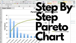
Create Pareto Chart In Excel

HTML-код
- Опубликовано: 18 май 2013
- Do Pareto Analysis in Excel and Create Pareto Chart in Excel . Download link bit.ly/2GWi6i0 Pareto Analysis is a technique used for decision making based on the Pareto Principle, known as the 80/20 rule and the Pareto Analysis can be done in Excel too.
It is a decision-making technique that statistically separates a limited number of input factors as having the greatest impact on an outcome, either desirable or undesirable. Pareto analysis is based on the idea that 80% of a project's benefit can be achieved by doing 20% of the work or conversely 80% of problems are traced to 20% of the causes.
10 Most Used Formulas MS Excel
• 10 Most Used Formulas ...
Learn Basic Excel Skills For Beginners || Part 1
• Learn Basic Excel Skil...
10 Most Used Excel Formula
• 10 Most Used Excel For...
*Most Imporant Excel Formuls Tutorials*
Learn Vlookup Formula For Beginners in Excel
• Learn Vlookup Formula ...
5 Excel Questions Asked in Job Interviews
• 5 Excel Questions Aske...
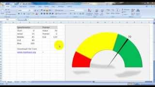
Create Speedometer Chart In Excel
• Create Speedometer Cha...
Learn the Basic of Excel for Beginners || Part 2
• Learn the Basic of Exc...
Create Pareto Chart In Excel
• Create Pareto Chart In...
How to Create Dashboard in Excel
• How to Create Dashboar...
Excel Interview Questions & Answers
• Excel Interview Questi...
To watch more videos and download the files visit www.myelesson.org 10 Most Used Formulas MS Excel
• 10 Most Used Formulas ...
Learn Basic Excel Skills For Beginners || Part 1
• Learn Basic Excel Skil...
10 Most Used Excel Formula
• 10 Most Used Excel For...
*Most Imporant Excel Formuls Tutorials*
Learn Vlookup Formula For Beginners in Excel
• Learn Vlookup Formula ...
5 Excel Questions Asked in Job Interviews
• 5 Excel Questions Aske...
Create Speedometer Chart In Excel
• Create Speedometer Cha...
Learn the Basic of Excel for Beginners || Part 2
• Learn the Basic of Exc...
Create Pareto Chart In Excel
• Create Pareto Chart In...
How to Create Dashboard in Excel
• How to Create Dashboar...
Excel Interview Questions & Answers
• Excel Interview Questi...


Exactly what I needed! Thank you!
This was so easy to be done thanks to you. Thank you for explaining it so well and going through it step by step.
Thank you so much! This was so much help.
Really good instructions...thanks!
Thank You!! That's what I was looking for exactly.
many thanks! its helpful for beginners.
Hazim Ahmadi Welcome : )
very useful , thank you
you saved my from getting a 0 on my assignment!! so easy to follow, thank you!!
Very good explanation, thank you very much for your help!
I really like your presentation easy understand
thank you
Man, you are a lifesaver! Thank you so much for posting this!
Welcome Friend
great resource! thanks!
Thanks for the video. You've a good presentation skill
Excellent example for beginners like me Mr Guru. After so long I have understood Pareto function.
Great instruction, thanks
I never comment on videos for any reason but I have to say thank you for helping me. I hate doing charts/graphs etc in excel and this helped me so very much.
+Chanell Lopez I am glad that this video helped you an dthank you commenting my friend, you can also watch all my videos on www.myelesson.org
How do you apply the same formula to other cells?
Thanks for the video!
Bro. You made it so simple and I understood it very well.
Thanks for your video. I learned one thing today
Seriously...tq...just for my assignment quality management...thanks god...really appreciate
wow, it solved my problem in under 10 mins. thanks.
very useful, easy to practice along :) thanks
GREAT JOB! Now i get it :) thank you so much
Thank you Guruji...It was nicely explained and I could get it easily.
HELPFUL VIDEO..THANKS
Thank you @Vikram :)
Great video, thanks!
+NothingTo DoCrew Welcome : )
thank you very much for the nice video , it is really helpful. I have one note that you should do the sorting before creating the accumulated frequency and the percentage, in this way you will be sure that the formulas will remain correct.
Awesome. This is a real simple and useful explanation. It will definitely help out for my project. Thanks!
Welcome dear Peggy, you mayfind this video useful too ruclips.net/video/f6c93-fQlCs/видео.html
an awesome one...really helpful for me. Thanks a Million for making this video Bro.
good for beginners. thanks
Thanks its very helpful
Very helpful! (Minus your two hick-ups towards the end) Thanks!
Thanks you very much
Awesome...Thank you so much😊
thank you!
thank you so much
Very well guru!!! Thanks.
Keep it rolling!
bintz Welcome :)
Thanks sir.helpfull
Thanks!
thanks much for this. very helpful and easy to grasp. however just like to ask, is cumulative frequency necessary when doing pareto analysis?
Thank you!
many thanks
Thanks!! Need to know about Waterfall Chart....
Thank you so much, please make some another videos related to quality control..
thanks for the video. I learned something today!
Thanks
thank you, that was very helpful.
Carina Aladjadjian Welcome
was able to get it in first shot , explained well , thank you guruji
Thanks
Thank you
In one video I learnt Pareto , many thanks Sir
Welcome .
You Rock sir!! This helped a whole bunch.
Jason Parsons Welcome
Excellent. Thank you very much.
+James U Welcome , you can also watch all my videos on www.myelesson.org
Very helpful. Thank you
Thank you Dear. Try These Important Links to learn Excel
MS Excel Beginner Series
ruclips.net/video/3kNEv3s8TuA/видео.html
MS Excel Intermediate Series
ruclips.net/video/U3bxRiJeWlg/видео.html
MS Excel Advanced Series
ruclips.net/video/98PwqRd9Rfc/видео.html
Hi Thank you for the video it was very helpful. Could you also show how to draw a Check sheet, Histogram and Pareto chart using the same data. So it would be easy to understand as I am very new to this. Thank you.
thanks mate!
Well explained sir
thank you sir! a great help to my research! :)
jane karla welcome
Thank you sir.
You are welcome Andrew :)
Thanks man!
Welcome Buddy
Excellent
well done.
Love it
thank u
just now have learned
Myadam Vinay :)
Awesome...Thanks
willie bloem Welcome
Good one..
Hello sir namaste thanks for the video
Sir i hv a confusion in pareto chart
Sir whether we shuld draw a percentage line equivalent to total 98 or for 60?
Suppose we are carrying a research to find out the factors affecting Work life balance. The rigorous literature review brings out a number of factors(some being repetitive). As it becomes difficult to decide which factors to select and which ones to leave,can we use this pareto here. Since this Pareto analysis is a decision making technique, can we use it as a decision tool to select the more relevant factors out of a list of so many factors ( i.e.selecting relevant few and rejecting trivial many).
Dear Guru Nath, Very nice presentation
Dr.R.S.Madhusudan Thank you sooo much dear.
thank you Guru !
Siva Ram Kuricheti Welcome
Great!
Thank you Dear. Try These Important Links to learn Excel
MS Excel Beginner Series
ruclips.net/video/3kNEv3s8TuA/видео.html
MS Excel Intermediate Series
ruclips.net/video/U3bxRiJeWlg/видео.html
MS Excel Advanced Series
ruclips.net/video/98PwqRd9Rfc/видео.html
thanks a lot!
Ioana Cohal Welcome
Awesome
Great sir
Very helpful, but for some reason my whole chart is becoming a line chart, I tried fixing it but did not work. I will keep trying. Thanks for a wonderful video.
amazing sir
Welcome
Nice video. Liked it. Can I use this in my training presentation / video? I will give you credit for it. Let me know please.
how to display the table at 4:34 ?? Do you show me the shortcut?
For some reason the scatter line chart from my percentage is going from lowest to highest. Is there a way to fix this ?
thank you guru
Dokter Whom Welcome
Could do it in minitab in 2 minutes or less
Need an update for 2019
Dear Sir , How to calculate frequency..some references
thanku you
Sandeep Tumma Welcome .
Thanks Sir
works only if your top frequency is allready no.1 sorted, otherwise sorting gives you "value" error
how to get those % symbols?
you have a really cute voice! anyway, great help thanks :)
👍
kab bstaayeinge
pr pareto chart m to bar k bich m gap nhi hona chaiye..uske bare m btaye..ki kya gap hona chaiye ya nhi hona chaiye..pl clear it.
5:33 start da real Pareto in Excel
speedometer
You forgot to highlight 1st 3..
You can also download an Excel Pareto Chart here: www.hitdocs.com/simple-pareto-chart-it-operation-xls/
Video with lots of errors... please have it re-recorded..
FALL
If you dont know about pareto dont teach anyone. You made wrong pareto pareo secondary line must starts with the top of the first column
thats it, i was looking for this comment .The chart is wrong.
Honestly you are abusing the Pareto Chart, please ask your self don't get offended my friend.
Thank you
Good boy Welcome