Colour Formatting Column Charts Based on Values

HTML-код
- Опубликовано: 20 окт 2024
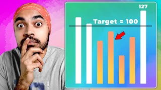
- In this video, I will walk you through how to create dynamic colour formatting in column charts based on:
Max/min values
above or below and average
above or below a threshold set by a dynamic parameter
All formatting takes into account the selected date ranges, and there is even the bonus feature of creating dynamic subtitles to capture key information and provide that added context.
The data model file is linked below if you want to follow along, and the medium link below shows the walkthrough steps and calculations.
Follow for more Power BI advanced tips and tricks.
Data Model Link: drive.google.c...
📱 SOCIAL MEDIA
LinkedIn: / gerard-duggan-15420a55
Twitter: @DGAnalysis
📔 BLOGS & WRITING
Medium: / colour-conditional-for...
DG-Analysis: dg-analysis.com/
Maven Showcase: mavenanalytics...


Great tutorial! Your voice is so chill, I could listen to you whole day. 😅
Haha,thanks 👍
Sitting here working on the next video...😎
@@dganalysis I followed you on your SocMed and Blog, since I find your tutorials helpful specially on my job. So thanks, and keep it up. 😉
@@francisthegeek cheers, appreciate it 👍
I just implement this features in my sales report! Thanks for sharing!!
Just wondering, for the subtitle MAX/MIN that you declare the variable and the you wrote it again instead of using the measure, but for the GLTA you chose the No Months measure instead of writing the measure, why's that?
Very good. A similar request I often get is highlighting columns which fall within the selected date range.
Thanks - yes, thats a good shout. A few adjustments to some of the measures, and you should be able to apply that type of formatting here.
This is great video, I am always amazed by your data analysis work, keep it coming 👍
Thanks, more being planned...👍
@@dganalysis I would love it! Thanks
I have been Waiting for this video, thanks for knowledge sharing
My pleasure
Great session. Thanks a lot 🙏
Cool,hopefully it helped....
Any other topics you would like a walkthrough for, let me know.
@@dganalysis Maybe a series on dynamic dashboard where the most part of it is dynamic where you can take advantage of bookmarks, tooltips, drill down feature, field parameters etc.
@@alexrosen8762 I'll see what I can do.
I wish you were a Udemy course creator. Your content worth a milli!
Cheers mate, appreciate it. Maybe one day I will do a mini course...
If you were to take a course, would you prefer building a project / portfolio piece, or looking at different techniques of analysis and viz?
@@dganalysis The project based courses steal the quality time with basic infos, deep understanding of the project - these are good for beginners and the market is fulled with these. So I would love to see a course from you, where you literally showoff your skillset, work-flow, problem solving cases. In my opinion, these kind of "good practice" videos improve the average quality of BI developers and in result, the beginner level would be placed higher as well.
Thanks, appreciate the feedback. Something to think about.
Maybe I could do a series of case studies in analysis and slightly more advanced visualisation techniques.
Thanks buddy
Great 👍
Thank you 🙏