Making a scatter graph and line of best fit in Excel

HTML-код
- Опубликовано: 25 авг 2020
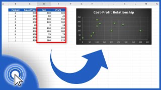
- Step by step instructions on entering data and then creating a graph with a trend line (line of best fit) in MS Excel. This is the Windows desktop version, if using a Mac or Office 365 yours may be slightly different.
To see the Google Sheets version of this video: • Making a scatter graph...


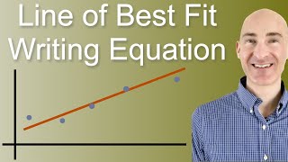


"What Excel calls a trend line and everyone else in the world calls a best-fit line..."
The shade thrown here, intentional or not, is legendary. Thank for the video!
Thank you! You're video is the only one that actually shows how you can find the y= equation from your graph, thank you!
THANK YOU VERY MUCH YOU'RE THE ONLY ONE THAT EXPLAINS IT FAST AND CLEARLY❤
Thank you, this helped me with my homework assignment!
Thank you so much for this!
thank you, this is very helpful
Thank you, very helpful
Very helpful thank you
Very helpful
that plus sign doesn't come up for me?
Thank you
okay but what if its office 365 excel? i am having the hardest time even finding similar options and tabs needed and the value inputs seem to not let me add values exither. and these wierd red blue and purple boxes appear around some of my selected values.
My understanding is that the Office 365 version of Excel does not support this function. I usually recommend my students who only have Office 365 access use Google sheets for this instead. See this video for Sheets instructions: ruclips.net/video/rJXz1qVYFu4/видео.html
@@dr.stepheng.prilliman8726 thanks! i installed the desktop app and it works great!
2:30 trendline