How to Create a Four Quadrant Chart in Excel | Quadrant Scatter Plot | Quadrant Matrix Chart

HTML-код
- Опубликовано: 9 фев 2025
- 👍👍If you have found this content useful and want to show your appreciation, please use this link to buy me a beer 🍺.
www.paypal.com...
Thank you! 👍👍
Download the featured file here: www.bluepecant...
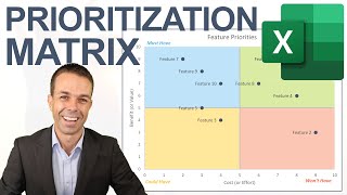
In this Microsoft Excel video tutorial I demonstrate how to create a quadrant chart. A quadrant chart is a scatter chart where the plot area is divided into four equal parts. In my example I am plotting staff costs against turnover: the branches in the quadrant representing high staffing costs but low turnover are the branches of concern.
------------------------


Very clear and insightful video! This one saved me this week! 🙏
Thank you - super clear! A bad tutorial can be a major timewaster so appreciate your clarity
Thank you, Chester! Well explained. You've earned that like for sure!
Thank you for this very clear tutorial! Exactly what I needed :)
Your videos are very informative and useful. Thank you Chester!
Very helpful, thank you. I followed along with you step by step and it worked. Thank you!
This video was so very helpful. Thank you so much.
Great tutorial. Helped me in time of need. Thank you so much.
more than useful. Thanks!
thank you very much, very easy to understand and helpful
Extremely used in marketing. It's a concept similar to SWOT, (Strength, Weakness, Opportunities and Threats). Thank you Chester!!!
Thanks for sharing!
This chart will be very useful,
How did we find the x and y of the vertical and horizontal lines?
The average oF turnover and staffing cost?
Thanks for posting this video - it was very helpful. How do you handle overlapping labels? In my case, it's common to have multiple records with identical coordinates on the chart. I haven't been able to figure out a way to make the labels readable because they overlap one another.
How do you give specific colors to texts within each quadrant?
Do you have one on PowerPoint please
👏👏👏