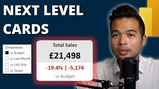
It seems that you are looking for a KPI visual. With this visual, you can compare a measure with a specific target and period. I hope this helps: ruclips.net/video/ZOAdZTOTAUU/видео.html
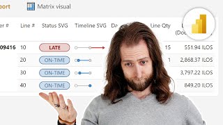
The visualization offers too much information. Difficult interpretation. Very small explanatory elements of the visualization. I have to study it in depth. Thank you Nestor!!!
Thanks for stopping by, Ivan. Yeah. The number of features can sometimes be overwhelming. My recommendation would be to start with the basics ones and go from there. This visual is definitely a game changer (based on my experience of course 😉)


![[IBCS] New Column chart in Power BI - Feb 2024 Update](/img/1.gif)
How did you make Profit Comparison card. Please explain. Thanks in advance
It seems that you are looking for a KPI visual. With this visual, you can compare a measure with a specific target and period. I hope this helps: ruclips.net/video/ZOAdZTOTAUU/видео.html
@@NestorAdrianzen Got it. Thanks a lot.
The visualization offers too much information. Difficult interpretation. Very small explanatory elements of the visualization. I have to study it in depth. Thank you Nestor!!!
Thanks for stopping by, Ivan. Yeah. The number of features can sometimes be overwhelming. My recommendation would be to start with the basics ones and go from there. This visual is definitely a game changer (based on my experience of course 😉)
what are you using to study?