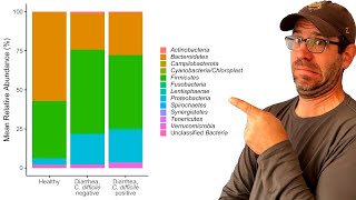
Improving the appearance of a stacked barchart with ggplot2, dplyr, and forcats (CC103)
US
Войти
Creating a stacked barchart in R with ggplot2 (CC102)
22:19
How to create a grouped plot of jittered data with the ggplot2 R package (CC108)
25:16
How to clean and join data from mothur with the dplyr R package (CC101)
25:48
Jason Segel Breaks Down His Most Iconic Characters
28:00
"BENDY: LONE WOLF" - Official Trailer - Coming 2025
01:32
Our Fire Evacuation! Forced To Leave Our Home...
21:37
Improving the appearance of a stacked barchart with ggplot2, dplyr, and forcats (CC103)
Riffomonas Project
Подписаться
23 тыс.
Скачать
Готовим ссылку...
Просмотров 13 тыс.
312
0
Добавить в
Мой плейлист
Посмотреть позже
Поделиться
Поделиться
HTML-код
Размер видео:
1280 X 720
853 X 480
640 X 360
Показать панель управления
Автовоспроизведение
Автоповтор
Опубликовано: 8 фев 2025
Комментарии • 33
Следующие
Автовоспроизведение
22:19
Creating a stacked barchart in R with ggplot2 (CC102)
Riffomonas Project
Просмотров 35 тыс.
25:16
How to create a grouped plot of jittered data with the ggplot2 R package (CC108)
Riffomonas Project
Просмотров 6 тыс.
25:48
How to clean and join data from mothur with the dplyr R package (CC101)
Riffomonas Project
Просмотров 6 тыс.
28:00
Jason Segel Breaks Down His Most Iconic Characters
GQ
Просмотров 230 тыс.
01:32
"BENDY: LONE WOLF" - Official Trailer - Coming 2025
Joey Drew Studios
Просмотров 316 тыс.
21:37
Our Fire Evacuation! Forced To Leave Our Home...
morgans vlogs
Просмотров 241 тыс.
34:19
These Are The Worst Job Interviews Ever
SMii7Yplays
Просмотров 430 тыс.
54:44
Using ggplot2 to visualize relationship between life expectancy and health spending in R (CC338)
Riffomonas Project
Просмотров 1 тыс.
13:38
Bar Charts with {ggplot2}
yuzaR Data Science
Просмотров 7 тыс.
27:09
Creating a pie chart in R with ggplot2 using microbiome data ... and why you shouldn't (CC104)
Riffomonas Project
Просмотров 8 тыс.
28:55
Learning to use the patchwork R package (how to learn a package in general) (CC099)
Riffomonas Project
Просмотров 6 тыс.
40:22
Exploratory Data Analysis with Pandas Python
Rob Mulla
Просмотров 527 тыс.
16:22
How to create a relative abundance barplot with ggplot2
Sur
Просмотров 20 тыс.
30:32
Showing groups on a scatter plot for an ordination using ggplot2 (CC079)
Riffomonas Project
Просмотров 14 тыс.
18:26
StatQuest: A gentle introduction to RNA-seq
StatQuest with Josh Starmer
Просмотров 517 тыс.
17:26
Using ggplot to create bar charts for 2 categorical variables. R programming for beginners.
R Programming 101
Просмотров 89 тыс.
01:13
притворился дедом и проверил шаурмечные на человечность ч11
ABRACADABRA TV
Просмотров 1,4 млн
54:16
Страна без коррупции. Успех диктатуры
Простая экономика
Просмотров 114 тыс.
02:45
GOOD RANDOMS - My Only Trophy (Official Music Video)
Brawl Stars
Просмотров 8 млн
00:11
Heart Drawing Challenge (Poppy Playtime)
FASH
Просмотров 5 млн
04:31
Как Я Лифты ЛОМАЛ (анимация)
X2DED
Просмотров 123 тыс.
11:55:00
СТАРТ БИТВЫ БЛОГЕРОВ 2025 - ДЕНЬ 1 ● ВСТУПАЙ В JOVE TEAM - ВМЕСТЕ ПОБЕДИМ!
Jove
Просмотров 189 тыс.
00:26
КТО ЛЮБИТ БЛИНЫ?? #shorts
Паша Осадчий
Просмотров 242 тыс.
1:06:09
✅Накрыла Горная Болезнь 😱 Эверест на Электро-Велосипедах ⚡️НЕРВЫ СРЫВАЕТ⚡️ ДЕШОВКА СЛОМАЛАСЬ⚡️ПСИХАН
KREOSAN
Просмотров 206 тыс.