Showing groups on a scatter plot for an ordination using ggplot2 (CC079)

HTML-код
- Опубликовано: 14 июл 2024
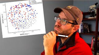
- Showing groups in a scatter plot to indicate the region covered by points from different groups can help your audience understand whether you see structure in your data. In this episode of Code Club, I'll show a variety of approaches you can take to show which points belong to different groups in a scatter plot. We'll cover plotting a centroid, adding rays out from the centroid, ellipses, and a 2 dimensional density plot (whoa!).
Pat will use RStudio and functions from the ggplot2 package and other packages from the tidyverse. The accompanying blog post can be found at www.riffomonas.org/code_club/....
Do you have a figure that you would like to receive a critique or help improving? Let me know and I'd be happy to arrange a guest appearance!
If you're interested in taking an upcoming 3 day R workshop, email me at riffomonas@gmail.com!
R: r-project.org
RStudio: rstudio.com
Raw data: github.com/riffomonas/raw_dat...
Workshops: www.mothur.org/wiki/workshops
You can also find complete tutorials for learning R with the tidyverse using...
Microbial ecology data: www.riffomonas.org/minimalR/
General data: www.riffomonas.org/generalR/
0:00 Introduction
1:35 Pre-attentive attributes
3:03 Grouping as a pre-attentive attribute
5:50 Rant about Rstudio
8:06 Indicating the centroid
12:20 Star plot
18:35 Adding ellipses
24:38 2D Density plot
27:41 Conclusion  Наука
Наука


![NoCap - Yacht Party [Official Music Video]](http://i.ytimg.com/vi/rm_lvDln8kE/mqdefault.jpg)


Really you deserve all the best ... Clear Easy magnificent amount of information..... i am new to R but i am able to follow you with no difficulties.... Thank you again
Thanks Shady! I’m glad you find the channel helpful
Which of the ordination do you like better: the base version with nothing added, adding the centroid, the star plot, adding an ellipse, contour plot? For bonus points see if you can add ellipses to the star plot!
Sir, is there any Bonus video where it was explained for how to add ellipse to the star plot?
@@rishikeshdash12 All you'd have to do is add geom_ellipse like we did for the normal ordination.
@@Riffomonas got it sir. Thank you so much
Awesome tutorial, I got it to work with my own data! Woohoo!
Fantastic! That's great to hear - can't tell you how happy it makes me to get news like this :)
Very useful! Thank you!
Thanks Philippus! 🤓
Thank you sir for great explanation regarding different way of plotting in ordination. It helps alot☺😇
I’m so glad to hear that! Thanks for watching 🤓
@@Riffomonas you're welcome sir
Great guide. I must admit, I've 'borrowed' some of your code to generate similar plots in my own work :).
FWIW, the guidance for the vegan package refers to something called 'spiderplots' instead of 'starplots'. Go with whichever suits I guess!
Glad it helped! Thanks for watching
Great set of tutorials, thanks for these videos.. Maybe I missed it but why you used NMDS, and not PCoA in this case? thanks!!
Thanks! I find that for the same number of dimensions, NMDS explains more of the variation in the data than PCoA
Thank you for this video! I'm struggling to get r to recognise my groups, it seems to just draw an ellipses around the whole data rather than grouping it. So you know why this might be happening? Thanks again!
One thing to double check is that you are defining the groups within the aes function and not in the main function call (eg ggplot(data, aes(x,y,color=group)) %>% geom_point() rather than geom_point(color=“black”)
Hey, thank you for this very informative video!
One question: At around 11:18, you say that it's possible to conduct a statistical test to see if the differences between the centroids of the three groups are significant or not. Can you elaborate what specific test you would have in mind for this?
Next week I'll demo how to do this using the adonis function from the vegan package. It's also known as amova, permanova, and np-amova
@@Riffomonas Looking forward to it!
It's up! ruclips.net/video/1ETBgbXl-BM/видео.html
@@Riffomonas Great work! Thank you :)
Is it possible to have an ellipse around healthy and not the other two? If so, how would this be accomplished?
This has been very helpful for me, thank you so much!
Hey Jess- I think I’d maybe try giving a second data frame for just the data you want grouped to the stat function and see if that works. Interesting question!
Does anyone know how to run statiatics for this? How do we test if the elipses are statistically different from each other.
Hi Hannah - be sure to watch this episode ruclips.net/video/1ETBgbXl-BM/видео.html
Is there a way to add a third axis to the plot where data points are aligned to units of time?
Hi Tina - if you were to order the points with fct_reorder by the third axis you could adjust what shows up where in the layering. I'm not a big fan of trying to build 3d into a 2d medium like a this figure since we can't see in 3d on a 2d image and all of the various work arounds always seem to be less than desirable.
like this, can we do same for PCoA plots.
Tha is for watching! Yep. You can do it for any ggplot object
Ok Thank You sir
Nice tutorial! Thanks a lot, sir!
Meanwhile, I have a question, and it would be appreciated if you could answer me when you are free.
The question is: how can I cluster a group of observant's data which are over 1 thousand? This 1000 data can be categorized into 10 groups. My idea is probably I can present and point up those groups on the figure rather than 1000 data. Yet, I am not sure how I can do that. Does it make sense if I just center those values within the group (average value)?
Thanks a lot!!!
If you want to do it with an ordination maybe you could include error bars, ellipses, or convex hulls to indicate the range. Alternatively, I’d tell you to look at the more recent episodes where I showed alternatives to depicting distances with ordinations.
@@Riffomonas
Ok Sir, thank you so much for your quick reply!
@@Riffomonas Could you give me the links to that episodes? thank you so much!
Hello! I’m conducting a metagenome analysis of gut microbiota. I have a total of 196 samples, however, when I subjected their relative abundance to NMDS to generate cluster dendogram and ordination plot, the stress level is always x10-5 and thus the ordination plot appeared obscure. Is there any way I can resolve this?
Thanks for watching! I suspect you might have some samples that are super different from the others? What happens if you remove those?
Sir, how can I increase the width of that Line Which Connect Centroid and Points.
Try size=2 in the geom function
@@Riffomonas you mean inside geom_segment ?
Pipe is not necessary ! Keep the code simple, meaningful and understandable even by python progarmmers
I guess we’ll have to agree to disagree 😆. Many of us think it makes the code easier to read and maintain