How to use ggplot to create beautiful scatter plots. This is an R programming for beginners video.

HTML-код
- Опубликовано: 21 авг 2024
- Data visualisation is easy when you use ggplot. Ggplot2 is package and forms part of the tidyverse group of packages in R. Ggplot is used to create amazing plots and graphs. In this video I talk you though how to visualise two numeric variables and a categorical variable to produce a scatter plot and a linear model. If you’re interested in statistics or quantitative analysis, learning R programming would be extremely useful. This video forms part of the R programming for beginners series.


Get my FREE cheat sheets for R programming and statistics (including transcripts of these lessons) here: www.learnmore365.com/courses/rprogramming-resource-library
Legend! as a R beginner, I watched all of your videos in two days, they saved my university life....I like when you mess around ggplot argument and come out with different graph and meanings, and would like to watch more like these! Please do more videos on more examples please please
Glad it helped and will definitely do more videos! Thank you for your feedback 🙂
Best R resources I've found on RUclips.. thank you
Glad it was helpful!
Thank you for all your helpful R videos. I linked your channel to my classmates, as we're all tackling R this semester. :)
Awesome! Thank you!
Thank you so much! Clear and concise. Keep up the good work, Greg!
Thank you, Farid! 🙂
Welcome back Sr
Good to me here :)
In the words of Tina Turner: "Your simply the best..." . Great job as usual Greg. Keep those R (and statistics) videos coming. Thanks!
Wow, thanks!
Thanks for the videos.
You make R look super simple!!!
Glad you like them!
Thank you for uploading these!!
You are most welcome Alan.
The teaching method is pedagogic, clear and understandable with excellent graphically sheen sharing.
One of the best R courses on the web. Well done!
I kindly ask you if you please could also record videos on an advanced use of R programming. Something regarding basic Spatial Analysis for movement ecology would be handy, in particular the package "adehabitatLH", "adehabitatHR" function "mcp", or package "lme4". Cheers
Thank you for your kind feedback 🙂
Hi,
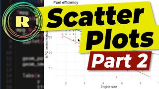
I have tried running the below code based on the mpg data set as per your tutorial video:
> mpg %>%
+ filter(hwy < 35) %>%
+ ggplot(aes(x = displ, y = hwy, colour = drv))+
+ geom_point()+
+ geom_smooth(method = lm, se = F)+
+ labs(x = “Engine size”, y = “MPG on the Highway”, title = “Fuel efficiency”)+
I just wanted to check if I was perhaps doing something wrong?
Really useful, thank you.
Glad you liked it.. .more oi these to come (for sure). I enjoy making them
Many thanks for this crystal clear video.
Glad it was helpful! More to come soon :)
@@RProgramming101 Thanks so much. I believe "learn by enjoying" is one of your top list mottos.
I hope you turn on the CC :( it's so helpful even if it's automated.
Thank you Bro. It is fantastic and excellent. But I have a question how can i send ? My question is recoding or grouping using R for date converting them into Weeks for example from January 1-7 is week 1, January 8-14= week2 and etc ...
Very useful for me who is just starting R.
Your recap is invaluable.
If the plot is in black n white,
Color of Points and lines will not be distinguishable so is there other way of showing points n line??
Thank you! Very helpful!
Glad it was helpful!
Thank you
great video sir!
Glad you enjoyed it - Thanks!
Thanks a lot. V helpful
Glad it was helpful! Thank you
Excellent teacher. I was wondering what is the marker app you are using?
sir can you do a video on how to plot a double coloumn graph using ggplot2?
Will do... :)
thank you sir
can you please do a video explaining how to create one way anova using R studio?
Will do. Thanks for the suggestion.
@@RProgramming101 thank you for your videos!
thanks a lot sir
Most welcome
How can I name each dot in the plot? For example, if I have a list of variables of different countries and wanna show which one belongs to which country.
Respected sir if u share ur scripts it will be more better
will do.
What you saying sir. You keep on talking like a radio
Switching back and forth constantly is reaaaaaaaaaaallly annoying sorry.... trying to watch and do... !
Thank you
You are most welcome Herbert