This is great. I have been working on excel for a while but I have never seen the grouping you have done in the excel file, how did you do it? what kind of grouping is that? As requested below, please anonymise the data and share the relevant files if possible, they will be extremely useful.
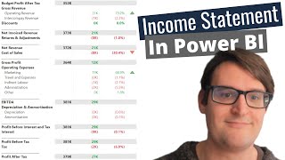
Thanks for this video, very helpful. Are you able to add additional rows between "Order" and "Formatted Table" to facilitate drilling up to summary categories (e.g., Travel & Entertainment) without double-counting?
Hello, we're very glad this video has been helpful for you. The Column titled "Colapser" in Michael's example is for this purpose. He doesn't go into detail on how to use it. The idea is you give each level a number, and filter your matrix to only show items below a certain number. Getting the formatting to work well with this is tricky but its worth the effort!
@@freshbibaby Thanks for your response. I've now replicated everything shown except for the collapser. At the beginning of the video, the author suggested that he'd describe the collapser at the end. Was this ever done in another video that you could direct me to?
@@boozers88 Hi There- original creator here.I missed putting this in to the video. As you can see, the collapser has some kind of relationship with group type. You should think of the collapser column as defining different views of your sheet. Remember that each line is calculated on its own, so total lines are completely independent of the detail lines. ( unlike a workbook like excel which may use sums for totals ). This means we can hide detail lines without losing any sort of data. For example, a 'detail' view might include blanks, 7, 8 and 9. A 'Low level' summary might include blanks, 7 and 8. A 'High level' summary might just be blanks and 7.By using a slicer, you can toggle different views. I would recommend a related satellite table which translates blanks, 7, 8 and 9 in to human friendly names.
@@freshbibaby Thanks for your reply. I think I have an intuition for how to do this via slicers. Is it possible to do the same using just the drill up/down feature by rows in the Matrix?
Thanks for the great video. Quick question, is it possible to export the report from Power BI into excel in exactly the same format that it appears in power BI? Thanks - Michael


Nice video it has helped send me in the right direction. Unfortunately your display is so small that it is nearly impossible to see your calculations.
Hii wanted know you have any financial dashboard analysis related projects explaination end to end projects
Nice method ! Thanks a lot!
Can you anonymize the data and share the pbix file to see the complete Dax??
This is great. I have been working on excel for a while but I have never seen the grouping you have done in the excel file, how did you do it? what kind of grouping is that?
As requested below, please anonymise the data and share the relevant files if possible, they will be extremely useful.
Ali also wondering how its done
Thanks for this video, very helpful. Are you able to add additional rows between "Order" and "Formatted Table" to facilitate drilling up to summary categories (e.g., Travel & Entertainment) without double-counting?
Hello, we're very glad this video has been helpful for you.
The Column titled "Colapser" in Michael's example is for this purpose. He doesn't go into detail on how to use it.
The idea is you give each level a number, and filter your matrix to only show items below a certain number. Getting the formatting to work well with this is tricky but its worth the effort!
@@freshbibaby Thanks for your response. I've now replicated everything shown except for the collapser. At the beginning of the video, the author suggested that he'd describe the collapser at the end. Was this ever done in another video that you could direct me to?
@@boozers88 Hi There- original creator here.I missed putting this in to the video. As you can see, the collapser has some kind of relationship with group type. You should think of the collapser column as defining different views of your sheet. Remember that each line is calculated on its own, so total lines are completely independent of the detail lines. ( unlike a workbook like excel which may use sums for totals ). This means we can hide detail lines without losing any sort of data. For example, a 'detail' view might include blanks, 7, 8 and 9. A 'Low level' summary might include blanks, 7 and 8. A 'High level' summary might just be blanks and 7.By using a slicer, you can toggle different views. I would recommend a related satellite table which translates blanks, 7, 8 and 9 in to human friendly names.
@@freshbibaby Thanks for your reply. I think I have an intuition for how to do this via slicers. Is it possible to do the same using just the drill up/down feature by rows in the Matrix?
Did you ever go over the 'Collapser Column'?
Where can I find the calendar table?
please could you share with us only the formatted table column
Do you have the model to share with us?
It has some sensitive data in it, sorry Igor
Great technique.
Couldn't you just use several dimension tables in order to categorize your expenses?
Thanks for the great video.
Quick question, is it possible to export the report from Power BI into excel in exactly the same format that it appears in power BI?
Thanks - Michael
Good method.
Congratulations!!!!!!