How to create a violin plot with ggplot2 in R with geom_violin and geom_dotplot (CC092)
HTML-код
- Опубликовано: 12 июл 2024
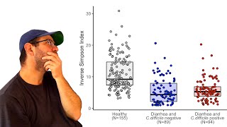
- One of the trendy data visualization methods is a violin plot. In this Code Club, Pat will show you how to create a violin plot in ggplot2 with geom_violin and how to show individual data points on the plot with ggplot2's geom_jitter and geom_dotplot functions. We'll also see how to indicate specific quantiles on the plot.
Pat will use RStudio and functions from the #ggplot2 package including #geom_violin, #geom_jitter, and #geom_dotplot and functions from other packages from the tidyverse. The accompanying blog post can be found at www.riffomonas.org/code_club/....
Do you have a figure that you would like to receive a critique or help improving? Let me know and I'd be happy to arrange a guest appearance!
If you're interested in taking an upcoming 3 day R workshop, email me at riffomonas@gmail.com!
R: r-project.org
RStudio: rstudio.com
Raw data: github.com/riffomonas/raw_dat...
Workshops: www.mothur.org/wiki/workshops
You can also find complete tutorials for learning R with the tidyverse using...
Microbial ecology data: www.riffomonas.org/minimalR/
General data: www.riffomonas.org/generalR/
0:00 Introduction
2:01 Creating a violin plot
5:16 Adding individual data to violins w/ geom_jitter
6:02 Adding individual data to violins w/ geom_dotplot
9:23 Adding quantiles to violin plot
11:01 Adding median with stat_summary
11:53 Removing violin body
12:59 Critique of violin and box plots
17:09 Conclusion  Наука
Наука


Violin plots - meh. or MORE!!!
I always use your videos to learn. Your content allows me to go the extra mile in the quality of the work I do. Thanks!!
Thank you for this thorough explanation
Glad it was helpful!🤓
Always awesome. I do have to watch a few times (stacked bar plots, hadn't done the prior tutorials tho...Still awesome
Thanks!
I find combining a boxplot within a violin plot is a good solution, "ggridges" can be good to compare distributions too.
Thanks for watching!
Box plot is the clear win, however sometimes entertainment trumps information. I'd never use one in a paper but maybe for a team talk I would use one (assuming a box plot wasn't available)
Thanks for the video! For me violin are great when you want to say something about different distributions but in most cases you are interesting in comparing the mean or median so boxplots would be better.
right on!
Great video and critics on the violin plot. What about merging the boxplot with the violin? It may help a reader to improve the visualization of the distribution of the data. Just my two cents comment
Thanks Carl! Ehhh I think that would be pretty busy and not much of an improvement
That is what I was thinking. Maybe it would be too busy though
Thanks for this, found it really helpful. Quick question please, is it possible to plot a violin plot with individual data points and also add the mean as a crossbar or in other geom forms? thanks ahead
Thank you for the video! I don't always get why violin plots are considered visually intuitive. They do look great when data is normally distributed. However, it becomes a bit hard to compare violins plots for distributions like in the video example.
Btw, I am curious, is there an "optimal" way to visualize count matrices to emphasize clustering (in my case, binary matrices and matrices with small count numbers, e.g., distribution of specific genes across bacterial genomes)? I've seen people mostly doing heatmaps and sometimes PCA plots, but still curious what way is considered the best.
Thanks, Aleksandr! Yeah, I'm not sure why they're so popular either ;) Something I've seen people do is to combine a heat map with dendrograms on either or both margins to show which samples or taxa/genes cluster together by similarity or co-occurence