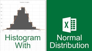
SPSS- how to create frequency distribution graphs (e.g., bar graph, histogram, polygon)

HTML-код
- Опубликовано: 11 сен 2024
- This video describes how to create various types of frequency distribution graphs in SPSS, including: bar graphs (use for variables measured on nominal or ordinal scales), histograms (use for variables measured on interval or ratio scales), and polygons/line graphs (use for variables measured on interval or ratio scales).
note: these graphs are typically not APA style
Outline:
To create frequency distribution graphs:
• Make sure you have indicated the correct scale of measurement for each variable in variable view (i.e., nominal/ordinal/scale).
• Select “graphs” from the top menu bar
1. Select “chart builder”
2. Click OK if a dialog box opens
3. To switch the view of the variable list (you can view either the variable labels or the names)
Hover the cursor over the list of variables
Right click
The options should come up to either “display variable names” or “display variable labels,” select whichever you prefer
4. Select type of graph
i. To create a bar graph (first complete steps 1-3)
Under the gallery tab you will see “Choose from” followed by a list of options
Select “bar”
Double click on the first option “simple bar” (you will only see this name if the cursor is hovering over it)
Select a variable from the list of variables, drag this variable into the box on the graph labeled “X-Axis?”
When you do this, the “Y-Axis” of the graph should change to “count”
Click “OK”
ii. To create a histogram (first complete steps 1-3)
Under the gallery tab you will see “Choose from” followed by a list of options
Select “histogram”
Double click on the first option “simple histogram” (you will only see this name if the cursor is hovering over it)
Select a variable from the list of variables, drag this variable into the box on the graph labeled “X-Axis?”
When you do this, the “Y-Axis” of the graph should change to “histogram”
Click “OK”
iii. To create a polygon (first complete steps 1-3)
Under the gallery tab you will see “Choose from” followed by a list of options
Select “line”
Double click on the first option “simple line” (you will only see this name if the cursor is hovering over it)
Select a variable from the list of variables, drag this variable into the box on the graph labeled “X-Axis?”
When you do this, the “Y-Axis” of the graph should change to “histogram”
Optional: in the “element properties” (menu on the right) you can select the option “display normal curve” to examine your distribution compared to the normal curve, click “Apply”
Click “OK”