Thank you ever so much for your great effort! I have seen a lot of your videos on SPSS. Without your kind help and step by step instructions, I would have never written the statistical part of my thesis!
Dr todd i need to make bar graph on spss. i have data of traffic people using car, bike and public mode and question was asked to people that would you shift to BRT and responses were recorded in yes, no ...i need to make a bar graph showing bars of yes no with all modes shown on x-axis and percentages of respective modes should be shown on bars...kindly help me i am dying of headache this problem has given me. please help me
Hey I got to making the chart , completed it, how do I save it to my laptop? The “ok“ button is not letting me click on it. The only ones I can click on is “ Reset” and “Cancel”.


Thank you ever so much for your great effort! I have seen a lot of your videos on SPSS. Without your kind help and step by step instructions, I would have never written the statistical part of my thesis!
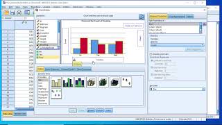
I was looking for a tutorial that uses Chart Builder (I didn't know that you have to drag the chart from the gallery) so this was spot-on. Thank you!
Thank you so much. All of your videos are really helpful. God bless you ! So happy to watch your videos and solve my problems.
Interesting! I had no idea about this.Great info!
Thank you Sir, your video are very informative and straight forward
How about the Likert-type scale if I want to have the percentage of level of difficulty for all variables?
You are a MASTER!!! Thanks!!!!
I like how you can set new minimums and new maximums in the scale range instead of having to stay with the default.
Many thanks for you excellent tutorials. Is there a way of showing the significant differences by letters between groups in spss chart builder?
Thank you for this video, it was very helpful for me
Thanks alot. I have got all I was looking for.
You're welcome -
You are the best!
Thank you Dr. Grande.
The plus sign for the y axis doesn't appear?
what if i want the count or value... they are not there with mean and median when i put 2 variables on y axis
Thank you sir!
Hi. Thanks it was helpful. I am.a beginner, n find it challenging...
Thanks for the tutorial. It was quite helpful. However, could you kindly describe how to compare the same categorical data using a clustered graph?
Did you get help?I need to learn this asap!
THANKS 4 THIS VIDEO
I GAIN SOME THING BETTER
can you help me...when i try to drag Item1 like you did for the graph, i cannot find my item1, item2, item3 etc..
Dr todd i need to make bar graph on spss. i have data of traffic people using car, bike and public mode and question was asked to people that would you shift to BRT and responses were recorded in yes, no ...i need to make a bar graph showing bars of yes no with all modes shown on x-axis and percentages of respective modes should be shown on bars...kindly help me i am dying of headache this problem has given me. please help me
I can't add to the x-axis. There is not a plus sign. How can I find it?
Is it possible to break axis on bar chart on spss?
Thank you so much .
Hey I got to making the chart , completed it, how do I save it to my laptop? The “ok“ button is not letting me click on it. The only ones I can click on is “ Reset” and “Cancel”.
THANK YOU
Bravoooo thank you
ı cant see plus sign on y axis,please can you help me?
It only works on scales (not ordinal or nominal data)
i cant see output
Thank you FYI :)
Tood grande explain very well but always voice is v much slow. V difcult to understand what he is saying