SPSS - Summarizing Two Categorical Variables

HTML-код
- Опубликовано: 26 сен 2013
- SPSS - Summarizing Two Categorical Variables: Cross-tabulation table and clustered bar charts with either counts or relative frequencies (and 3 ways to get them)
 Хобби
Хобби
Хобби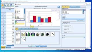


You have no idea how much this helped me, no words can reward you, thank you.
Thank you! You're a life saver! :)
Thank you so much. Was struggling to figure this out. Bless you!
Thank you so much. You've saved my day.
nice and simple explanation, thanks a lot
thank you sir! you're a life saver. god bless you :'D
Thanks for this useful video, it helped us too much..
Huge thank you. Helped me a lot
It's me dr amjad thanks for such a nice presentation.
hi, thanks for your video
is it possible to combine 3 variable?
Great video, really helpful
It really helps me thank you... God bless you
Big thank.... Really helpful
Thank you, sir. Best Regards.
If i make a bar chart from chart builder with many filters can i analyze this chart as Descriptive Statistics - frequencies ??
Thank you so much!
Thank you!
Thanks u sir, really useful
thanks so much!
THANK YOU SO MUCCCCHHHHHH
This is a great video! Can you tell us how to generate comparitive histograms like this for TWO categorical variables where data has been collected for many? How do you isolate two categories? Eg: say I wanted to see how many people owned cars, and I had stats for every US stare, but I was only interested in asking about car ownership in NY and TX.
You can use "select cases" in data menu to subset your data but I'd probably just create a new data set that included on the NY and TX data (just sort and delete other rows; make sure you save with a new file name so you retain your original data set. Then, go to the graph menus, select histogram, and here is an option for a population pyramid that might give you what you need. Alternatively, once you have your data subsetted, just do a comparative box plot (Analyze, Desciptive Statistics, Explore ...).. If you know how to use R, a comparative density plot is another alternative. See, for example, ruclips.net/video/ZL9sRQWPGQM/видео.html.
God bless you
Bob Ross of statistics
thank a lot sir....
thank you for this vid ... really helpful ... im a student and I thought I should use excel to have nice charts in my thesis ... so thanks for ur vid :) ... side note: I hate Excel ?
how to analysis four to five variables?
THANK YOU SO MUCH absolute life saver, does anybody know how i can make the percentages show as single numbers without the decimal? thanks
how could you add a third coloumn per answer. as in all population vs male vs female?
Thank u so much
this is helpful
Thanks....
HELLO, THANKS FOR YOUR VIDEO. It is very helpful. I am studying the relationship between parents who like math, their children may enjoy learning math. I want to use parents attitude (parents believe studying math is important) towards math as a mediator variables. I want to create a bar chart for 3 categorical variables. how can i do this graph please?
Please see my (updated) response to Laleh (below).
@@DWR447 sir I need these lecture in notes forms
thank bro
thx m8
your voice is spooky
+rep
what about more variables?
Consider a mosaic plot. Though not included with SPSS, I think you can search and find some syntax written by another SPSS user. If you know how to use R, a mosaic plot is pretty easy to make. See, for example, www.statmethods.net/advgraphs/mosaic.html.
Thank you very much.
Here is a video that shows how to use R to summarize three categorical variables (and it wouldn't take much more to summarize a 4th or 5th: ruclips.net/video/TJKskHT_zQs/видео.html.
If you haven't use R or R Studio before, I have posted some links and videos at sites.google.com/site/buad2053droach/statistical-software/r.
Thank you very much. You know I am working on my dissertation and have three questionnaires for one them I need a graph to show percentage on the horizontal part, my 36 questions on the vertical part and also the level of difficulty with different colors on each bar. I have read many articles and found it in one of them. It has been described that they have used Descriptive part of SPSS to do it. I have tried a lot but I was not successful. I am going to try this software and method. Thanks again.
recorded in a submarine
It really helps me thank you... God bless you