Overhauling the UI in my Farming Game (still)

HTML-код
- Опубликовано: 10 июл 2024
- Devlog video about "Homegrown", a casual farming game I'm creating using my own engine.
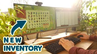
More progress on the UI this week - tile examining, better icons, lighter inventory, buff tool-tips, and stripy health bars!
A big thanks to twistedcatcc for creating the fantastic designs: linktr.ee/twistedcat/
Support the channel on Patreon and get access to the game & code for Homegrown, the city-builder, and Equilinox:
/ thinmatrix
Play my previous game "Equilinox":
store.steampowered.com/app/85...
You can follow the progress of the game on my social media:
Twitter: / thinmatrix
Instagram: / thinmatrix
Facebook: / thinmatrix
Trello: trello.com/b/W3zkIJTM/farm
Email: thinmatrix@gmail.com
Background music by Jamal Green:
open.spotify.com/artist/50jTM...
Equipment (Amazon Affiliate Links):
Camera: amzn.to/491ayFZ
Desk Microphone: amzn.to/48Hs5mP
Camera Mic: amzn.to/48ZcRcE
Mouse: amzn.to/3Sn0v8J
Quick and easy bread recipe: • The 5 minute baguette
#devlog #Homegrown  Игры
Игры


I must say i really love the cozy vloggy vibes of this channel
I really loved the examples sent by twistedcatcc! The idea of some UI having little vegetable/flowers is super cute. If you think they might be too obtrusive for general information panels, maybe you could incorporate them to special places like the shop UI.
need some wild life
- birds, butterflies, bees, bunnies, little bugs and cats
idea: Cloud's shadow drop on the terrain, this effect will give life to your map
Wildlife will definitely be coming at some point!
The cloud shadow idea sounds so cool, giving a sense of "motion" to the map thats amazing
And wind!
Yeah cloud shadows feel necessary. Even some wind streaks now and then when the weather gets blustery.
I love this suggestion! Also, if you can have lakes or water ponds, the clouds could reflect there, which gives a very cozy ambient.
For a very casual game maybe "bonuses" is a better term than "buffs"? Looking great!
Having a simple UI to showcase the main aspects of a tile is a good start, but having a secondary button (like pressing alt) or some other button to expand the UI to show advanced stats would be super handy. Having it like that means you can put your most important bits front and center but still give people the option of a more detailed look.
While you can see the "weeds" and "water" on the tile, that's only a surface level look, when you have plants all clumped together with lots of things going on it's going to be hard to see exactly what that "single" plant you're looking at is doing.
Another great vid mate, can't wait to see how it progresses
Wanted to second this! It's good practice to have an audience in mind ("casual, cozy gamers"), but inevitably you'll get some minimaxers to whom you may be able to throw a bone or two
Could I recommend that when you're hovering over a tile in a certain view mode, it highlights (colours) the neighbouring tiles which the hovered tile provides buffs/debuffs to. That way when you're about to edit something you can tell whether it'll gain or lose you some bonuses nearby. Equally, the opposite could be true, mousing over something with buffs highlights the tiles that gives it buffs/debuffs.
Getting back into the sims (and it's modding community) recently and seeing twistedcat here was a nice coincidence. She makes some amazing stuff so taking inspiration from her is always bound to turn out well. The game is coming along wonderfully and the devlogs are always a nice relaxing treat!
Related to the content bars I would do is suggest is having different patterns for each color, thinking about accessibility
Thanks, that's something worth considering. Although I think in the case of the fertilizers it's probably not necessary as the fertilizer/buff icon and name is shown right by it, so the colour isn't required to identify it.
Always get a motivation after watching the video.
It would create more confusion and loses cohesion if anything
Great video as always! One thing for the inventory bar, if it isn't already implemented, make sure you can choose tool and item from the bar with key presses.
Yea same with the “focused” tile. I expect esc would de-select.
Thanks, will do!
What I would change in the tooltip of the gardening tools is to replace the size of the affected area, eg. 4x3, by a visual representation of squares. This makes it visually more pleasing to look at and easier to grasp.
It's always a bloody good day when you upload
Love your videos - always a good day when there is a new video 🙂
A smile always pops whenever I see a new upload, In a sea of game devs that started a youtube channel for game dev to sell courses before even writing a single line of code. You really do stand out. Big inspiration for me to keep making games even after all these years. Keep up the good work !!!
I love the chill cozy vibes of your devlogs, and your progress every time really pushes me to stay as committed and productive for my project.
Love the vibes of these man, and am a big fan of your desk setup. Going to use this as a spark of inspiration when I redesign my office (:
Loving watching this get developed! I would love to get into something like this once I am done with my studies and your videos are a constant (and cosy) source of inspiration :)
Love the UI updates to the toolbar! I think you have a nice balance of your style (with the playful shapes) and the cohesive lighter palette/icons from the fan’s mockups. Great work :)
Your devlogs are always a treat to watch. Well annotated and calm vibes always. ✨
I so much like your vlogs! They are so cozy and warm and motivating to work and create!☺
Keep going. you're really just too good at your craft!
omg the artstyle is coming along really nicely
Great work! Real nice and cozy devlog, love it! Keep up the good work!
Thanks!
Love the dev log updates! Really enjoy the food with friends!
Thank you for providing us with good content mixed with vlog! I hope more videos will come more often.
Your art style is so good. Some time ago I also started a farming game very similar to yours, to practice what I've learned. It was very hard to make it look good, you did a great job
Looks great, can't wait to see everything else!
As always, great progress and great video!
Thank you!
Let me start saying that I love your videos... very cozy and at the same time full of life (meaning nature and plants)
It is amazing how far this game has come over the last couple of years. You are such an inspiration to me.
I love that you are mixing up the shots a lot more with real life really adds to the videos! Like a little vlog of your life and the game dev stuff but yeah also the game dev stuff is looking awesome!
I love watching this game progress! I had a thought though about adding weather into the game. Weather could provide buffs and nerfs to different plants like watering tiles for you and such. Keep up the great work!
Beautiful ! Love it , nice video
The game is looking beautiful, and the stripy bars really helped give it a bit of polish
I'm really liking the style of this new UI, especially those striped content bars.
UI’s really coming together nicely. Great work
Thanks!
6:43 Quacks!
yessss that game is very good!
OMG. The game looks so clean and smooth and minimal. I love it.
The UI tweaks all look excellent, imo 👍
Looks amazing!
Also AHHHHHH THIS IS SO CUTE 10:55
The UI is coming along great! You could make it that clicking on the tile locks in place and extend the info panel to have best of both worlds
What you can do if people want more info and stats, is give an option somewhere in the menu. Call it nerd stats or something like that, completely optional and gives players the ability to choose if they wanna see a bunch of stats and numbers, or the minimal style you're going for.
You are living my dreamed life, I wish you the best !
Hi ThinMatrix! Game is looking good! Your comment about having to type things out gave me a flashback to my DOS days. Heh. 😜
Great work!
Man, I need to get some more plants in my workspace.
Game and UI is looking great, BTW!
aside from coming back every video for the beautiful game development
i just wanted to say that you actually inspired me to get houseplants for my own apartment! it really changed the space, keep up the good work bro 👍🏼
The UI is so visually satisfying to look at
I must say, YOU ARE MY INSPIRATION! ever since i came across your 10 years game dev journey video, i said to myself that "hey he started at my age, and he learn java in college just like me,". and since that moment i deleted my mindset which is "Java is bad" cuz that is what i hear from lots of developer and it makes me feels insecure. watching your video always makes me feel i have to be like him. and from that moment i tried to find lots of lwjgl tutorial and open gl and trying to polish my math skills. but there are no good tutorial well at least for me. but then i decided that screw it i dont care if its latest tutorial or not imma follow it. and i followed your tutorial. i'm at the fog tutorial for now and you explained it so well. when im feeling down and ever wanted to give up ill watch your socuwan devlog and think to myself that i cant give up yet. watching your socuwan devlog always makes me feel like "am i learning the right way? my maths skill is bad. i have to improve my problem solving skills." etc. and it kept me going. I've always wanted to know how can i approach learning stuff like this (math, problem solving, and advance concept) as a programmer and my mindset is always i want to be like you. point is i just wanted to say THANK YOU FOR BEING SUCH A GREAT TEACHER AND INSPIRATION FOR ME AND ALL OF US DEV OUT THERE.
you're so talented man
Looks really good
The minimalist UI by twistedcat is realy great
wow please add this amazing gaussian blur effect from her sketch to the panels, it is so pretty
The eye dropper icon really doesn't match the function of inspection. The magnifying glass as pictured in @twistedcatcc's design is much more fitting, although the one pictured in the video is flat, and needs more detail. The eye dropper usually means "pick some of this" for use elsewhere.
edit: great video as always, and it's always fun to see Rufus, he couldn't be any more adorable
That's true. I'm hoping to completely change that icon at some point though - to something that somehow shows that it relates to the terrain. I've failed so far in my attempts to create an icon that shows that though!
@@ThinMatrix only thing I can think of is either a magnifying glass over the "4 corner" tile selection cursor, or instead of a magnifying glass, an eye (again, with the selection cursor behind it). As in "looking closer at a tile"
How about an information icon? Might fit well with an inspector tool. Quacks looked fun- me and my partner love that game too!
This might be difficult to implement, but having little creeks or rivers that you can build bridges over and that water your plants would be so cute and fun. On a smaller scale, maybe you were already planning on doing this, but making the content bars rounded on both ends even when it isn't fully filled would look nice. I love how the game is looking!
Lovely devlog as always! You answered my concern as I was thinking it, about how you'll show the tooltips with your investigate/magnify tool, your method for that seems perfect really :P
And also as always, your food looks fantastic, cookbook/cooking channel when! :D
man i truly love this kind a games such good video tnx ... im web developer and love know how to create game like this cute UI i loved good job
Looking good breh
Hey 👋 I am working on a, totally unrelated, 3D-based user interface for a Home Automation project of mine.
I had a hard time aligning actual user controls with the 3D model. I even decided to use a hacky workaround some time ago, and let the topic rest.
However, after your last video, where you implemented the screenspace projection for your UI containers, that concept finally "clicked" with me and I was able to resolve the element positioning in my project, too. I still have that screenshot of your implementation in the todo of my Kanban 😆
Thx for the (unintended 🙈) nudge and keep on with your great work here 🙏Always curious what you work on next.
Cheers!
Great devlog as always!
Another way I like getting more info on the moused over tile, would be to use ctrl, alt or shift for example. Desynced does this really well. Mousover would then give minimal info and with holding a keyboard button you expand the info. That way you would not need to click and click away from the tile. Just a thought ofcourse!
Great job as always! I think that a magnifying glass would be a good icon for the "examine" button :)
Looks good.
Quacks of Quedlinburg, love to see it!
I love your content mate, keep it up!
I’m the type of player that enjoys expanded tooltip’s in a game but understand why you’re implementing simplicity, so thought I’d make a suggestion; have you considered extended hovering providing more tooltip detail? Perhaps 5 seconds, then you provide the player all of the additional juicy detail.
For the connected to house bonus, you could use some sort of simple pathfinding algorithm from the bed to the house, figure out maybe the most common path tile used, and depending on the path tile, give it a different bonus (stone gives 2 buy dirt gives 1, for example)
I really woukd love a modern up to date java game development tutorial like this one.
UI is one of the hardest part of game development for me. It always takes 10x longer than you think it will.. and even then it might not look amazing! It's impressive how much effort you're putting into it. UI can make or break a game, and is such an under appreciated aspect of video games. hoping to get better with my own UI design skills.
I really love seeing your progress every time you update this game it's really inspiring and helpful for how to think about implementing systems and functionality when making a game, something I'm just starting to learn about how to do so I really enjoy and appreciate your videos. The inventory update looks much nicer, and I think your shop icon is very cute, though definitely the outlines need adjusting to better fit with the rest of your UI elements. As for the status bars and that texture, currently your graphics have very soft and rounded shapes, so I was thinking maybe using a gradient might compliment the rest of your game a bit more as far as visual language is concerned. Your menus/pop ups are all very soft in color, shape, and often include transparency elements it seems like, so perhaps trying to unify your design more by making the status bars follow those trends a bit more closely could nicely fit in with the rest of your design language? As for the texture you implemented here, it might just be me, but they remind me of cheap mobile games that get advertised to me when I'm trying to watch RUclips with the exception of the purple one which I like, but it feels out of place with the rest of your game to me.
Thanks a lot for the feedback! I'll definitely try using a gradient, maybe that would make more sense than the stripes.
8:12 I must say I like the market town symbol alot. I’m not attached to it, but I think it’s good as is.
I’ve been watching your videos for ever, and really love your content. Thank you!
I have a couple of small ideas regarding subtle UI animations in 2 areas that you’ve shown here if you’re up for hearing them?
Firstly the textured fertiliser bars that you showed off towards the end of the video. Instead of having arrows beneath them pointing left or right to indicate whether the resource is increasing or decreasing, why not animate the stripped bar texture either left or right. You’ll save some vertical space in the tooltip and convey the same information with just the bar itself.
Secondly, the hover state on the toolbar items at the bottom: instead of scaling the entire UI element as one (background, stack number and item icon), I think it would look nicer to only scale the item icon and then just slightly increase the opacity of the background square so that it’s slightly more solid, leaving the stack number as is.
I think the new UI looks fantastic, it gives me Nintendo wii vibes which hits a cozy nostalgia vibe for me. I also really love the sound design of click sound when you select the inspect tool. Keep doing what you’re doing! :)
I love your videos!
I like the idea of holding a modifier to get more detailed information
Nice video, I always enjoy these. I'm having a bit of a tough time discerning depth given the block-colour nature of the assets: I think a little bit of subtle ambient occlusion would go a long way toward helping with that.
It might be a good idea to make the mouse over popups in the inspector tool buttons. That way you're not spammed with popups if you randomly move your mouse over them. The same can be done for the inventory but that's fine since you want easily accessible info when you open up the inventory.
Also, for the bars, to get that rounded end, what you can do is take the color behind the bar and make a cutout of just the rounded end portion of the bar plus a little bit of leeway, and make it the color that I told you about. Then all you have to do is to draw it at the end of the bar, and make sure to apply the same cut thing on it.
I love the game and can't wait to play it. Good luck m8!
I like to watch more of coding sections, which this video series is all about, developing and programming a game, rather the seeing you cooking or you doing garden stuff, or you being outside or your dog or whatever unnessecarily....This series has become more and more of a self presentation than logging the (game) development - hence devlog !!!!
Looks amazing! If you still are interested in offering more detail without overloading the hover ui, perhaps either a hold or toggle of ALT would expand more info that the casual gamer may not care about.
U can add water levels of plant as vertical progress bar on either of the sides. Example: water bar on left and fertility bar on right
Yay new vid :D
Looks great!
Just as a general bit of feedback, the first impression I would have of the eyedropper icon is that I can select a crop to plant, essentially quick-selecting it, without having to browse through the list of available crops.
The inspection feature it offers I would expect from a magnifying glass icon :)
For the portion about locking the examine information on a specific tile, it might also be an idea to allow the user to press and hold a button to keep the examine window of the current tile open, allowing the mouse to move around freely - inspecting the buffs in the examine window
Thanks for the feedback, both good ideas!
I miss watching your videos!
Even though the information is visible (such as the amount of weeds on the tile), I still think it would be nice to highlight this in the inspect panel, as a second form of confirmation there is an action that needs to be taken. This helps to reduce confusion I think. It doesn't have to be a large section, probably could just be one line of text.
I also would add an alt-key or command-key that allows someone to quickly see an inspect panel for the hovered tile, just in case the player needs to do a quick check. The player can get a permanent tile-overview by clicking the inspect view, or press down one of the hotkeys and the panel pops up, and when they release the key, it goes away. I appreciate when simulation games have that feature.
Your every video in itself is a masterclass for people like me who wants to learn game dev, devlog making, script writing and video editing. All the best for Home Grown. It looks super cute and cozy! ❣
So vibey, this is how I aspire to be when programming 😂
Always a good day when the ThinMatrix notification comes across the screen.
I love watching your dev logs, they are super chill and interesting.
One side question: what tabletop game is that?
Wonderful as always. Kinda wish the progress bars still had their rounded edge but I'm not sure if the openGL workaround can do that.
Die Quacksalber von Quedlingburg is a great game. Btw. the game is named after the very idyllic town Quedlingburg in the Harz.
Awesome update as always!
You could animate the stripes of the bars slowly to indicate them depleting / actively changing?
Also, the straight cut off looks a bit 'hard' for the game's style, so having a rounded right 'end cap' would look even better. That gives issues with continuing the pattern, you could fix it by scaling a mask or overlaying graphic on top of the bar instead of the bar itself!
Screen space texturing might be a good option for that, since it's a UI.
@@bluesillybeard how didn't I think of that. Great suggestion!
I second this opinion!
Holy ****, he has uploaded!
I think it would be very cool if the striped design on the bars actually moved according to the current state of that bar. To either replace or complement the arrows that show if the bar is increasing or decreasing
One subtle piece that may not matter much, but I kind of agree with what the person who gave the reference ui was doing. A magnifying glass seems better suited for your inspect button icon rather than an eyedropper. It's a bit more intuitive to the function, especially because an eyedropper usually implies selecting an object in the world as the item you want to use/place further
I feel like one way to have people be able to tell the specifics on visual detriments/bonuses without overfilling the examine menu is to have multiple examine tools. My idea is that you can click on the examine tool and it would open a drop down menu (or drop up or just a horizontal menu) and you can select a weed examiner or a bonus examiner
I think the icon for the tile checker might make more sense if it's a magnifying glass or something. Right now the picker icon makes me think i'd be able to "pick" a tile to duplicate/place it somewhere else.
This is just a thought, I know you want to keep the UI minimal, but for things like Water or Weeds growing etc... Perhaps changing the way the panel looks itself.
For instance, use the default UI window if the land plot is dry. If it's wet, maybe a blue-ish tint, or a blue border.
For weeds, maybe along the edges of the panel have weeds growing out the side of it.
Either way, I like the way everything looks.
nice. Thanks for the video. For the inspect tool will be great to have it in a shortcut like shit or ctrl
Wow, I'm not playing board games often but this one at 6:43 I know very well! It's awesome, highly reccomend it! It's called "Quacks of Quedlinburg". Crazy to see it on the "random" vlog on RUclips. :D
We just discovered it at the end of last year and now we can't stop playing it! We already bought both the expansions :D
Cooking devlog next? It looks amazing 😮
3:55 idea: you can keep ui minimal but you can add some examine option to see how much for exmp compose there are or wet etc.that willl keep ui minimal but still give option to examine details
You should add an accessibility option to include all the "visual" info in the tile information tool so low visibility players can still get the information
very nice to see the progress over the year! Why not add an object (like glasses or a book) to allow to display more stats? It never hurts to have an additional source of information, it might help colorblind people or people with not the best eyesight
QUACKS OF QUEDLINGBURG. A man of fine taste.
You could add bed indicators for things like soil dryness or weeds overgrowing. Like those icons you have in cities skylines when some need isn't met. That would make it apparent to the player that there is something needing their attention right now.