Make Your Web Design Responsive in 10 Minutes | Figma Tutorial

HTML-код
- Опубликовано: 24 окт 2022
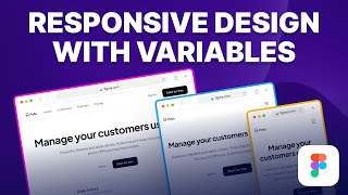
- In this video, I'm going to show you how to make your web design responsive in Figma using Auto Layout and Constraints in just 10 minutes.
Remember to subscribe: bit.ly/3US49pf
Download the practice file from here:
bit.ly/3z9dcde
👉 Become a UI Designer with my UI Design & Figma Mastery course:
bit.ly/43v79vX
👉 Get my FREE UI/UX Design e-book here:
bit.ly/3UXpcsz
📸 Instagram: / uiux.arash
Who is Arash Ahadzadeh? Well, I'm a UI/UX designer and a university instructor with 7+ years of experience, and I teach people how to design great user interfaces and experiences. I've helped over 30,000 students become UI/UX designers from scratch worldwide.


👉 Become a UI Designer with my UI Design & Figma Mastery course (17+ hours and 130+ lessons):
bit.ly/43v79vX
Hi. So far, I've only looked at the header. The question is, after making three elements of remponsvv, should they be grouped back or how?
😂😂😂😂😂 do you folks do not know about media queries? Are you Indians?
This is the most straightforward and concise figma tutorial I’ve seen. I’m definitely subscribing and turning on notifs now.
Thank you Arash ❤
Glad it was helpful! Thank you so much. Welcome aboard.
me too
Not sure how I'm just discovering this channel cos I'm binge watching your tutorials. User experience well done! And how you put relevant follow up videos at the end. Not distracting popups mid video. That's some user psychology. Great content all round! Subscribed.
Thank you so much. Glad you found them helpful. Welcome to the channel.
Whoa. This is one of the most helpful 10 minute tutorials I've ever seen. This is absolutely excellent.
You thought through all the possible issues that a beginner will face and then provided solutions for each of them. This is what a great teacher looks like. Thank you so much for your effort.
No problem. Glad it was helpful!
Hi Arash! I just wanted to say how I appreciate your work. These tutorials are so helpful.
You are most welcome. I appreciate it.
Arash, you're the MAN! Not only the directions "do this, do that", but also WHY you should do it that way. Thanks much for your informative video! Cheers
No problem. Thank you.
This is such an excellent video and your teaching style is concise yet straightforward. Thank you so much Arash!
You're very welcome! Glad you liked it. Thank you very much.
I used to create responsive designs manually till now, I didn’t know the power of constraints and auto layout, now it will definitely save a lot of my time, Thank you 🙏🏼
No problem. Glad it helped!
Same with me
I recently did the same to my project. I just couldn't understand constraints until now
I've just started in UX design struggling with things I don't even know I don't know cuz it's a whole new world. Then I found your channel. Super super helpful and easy enough for this newbie to learn. Thank you sooo much!! Hit subscribe 10 sec ago ✨
Glad you liked the content. Welcome to the channel.
Thank you so much! I’m just starting out in Figma, and this tutorial was extremely helpful! I subscribed to your channel and this will definitely be one of my first stops when I’m looking for excellent tips!
No problem. Glad it was helpful!
Thank you so much for this, Arash. You make it so simple!
My pleasure!
Thanks for the tutorial Arash, it was great. The way you explain the flow was so easy to understand. It will really help in saving lot of time. Keep making such tutorials.
No problem. Glad you found it helpful.
You explained this Figma responsive tutorial perfectly and concisely. This is going to save me a load of time, thank you so much.
Also, I respect that you didn't ask for a like or follow until the end of your video. This is the first video I've watched on your channel and I'm about to subscribe now.
Thank you very much. Glad you liked it. Welcome aboard.
i have been trying to make my websites responsive for the past 2 days and this is the only tutorial that helped me, thank you so much!
I'm glad it helped. You are welcome.
Yesss, I finally understand what is responsive design...so I hope now to complete my task and finish the design course. You have a new suscription. Thank you
@@wik_wal I'm glad to hear that. Welcome to the channel.
As a beginner, your contents are just the best! As time passes I’ll get to this level.
Thank you so much. I'm sure you will.
This is the best and most straightforward figma video I've ever seen, thanl u man!!
Thank you very much. Glad you liked it.
You are my favourite designer on RUclips. Easiest to understand, thank you!!!
Thank you so much. I'm so happy to hear that.
Finally, someone finally thoroughly taught auto layout and responsiveness…Thank you so much, I’m trying to save this video for later
No problem.
I'm just getting started and your videos are so helpful! Thank you!
You are so welcome!
Awesome lesson! Soooo helpful 💚💚💚
Thank you. Glad it was helpful!
The best and top explanation of responsive design in all of RUclips...
respect
Thank you.
Really well thought and detailed video. Grateful for the content. Thank you Arash!!
My pleasure!
your videos such a blessing! Thank you so much for them!
Thank you so much. Glad you liked them.
This was a life saviour video. Thank you so much Arash! Great Content
No problem. Glad it helped.
Excellent video, clear and concise. Many thanks! I'm subscribing!
Thank you so much. Welcome aboard.
subscribed, this has single handedly boosted my figma experience!
Glad to hear that.
Tks Arash. For creating this tutorial. You made it easy. I hope you will dont stop creating. Experting more videos from u r side ❤
No problem. Thank you.
Thank you for this sweet and short tutorial!
Glad it was helpful!
Thank you Arash,You speak very fluently and I have benefited a lot from your teachings❤
No problem. Glad to hear that.
This is a great channel! ...
Congratulations on such an outstanding achievement. ...
Thank you very much.
Very concise and well explained video. Thank you for this amazing tutorial!
No problem. Thank you so much.
Man, this is very helpful, my design now works on my teammate's widescreen.
To be honest u really explained it amazing
I just started design webpage and I don't know what is responsive Design but u nailed it
Thank you very much bro.... ❤️
No problem. Glad it helped.
This is really nice. Excellent teaching Arash ♥♥
Glad you liked it. Thank you so much.
I'm so happy to found you, you have a nice way to explain. Your voice is easy to hear (English is not my mother tongue). Thank you for share your knowledge :)
Thank you very much. I'm glad to hear that.
thank you for sharing, Arash it really helpful!
No problem. Glad it helped.
That was really helpfull. I seen other videos of same concepts but your video is a way better than the others. Thank you so much.
No problem. Glad it was helpful!
Hi, I'm from Tokyo, Japan. What a great Content!!! I can understand about Figma really easily ! The best tutorial I've seen!! Thank you so much for the wonderful tutorial.
Hi. Welcome to the channel. Glad you found the content helpful.
This was awesome! Super helpful as I always had fear of responsive design..
Glad it was helpful! Thanks.
عالی بود. ینی من ده تا ویدیو فارسی دیدم رسپانسیو و auto layout رو یاد نگرفتم یه ویدیو شمارو دیدم متوجه شدم ممنون.
This is such an excellent tutorial. Beautiful design by the way
Thank you so much.
Awesome ! I can solve problem thanks to this lesson. Thank you SO MUCH !
No problem. Glad it helped!
Brother the way you explained is brilliant 💯 very useful 💯
Glad it was helpful! It's very kind of you.
This helped me immensely. Thank you so much for sharing ❤️✨
No problem. Glad to hear that.
Your videos are very useful and provide lots of information. I have received lots of help after watching this post, please continue to share this kind of information. Thank you.
Glad to hear that. Thank you.
Thank you Arash, it was clear, understandable, and useful🤩💫
No problem. Glad you found it helpful.
You are amazing. Thanks for the video 😊😊
this video is so helpful! way better than what my school provided us! thank you!
No problem. Glad it helped.
damet garm arash jan kooli estefade kardam❤
Ghorboonet Mohammad Javad jan.
Thank you, dear Arash, It was great video
No problem. Glad you liked it.
You are amazing my friend, I am a fan of Adobe XD and watching these tutorials makes me wanna switch
Thank you so much. Glad it helped.
It is just easier to create a separate mobile version on figma and less time consuming.
Appreciate your effort
That's not the point. We should design for the desktop, tablet, and mobile anyway but we don't design for only one mobile device. We make these frames responsive because there are different devices with different dimensions in the market, and our design should adapt properly.
So far, that’s been FE people work to ensure responsiveness and design only needs to provide breakpoints. Which is I also personally find easier to just create manually, especially in complex dashboards and systems where you will have text size and placement changes. This said, if you’re building a landing with a direct export to Anima or Webflow even, the constrains will defo help
Wow i love to watch your videos
آرش دمت گرم!آموزشت بی نظیررر و بسیار برای بنده مفید بود
ممنونم. لطف داری.
THANK YOU ARASH
Awesome ! thanks for this responsive design video, Please share more of your skills like these..
No problem. Sure.
Very helpful tutorial. Thanks!
Glad it was helpful!
Thanks for the tutorial, I really appreciate
No problem.
Good job, loved this lesson
Glad you liked it! Thanks.
Its just Amazing, very easy to undestand your explanation, thank you so much. 😀
No problem.
oh thank so much , u help me a lot ❤
No problem. Glad it helped.
Thank you for this helpful tutorial :)
You're very welcome!
Amazing tutorial uncle,thank you very much..this gonna make my workflow faster
Glad you liked it.
Hats Off to You!
Your Content is really AWESOME!
I'm also learning from you SkillShare Courses :)
Thank you so much. It’s so nice of you. I’m glad you liked my content.😊
best explanation! clean and ocncise
Thank you so much.
Thanks, this is really helpful
Glad it was helpful!
Easy and Fast, Thank you!
No problem.
nice ! thanks bro
No problem! Thanks.
Thank you for this.
No problem.
Thanks for the Video. It has been really helpful in my project, as I wasn't clear about this. I have one question: When you converted the desktop version to a tablet or mobile, I didn't see you changing the grid layout from 12 columns to 8 or any of the margins. I assume it doesn't happen automatically, and we have to manually do it, or because our layout is already set on the desktop. You were just changing the constraints/properties to make it suitable for other sizes. Please throw some light. Thanks!
Thank you so much, it was easy to understand
Glad to hear that.
It i soo good, damn. So fast and understandable. Thank you
No problem. Glad it was helpful!
Very helpful, Thaaaanks
No problem.
thank you! 😊
No problem.
Very interesting video!👍
niceee tutorial thankyou!!
Glad you liked it!
awesome.Thank you very much
You are very welcome!
just in time and just whats needed. TY XD
Nice to hear that.
Thanks Sirr Love Yoy ....😍
Thank you.
This took me way too long to make it work and it's because I was setting the "scaling" in the height section rather than width section. You definitely need to communicate this. Also, you have to make sure the text is set to auto-height in the type settings.
Question about responsiveness: When it says it is responsive, does the spacing between elements (cards, buttons, title and text, etc.) remain the same size or vary proportionally?
thank you so much 😍😍😍
No problem.
Thank you!
No problem.
Thank you man
No problem.
Hi and really thanks Arash.
Hi. You are welcome.
This is a game changer for me as i'm working as developer :)
Glad to hear that.
This is the best tutorial I've seen so far. I've gone through so many RUclips videos and this one is very well explained. However, I can't download the source file so I've been following along with another file from another RUclips video :/
I'm glad you found it helpful. I checked the link and everything worked properly. Once you download the Figma file you can drag and drop it into your Figma dashboard.
@@DesignWithArash Dragging the file to Figma didn't work, what worked was importing the file in the dashboard. I was able to do the tutorial. Thank you!
THANK YOU VERY MUCH!!!!👌
No problem.
Very Good man , Make a full web design projct wireframe to prototype
Thanks Arash
No problem.
Thnak you so much
You are welcome.
Hi Arash, nice helpful content. When we make wireframes should we be working on the responsive grid from the earliest stage itself?
Hi. Thanks. It's not needed but you can make your wireframes responsive as well especially if you work on a large-scale projects with lots of pages, it would save you so much time down the road.
Many thanks!
You're welcome!
very awesome video and helpful to us
Glad you think so! Thank you.
Very well explained - clear and concise! Is there a better way to handle the images though? Especially in the mobile view- its cutting of the heading that says dashboard and only showing the center of the content which doesnt make much sense for an embedded screenshot or video
No problem. Yes, usually for the mobile version we manually adjust the image's position and aspect ratio to make sure it's clear. For something like a dashboard we replace the image entirely with the mobile version of the dashboard.
Thanks very much
You are welcome.
Very good video. Thanks
Happy to help.
Hi sir you deserve a subscribe from me this is very helpful for me since I started learning UI/UX Design for Figma. thank you so much.😊
Hi. No problem. Glad you found the content helpful.
Hey Arash. Great video! I learn something new every time I watch your videos. I watched this video twice. Does the new wrap feature in figma Autolayout make this plugin unnecessary? If so, have you made a video on making a full website page responsive all the way down to mobile size using autolayout's new wrap feature? Thanks again!
Hi. No problem.
Please check out the following video.
ruclips.net/video/grKp_TVAaTE/видео.html