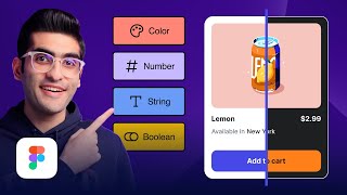
Make Your Web Design Responsive Using Variables | Figma Tutorial
HTML-код
- Опубликовано: 6 авг 2024
- In this video, I'm going to show you how you can make your components responsive using Figma variables.
👉 Check out Conjointly's Market Test and its Figma plugin:
conjointly.com/solutions/mark...
bit.ly/3Eppv7C
👉 Become a Pro UI Designer with my UI Design & Figma Mastery course:
bit.ly/43v79vX
📸 Instagram: / uiux.arash
Who is Arash Ahadzadeh? Well, I'm a UI/UX designer and a university instructor with 7+ years of experience, and I teach people how to design great user interfaces and experiences. I've helped over 30,000 students become UI/UX designers from scratch worldwide.
👉 Become a UI Designer with my UI Design & Figma Mastery course (17+ hours and 130+ lessons):
bit.ly/43v79vX
First on board 🏃🏽♂️🏃🏽♂️🏃🏽♂️
Doesn't work Arash .
هزینه چقدر ؟
Thank you for your Figma lessons! So far the best channel to understand how to work correctly with new features!
No problem. Glad you liked the content.
Hi Arash! I loved seeing your walkthrough of how to use variables for the navigation bar. I remember I used to make a variant in a component for every version of the bar, whether it responsive, and then for different states based on whether the user was logged in or out. It was exhausting! I'm sure you can still combine component variants with variables, but the way you demonstrated it was impressively efficient. Thanks again!
No problem. Glad it was helpful!
Most simple and clever explaining. Bravo. You have exceptional skills in teaching. No comparison with other guys!
what would be really cool is if it were truly responsive in Figma.. as in, as you resize the frame, the variables kick in at the break points and lesser or greater values. But thats not whats happening, and it only works at that those set values when the parent frame is created from scratch specifically for that look. Its ok to provide a view to the developers of what should happen at those specific widths, but its technically not a "break point", but more like what it should look like at that specific width. I believe using constraints along with advanced auto layout like multiple nests are a more depictive way to present responsiveness, especially when presenting a concept. Hope the day comes, when variables and Figma tuly work this way with breakpoints
You can do that using a plugin called Breakpoints. You can check it out here:
ruclips.net/video/c0ZTaDMGb20/видео.html
This came in right on time. Thank you so much for sharing your knowledge.
No problem.
Perfect,your teaching and the tips are amazing . the best video that I could find about Figma .عااااااااالی
Glad it was helpful! Thank you.
Keep Going Bro (Y)
love your content and your calmness of making things undestand
I appreciate that!
thank you! this video is very helpful :)
Right on time, instructor. Thanks.
Glad it was helpful! No problem.
Hey, Arash. I feel like it's easier to just create component variants for each format Desktop, tablet, etc then use the String variable and name it the same as the variants. It ends up with the same result as what you did essentially but more control over it since you can easily customize the padding on the go as well as switch to hamburgers without the need for padding or boolean variables. You only need the String variable to detect the variants you made as long as they have the same name.
Very clear explanation! Thank you!
Glad it was helpful!
Beautifully explained. Very helpful. Thank you
No problem. Glad it helped.
I'm enjoying your course so far Arash, just started module 7 so wish me luck!
I'm glad you are enjoying the course. I wish you the best of luck.
Thank you so much. It was very informative
No problem. Glad it was helpful!
is there a way for a design to automatically change the variable type when resizing the frame? in other words: creating a frame where if you make it smaller, or bigger, it automatically adjusts to the correct implementation (mobile/desktop/tablet) based on the size of the frame
Unfortunately, not with variables, but you can check out the following video that shows you how to do that using a plugin.
ruclips.net/video/c0ZTaDMGb20/видео.html&lc=UgxIurQ8ANoeJGG2A_94AaABAg
Hi Arash. Great video! I was wondering in the Responsive team section, instead of manually changing the container width, can they adapt to the padding and the container width will change accordingly?
Great RUclips channel to learn uxui design 👍 i love your tutorials 💎
Thanks.
very helpful
Arash sir thanks for motive us.
No problem.
thanks a lot, dear arash
No problem.
you saved my life
GOSH! You're the Man! 🥰
Thank you.
Thanks for the video! Do you have a video on how to proceed this design by opening the menu (items)? Do I use overlays or is that also possible with variables?.
Really need some help with this 🙏🏻
Thanks a lot!
No problem.
Thank you so much, more videos are expected from your side.
No problem. More to come!
Thank you
No problem.
Great content.
Thanks.
Will this also be reflected in the exported code? (example to tailwind CSS etc?)
hey can i export a VARIANT created on figma to webflow or framer, a changing color and font while hovering for example, please i tried several times but it doesnt work !
How to make prototype for different devices and view the specific variant in each of the physical devices - desktop, tablet and ipad? I'm not referring to the simulation, but want to view in the actual physical devices.
Great
Thanks.
How do you adjus t the font size in this context? Need help!
Great tutorial, but I struggle with building the responsive header. When the variables come into play, my logo and the icon shrink to the middle, I have an enormous padding left and right ... any chance to get the figma file of this video?
Hi Arash, I loved the video, thank you so much. The only question I have is if there's a way to download the HTML/CSS code to make it responsive, or if there's a specific plugin for that. You'd make my day if you could help me out. Thank you very much.
Hi. No problem. You can use Framer.
this seems won't work with color modes. let's say we have 3 width and 2 color modes. any idea how to manage it?
Do you have the link to this file please?
@ 14:33
Why container size of the Tablet is 744 while the written value is 720 in the variable?
Hi Arash,
The video is very interesting, smooth and easy to understand. I have a question. I am in team mode on Figma, which means that I was able to add new variable modes, but I don't have the variable icon in the Layers section. Do you know why?
Thanks in advance,
Hi. No problem.
Glad you liked it. On the Layers section you should right-click on the eye icon to see your variables.
I see many trend design where the hero section using style called "lava layout" style but i only see that work on desktop only.Plis make it tutorial lava layouy but responsive
@DesignWithArash can you please tell what type of paid subscription needed? Professional will be enougth?
That depends on the number of modes you want to create.
Hello Arash, what can be used as an alternative of the Local Variables for users who can"t afford the paid version of it at the moment? Please gimme a feedback asap
Hi. Unfortunately, there is no free alternative. You can use the Breakpoints plugin for responsiveness but it's also paid.
At 4:57 you show the use of a variables button on the Layer panel that is not shown for me. How does one make this button available?
Answered my own question: One must apply the variable to the component, then add the component to the frame. At that point the variable button is displayed. There seems to be a lot of confusion about this online. Hopefully this helps someone!
Can you make text size responsive based to screensize with auto layout
We cannot change the font size but we can make the text's width responsive.
How can i make my desktop frame repsonsive in figma.
For example: if i resize the desktop frame to mobile or tablet size, the elements including images, text should be completely responsive to the screen size.
How can i achieve this thing. Please reply
I have a dedicated video about this on the channel. Please check that out.
Is there any way to create responsive text styles as well?
Not yet.
Well done dude, good video. I'm angry at Figma BTW, they don't allow more than 4 modes until the Enterprise plan which costs 75 euro per month, it's insane.
Thanks. Yeah. I think they will update it soon.
Can we do the same with components so that it can adjust according the screen.
Yes.
Man, you are good.😢 Will you create a free course one of these days?
Thank you so much. No, I won't be offering any free courses.
Great tutorial! Thanks for sharing your knowledge! Shouldn't the title be called "Adaptive" instead of "Responsive"?
Thank you. Well, since we use Auto Layout and Variables together we can call it responsive but if we weren't using Auto Layout for our elements then yes, Adaptive would be the correct term.
Hey, after making it responsive, if we export the code, will it have the CSS for responsive behaviour, if we test it on localhost??
Hey. Nope, it's still not that advanced.
And if we choose to use plugin like anima ?
What's not intuituve is that we define variables for a component but have to apply to its parent frame...
I have one question for responsive design!
For desktop, tablet and mobile all have different sizes of fonts, images and product cards then why nobody shows that in tutorial?
You can change the font size with variables yet. It's not supported.
Please check out the following video.
ruclips.net/video/gwiX0oASlEw/видео.html
What is the advantage of doing this with variables instead of using the breakpoint plugin? If you make it with variables then your design is not truly responsive right?
Hello brother
I'm just stated my uiux course and I'm not payed user
Please reply me.. ❤️
How can I add android and mac in variable
I'm not using paid version
Can u tell me the other way please
I don't know why the boolean variable doesn't work for me. I hover on the "eye" Symbol but nothing is showing.
Hey, I didn't watched the entire video but I think I know the problem you have. You must right click to eye button to add variable to it. I hope it helps.
if not paid user you are screwed i tryto find a tutorial that allow not paid user to make it can not find the way
if someone know where to see that
Great tutorial, but one thing I would highlight is this method is it's technically classed as adaptive design. Not responsive.
Granted there are still limitations within Figma for true responsive layouts but it's worth calling out.
Great content but without playground file its hard to follow.
Why is this faster than just create 3 variants for the component?
It's not but this way you can dynamically modify the properties and also you can create advanced prototypes with it.
you just hide the button and menu you didn't add them if i'm not wrong, now i want to learn how to add hamburger menu with animation
You can simply create an interactive component and include it in your components.
Great video, but next time blink your eyes when you talking. 😅
Thank you. I'll try.😅
Yeap, variables are good but they take more effort. It is so boring and makes us tired.
Exactly. Dev do have common sense. Don't need to do everything even figma trying to use coding concepts, which takes too much time tho itz easy. Just make text size responsive according to breakpoint