OMG!😲😲You are the most professional person in excel. I've seen so far Thanks for the video you are my new mentor from today, hope you will keep posting videos ❤❤❤❤❤❤
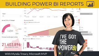
Amazing delivery Mynda. Love how you teach, making it clear how to get there, without wasting time showing "how to get there". Would only suggest the donuts might be better represented with a higher contrast of colors. A user that doesn't recognize Excel starts at 12, and works CW around the donut might have troubles tying the visual to the legend and the numbers, particularly if the values are a bit closer.
Take a bow Mynda for this awesome Video! I often struggle with dashboard design and utility, and have seen other videos, but yours has made it all clear to me in one go! Amazing! I was thinking of watching video part by part, but ended up watching it all w/o break! Whew! Thank you so much! Keep up the great work of helping us Excel! 🙂👍
I really love these dashboard videos!! They get me excited to build my own when I watch them. Happend to notice you use a lot of keyboard shortcuts, but update your report/dashboard by clicking. There is a shortcut for that too: Ctrl + Alt + F5 and it comes in very handy! Especially when you are frequently updating your data like me :)
Great to hear! Thanks for sharing the shortcut. I tend to focus on keyboard shortcuts that most people know or that are super easy to remember when teaching. If they don't meet this criteria then I'll use the menu as it's easier to remember where a button might be through logical conclusion.
Great Mynda. Thank you very much for this Masterclass. Your videos always give us the satisfaction we seek by learning useful things for our daily work. Forever grateful
There's lots of great tips in your videos. I wonder whether it's possible to get a dashboard that looks as slick as this while making the graphics and numbers easier to read. My old eyes have some trouble figuring out what color goes with what label. You could change the colors to make them easier to differentiate, but then you lose the color scheme that looks so nice. Pick your priorities, I suppose.
Hi i have 27 indicators, 52 diffrent regions tracking all the 27 indicators and i want to put it in a dashboard to be tracked monthly quarterly then annually. I have targets and results for one month...kindly help
Sounds like a great challenge, Kelvin. I don't do consulting, but I'll teach you everything you need to know so you can build your own dashboards in my Excel Dashboard course: www.myonlinetraininghub.com/excel-dashboard-course
Great video.Learnt a lot. Please, how do I get those x and y coordinates for the bubble chart. Do I copy them off the internet, or is there a way to calculate them?
Awesome, thank you. When combined and transformed data, an error in the Sales column from 2021 -2022 appeared because most of the .csv files have the money symbol in the Sales column and thus data did not load. I would like to now if anyone had the same issue
@@MyOnlineTrainingHub So many people should use it, if only they had an idea of what they are looking for. The why things are going on and the way to accomplish their goals.
It is always a challenge to choose the optimal dashboard size. I note that for this one you have 28 columns of 8.55 character lengths and 26 rows of 14.5 points. Would that be the ideal setting such that when I go into full screen mode and use the dashboard for presentation purposes, I will have no need to scroll left or right? But then there is also the zoom level.
There's no standard because it will come down to the resolution of the screen you present on, so it's best to get that information and then design for it. Of course, if you're sharing with multiple users, then you'll likely find you can't please them all.
I appreciate how you educate and cover all areas. I'm wondering if an excel dashboard can be created with both vertical and horizontal headers from the same database to which we're referring. plz do let me know.
Thank you! As long as your source data is in a tabular layout, you can use PivotTables to place headers in row and or, columns. Hope that's what you mean. If you have further questions, please post your question and sample Excel file on our forum where we can help you further: www.myonlinetraininghub.com/excel-forum
It’s really weird why there so much customisation in excel, but Power Bi, that is meant to be incredibly eye appealing, lacks so many basic features. Like the pie chart etc, you can’t customise them to look this good within the programme.
Thank you for this! Amazing! One question, could the auto updating for multiple pivot charts be setup within the same folder? Let’s say i need multiple dashboards within the same workbook.
Glad you liked it. I don't personally have time to do custom dashboard consulting, but if you reach out via email I can recommend someone: website at MyOnlineTrainingHub.com
Thanks for the amazing video, small problem I have The query detected wrong format for the date, like the month is day and vice versa and ended up with 1-12th of each month instead of the 30s any solution for this?
I wanted to follow along as practice, but I don't see any of the sample data or excel workbook sample when I go to the link that says "download the file here"
Great to hear you're keen to practice. When you go to the page linked to in the video description (here it is again: www.myonlinetraininghub.com/dark-themed-excel-dashboards) the file download link is under the heading "Download Workbook", which is just under the video on that page. Read the instructions for downloading the file there. If you have any trouble, please reach out via email as I won't see your reply here due to the volume of comments I get: website at MyOnlineTrainingHub.com
There's no set size, but they're supposed to be a one page report, so whatever most of your audience can read on one page. You may need to check what resolution their monitor's display settings are.
Great video…very informative…Thanks a lot for this. My Question: In the map element of the dashboard, How do I group a few values? I mean, let’s assume I have values for a few countries in Europe. With a filter(or a toggle witch kind of), I want to view the values country wise and region wise( a cumulative of Europe). Can you please help me with this? @myonlinetraininghub
Im facing the exact same problem, i dont think there is any filter applied anywhere, actually it didnt ask me to import the data as a table or a as a pivot table, it automatically got loaded as a table. So i made a pivot table out of that, and there the data for sales of the two years is not getting displayed for some reason
I'm not sure what error you're getting. Please post your question and screenshot on our forum where we can help you further: www.myonlinetraininghub.com/excel-forum
6:10 at this point i didn't find the pivot table report & PivotChart. it must be a eailer version of Microsoft office. is there any help that I can move the process with you?
Very very useful. Is there any chance to calculate in pivot table tve % evolution between let's say 2022 and 2021? I tried with calculated items (field is not working) but the measage is "Calculated item in Pivot table error when field is grouped". 2021 2022 EVO Sales 7.208.667 9.413.677 31%
Glad you liked it! Unfortunately, as the error states, when you've grouped fields, you can't also add calculated fields. You'd be best to remove the grouping and add a field to your source data that groups it, so you can use the build in calculated fields.


OMG!😲😲You are the most professional person in excel. I've seen so far
Thanks for the video
you are my new mentor from today, hope you will keep posting videos
❤❤❤❤❤❤
Wow, thanks so much 🙏😊
Amazing delivery Mynda. Love how you teach, making it clear how to get there, without wasting time showing "how to get there". Would only suggest the donuts might
be better represented with a higher contrast of colors. A user that doesn't recognize Excel starts at 12, and works CW around the donut might have troubles tying the visual to the legend and the numbers, particularly if the values are a bit closer.
Thank you! Yes, by all means modify the colours to suit.
Take a bow Mynda for this awesome Video! I often struggle with dashboard design and utility, and have seen other videos, but yours has made it all clear to me in one go! Amazing! I was thinking of watching video part by part, but ended up watching it all w/o break! Whew! Thank you so much! Keep up the great work of helping us Excel! 🙂👍
Awesome! Thank you so much, Vijay!
I love these videos, you always share some really useful techniques that I can pick up and use in my own reports.
😊
So great to hear 🙏
Hi Mynda, excellent video! Your tutorials never fail to blow me away. My dream is to be half the Excel guru you are :)
Wow, thank you, Jack! Keep practicing and learning 😊
I really love these dashboard videos!! They get me excited to build my own when I watch them. Happend to notice you use a lot of keyboard shortcuts, but update your report/dashboard by clicking. There is a shortcut for that too: Ctrl + Alt + F5 and it comes in very handy! Especially when you are frequently updating your data like me :)
Great to hear! Thanks for sharing the shortcut. I tend to focus on keyboard shortcuts that most people know or that are super easy to remember when teaching. If they don't meet this criteria then I'll use the menu as it's easier to remember where a button might be through logical conclusion.
Great Mynda. Thank you very much for this Masterclass. Your videos always give us the satisfaction we seek by learning useful things for our daily work. Forever grateful
You're very welcome!
I learnt a lot from your dashboard and You are my best teacher. Thank you Mam
Glad to hear that 🙏
Mynda that was incredible. You made that fun. Thank you so much.
Wonderful to hear, Al! Thank you 😊
Feeling joyful to see such type of content with full of knowledge and skill. Thank You Mynda
Great to hear!
Looks awesome Mynda! Thanks for the walkthrough on how to create. Thumbs up!!
Thanks so much, Wayne 😊
Amazing. The best excel tutorial on youtube by far.
Wow, thanks so much!
Wow. Great dashboard. Thanks a lot. Best channel!!
Thanks so much, Dennis! Please share it with your co-workers.
Awesome. The session like a pro. Greetings
Glad you enjoyed it
Love your Dashboard videos, and this is one of the best you’ve done ❤
Wow, thank you!
Fantastic result! Thank you for this very easy to follow tutorial video!
You’re welcome 😊
Excellent as always, thanks Mynda!
Cheers, Chris! Thanks for watching.
Thanks a lot for this valuable information ❤
Glad it was helpful!
Hi Mynda!Wow Really Impressive...Thank You :)
Thanks for your kind words, Darryl!
You are so great at these dashboards and slicers! Thanks so much for the great training! :)
Glad you like them, Jennifer 🙏
There's lots of great tips in your videos.
I wonder whether it's possible to get a dashboard that looks as slick as this while making the graphics and numbers easier to read. My old eyes have some trouble figuring out what color goes with what label.
You could change the colors to make them easier to differentiate, but then you lose the color scheme that looks so nice. Pick your priorities, I suppose.
Sure, you can make the differences between the colours more distinguishable.
Great tutorial. As always.
Thank you!
Nice colours and combinations. I love it
Thanks so much 😊
Awesome tutorial!!!
Glad you liked it, Gaurav!
Always great videos, thank you. Happy Holidays Mynda!
Thank you and same to you!
You just gave me a sensational idea for a dash ty so much
Wonderful to hear!
Beautiful job, i liked! Great! Tank you Mynda.
Thank you 🙏
Thanks for the knowledge sharing
My pleasure, Siva!
Great dashboard. Very modern and intuitive!
Glad you liked it!
Lovely! Piece of art!!
Thank you very much!
Absolutely amazing tutorial.
Thanks so much!
Great explained. Neat and clean.
Thank you!
Brilliant video as always.
Glad you enjoyed it
Hi i have 27 indicators, 52 diffrent regions tracking all the 27 indicators and i want to put it in a dashboard to be tracked monthly quarterly then annually. I have targets and results for one month...kindly help
Sounds like a great challenge, Kelvin. I don't do consulting, but I'll teach you everything you need to know so you can build your own dashboards in my Excel Dashboard course: www.myonlinetraininghub.com/excel-dashboard-course
Brilliant work. Thanks!
Great to hear 🙏
Great video.Learnt a lot. Please, how do I get those x and y coordinates for the bubble chart. Do I copy them off the internet, or is there a way to calculate them?
Great to hear! The X and Y coordinates represent your data points. They're not something you copy from anywhere.
Awesome, thank you.
When combined and transformed data, an error in the Sales column from 2021 -2022 appeared because most of the .csv files have the money symbol in the Sales column and thus data did not load. I would like to now if anyone had the same issue
You can use Change Type > Using Locale, to fix the values for your location, as explained here: ruclips.net/video/QKgS3hrrmvw/видео.html
That is so awesome!!!
Glad you like it 😊
Really great job ! Thanks
Glad you liked it!
@@MyOnlineTrainingHub So many people should use it, if only they had an idea of what they are looking for. The why things are going on and the way to accomplish their goals.
Whenever I want to feel that I can do better 💥
😊 glad you liked it!
It is always a challenge to choose the optimal dashboard size. I note that for this one you have 28 columns of 8.55 character lengths and 26 rows of 14.5 points. Would that be the ideal setting such that when I go into full screen mode and use the dashboard for presentation purposes, I will have no need to scroll left or right? But then there is also the zoom level.
There's no standard because it will come down to the resolution of the screen you present on, so it's best to get that information and then design for it. Of course, if you're sharing with multiple users, then you'll likely find you can't please them all.
Great job!
Thank you!
Thank you so much for this tutorial I love it but am so confused, when I download the sample data it seems all mixed up. Kindly advice me on this 😢
Not sure what you mean by 'seems all mixed up'. The data is stored on my PC, so you cannot refresh the data.
You can ctrl+c, ctrl+v chart formatting and use images as chart background?!?! How do I not know this lol
Glad you learnt something new 😊
I appreciate how you educate and cover all areas. I'm wondering if an excel dashboard can be created with both vertical and horizontal headers from the same database to which we're referring. plz do let me know.
Thank you! As long as your source data is in a tabular layout, you can use PivotTables to place headers in row and or, columns. Hope that's what you mean. If you have further questions, please post your question and sample Excel file on our forum where we can help you further: www.myonlinetraininghub.com/excel-forum
Thanks
My pleasure 😊
THanks
Welcome 🤗
It’s really weird why there so much customisation in excel, but Power Bi, that is meant to be incredibly eye appealing, lacks so many basic features.
Like the pie chart etc, you can’t customise them to look this good within the programme.
Maybe you can write a custom pie visual to do what you want.
Utmost Fantastic!!!
Thank you 🙏
splendid
Thank you!
Thank you for this! Amazing! One question, could the auto updating for multiple pivot charts be setup within the same folder? Let’s say i need multiple dashboards within the same workbook.
Yes, you can store multiple dashboards in the same Excel file which all use the same source data.
awesome video, do you all do custom dashboards?
Glad you liked it. I don't personally have time to do custom dashboard consulting, but if you reach out via email I can recommend someone: website at MyOnlineTrainingHub.com
Thanks for the amazing video, small problem I have
The query detected wrong format for the date, like the month is day and vice versa
and ended up with 1-12th of each month instead of the 30s
any solution for this?
Glad you liked it. You can fix the date issue with Change Type > Using Locale as explained here: ruclips.net/video/QKgS3hrrmvw/видео.html
That's good...
Glad you liked it!
I wanted to follow along as practice, but I don't see any of the sample data or excel workbook sample when I go to the link that says "download the file here"
Great to hear you're keen to practice. When you go to the page linked to in the video description (here it is again: www.myonlinetraininghub.com/dark-themed-excel-dashboards) the file download link is under the heading "Download Workbook", which is just under the video on that page. Read the instructions for downloading the file there. If you have any trouble, please reach out via email as I won't see your reply here due to the volume of comments I get: website at MyOnlineTrainingHub.com
hi..what version of excel are you using? I'm not able find most of the option and have to keep digging
These techniques should work on all Windows versions of Excel from 2016 onward, if not earlier.
What should be the height and width of a dashboard?
There's no set size, but they're supposed to be a one page report, so whatever most of your audience can read on one page. You may need to check what resolution their monitor's display settings are.
Wow!, how to continue to do real-time update and get the html tag for embed to the website. Thank you for sharing.
Glad it was helpful!
@@MyOnlineTrainingHub Yes, very helpful, and is it possible to get the html tag from excel to embed into the web application code?
See this tutorial for embedding reports: ruclips.net/video/uvA-U9FKgPw/видео.html
@@MyOnlineTrainingHub Thank you so much.
Wonderful video ! Where could I download the csv files data please ?
Glad you liked it. You can download the dashboard and data from the link in the video description.
The image you downloaded from pngwing i can't seem to.find it when i search for it.
You can get it from my example file that you can download from the link in the video description.
Great video…very informative…Thanks a lot for this.
My Question: In the map element of the dashboard, How do I group a few values?
I mean, let’s assume I have values for a few countries in Europe. With a filter(or a toggle witch kind of), I want to view the values country wise and region wise( a cumulative of Europe). Can you please help me with this?
@myonlinetraininghub
Please post your question and sample Excel file on our forum where someone can help you further: www.myonlinetraininghub.com/excel-forum
Plz share the link, if you have a dashboard showing data in a table, otherwise make a video on it.
This video uses data in a table to create a dashboard: ruclips.net/video/K74_FNnlIF8/видео.html
Sales of 2020 are displayed, why are the sales of 2021 and 2022 not displayed.
What could be the problem?
Thank you
Hard to say without seeing your file. Perhaps you have a filter somewhere?
Im facing the exact same problem, i dont think there is any filter applied anywhere, actually it didnt ask me to import the data as a table or a as a pivot table, it automatically got loaded as a table. So i made a pivot table out of that, and there the data for sales of the two years is not getting displayed for some reason
I am unable to insert icons into this file ! Please Help
I'm not sure what error you're getting. Please post your question and screenshot on our forum where we can help you further: www.myonlinetraininghub.com/excel-forum
6:10
at this point i didn't find the pivot table report & PivotChart.
it must be a eailer version of Microsoft office.
is there any help that I can move the process with you?
Ok....i just import it as table and then make a new pivot table by my own. I'm just a beginner
Keep going on
👍🏼
Great to see you're having a go at building it yourself!
@@MyOnlineTrainingHub Yeah actually
Where do i get the raw datafiles for this dashboard?
The link is in the video description.
have any one managed to download the file ?
Loads of people have downloaded the file. Reach out via email if you're still having trouble: website at MyOnlineTrainingHub.com and we can help you.
Error in order date
Not sure what you're referring to.
@@MyOnlineTrainingHub the order date was showing error so i had to change the format
It was probably a locale issue - see this tutorial: ruclips.net/video/QKgS3hrrmvw/видео.html
You are not teaching. You are just talking to yourself.
p̲r̲o̲m̲o̲s̲m̲ 🎉
Very very useful. Is there any chance to calculate in pivot table tve % evolution between let's say 2022 and 2021? I tried with calculated items (field is not working) but the measage is "Calculated item in Pivot table error when field is grouped".
2021 2022 EVO
Sales 7.208.667 9.413.677 31%
Glad you liked it! Unfortunately, as the error states, when you've grouped fields, you can't also add calculated fields. You'd be best to remove the grouping and add a field to your source data that groups it, so you can use the build in calculated fields.
Thanks
My pleasure, Ali!